|
0 Legionnaires (),
34
Murran Spies, and
3
Spider Guild Agents. |
|
Key:
Admin,
Global Mod,
Mod
|
|
 Previous Thread Previous Thread |
|
Next Thread 
|
|
Print Thread  |
|
|
Joined: Jul 2003
Posts: 3,613
in season
|
|
in season
Joined: Jul 2003
Posts: 3,613 |
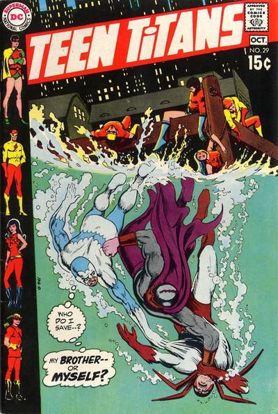
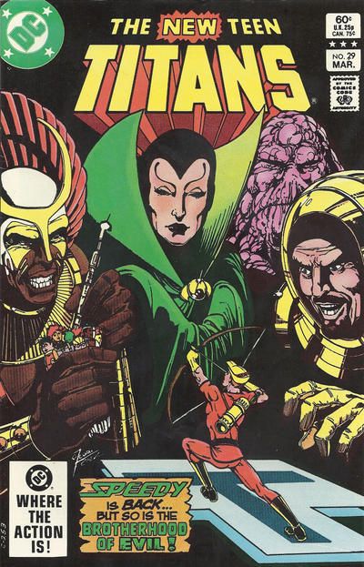
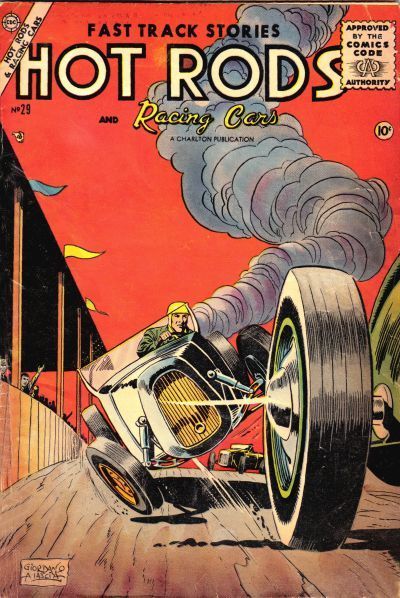
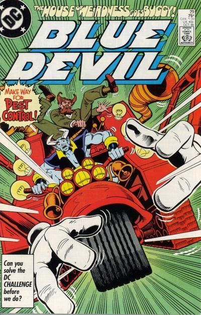
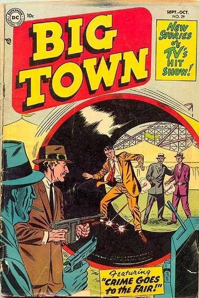
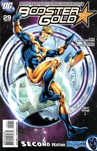
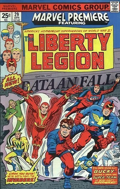
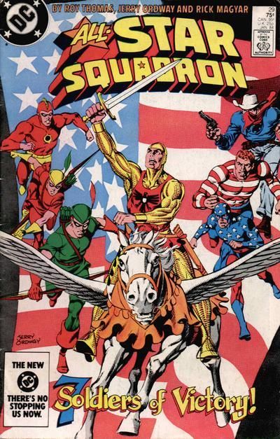
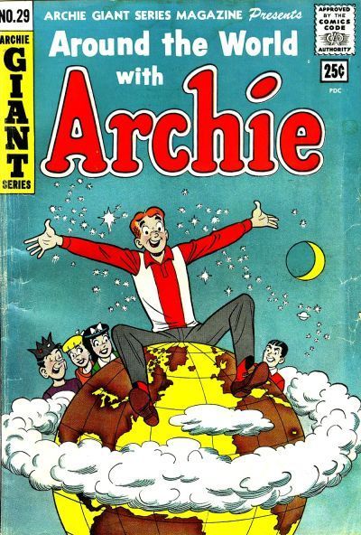
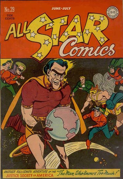
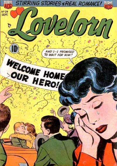
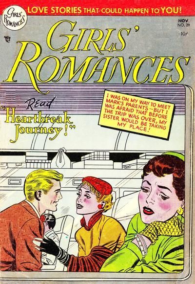
Twenty-Nines ain't waiting for 2032. Twenty-Nines don't give AF about Elevens, Twelves, Eights, or Tens. TWENTY-NINES ARE BRINGING THEIR OWN COVER DRAMA & DEMAND YOUR ATTENTION NOW. Choose one per matchup -- no ties -- on your opinion of the cover merits alone. Click images to see larger versions1. TEEN TITANS vs. NEW TEEN TITANS  2. HOT RODS AND RACING CARS vs. BLUE DEVIL  3. BIG TOWN vs. BOOSTER GOLD  4. MARVEL PREMIERE vs. ALL-STAR SQUADRON 
|
|
|
|
|
Joined: Jul 2003
Posts: 16,863
Time Trapper
|
|
Time Trapper
Joined: Jul 2003
Posts: 16,863 |
1. New Teen Titans - good black background with giant Brotherhood of Evil. Teen Titans presents an engaging moral dilemma, but, as every air traveler knows, you put your own oxygen mask on first, Don.
2. Hot Rods - like the simplicity, with only the tire coming at you.
3. Booster Gold - more dynamic
4. All Star Squadron - nice hoss.
Holy Cats of Egypt!
|
|
|
|
|
Joined: Jul 2003
Posts: 3,613
in season
|
|
in season
Joined: Jul 2003
Posts: 3,613 |
1. TEEN TiTANS. It's the lines -- eye and actual. First the underwater action, then up to the surface (dammit Garth, WTF), then the title tilt slides you into the left side lineup. It's all a little off-kilter and I can dig it.
2. BLUE DEVIL. I can see how the Hot Rods cover might be big with car/racing nostalgia aficionados. But it took me a long time to realize that the wheel in front was from another car, not blown off the one that's in the center.
3. BOOSTER GOLD. Much as the classic fair ride is appealing, Booster is, indeed, more Dynamic.
4. ALL-STAR SQUADRON. On the other, the Marvel banner + Marvel Premiere logo + the Liberty Legion logo squish the characters down into the bottom half -- and there's nothing special going on there anyway. A-SS makes much better use of the space.
|
|
|
|
|
Joined: Jul 2003
Posts: 3,613
in season
|
|
in season
Joined: Jul 2003
Posts: 3,613 |
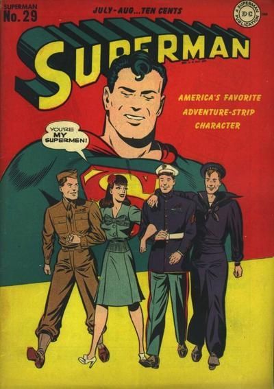
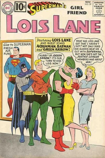
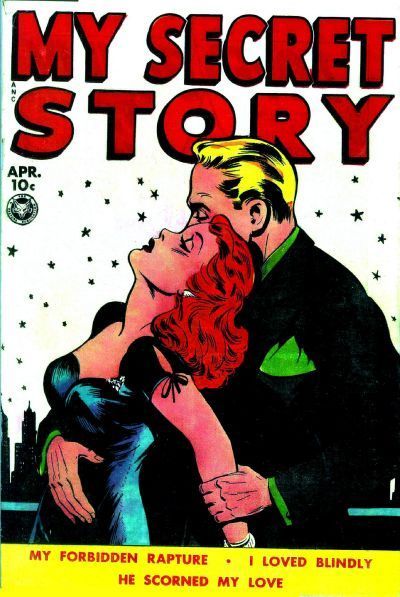
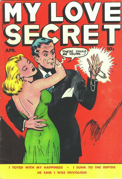
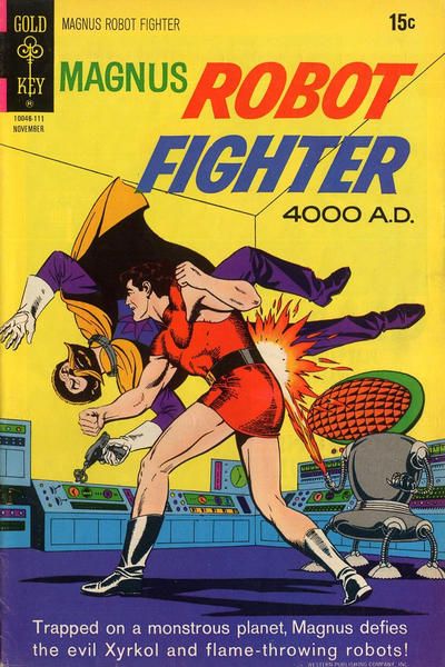
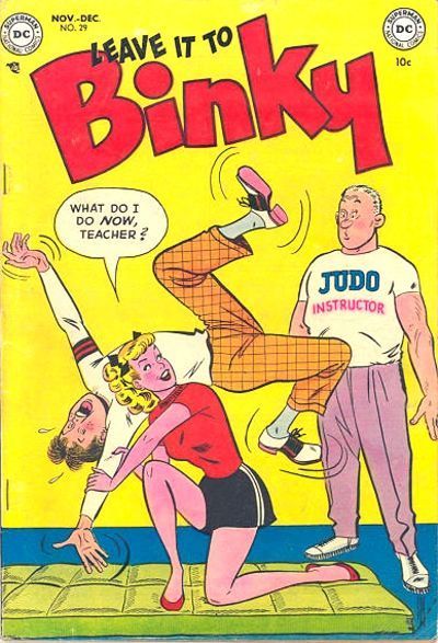
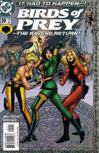
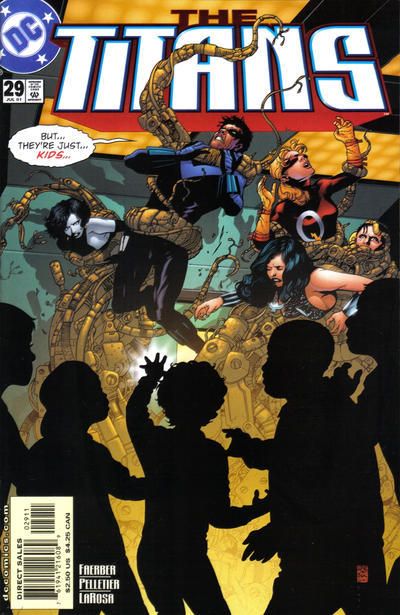
5. SUPERMAN vs. SUPERMAN'S GIRLFRIEND LOIS LANE  6. MY SECRET STORY vs. MY LOVE SECRET  7. MAGNUS ROBOT FIGHTER vs. LEAVE IT TO BINKY  8. BIRDS OF PREY vs. THE TITANS 
|
|
|
|
|
Joined: Sep 2003
Posts: 34,634
Bold Flavors
|
|
Bold Flavors
Joined: Sep 2003
Posts: 34,634 |
1. New Teen Titans – these types of covers have been done a lot in comics, but this is a great one by Perez!
2. Hot Rods and Racing Cars – something about the simplicity and minimalism of it makes it look beautiful and serious.
3. Big Town – I prefer the image showing an actual “something” rather than a pin-up, even if it’s a character I like.
4. Marvel Premiere – love the obscurity of it all, and love the “ugliness” and love that Bucky is about to punch someone in the mouth the second he gets a chance.
5. Lois Lane – one of my favorite Lois covers. I want to be in that line. Preferably before fishlips Aquaman.
6. My Secret Story – nice pulpy, erotic cover! The stars in the background against a white background make it feel even moodier.
7. Magnus Robot Fighter – I’m a big fan of Russ Manning’s Magnus art, and even though this feels more like a panel than a cover, I’ll give it to him. But the Binky one is really great.
8. Birds of Prey – by this point I was just loving the hell out of this series and I really miss it. Wonderful Butch Guice art which was always the perfect combo of sexy and pulpy action. This was an awesome storyline too.
|
|
|
|
|
Joined: Jul 2003
Posts: 3,613
in season
|
|
in season
Joined: Jul 2003
Posts: 3,613 |
5. LOIS, duh.
6. Gotta love the Fox sleaze. MLS has extra sleazy dialogue, but that MY SECRET STORY weird reverse skyline is SO eye-catching taht it has to win. Even though I suspect it was a mistake.
7. LEAVE IT TO BINKY. "Robot Fighter" sounds so damned dorky. That's not a a cover merit (or demerit) -- but the figure stiffness IS.
8. BOP. There are better "foreground figures in shadows" cover, The Titans. BOP fills the page better and coloring also very nice.
|
|
|
|
|
Joined: Jul 2003
Posts: 3,613
in season
|
|
in season
Joined: Jul 2003
Posts: 3,613 |
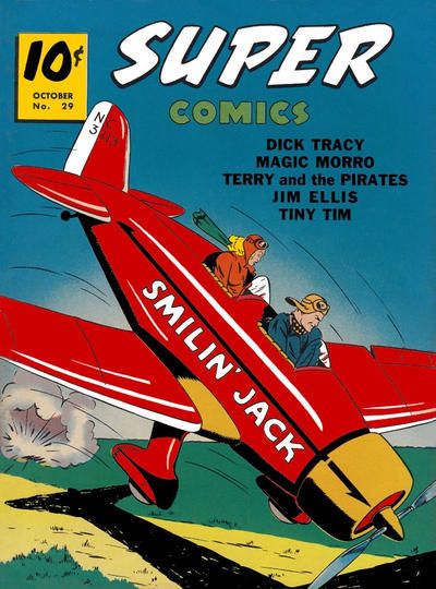
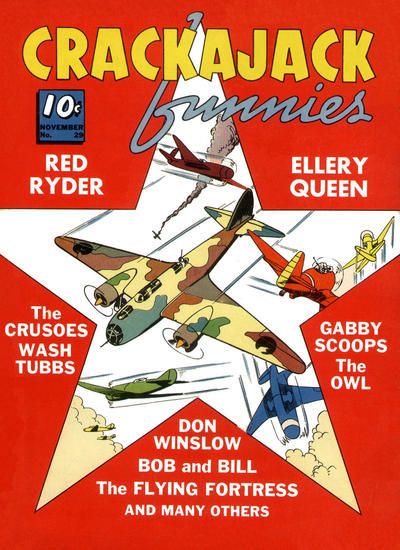
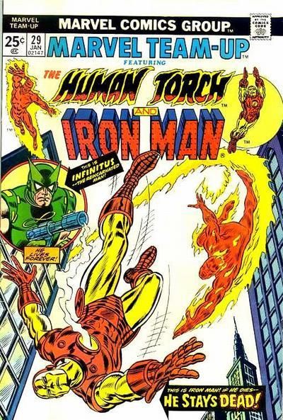
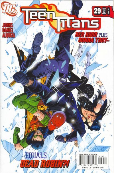
9. ARCHIE GIANT SERIES MAGAZINE vs. ALL-STAR COMICS  10. LOVELORN vs. GIRLS' ROMANCES  11. SUPER COMICS vs. CRACKAJACK FUNNIES  12. MARVEL TEAM-UP vs. TEEN TITANS 
|
|
|
|
|
Joined: Jul 2003
Posts: 16,863
Time Trapper
|
|
Time Trapper
Joined: Jul 2003
Posts: 16,863 |
5. Lois, not just for the kiss, but Lucy's snarky remarks.
6. My Secret Story, romantic tone; on the other one, the guy looks mean, manipulative, buying the girl.
7. Magnus Robot Fighter, more dynamic action. But we like a good joke, Binky.
8. A tie: Birds of Prey evokes the fun of Charlie's Angels, promises danger on both sides, but the medallion they're standing on looks clunky and the firey/smoky background is distracting. Titans: Nice silhouettes, weird tentacle machine monster, Nightwing's comment.
9. Archie: silly, but full blue background looks good, Reggie to one side looking disruptive; the JSA logo splits the cover and scrunches up the image.
10. Lovelorn: captures the story with fewer words and images.
11. Super Comics, the star on the other is unusual, but the white background just looks tepid and the text clutters the image.
12. Teen Titans, all that shattered reflective glass is striking.
Holy Cats of Egypt!
|
|
|
|
|
Joined: Jul 2003
Posts: 3,613
in season
|
|
in season
Joined: Jul 2003
Posts: 3,613 |
8. A tie: Birds of Prey evokes the fun of Charlie's Angels, promises danger on both sides, but the medallion they're standing on looks clunky and the firey/smoky background is distracting. Titans: Nice silhouettes, weird tentacle machine monster, Nightwing's comment.
|
|
|
|
|
Joined: Jul 2003
Posts: 16,863
Time Trapper
|
|
Time Trapper
Joined: Jul 2003
Posts: 16,863 |
Well! Just wait until they turn 30. Then we'll see who's adamant.
Holy Cats of Egypt!
|
|
|
|
|
Joined: Jul 2003
Posts: 10,154
Terrifyingly On-Topic.
|
|
Terrifyingly On-Topic.
Joined: Jul 2003
Posts: 10,154 |
No no NO, that Canadian affability has no place in this here riot. Decide wisely. Or unwisely. Just decide. Wait too long and you'll be put in charge of the Thirties AND the Thirteens. Simultaneously.
|
|
|
|
|
Joined: Jul 2003
Posts: 3,613
in season
|
|
in season
Joined: Jul 2003
Posts: 3,613 |
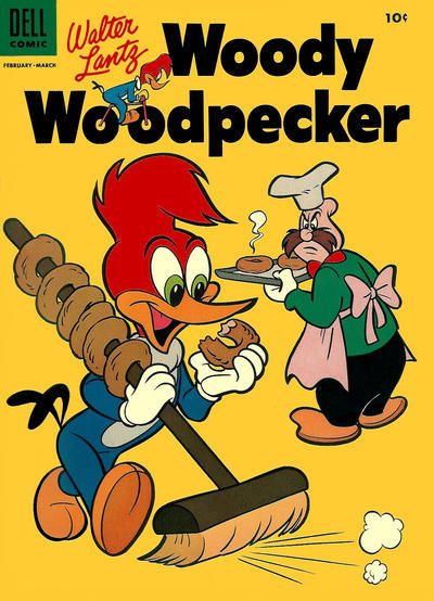
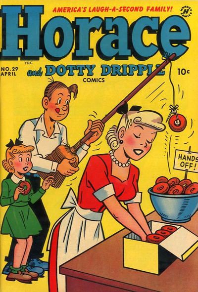
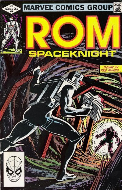
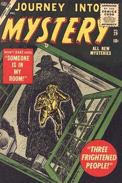
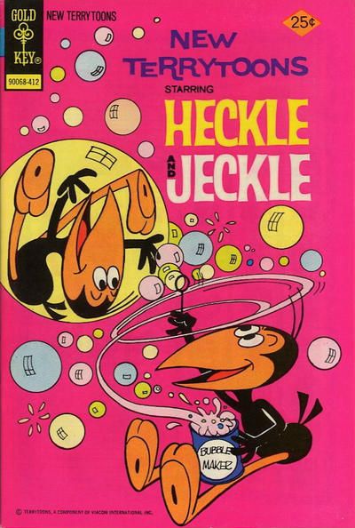
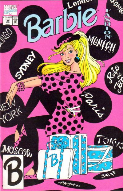
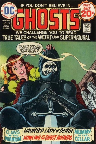
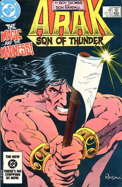
13. WOODY WOODPECKER vs. HORACE & DOTTY DRIPPLE  14. ROM vs. JOURNEY INTO MYSTERY  15. NEW TERRYTOONS (HECKLE & JECKLE) vs. BARBIE  16. GHOSTS vs. ARAK SON OF THUNDER 
|
|
|
|
|
Joined: Jul 2003
Posts: 16,863
Time Trapper
|
|
Time Trapper
Joined: Jul 2003
Posts: 16,863 |
No no NO, that Canadian affability has no place in this here riot. Decide wisely. Or unwisely. Just decide. Wait too long and you'll be put in charge of the Thirties AND the Thirteens. Simultaneously. Canadians only riot over hockey playoffs. Nevertheless, we can be stubborn in the persistence of affability. 13. Horace: shows both inventiveness and kindness to children, since dad already snitched one for the kiddie. 14. Journey into Mystery: much more menacing. That guy's a goner and he knows it. Unusual overhead shot, too. 15. Heckle & Jeckle: just how do you get someone inside a soap bubble, and why? Truly an existential and a scientific challenge. Both covers' colour schemes leave something to be desired, but Barbie's is worse with the blue logo and luggage. Why do blondes wear pink? I never understood that. Maybe she could guest appear in the Woozy Winks thread. 16. Ghosts: what kind of weirdo would dress up in armour to surprise his girlfriend? Buy that comic and find out! It wins on promise, although Arak is considerably more dynamic.
Holy Cats of Egypt!
|
|
|
|
|
Joined: Sep 2013
Posts: 31,872
Tempus Fugitive
|
|
Tempus Fugitive
Joined: Sep 2013
Posts: 31,872 |
1. Teen Titans: As well crafted as the Perez cover is, just look at the expression on Don's face. That's anguish. The thought bubbles aren't even needed. Just switch in environments, and the really well posed unconscious Titans Slumping on the Dock of the Bay, make this a winner.
2. Hot Rods: I wanted to duck out of the way, just looking at the cover.
3. Big Town; Even crooks need some entertainment. A fitting end for noted snitch "Hamster" Morales. The Booster Gold is just a pin up and a time bubble. It'll take more than a Legion cash in to get my vote. Well, here anyway.
4. All-Star Squadron. Their expressions aren't quite as psychotic and they are better posed.
5. Lois Lane. Mainly for those awkward Justice League Meeting silences after Clark and Lois get married.
6. My Love Secret. The second story "I sunk to the Depths" is a follow up to the Lois Lane issue. Here she sneaks off with Aquaman.
7. Binky for the gender reversal. Over in Magnus, Xyrkol was actually a pharmaceutical. Left wing Magnus wasn't just about the manly short skirts.
8. Titans. They meet the Children of the Corn. Nice use of foreground silhouettes. It's not just that their foes are kinds, it's the tentacle monsters too. Over in prey, the ravens had to return. Did they? depends entirely on previous knowledge of the book and the generic poses don't reel me in either.
9. All-Star. Some countries really feel like they're screwed when it comes to global politics. But they should look at All Star and count their blessings. It could have been worse.
10. Lovelorn has the angst and my vote. So many story possibilities with that one. On the other cover, it's no wonder he wants to talk to the sister, if all she does is sulk and look out the window. Less angsty, more self pitying.
11. Super. It doesn't need the airshow of the other cover to get across it's aerial action.
12. Iron Man. The faulty arithmetic on the Titans cover loses it whatever few points it had. I'm all for Legion cash ins and the Infinite Man link to Infinitus gets my vote. Plus the more accurate dialogue boxes.
13. Horace is funnier, and not even a cycling Woody on the log can change it.
14. Journey into Mystery. "Someone is in my room" Yes it's you. You're reading a comic. "Three Frightened People" really needs to give the viewer something more. They could be watching a horror film on ROM's tablet. Poor ROM, reduced to desperately forcing people to watch his favourite TV shows down mines.
15. Barbie. Heckle and Jeckle has a great visual gag, but the Barbie cover is super polka stylish!
16. Ghosts. You get the feeling that the couple don't talk much, if she hasn't noticed his death. Still, skeletal black knights for the points. That Arak axe is going to miss the reader, and should take some notes from that Hot Rods cover.
"...not having to believe in a thing to be interested in it and not having to explain a thing to appreciate the wonder of it."
|
|
|
|
|
Joined: Jul 2003
Posts: 10,154
Terrifyingly On-Topic.
|
|
Terrifyingly On-Topic.
Joined: Jul 2003
Posts: 10,154 |
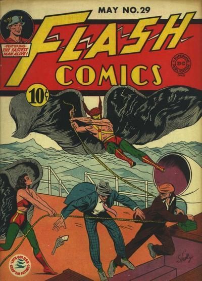
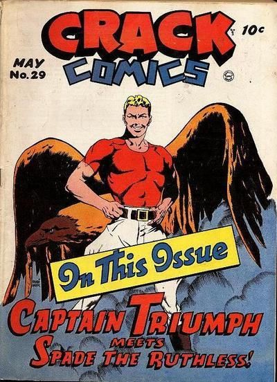
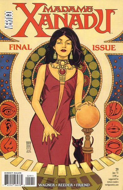
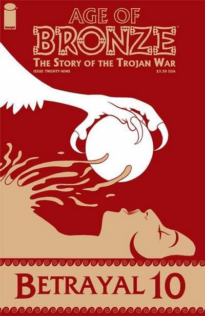
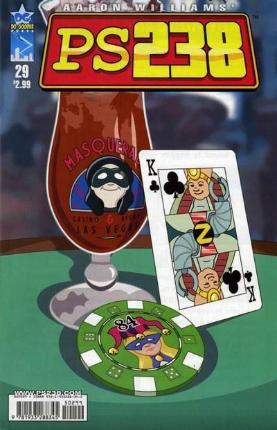
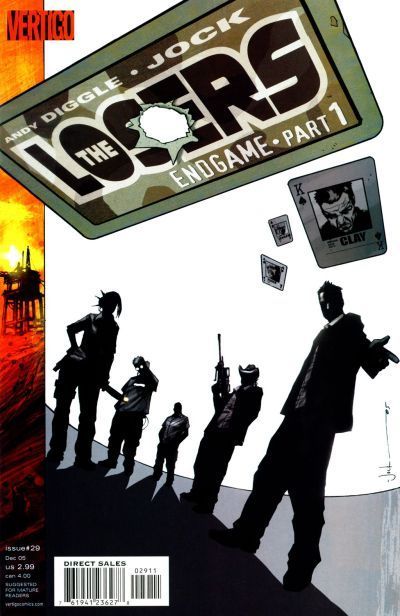
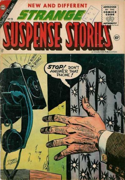
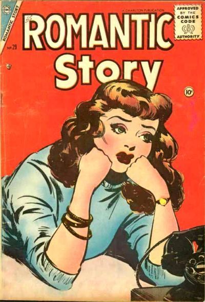
17. FLASH COMICS vs. CRACK COMICS  18. MADAME XANADU vs. AGE OF BRONZE  19. PS 238 vs. THE LOSERS  20. STRANGE SUSPENSE STORIES vs. ROMANTIC STORY 
|
|
|
|
|
Joined: Jul 2003
Posts: 16,863
Time Trapper
|
|
Time Trapper
Joined: Jul 2003
Posts: 16,863 |
17. Flash - wavy wings and wavy sea
18. Oh no! Not another tie! To appease the 29 Gods, I'll reluctantly choose Age of Bronze for its striking simplicity. The red suggests blood.
19. Losers. Beautiful cover, silhouettes, quiet menace, the visual of the cards ties in with the Endgame title, as does the sunset over the ?oilrig.
20. Strange Suspense - usually I opt for the more simple cover, but the text warning and the hand about to pick up that phone compels one to read the story. Why is a guy with gold cufflinks answering a phone in a paint-peeling, ugly curtained joint?
Holy Cats of Egypt!
|
|
|
|
|
Joined: Sep 2013
Posts: 31,872
Tempus Fugitive
|
|
Tempus Fugitive
Joined: Sep 2013
Posts: 31,872 |
17. Crack: Uh oh! That "In This Issue" sign is slipping. It's about to reveal why Captain Triumph is so confidently posing. This is the issue that got Cap banned! He next pops up...um stand erect on...um...appears in Jodhpurs Monthly a whole year later. Over in Flash, they beat up Carter Hall and steal his billowy wings to make a sail. Reincarnate that!
18. Xanadu: All sinuous, slinky grace. The artist then puts in some other stuff beside the cat. The other cover has no cat at all. Unless one moves into the chest cavity that the energy saving lightbulb was ripped from.
19. Losers: They are pathetic. Look at them. Standing for a cover pose under a logo that clearly weighs a couple tons and is about to squash them like bugs. They probably think it's card sized but close when. in fact. it's huge and further back. I must really not like the art on the other one for this to still win.
20. Suspense. It's the last issue of Romantic Story. By that point they were so desperate, they drew the characters sitting around waiting for someone to call in with a plot hook. The pay off in Suspense is that the phone is wired to the power grid. Anything to create a superhero origin.
"...not having to believe in a thing to be interested in it and not having to explain a thing to appreciate the wonder of it."
|
|
|
|
|
Joined: Sep 2013
Posts: 31,872
Tempus Fugitive
|
|
Tempus Fugitive
Joined: Sep 2013
Posts: 31,872 |
Why is a guy with gold cufflinks answering a phone in a paint-peeling, ugly curtained joint? Good spot Detective Cramer!
"...not having to believe in a thing to be interested in it and not having to explain a thing to appreciate the wonder of it."
|
|
|
|
|
Joined: Jun 2005
Posts: 5,083
feelin' hot hot hot
|
|
feelin' hot hot hot
Joined: Jun 2005
Posts: 5,083 |
(1) The New Teen Titans cover is such classic imagery with the villains so large and poor Speedy all tiny and alone fighting them. I love how powerful it is. The other image is just kind of meh to me. (2) I like the franticness of the Blue Devil cover but ultimately the Hot Rod one seems more interesting with the billowing smoke and solo racer. (3) I get more of the Big Town storyline from the cover image than with Booster Gold and it's more interesting to me. Booster's is a great glamour image but, honestly, those rarely do much for me. (4) Marvel Premier speaks to that part of me that loves teams breaking through images of other things (SEE: All-New, All-Different X-Men  ) and it seems more dynamic to me than the sort of generic team shot of the All-Star Squadron. (5) Okay, first of all, these are both hilarious in their own ways. I love this! My vote goes to Superman's Girlfriend Lois Lane because she's making out with Green Arrow on the cover! (He's such a ladies man.  ) I'm just way more curious about this issue and, honestly, I love the crack. (6) My Secret Story because the pose raises questions and the guy isn't quite as smarmy... (7) I am loving the ladies kicking butt! Gotta go with Leave it to Binky though because the humor hits me just right. (8) Giving it to Birds of Prey even though the awkward flails doesn't do it for simply for being the lesser of two evils. The Titans cover wreaks of try-to-hard to me. (SIDE NOTE: I wanted so badly to love The Titans and just... did not. It had so many of my favorite characters, so much potential and did nothing for me in the end.  ) (9) Liking the evil vibe in All Star Comics much more than the humor one with Archie. (10) It goes to Lovelorn for being slightly less obnoxious story-wise for me and, I think, the more interesting cover with the big fanfare behind her to give that contrast of her pain verses the joy of the day. (11) I'm not sure why but I just like all the different planes in Crackajack Funnies more than the solo plane.  (12) Huh, I remember reading that issue of Teen Titans and not caring for Donna Troy so much but eh. I do like it better than the Marvel Team-up even with the ridiculous line about dead Robin (OBVIOUSLY NOT GONNA HAPPEN) because the imagery is so much more dynamic. And the title in the Marvel one, I think, takes away from the cover image too because it makes everything too busy. (13) Woody Woodpecker is so cute! The Horace cover has a little bit of the try too hard feeling too it... (14) Ooh, I like that Journey Into Mystery cover - very mysterious. Rom feels more done before to me. (15) I don't really like either of these but, push comes to shove, I suppose New Terrytoons are pretty cute. The cover is more interesting to me with the bubbles and color, though I am impressed that Barbie is actually doing something! (16) Surprisingly (to me), I prefer Arak Son of Thunder - it's dynamic even if he does look roided out. The Ghosts cover has too much text and hits obvious trope beats that don't really entice me to the story. (17) Hmm, neither of these do much for me. I would probably rather read Flash Comics, though, because I'm more interested in the story potential. (Also, Flash.  ) I like their teamwork, too. The pin-up thing has never done much for me, so Crack Comics is out... even if it does have a hilariously inappropriate name.  (18) Madame Xanadu manages to be sexy without being full on pin-up or overdone. I really like the sensibility of the cover; I would pick that comic up for sure. I also think it's really beautifully done. All of that said, I also really do like the Age of Bronze cover and would probably pick that comic up, as well. This was a hard one! However, I can't help but be pleased when I see a female character not reduced to sex appeal and still being sexy and interesting. (19) There's something really classic about The Losers with the silhouettes. All the little bits - stripe of color with a sunset, bullet hole through the name, cards with what I assume are character names - are so enticing. It is, to me, quintessential comic book and one that I would be interested to read. (20) I have to vote Strange Suspense Stories for two reasons: #1 - the other cover is so pathetic I could scream and #2 - I'm a sucker for word balloons coming out of unexpected places.  Who is behind that curtain? A more fascinating quandary than who is not calling Girl #413. It's also a more active and, therefore interesting to me, cover than the Romantic Story one. Wow that's a long reply! Welp, I enjoyed it. Thanks, Teeds!
|
|
|
|
|
Joined: Jul 2003
Posts: 10,154
Terrifyingly On-Topic.
|
|
Terrifyingly On-Topic.
Joined: Jul 2003
Posts: 10,154 |
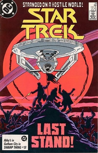
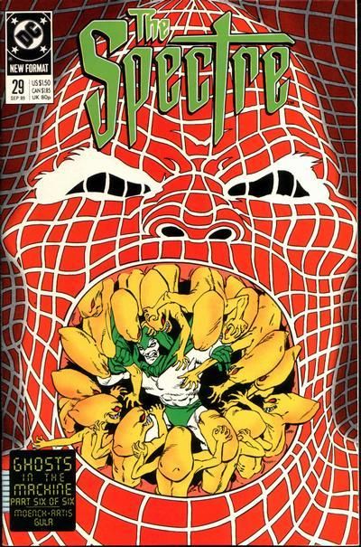
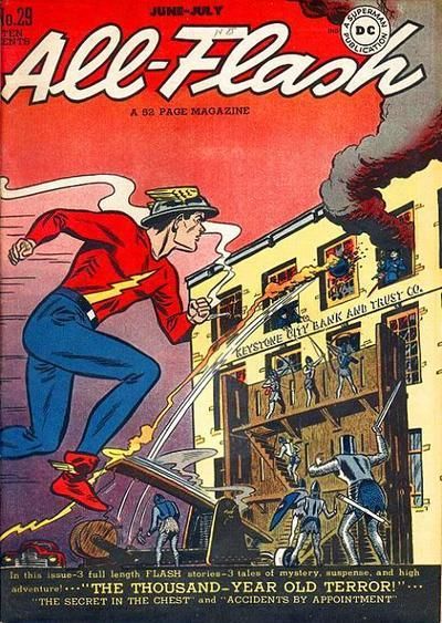
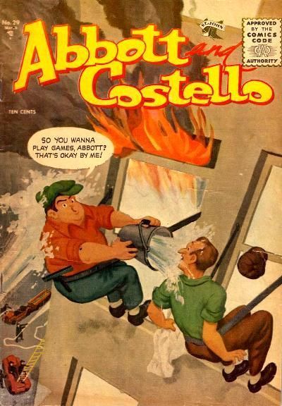
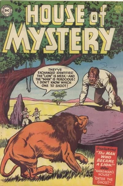
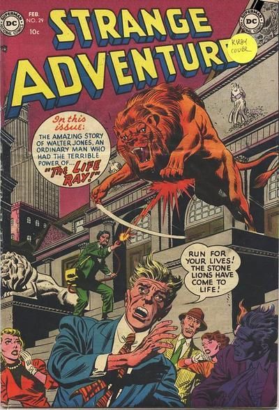
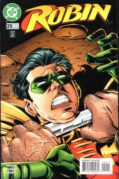
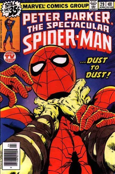
21. STAR TREK vs. THE SPECTRE  22. ALL-FLASH vs. ABBOTT AND COSTELLO  23. HOUSE OF MYSTERY vs. STRANGE ADVENTURES  24. ROBIN vs. SPECTACULAR SPIDER-MAN 
|
|
|
|
|
Joined: Jul 2003
Posts: 16,863
Time Trapper
|
|
Time Trapper
Joined: Jul 2003
Posts: 16,863 |
1. Star Trek - the torn flag, the silhouettes on the hill, bouncing apes reminiscent of 2001 A Space Odyssey, the weird planet. I could do without the starship. The Spectre just looks creepy gross.
22. Abbot & Costello: another fine mess, indeed. And I'm fascinated by the precarious technology of window washing back in the day. There's something about the colours or style that makes the cover look painted.
23. Strange Adventures - more dynamic and it looks like a win for the lion. That must be the NY Public Library. Children should read!
24. Cleaner design and much more dramatic than Spidey.
24.
Holy Cats of Egypt!
|
|
|
|
|
Joined: Sep 2013
Posts: 31,872
Tempus Fugitive
|
|
Tempus Fugitive
Joined: Sep 2013
Posts: 31,872 |
21. Spectre: Just an unusual concept, yet confident and using bold colours. Elsewhere..."stay off our planet and take your federation fascism with you."
22. Flash: While A&C ignore health and safety the Flash has action and a mystery. Knights attacking a bank? What is the 1000 year old terror? Is it Vandal Savage, so cruelly dropped from a recent round of Flash Villain Idol? I also like the Flash discovering the scene along with the reader, as he arrives on the far left of the cover.
23. Strange Adventure: Walter Jones is a villain I'd like to see again. He's just about due out of prison following inappropriate behaviour with the venus de milo. Over in House of Mystery, Congo Bill checks his options. Why are they looking to shoot anything at all? Why not go back to base and get some nets? Creeps.
24. Spidey: Robin can use that rock just behind him. But Spidey has to hope that logo isn't too heavy if he wants to use it as a weapon.
"...not having to believe in a thing to be interested in it and not having to explain a thing to appreciate the wonder of it."
|
|
|
|
|
Joined: Jul 2003
Posts: 10,154
Terrifyingly On-Topic.
|
|
Terrifyingly On-Topic.
Joined: Jul 2003
Posts: 10,154 |
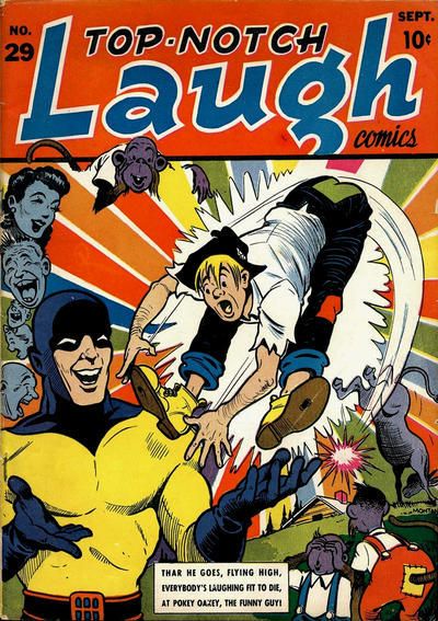
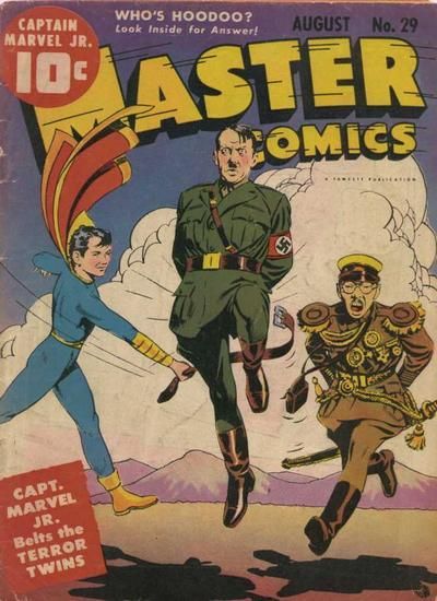
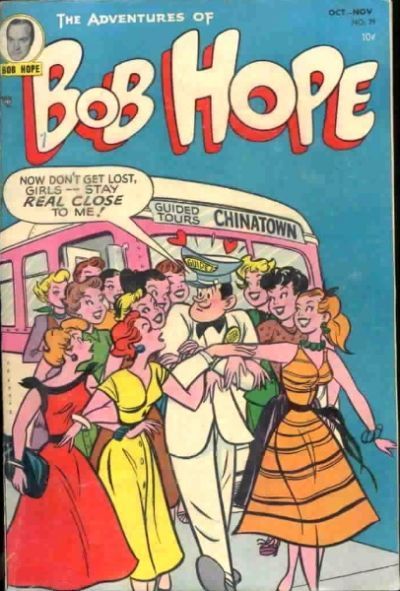
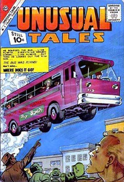
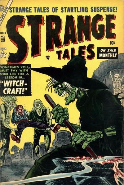
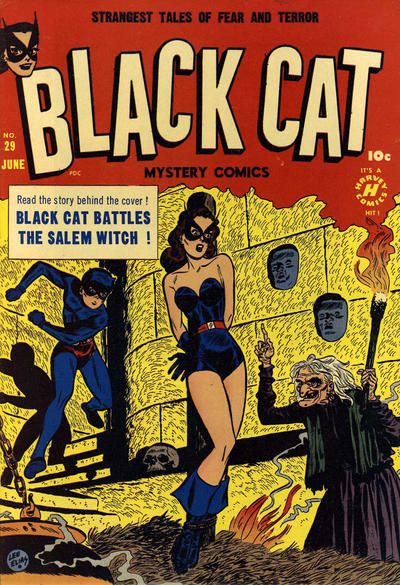
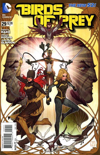
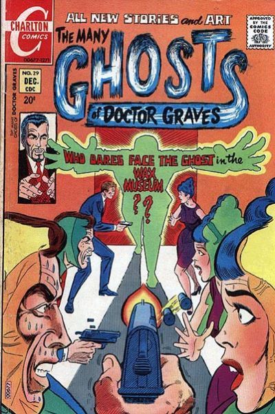
25. TOP NOTCH LAUGH COMICS vs. MASTER COMICS  26. THE ADVENTURES OF BOB HOPE vs. UNUSUAL TALES  27. STRANGE TALES vs. BLACK CAT  28. BIRDS OF PREY vs. THE MANY GHOSTS OF DOCTOR GRAVES 
|
|
|
|
|
Joined: Jul 2003
Posts: 16,863
Time Trapper
|
|
Time Trapper
Joined: Jul 2003
Posts: 16,863 |
25. Master Comics: oh for the simple days, when a young boy could make the Axis dance. Probably not too many laughs left in the old kicked-by-a-mule story.
26. Unusual Tales: gotta go with the flying bus over Bob Hope any day, even if the young ladies look pretty and cheery. They're probably on drugs.
27. Black Cat: if you're going to burn at the stake, might as well look good.
28. Birds of Prey: Beautiful bird theme with the frame and ascending characters.
Holy Cats of Egypt!
|
|
|
|
|
Joined: Sep 2013
Posts: 31,872
Tempus Fugitive
|
|
Tempus Fugitive
Joined: Sep 2013
Posts: 31,872 |
25. Master Comics: The art is much better. I'll regret it when the History Channel see the cover and devote a six part series to "Hitler's Kinks: A Hitler channel special series.  Elsewhere, after the JSA split up, Wesley Dodds hit hard times, traveling the country with Sandy and Dream Mule. "If you had been a wonder dog, mule, we'd not be reduced to this," said Wes. 26. Bob Hope: Ah, Bob's using that old Braalian magic to attract the ladies' jewellery to his person. Over in Unusual "aw heck, not another magnetic ray. That's the third issue this month. I'm gonna be so late. Darn Bob Hope's Braalian karma." Worse, it breaks down and has to wait 10 000 feet up for the AAA (Antigravity Automobile Association) 27. Strange: The new cola recipe test group seems oddly reluctant. Over in Cat, the sidekick is trying to blow on the flames, as if it's going to help. She gets her own book and still has to be rescued on the cover. Bah! 28. Ghosts: Charlton invent the first person shooter. On either side of the central action we have trippy colouring on the wax statues. Or are they wax? Two horror tropes catered for along with some action. Over in Birds, there's just another pose that tells me nothing about what's in the book. Is that a trend with Birds?
"...not having to believe in a thing to be interested in it and not having to explain a thing to appreciate the wonder of it."
|
|
|
|
Forums14
Topics21,113
Posts1,053,305
Legionnaires1,732
| |
Most Online53,886
Jan 7th, 2024
|
|
|
There are no members with birthdays on this day. |
|
|
Posts: 773
Joined: July 2007
|
|
|
|


 Previous Thread


