|
0 members (),
47
Murran Spies, and
6
robots. |
|
Key:
Admin,
Global Mod,
Mod
|
|
 Previous Thread Previous Thread |
|
Next Thread 
|
|
 Re: The Tops in Tens!
|
Joined: Jul 2003
Posts: 33,081
Time Trapper
|

Time Trapper
Joined: Jul 2003
Posts: 33,081 |
25, MILLI, now with extra MMMMMMMMMMMM.
26.BOT MEETS GIrL
27. PRESIDENT STRIPPER!!! (MY LOVE)
28. flash TOPS ZATANNA beCAUSE IT's EXCIING YET HARMLESS
|
|
|
 Re: The Tops in Tens!
|
Joined: Sep 2013
Posts: 31,847
Tempus Fugitive
|

Tempus Fugitive
Joined: Sep 2013
Posts: 31,847 |
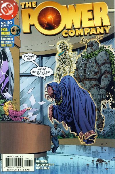
105. We had Lightle v Ordway before I think, and Ordway was a clear winner. This time...Ordway is a clear winner again. The Legion cover tells you what some of the story is about. But like the overuse of layering on the cover, it's all a little vague. It's elements don't really combine to grab me. Invisible Kid's face over a shuttle. Why? Why is Sun Boy flying around? What do they add? Over in Infinity, we get heroes gone bad in recreation of a classic golden age cover. There are a lot of characters on there, but Ordway cleverly keeps them in tiers, with the triumphant gloating villain taking centre spot. Ordway's grasp of physicality once again trumps Lightle too.
106. 'Mazing Man: His expression is just priceless. There's a little part of me that's wondering why he's not getting arresting for obstructing the rescue effort. But it's a small, mean part that never read 'Mazing Man which is all about the fun. Look at the little water pistol! The Legion cover does show Roxxas on the rampage, so it's effective in letting you know what's in the book. But it doesn't rise to more than that.
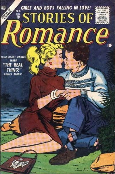
107. Toughie. Two nice covers. Form the well rendered swan on Margie to the lost in love premise of Scribbly. Although the art in Margie is better I'm concerned about the title. Is "My little Margie" indicating that it's Margie's parent who's telling us about her. If so, why is that parent allowing her to go off with so many boys? There's no point in backing a book that's only going to get taken into care by the state. So, I'm going with Scribbly.
108. Justice League of America: This is one of my dad's favourites from when he was a kid. He was a pleased man when he bought me a copy of it, after I started reading them. It's a classic cover, that's so crisply drawn you don't need a background at all. The eyes focus on the hero finger puppets. Personally, I've always pictured them squirming while they're on there. Then you notice Faust's really evil expression and the detail on his outfit. There's still room for a pun in the dialogue along with the ominous threat.
I don't think I've seen that Aquaman cover before. It certainly gets in a nice sense of scale between the combatants. But this is one that could probably have used some extra detail. And Water Imps (5th Dimensional Morrison fodder?) just can't compete with Faust.
109. Captain Marvel: If Hal Jordan had gender realignment, this would be the cover. Marvel is looking wistfully up at the stars. Sure, the cover has planes, but that wouldn't be enough. Marvel knows that she used to be able to fly to those stars. But can she any longer? The loss in her face would suggest not. On the other hand, she could just be wondering how long that logo is likely to stay up there, and how many planes it will damage when it falls. Spidey has pointy fingers, but I don't know if it's just a costume change or if I'm supposed to know it's really the Scorpion or something in there. So it loses more points than Marvel.
110. American Flagg: All you need is a pencil...now take it in your hand and tell the news vendor to "give me DC or I poke your eyes out." Marvel Fun and Games: A DC Marketing Publication. Another Flagg cover with some more buxom women on it. This month, their implants have helium in them, allowing that whole platform to float with the logo. But Chaykin is on a different level here, with our without the helium filled boobs, and it's an easy win.
111. Mary Marvel: Bulletman's plunging neckline and suggestive look, while holding a lot of bondage chains, probably made the book popular with a lot of unexpected readers. Mary Marvel is very much the centre piece of her cover, despite the mayhem going on around her. After Freckles suffers serious injuries on the cover, Mary attaches the rocket pack to her wheelchair. Fun abounds! For another couple of panels. But who knew a coffin could travel so fast when rockets were attached? I miss the short comics career of Freckles.
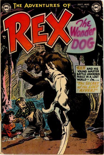
112. Rex Libris: I quite like Rex Libris. So, there's nothing I like more than being TAUNTED BY THE COVER OF AN ISSUE I DON'T HAVE! WHEN WAS THAT ONE OUT?! BAH! Well, there's a cock, a bull and a librarian all on the cover. So, it's a pretty literal interpretation of the story title. The Hawks makes it's point about not conforming to super hero stereotypes. But, despite this continuity nightmare of a title, they would still appear in every event including War of the Gods. I mean War of the Gods! Yuck! Sell Outs. Rex wins because there's not enough blue sky and countryside on comic covers.
"...not having to believe in a thing to be interested in it and not having to explain a thing to appreciate the wonder of it."
|
|
|
 Re: The Tops in Tens!
|
Joined: Jul 2003
Posts: 10,145
Terrifyingly On-Topic.
|
OP

Terrifyingly On-Topic.
Joined: Jul 2003
Posts: 10,145 |
101. FREEDOM FIGHTERS. PL's ray thingie looks cool.
102. X-STATIX. While the other "bedspread" is a little more visually interesting, I've done that sitting-on-the-bed-with-stuff around-you thing. I like the occasional non-action moment on a cover.
103. CRACK COMICS. I agree about the swinging-from-logo, and a more attractive total package.
104. LITTLE SCROWLIE. I like the style and color scheme more.
105. LSH. I guess. It's kind of odd, though.
106. LSH. Although I'm fond of 'Maze, look at how your eye is drawn into the cover first with Mekt, then the flames, then the back of Roxxas. He ain't stopping for no cover, he's got stuff to do.
107. SCRIBBLY. I've seen the joke plenty of times. but what the heck. It's cute.
108. AQUAMAN. I know JLA is famous and I certainly can'y deny it's well done, but it just doesn't do anything for me.
109. CAPTAIN MARVEL.
110. AMERICAN FLAGG. There's a story. The other is a gag.
111. MASTER COMICS. That flight path over Mary's shoulder is not possible.
112. REX LIBRIS. BIG CHICKEN, Y'ALL!
|
|
|
 Re: The Tops in Tens!
|
Joined: Jul 2003
Posts: 10,145
Terrifyingly On-Topic.
|
OP

Terrifyingly On-Topic.
Joined: Jul 2003
Posts: 10,145 |
One last double-header to cap off the Tens!
|
|
|
 Re: The Tops in Tens!
|
Joined: Jul 2003
Posts: 10,145
Terrifyingly On-Topic.
|
OP

Terrifyingly On-Topic.
Joined: Jul 2003
Posts: 10,145 |
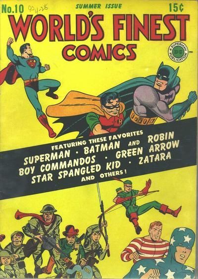
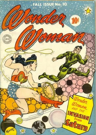
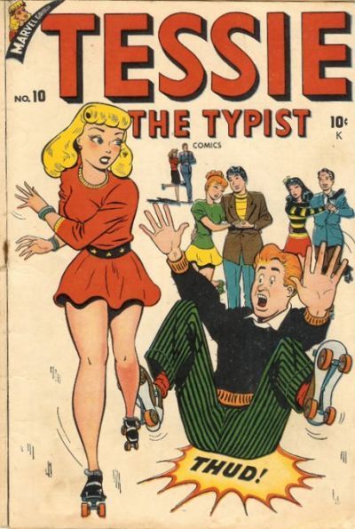
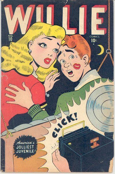
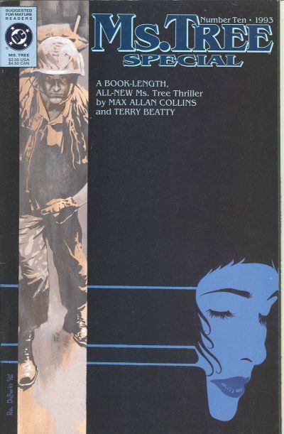
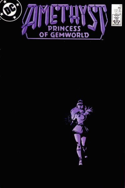
113. WORLD'S FINEST COMICS vs. WONDER WOMAN  114. TINY TITANS vs. BATMAN ADVENTURES  115. TESSIE THE TYPIST vs. WILLIE  116. MS. TREE SPECIAL vs. AMETHYST PRINCESS OF GEMWORLD 
|
|
|
 Re: The Tops in Tens!
|
Joined: Jul 2003
Posts: 10,145
Terrifyingly On-Topic.
|
OP

Terrifyingly On-Topic.
Joined: Jul 2003
Posts: 10,145 |
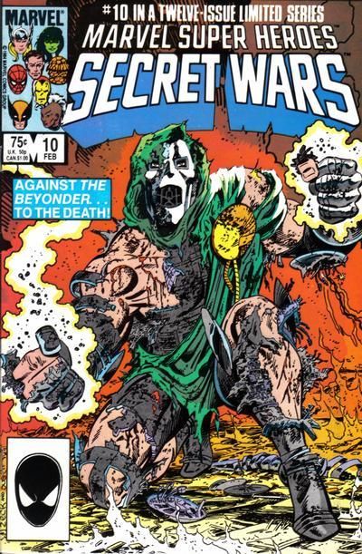
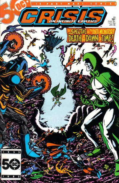
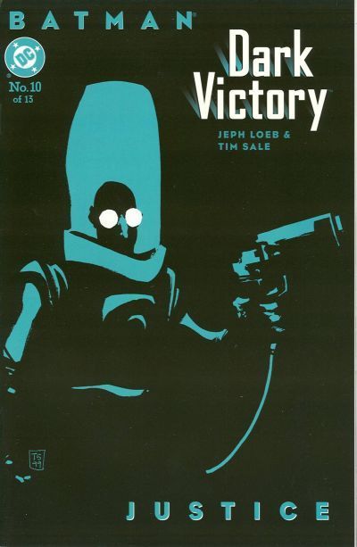
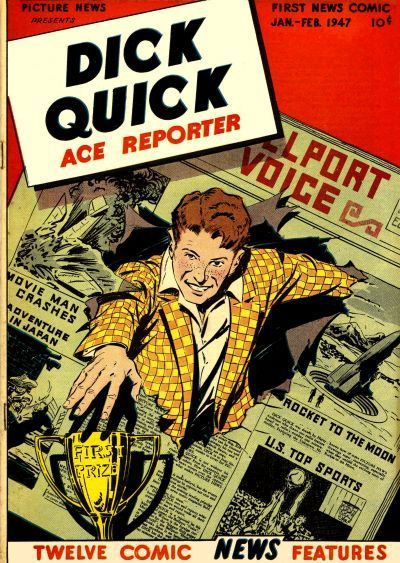
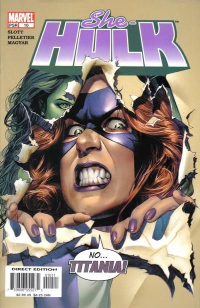
117. SECRET WARS vs. CRISIS ON INFINITE EARTHS  118. TOO MUCH COFFEE MAN vs. X-MEN LEGACY  119. THE WITCHING HOUR vs. BATMAN: DARK VICTORY  120. PICTURE NEWS (DICK QUICK) vs. SHE-HULK 
|
|
|
 Re: The Tops in Tens!
|
Joined: Sep 2013
Posts: 31,847
Tempus Fugitive
|

Tempus Fugitive
Joined: Sep 2013
Posts: 31,847 |
113. Wonder Woman: World's Finest looks to be a collection of cut outs from other covers. The guy who did it gets some points for getting Bats and Supes to look at the logo. So Wonder Woman wins as it's original looking. There's a certain game of chase going on in the WW cover too, judging by the expressions. Considering the skin tight villain outfit, it's more like an invasion from Uranus.
114. Batman Adventures. World's Funnest is a nice line, and it's really targeting very young kids. BadAd wins on art alone, although I could mention the wallpaper and the next panel where the cat asks where it's dinner is or at least could it have a toy and not a stupid jewel.
115. Willie: Boy falling on butt isn't a gag in itself, and the perspective of Tessie's legs is wrong. I guess in Willie, it's a relative taking the shot. Presumably to blackmail Tessie who looks way to old for the nervous kid. Were they both Marvel comics or is another "remarkable coincidence" and not pinching?
116. Amethyst: The art is better on Ms Tree and there's a sense of regret/loss from the character in the bottom right. There's a war/vet theme that suggests some of the story too. Nothing wrong with the design either. But Amethyst really shows a lost soul struggling against whatever darkness is in her life. Since it's Amethyst, this could be across two worlds. She was also blind from the Crisis, so that might be involved too. The black and purple colour scheme gets it the win. Incidentally, as I skipped over comic titles as a kid, I didn't figure out what Ms. Tree Special meant for a while. I blame the "special" throwing me off.
117. Crisis: The world's mightiest heroes are powerless in a battle between the universe's two most powerful entities. DC's god shows up to give a thumbs up or down at the end of the fight... and hopefully to crush whiny Pariah. All at the dawn of time and by Perez. Not much more you could add to that.
As a young kid, lots of battle drawings would have damaged costumes, to show the ferocity of the battle. The damage would not really reflect any possible source for the injury nor would it have corresponding injuries to the bodies beneath. Some folks haven't really grown out of that.
118. X-Legacy: Two powerful images. TMCM shows the giant caffeine addiction monkey/ oppressive life and the shadow it casts over the central character's unfit lifestyle (see posture and body shape). But over in X-Legacy you get the feeling that humanity has found a way to "cure" all those pesky mutants. It's also an obvious conformity analogy. Although I'm not too keen on the text, the use of the pill as a doorway gets the win.
119. Witching Hour: Those Dark Victory covers must look really nice together. More than the minimalist design I like the use of a normal looking guy in the futuristic suit. But it's just blown away by the Adams cover on Witching hour. From the silhouette with the murderous eyes, through the narrator opening the doors of the mansion as she will the story to the terror in the old man's face. Is it a bride or spirit from now, or is it something from his murderous past? How could you not want to find out?
120. Dick Quick: The quality of art is much better on She-Hulk and it's the old villain taking offence at the hero on the cover gimmick. But Mr Quick, as I call him to avoid chuckling, gives us career highlights as well as his eye on the (first) prize personality. Watch out Olsen!
Great thread as always Teeds! Thank you!
"...not having to believe in a thing to be interested in it and not having to explain a thing to appreciate the wonder of it."
|
|
|
 Re: The Tops in Tens!
|
Joined: Jul 2003
Posts: 33,081
Time Trapper
|

Time Trapper
Joined: Jul 2003
Posts: 33,081 |
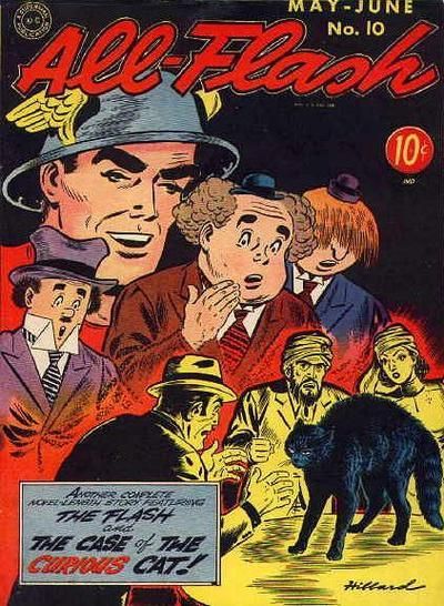
THE REAL 27. CRIME PATROL --because the cops sre enjoying neting the shit outta tht lleged criminal
the real 28. MY LOVE
|
|
|
 Re: The Tops in Tens!
|
Joined: Jul 2003
Posts: 33,081
Time Trapper
|

Time Trapper
Joined: Jul 2003
Posts: 33,081 |
29. Colton Haynes as JUGHEAD defeats Henry Aldrich but I like both gags.
30. both are dreary/depessing which is i assume the point. PLANETARY would be the one i'd be more likely to pick up for curiosity's sake
31. RUSE has more interesting detail
32. FLASH comics, that's a great g.a. cover
|
|
|
 Re: The Tops in Tens!
|
Joined: Jul 2003
Posts: 10,145
Terrifyingly On-Topic.
|
OP

Terrifyingly On-Topic.
Joined: Jul 2003
Posts: 10,145 |
113. WONDER WOMAN!!! AWESOME. And even if it wasn't, that WF is no great shakes. 114. Aww, Kid Babs and Kid Kara are the cutest! I'd feed them all the cookies they wanted, and super-treats for the super kitty & pup too. But look at Selina's expression, and the cat's. BATMAN ADVENTURES!115. WILLIE. Tessie cover not funny, just a pratfall. So what? That black background makes Willie's cover pop, although it IS rather odd -- what kind of porch-swing paparazzi did they have in the 1940s? 116. AMETHYST. DAYUM. 117. SECRET WARS. Because Spectre's "come at me bro" pose looks dorky. YEAH I SAID IT. Also they need more pants. Doom's a little short on that front too, but he gets the win. 118. X-MEN LEGACY.119. Dark Victory is excellent, but THE WITCHING HOUR is OUTSTANDING. One of the best covers in this whole glockenspiel. 120. SHE-HULK. Dick Quick jokes? Been there, done that. Titania's expression wins it!
|
|
|
 Re: The Tops in Tens!
|
Joined: Jul 2003
Posts: 33,081
Time Trapper
|

Time Trapper
Joined: Jul 2003
Posts: 33,081 |
33. comics for whores!! Such indeceny!AMAZING MYSTERY FUNNIES because it makes me LOLZ hardest and you're all sluts.
34 . INHUMANS! Jae Lee is a a big favorite of mine.
35. BARBIE getting physical, animal!
36. DOLL MAN so true amirite ladies? he's ADORBLES. poor sopping wet little thing, come warm yourself under my shirt, or something!
|
|
|
 Re: The Tops in Tens!
|
Joined: Jul 2003
Posts: 10,145
Terrifyingly On-Topic.
|
OP

Terrifyingly On-Topic.
Joined: Jul 2003
Posts: 10,145 |
|
|
|
 Re: The Tops in Tens!
|
Joined: Jul 2003
Posts: 10,145
Terrifyingly On-Topic.
|
OP

Terrifyingly On-Topic.
Joined: Jul 2003
Posts: 10,145 |
|
|
|
 Re: The Tops in Tens!
|
Joined: Jul 2003
Posts: 10,145
Terrifyingly On-Topic.
|
OP

Terrifyingly On-Topic.
Joined: Jul 2003
Posts: 10,145 |
|
|
|
 Re: The Tops in Tens!
|
Joined: Jul 2003
Posts: 10,145
Terrifyingly On-Topic.
|
OP

Terrifyingly On-Topic.
Joined: Jul 2003
Posts: 10,145 |
|
|
|
 Re: The Tops in Tens!
|
Joined: Jul 2003
Posts: 10,145
Terrifyingly On-Topic.
|
OP

Terrifyingly On-Topic.
Joined: Jul 2003
Posts: 10,145 |
|
|
|
 Re: The Tops in Tens!
|
Joined: Jul 2003
Posts: 33,081
Time Trapper
|

Time Trapper
Joined: Jul 2003
Posts: 33,081 |
37. a shame-filled nice catholic boy is diving right for me! hooray!! what we're going to do will cost you a few Hail Marys!
38. GEORGIE because of the cast in bubbles
39. I already have this weird preference for Bulletgirl covers but throw in Bulletdog and it is all over. Sorry Mary.
40. I'd be more curious about PROMETHEA
|
|
|
 Re: The Tops in Tens!
|
Joined: Jul 2003
Posts: 10,145
Terrifyingly On-Topic.
|
OP

Terrifyingly On-Topic.
Joined: Jul 2003
Posts: 10,145 |
55. OUTSIDERS. Nutty shit. In #1, Titans getting bomb dropped on them. Here, People's Heroes dropping Pravda Bomb ON YOU.
 
|
|
|
 Re: The Tops in Tens!
|
Joined: Sep 2013
Posts: 31,847
Tempus Fugitive
|

Tempus Fugitive
Joined: Sep 2013
Posts: 31,847 |
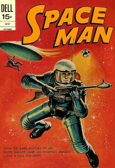
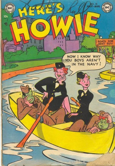
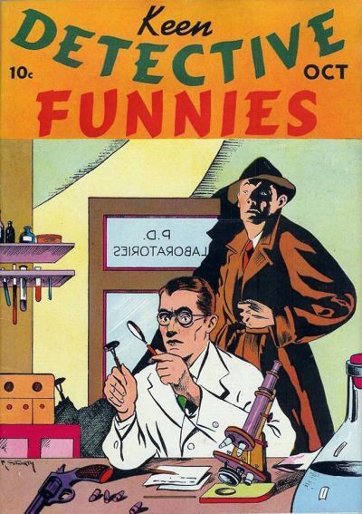
wow ambassador, you have really spoiled us in bonuses.  "Some night, when we know each other better, you'll find out what it is..and it may surprise you!" A moon... A girl... A gender switch...co-starring Ayla Ranzz See how you like it Buzzy! Go for it Popsy!  How did Constipation Kid save the Legion, when they were trapped inside a Space Whale? Read on in The Hidden Tryouts! Spaceman. Back in the days when you knew what you were getting in a comic. Like Frogman. Or Frogmen. Or Spacefrogs. Proper comics.  'Cause Colu doesn't have a navy, obviously.  "...and this bullet went right into her cranium, orphaning all her kids. Ha ha ha!" Yup, putting the "Funnies" back into "Keen Detective" was sure to be a hit!
"...not having to believe in a thing to be interested in it and not having to explain a thing to appreciate the wonder of it."
|
|
|
 Re: The Tops in Tens!
|
Joined: Jul 2003
Posts: 10,145
Terrifyingly On-Topic.
|
OP

Terrifyingly On-Topic.
Joined: Jul 2003
Posts: 10,145 |
|
|
|
 Re: The Tops in Tens!
|
Joined: Sep 2013
Posts: 31,847
Tempus Fugitive
|

Tempus Fugitive
Joined: Sep 2013
Posts: 31,847 |
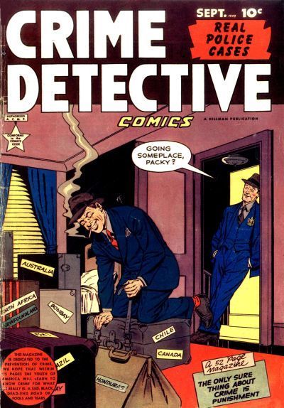
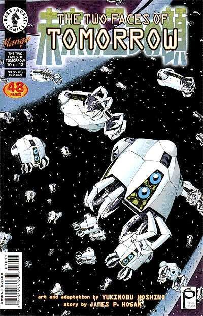
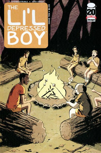
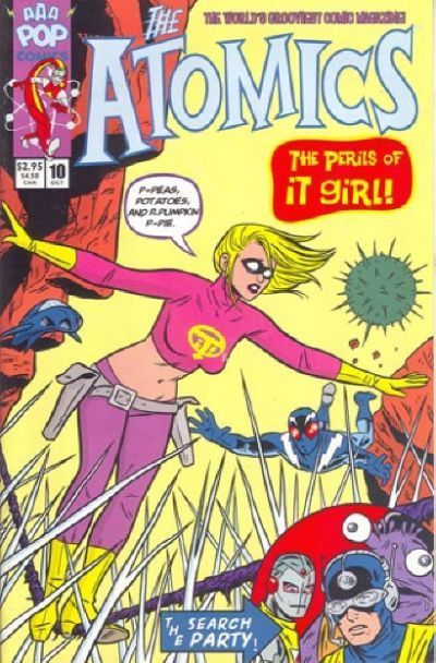
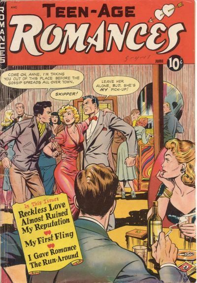
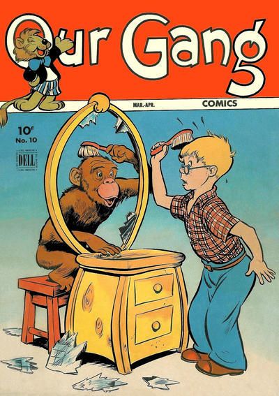
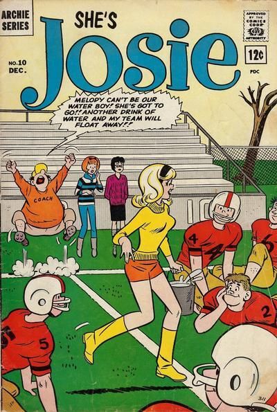
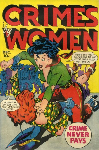
 So many questions about this one... If you're looking for the crook who arranges getaways, isn't "Packy" always going to be the first person you go to? Do the cases contain the body parts from Packy's crimes, hence the various countries? The guy in the doorway looks very similar to Packy. Is this his brother Leany? Could Packy kill Leany, put the parts in the cases and take his place? I do love all those "this comic is dedicated to the preventions of crime" and to help prevent crime, we must show it in all its lurid glory! captions.  Li'l depressed boy always seems to have a a pretty decent social group around him. Camping, movies and a girlfriend. Could it be the title of his book that weighs him down?  Peas, potatoes and pumpkin pie. IT Girl looks firmly at The Buffet Table of Doom! just off cover.  Look Anne, you look like you're having a swell time there at the pick up joint. But here are your choices. You're going to stick with a guy wearing a bow tie, Anne. He'll be wearing that bow tie for as long as you know him, and you will hate him for it. On the other hand, your would be rescuer has a ghastly neckerchief thing going on. It's never been in fashion, and any kids you have will be ruthlessly mocked for their dreadful sense of design. That he's called "Skipper" should really have kept you away from him in the first place. There are other towns Anne. Other sleazy, cheap pick up joints for you to get recklessly drunk in. Go to them now Anne. Go now, before it's too late.  I hate seeing a human stare back at me while I'm getting ready in the morning. I empathise totally with this cover.  [thoth lad's comments on this one have been censored. Sorry we couldn't get to any of the earlier ones]
"...not having to believe in a thing to be interested in it and not having to explain a thing to appreciate the wonder of it."
|
|
|
 Re: The Tops in Tens!
|
Joined: Sep 2013
Posts: 31,847
Tempus Fugitive
|

Tempus Fugitive
Joined: Sep 2013
Posts: 31,847 |
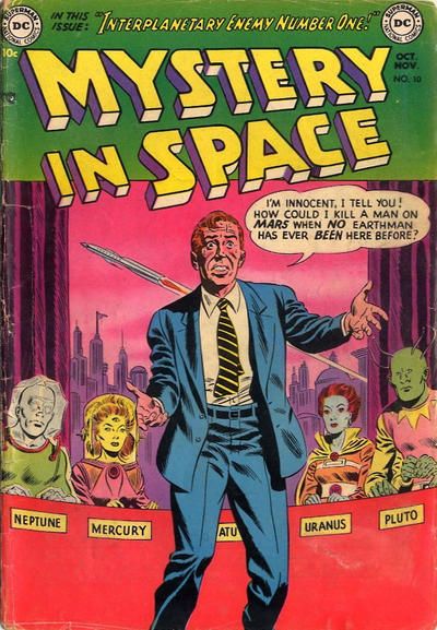
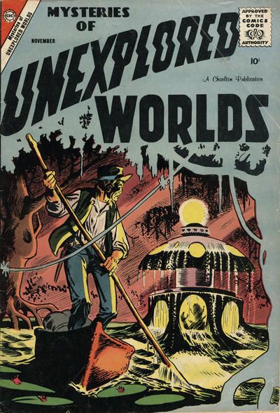
 Abby pleaded with the kind, old flower seller to sod off while she was feeling up Swamp Thing.  Ooooh. Alt+Legion! Astroarchaeologist Rexx Mah-Sonn discovered that the Egyptian Gods had visited Neptune before they reached Earth. Now he uses his control over his every atom as Morpho Man. Many creatures are drawn to the energy of our Sun. Some choose to take human form. Dirka Burroughs (Sol Girl) keeps the colonists of Mercury safe from hostile creatures, while her costume keeps them safe from her combustible powers. Nothing lives on Saturn. And that's just what Lyle Norg, the Invisible Kid wants everyone to keep believing. [removes connection between the Mallors and the shadows of Uranus gags for fear of Fickles revenge] - but it's Shadow Kid They moved through the angles of spacetime from their home on Colu to spread intelligent life across the galaxy. The forearmed, four eyed plant people of Yuggoth. Here, we know Yuggoth as Pluto and we know their ambassador as Querl Hol-Land: Brain Boy Together these six (well five, now that someone's bumped off the Martian Deerstalker and his Magic Hat) have joined together to fight crime. Even if that meant teleporting innocent, backwards guys and screwing with them until they get a confession. Could this guy be the killer? Was he given the tie by Zazalla, the Queen Bee? Is he Adam Strange or even the Spaceman from Dell comics? Well, I'm not telling you. So there.
"...not having to believe in a thing to be interested in it and not having to explain a thing to appreciate the wonder of it."
|
|
|
 Re: The Tops in Tens!
|
Joined: Sep 2003
Posts: 34,634
Bold Flavors
|

Bold Flavors
Joined: Sep 2003
Posts: 34,634 |
61. Justice – really great painted cover that showcases the action, which is hard to do on painted covers, while also giving it the grandiose look that the painting effect is trying to achieve.
62. The Toodles – Dolly just looks crazy creepy so Toodles wins by default.
63. Dynamic Comics – I like the usage of the signs to showcase the various features inside, and I especially like the big hulky guy in the red turtle neck, who looks like the ultimate 40’s roughneck.
64. Fury of Firestorm – when I was a little kid, before I even actually read comics, I would look at cover after cover of my Dad’s collection, mesmerized by what I saw. My two favorite DC’s to do that with were Flash and Firestorm. This Firestorm cover just enthralled me and IIRC, scared me too! So I have some nostalgia for it.
65. Black Cat – though perhaps not fully successful, I appreciate what the artists are trying to do on the Black Cat cover.
66. Darling Love – just because I want to see why she’s marrying a man she HATES. Whether revenge or no other options…still a pretty big misstep, no?
67. Red Robin – it’s from an era when I had stopped following my once-beloved Tim Drake and Stephanie Brown, but it makes me miss them all the more.
68. Smiling Jack – when the aviator genre was still high profile and could nicely mix with the mystery man genre.
69. Criminals – a pyromaniac attacking forests and national parks is just menacing enough, and just innocent enough, to peek my interest.
70. X-Men – love, love, love this Kirby Ka-Zar first appearance, and the cover is all on action and color. This is one of my favorites of the original X-Men run.
|
|
|
 Re: The Tops in Tens!
|
Joined: Sep 2003
Posts: 34,634
Bold Flavors
|

Bold Flavors
Joined: Sep 2003
Posts: 34,634 |
71. Romantic Adventures – more glamorous, more serious, and the lead looks like Cobalt Kid. What’s not to like? 72. Flaming Carrot – the cover art was always terrific on this series and I always wanted to read it when I was a kid. 73. First Kiss – such detail and such an interesting depiction. Terrific! 74. Leave it to Binky – they’re both cute, but the first one at the beach is something a lot teenage couples can relate to. What’s worse than being surrounded by adults and little kids? 75. Poppo of the Popcorn Theater – I’ve never even heard of this series before! 76. Doug Winslow of the Navy – Katy Keene’s dress is nice but Doug Winslow is a man’s man fighting an enemy with everything he has…including a shovel! 77. Speed Comics – Golden Age batshit craziness. Oh the Golden Age  78. Astonishing X-Men – head shots like this are boring generally so something needs to make them stand out. The X-Men one does that by making it extra weird and realistic. It looks like it should be in the movie Scanners. 79. 2001: A Space Odyssey – just love the simplicity and weirdness to it all. 80 Superman’s Girlfriend Lois Lane – baby Lois hurling a giant diamond snags this one!
|
|
|
 Re: The Tops in Tens!
|
Joined: Sep 2003
Posts: 34,634
Bold Flavors
|

Bold Flavors
Joined: Sep 2003
Posts: 34,634 |
81. All-New Ultimates – a series I don’t collect, but I really enjoy that cover. It’s the concept of the “old fashioned bomb” and the background coloring I think that works for me.
82. Justice League International – a really beautiful Maguire cover. Those early JLI days were just incredibly awesome.
83. Agents of Atlas – a tough one because both are good but neither is truly great. But I think I like the coloring in AoA, and the placement of the logo in the bottom right.
84. Blue Ribbon Mystery Comics – love the look of Mr. Justice.
85. Suicide Squad – in the late 80’s, DC still knew how to really put out a dynamic cover. This one, totally simple, nails the exact response it was looking for in me.
86. Feature Funnies – if only because it has one of my favorite obscure heroes, the Clock.
87. Metamorpho – this was always my favorite Metamorpho cover as a kid because of Stingaree, who I immediately knew even then was a Scorpion (Spider-Man villain) rip-off. Yet, it also features Element Girl, something that only DC would have. So its kind of a DC / Marvel mash-up in terms of style.
88. Secret Romance – less copy on the cover, nice placement including placement of the story title.
89. Hawkeye
90. Tales of the Mysterious Traveler – early Ditko at his best.
|
|
|
|
Forums14
Topics21,066
Posts1,050,296
Legionnaires1,731
| |
Most Online53,886
Jan 7th, 2024
|
|
|
Posts: 1,061
Joined: August 2003
|
|
|
|


 Previous Thread


