Pick your favorite of the 2 covers shown. If you like, tell why it is your favorite. In a couple of days, I'll tally the votes and we'll do another round....
VS.
Posted by Nightcrawler on :
#263 owns #267!
Posted by Mattropolis on :
This is a tough one for me because they both featured little seen Legionnaires.
With that said, I think I prefer the Dagon cover...
Posted by Eryk Davis Ester on :
#263 is incredibly dynamic, plus features the Super-Sexy Adventurers of the 2940s!
I'm going with it!
Posted by Jerry on :
I pick the first one - #267. The layout is a bit stronger, with the members facing more forward. They all look great. The colors blend well. The detail work of the inside of the ship is realistic. The cover tells a story of suspense. Will Element Lad be saved?
Posted by Blacula on :
Great thread idea Lash!
#263 is dynamic (and features Tyroc) but I think #267 is a much more creative and interesting cover (and features Colossal Boy obviously). It almost looks like it could be a still from a sci-fi horror film.
And I love that they used that blow-up doll auto-pilot from the movie Airplane (Flying High outside the US) to play Chuck on it! Posted by lil'rhino on :
#267 is my favorite. Lu's pose is classic Giordano. Nice crotch shot of my favorite Legionnaire, Element Lad! The whole cover layout seems to be an homage to the EC weird sci-fi covers of the 1950s. The yellow highlights on the side of Gim's & Chuck's faces are very Wally Wood. Finally, I love all the detail on the interior wall of the spaceship.
Posted by MLLASH on :
It's the interior spaceship detail that sells me on LSH 267. (Plus LU!!) Although I'm also a fan of 263, Tyroc's legs and The LSH of the 2940s. Shady's lack of cape hurts it a tiny bit for me, though the rest of her costume looks uh-MAZING.
I'll go with 267.
Posted by Mattropolis on :
Did Dagon's pink power distintigrate Tasmia's cape?
Posted by Set on :
Oh, that was from Dagon? I was afraid Tasmia was having burrito-related difficulties in that scene...
I'd have to go with 263, although the other one deserves high kudos for putting CB on the cover without having him be all ginormous. That's usually his 'thing,' to be all huge and hulking behind everyone else, for no darn reason.
Are those supposed to be Legion parents in Dagon's Petting Zoo of Space? Cause I see a Durlan who could be Chameleon Mom, and a blue-skinned lady who could be Shadow Mom, but the remaining three are looking a bit, um, pasty, to be Tyroc Dad or Tyroc Mom...
Posted by Eryk Davis Ester on :
Those are Ultra Boy and Shrinking Violet's parents!
Posted by Set on :
Ah, I was expecting them to be parents of the people on the cover, which, obviously, wouldn't have worked unless Drake had three parents, and Tyroc none!
Posted by MLLASH on :
First Tally:
LSH 263... 4 votes
LSH 267... 4 votes
(Blacs, you didn't state it outright but your wording strongly suggested an overall preference for 267, right?)
Posted by Blacula on :
quote:Originally posted by MLLASH: (Blacs, you didn't state it outright but your wording strongly suggested an overall preference for 267, right?)
Right. And if I could vote for it again I would. Looking at the two again, it's the much stronger cover I think.
Posted by Candle on :
I'll take one direct word balloon over 3 blurb signs anyday!
I love the parent story, to this day, but not the cover. They just tried too hard, imo.
I vote for 267.
Posted by razsolo on :
I vote the first one because it shows the look of abject horror dawning on Lu's face as she is the first Legionnaire to realise that Size Lad has grown Element Lad big enough that his gravitational pull is drawing the rest of the universe into his veejay.
THE LEGION NEED HELP WITH THEIR SEXY FIGHT! Posted by Quislet, Esq. on :
I pick 267.
Posted by Nightcrawler on :
Can the 267 supporters explain to me how Element Lad can be both standing up and have his fingers pressed against the glass?
Pink rays from fingers and helmet horns are much cooler.
Posted by MLLASH on :
Nighty, to my eyes it doesn't look like he's standing, it looks like he's floating loose in space, and attempted to reach the ship in a last ditch survival effort and just as his fingertips touch the 'window', he passes out and his legs kinda float upward while his fingers are still on the window.
Posted by Ram Boy on :
Some objects (feet for example) may appear closer than they actually are...IN SPACE!
I vote for the Shady/Pepto Bismol cover.
Posted by He Who Wanders on :
quote:Originally posted by MLLASH: Nighty, to my eyes it doesn't look like he's standing, it looks like he's floating loose in space, and attempted to reach the ship in a last ditch survival effort and just as his fingertips touch the 'window', he passes out and his legs kinda float upward while his fingers are still on the window.
That was my initial thought, too; however, Jan should be hunched over for his fingers to be touching to window.
I'm not a fan of either of these covers, but the Dagon one trumps the other primarly because Jan's position makes one think too much about the cover.
Posted by MLLASH on :
Dang, now you've got me thinking about it too!!
Posted by rouge on :
I'll go with 263, just because Jan can create his own darn air so there really isn't a crisis there.
Posted by Eryk Davis Ester on :
quote:Originally posted by rouge: I'll go with 263, just because Jan can create his own darn air so there really isn't a crisis there.
That was one of my reasons too!
Posted by MLLASH on :
UPDATED TALLY!
LSH 263... 7 votes
LSH 267... 7 votes
Posted by Cobalt Kid on :
I like both covers quite a bit, but I'm going to take 263 over the other because I find it just a bit more dynamic. It feels like we, the readers, are rushing into the fight and we could almost be the fifth Legionnaire arriving on the scene.
Posted by Doctor One on :
I vote 267. But I will confess that I had never noticed that Jan is touching the glass. The position of his legs doesn't make sense, does it?
Still, I love Lu and BB, and there are very few covers that feature them. I remember 267, and had no recollection of 263.
Posted by Sketch Lad on :
I like 267 because it shows off the Legionnaires better.
Posted by stephbarton on :
263 because I always thought that Element Lad looks odd on 267. The proportion or something seem off, the first time I saw that cover I though Jan had some sort of allergic reaction and was puffing up, not that he was drifting unconscious in space.
However, if it wasn't for the odd pose on Jan, I do think the rest of the cover is stronger than 263 and the subject matter is more interesting (nice classic vibe, beyond group of heroes gang rushing villain).
But I still vote 263, better understanding of anatomy or foreshadowing or something.
Posted by MLLASH on :
Updated tally:
LSH 263.... 9 votes
LSH 267.... 9 votes
Every tally has been a tie, that's pretty amazing. I'll leave the polls open until... I wake up tomorrow (THAT could by ANY time!) and we'll see if we have a winner or a tie!
Posted by ultrajo on :
Duo Damsel and Bouncing Boy on the cover gives #267 my vote.
Posted by MLLASH on :
I'm awake.... and we have a winner!
267... 10 votes
barely manages to take down
263... 9 votes!
Posted by MLLASH on :
Round 2....
VS.
Posted by Blacula on :
Yay! What's next? Posted by Blacula on :
Whoops. Posted at the same time.
Gosh - tough choice!
I love #25 because it represents a bright moment in an otherwise VERY dark era but I also love #80 because hey - it's Alan Davis drawing the Legion flying through the sky waving their flag! What's not to love?
That issue was also the excellent culmination to a year's worth of intriguing and exciting stories and holds a dear spot in my Legion-loving heart so I'm going with it.
#80 for the win.
Posted by Jerry on :
Dang, Lash. You're making this hard. Both are great.
I'm going to have to go with the Dusty Abell cover for #25. It's a substance over style thing. #80 is sleek and beautiful to look at. It has a better layout. However, the Abell cover tells more of a story. The image of the Dominator looking down gives a sense of danger. Gim, Imra and Devlin looking over their shoulders conveys a sense of urgency and movement. Dirk turning to flash his powers gives us a sense of his personality and defiance to whatever the threat is. The detail in the metallic mountain of debris gives it an eery dark feel.
Posted by Doctor One on :
The cover of #80 with the Victory! sign and all those smiling faces makes me want to stand up, wave the flag and yell yay Legion! I don't want to do that with the other one. Beautiful as it is.
I vote for #80.
Posted by MLLASH on :
Again for me, the difference is in the details. LOOK at that debris the LSH is standing in on # 25. How long did that take Dusty to draw???
Also, # 25 marks the point where I went from 'LSH fan' to 'complete LSH nerd learning about and obsessing over EVERYTHING LSH related' (it helped that the Archives were coming out regularly during this time-span).
It's # 25 for me.
Posted by Eryk Davis Ester on :
This is definitely hard, but Silver Age costumes on #25 for the win!
Posted by Mattropolis on :
#25 - I agree with Lash - it tells a story
Posted by He Who Wanders on :
# 25 because of its ominous mood and the contrast in colors.
By comparison, #80 almost hits you over the head with it's "gosh-wow-aren't-we-cool" vibe. I also think the composition is (literally) in your face.
Posted by duck458 on :
80. 25 looks like its a detail of a larger picture, as if another cover connects to the left. 80 is a fun group picture but not much of a selling point for a cover. Hmm. 80 final answer.
Posted by Quislet, Esq. on :
I go with #25.
I also like the story telling aspect of the picture over the group shot, which a group shot of the Legion flying has been done and redone.
Posted by Set on :
80. It captures the Legion I love to read about, set in a future filled with hope, not darkness.
25 has too many flaws. Lightning Lad's legs are attached wrong (or there's a coloring error, or something that makes him look like he's wearing a saggy diaper). Ayla is in a Liefield pose. Rokk looks like a caveman. Sun Boy's got an interesting dynamic pose, but his skull is square, like he's Herman Munster, pretending to be Sun Boy. Too many of the figures look deformed, or are posed awkwardly. Imra appears to be surprised by the sight of her own shoulder. What, did it sneak up on her? Tinya is doing her best Betty Boop pose, which apparently is the thing to do while your teammates appear to be running away from a giant floating Dominator head...
And the dark red haired dude in the center, wearing Star Boy's shirt and activating his Wonder Twin powers by bumping fists with Invisible Lyle, while grabbing Violet's ass with his other hand? I don't even know what's up with that. Let's put the dude who some Legion fans wouldn't even recognize in the center of the cover...
Posted by He Who Wanders on :
quote:Originally posted by Set: 25 has too many flaws. Lightning Lad's legs are attached wrong. Ayla is in a Liefield pose. Rokk looks like a caveman. Sun Boy's got an interesting dynamic pose, but his skull is square, like he's Herman Munster, pretending to be Sun Boy. Too many of the figures look deformed, or are posed awkwardly. Imra appears to be surprised by the sight of her own shoulder. What, did it sneak up on her? Tinya is doing her best Betty Boop pose, which apparently is the thing to do while your teammates appear to be running away from a giant floating Dominator head...
When you put it that way, I almost want to change my vote. Almost.
Posted by Ram Boy on :
80. The awesome flight perspective easily overcomes the more cloying aspects of the scene. Like the cheesy mugging and the butter yellow background.
Lash, this is fun!
Posted by MLLASH on :
FIRST TALLY!
LSH 25... 6 votes
LSH 80... 5 votes
These tallies seem to run neck and neck-- sorta like Double-Header!
Posted by Disaster Boy on :
tough one.
much prefer the story in 25. i think cover #80 could almost work as the cover for issue #25.
#80!!! it's alan davis. and possibly one of the best LSH covers of all time.
Posted by Candle on :
#80 I have to go with Alan Davis, every time.
Posted by Mystery Lad on :
That ain't an easy choice!
I remember having to drive to multiple stores to find #25-- and being beyond excited to see the young Legionnaires in those costumes.
The Alan Davis is a great cover that really does encapsulate what was right about that era's LSH. I love seeing that many smiling faces in one image- so unusual for comics, or any art form these days.
But I'm going to pick #25 for four reasons-- Invisible Kid, Ferro Lad, Phantom Girl (whose image here I love) and Sun Boy. All characters dead by that point in LSH history. What a great thing it was to see them walking around, interacting and using their powers in that story and the ones that followed!
I often wonder what folks would've said about this issue and the ones around it had there been a 'Legion World' back then to use to communicate.
Posted by MLLASH on :
I'm sure we would have been discussing the nudity heavily... Posted by MLLASH on :
BTW, the next 2 covers for face-off have been chosen, and I suspect they will be difficult as well...
We'll leave this one running through... I guess 'til I go to bed tomorrow night! Then I'll do a final tally and start the next one.
CURRENT TALLY
TIE 7 votes each.
Posted by KryptonKid on :
This really is a tough one. I remember the rush I felt when I first saw #25 ("They're back! Yes!"). The thing I don't like now about #80 is that it is pretty generic.
Still, for pure dynamic energy and optimism I vote for #80.
Posted by reckless on :
25. The detail and the variety of positions are far superior to 80. Yes, 80 is Alan Davis, but it just seems boring to me.
Posted by lil'rhino on :
# 80, easily. It simply radiates!! From a design perspective, # 25 is just a disaster.
Posted by Nightcrawler on :
80 for me.
Posted by razsolo on :
Alan Davis will ALWAYS win any cover vote with me... Posted by jimgallagher on :
I missed the first vote. I'd vote for 267. It's clearly a superior design and has much better members featured.
I'll vote for 25 on the 2nd vote. The smiles and youthful optimism are just way too cheezy on the 2nd one.
[ April 18, 2010, 08:16 AM: Message edited by: jimgallagher ]
Posted by superboymddjr on :
25 thats the one I felt more compelled. It attracted me whereas the #80 repelled me, as oddly it works that way to me.
PS I am baaack from two weeks business trip. I am pretty much exhausted. ah... nice to be home.
Posted by lil'rhino on :
Nice to have you back!!
Posted by MLLASH on :
Let's wrap this one up and move on.
FINAL TALLY:
LSH 25... 10 votes
LSH 80... 11 votes
80 takes the win... VERY close, again!
Posted by MLLASH on :
VS.
Posted by Ram Boy on :
In your FACE, 25ers!
Posted by Ram Boy on :
I've always loved that Star Boy cover. 306
Posted by Mattropolis on :
Seriously? What do you think?
Posted by Set on :
While I like Mon-El more as a character, that's a vastly better picture of Star Boy. 306 all the way. Plus I feel better voting for a comic that made it to issue 306 than to a comic that's on issue 4.
Wow, Mon-El has such a classic look, and between the new skintight 21st century duds and this bloated warthog up here, it's like the artists are *trying* to make him look ugly!
Posted by MLLASH on :
Maybe this one isn't so difficult then! I too choose LSH 306, love Star Boy 'blending in' to space like that, a fun and interesting use of Cockrum's starfield design.
I *do* also like the LSH 4 cover, with Mon looking like he's been through the wringer, and is preparing to go through it again. Gawd, I miss those puffy sleeves and big buttons...
306.
Posted by Dev Em on :
LSH 4 - Sheer determination.
I like 306 as well, but seeing 4 makes me want to read that issue again.
Posted by lil'rhino on :
Hmmm...both are powerful covers. Good pairing, Lash!
While I like Mon-El's expression, and the upwards angled POV, #306 is simply a perfect cover I can find no fault with. Thom blending into space, the starfield included in the logo, the colors chosen to hi-light the logo, the polymer screen around the Earth, the moon behind Thom- it all works for me! I vote #306.
Posted by jimgallagher on :
Star Boy's cover has Mon-El seeing stars. Alas, if only Giffen hadn't gone to the dogs in his later Legion issues. Then this might've actually been a contest.
Posted by jimgallagher on :
P.S. Great thread, Lash. Can't wait to see what covers you spring on us next.
Posted by Nightcrawler on :
306.
Posted by Eryk Davis Ester on :
I'll go 306 as well, but 4 definitely deserves props for the "real clothing" look on Mon-El!
Posted by Mattropolis on :
Against ANY other cover, I probably would have chosen the MOn-el one. First of all, I loved the story. Secondly, it really is a striking pose.
But alas, I will never ever vote against that beautiful Thom cover.
Posted by MLLASH on :
quote:Originally posted by jimgallagher: P.S. Great thread, Lash. Can't wait to see what covers you spring on us next.
Expect the unexpected... Posted by Dev Em on :
M-E-L M-E-L M-E-L M-E-L M-E-L M-E-L M-E-L M-E-L M-E-L M-E-L M-E-L M-E-L M-E-L
Posted by Doctor One on :
Star Boy.
Posted by superboymddjr on :
what?!? no Timber Wolf (LSH #13...)?!? well....perhaps next time...
I choose: Star Boy...the one with beard. Posted by Jerry on :
Two more excellent choices. I'm picking number #4 for the emotion it conveys. It has a portrait quality to it. Mon-El's eyes, expression and position of his hands tell you that this won't be an ordinary issue.
Posted by Cobalt Kid on :
While the Star Boy cover is simply one of the best looking covers I've ever seen, I have to go with #4 with Mon-El as its one of only two Legion covers that actually make me a little teary-eyed.
I actually well up with emotion every time I read that issue. When you read the entire Legion run chronologically from Adv. #247 through and get to that issue, it is just this huge moment, especially after the first three issues of TMK. I *have* to go with it.
(BTW, I would have voted for #80 in the earlier competition).
Posted by Quislet, Esq. on :
306 definitely
Posted by MLLASH on :
I'm glad to see some # 4 votes come in, I know I voted for 306 but I still think # 4 is truly a work of art.
FIRST TALLY!
# 306.... 11 votes
# 4...... 3 votes
Posted by He Who Wanders on :
Even though Mon-El is my favorite Legionnaire, I don't like the "grim and gritty" look. I picture him as Clint Eastwood after having been beaten up by the bad guys in one of the latter's Westerns--not an image I find compatible with Mon, even though I understand that it was meant to protray him as heroic.
The Star Boy cover, on the other hand, is elegant and inviting. So, it gets my vote.
Posted by KryptonKid on :
No. 4
Posted by Candle on :
I love Lar, so I vote for #4
Posted by MLLASH on :
A few more votes for 4 have come in, but this is by far our most 1-sided duel yet. I think we can go ahead and move on.
FINAL TALLY
LSH 306... 12 votes
LSH 4..... 5 votes
306 is the undeniable winner!
Posted by MLLASH on :
Are you ready for a COCKRUM SMACKDOWN?!? 2 points of interest: 1 peice is very early Cockrum, the other is likely one of his final works.
The other is that NEITHER appears on a LSH comic-book...
vs.
Posted by Jerry on :
The Legion Outpost wins. The Companion is too crowded.
The Outpost cover is crazy and fun. Romance. Karate kicks, flying in dramatic poses, futuristic headphones, and glasses, a Legion cruiser and HQ all in Nura's hair!
Posted by Doctor One on :
There is something...off about the Companion cover, I've never liked it. I think that in many cases the proportions just look wrong. The Outpost cover is better, but it's not one of my favorites, either.
Posted by Quislet, Esq. on :
Legion Outpost as the winner.
Like I said, the "All the Legionnaires flying" has been done and done.
Posted by Nightcrawler on :
Legion Companion for me. Despite Dave's failing health (and he forgot Karate Kid), I think he produced a dynamic cover. It's almost 3D.
The other is a favorite of mine, but feels like it needs something more.
Posted by Blacula on :
Drats! I missed the last challenge. I would've voted for #306 too though so all's good.
This is a tough one but only because neither of them elicits any sort of emotion from me. They're just kinda 'there' IMO.
The Outpost one is kinda weirdly interesting with Nura's hair going crazy (she looks like 5YL Spider Girl) and Tinya's sunglasses and that make-out action happening in the background. It reminds me of a James Bond poster now that I think about it.
The Companion is too busy (as someone else said) and the Legionnaires flying through the sky is not a very original idea. But dang, if I don't love that sort of thing. Plus, it's got nearly everyone on it and they all look kinda happy and cheery (which is good to see with this team).
Hmmmm I'll vote for the Companion.
Posted by lil'rhino on :
The Legion Outpost for me. It's such a product of it's time. Besides, the Companion cover omitted Chemical King.
Posted by jimgallagher on :
Outpost for me. No question.
Posted by Dev Em on :
I like the randomness, almost movie poster quality of the Outpost one better than the tried and true flying in one direction cover.
Posted by superboymddjr on :
Outpost, hands down easily.
Posted by Candle on :
Yes, the Outpost IS a product of it's time and a wonderful poster piece. The Companion is generic, perhaps as it had to be for it's purpose.
I vote for Dreamy and the OUtpost.
Posted by Eryk Davis Ester on :
Outpost for me.
Posted by Cobalt Kid on :
Outpost for me--just spectacularly dynamic!
Posted by Ram Boy on :
Timber Wolf looks pretty awkward on the Outpost cover. But it doesn't matter because the cover belongs to a beautiful Nura and a smokin' hot Tinya.
Outpost.
Posted by He Who Wanders on :
I loves me some Cockrum. I'm tempted to say TIE!
If I have to pick one or the other, I'll go with the Outpost for its originality and whimsy.
Posted by MLLASH on :
FIRST TALLY:
OUTPOST... 12 votes
COMPANION.. 2 votes
Another lopsided face-off it seems. I'll have to do better next time...
Posted by Mattropolis on :
Outpost is my vote: I had never seen this piece before and I am enthralled by the "strangeness" of it.
Posted by Disaster Boy on :
grrr! missed the last one.
#4. Mon-el kicking the Time Trapper's butt despite the Mordruverse consequences!
and OUTPOST. great composition, all that Dream Girl hair.
Posted by razsolo on :
ohhh this one is difficult!
I love that shot of Mon, even though it's not very dynamic and there is no background, it says a lot about the fight he has in this issue.
BUT...that Star Boy costume is my favourite superhero costume EVER, and I love the way he blends into the stars behind him.
I think both covers actually say a lot about where their particular Legion was at during the time, but the Star Boy one wins by a narrow margin because I think it is actually more clever and objectively a better image.
Posted by Crymsun on :
Love the Outpost cover... the Companion is too busy.
Posted by dedman on :
I like the Legion Outpost cover better
Posted by rouge on :
Both have a half decent Wildfire.
One has Val in action and the old style Cruiser, but the other has Quislet and Tellus. Hmmm.
Have to go with the Outpost, but it's close.
Posted by MLLASH on :
Yipes. Okay, let's call this one...
OUTPOST... 17 votes... let's er, just leave it at that for this winning cover!
I have a request for a battle, and I'm looking for those covers, but 'til I find 'em, thought we'd go back...
Posted by MLLASH on :
...to a couple of sexy covers. Fooled ya!
VS.
Posted by Nightcrawler on :
#16 easily.
Posted by Eryk Davis Ester on :
#7 easily, for me.
Posted by Ram Boy on :
Dream butt for the win.
Posted by Crymsun on :
16. Cannot say no to a Nura butt shot.
Posted by Quislet, Esq. on :
#16. Sexy Chuck does it.
Posted by superboymddjr on :
#16....I remember seeing that cover and stood like "what? so they finally found a way to get SW6 Dreamy, Star Boy and BB?" and found it was connected to Zero Hour. a bizarre final page! brrr.
so #16 really stood out better than #7 whereas the 30th century Atlantis finally made an appearance in Legion.
Posted by Jerry on :
It's a tie for me. I have to throw my vote away.
Posted by MLLASH on :
quote:Originally posted by Jerry: It's a tie for me. I have to throw my vote away.
C'MON Jerry-- Dirk and his nipples need some love here! Posted by He Who Wanders on :
I'll discard my vote, too, but for a different reason: I prefer sexiness to be understated, not in your face (pun not intended).
Posted by cleome on :
Sweet Zombie Jesus, but I do hate any and all incarnations of the thong...
Watch. They'll finally cover up Kara's damn midsection again but then she'll end up wearing a thong. Just kill me now, okay?
Posted by Jerry on :
quote:Originally posted by MLLASH:
quote:Originally posted by Jerry: It's a tie for me. I have to throw my vote away.
C'MON Jerry-- Dirk and his nipples need some love here!
It's the nipples vs. the eyes. I can't vote against Dirk's nipples, but I can't vote against that naughty look in Nura's eyes either.
Posted by MLLASH on :
quote:Originally posted by cleome: Sweet Zombie Jesus, but I do hate any and all incarnations of the thong...
Watch. They'll finally cover up Kara's damn midsection again but then she'll end up wearing a thong. Just kill me now, okay?
Is this a vote for no. 7? It needs some love, y'know.
Posted by MLLASH on :
quote:Originally posted by He Who Wanders: I'll discard my vote, too, but for a different reason: I prefer sexiness to be understated, not in your face (pun not intended).
Awww, HWW~ no. 7 just features regular bathing suits. Props to it too for Triad's bodies having suits that fit their personalities....
Ya'll please pick one! Posted by Mattropolis on :
16# for me. Mostly because I remember looking at it with well... GLEE when it came out!
Great cover! Great story!
Posted by MLLASH on :
I'm actually surprised at my gay brethren not voting for the Dirk cover. But I understand.
Though I love both covers, I will never forget the rush of excitement I had upon first viewing the # 16 cover. For one reason, because Nura (and Thom and Chuck) had gotten the shaft in Batch SW6... but the main reason was... well, LOOK at her. Wuh-OW.
# 16
Posted by cleome on :
quote:Originally posted by MLLASH:
quote:Originally posted by cleome: Sweet Zombie Jesus, but I do hate any and all incarnations of the thong...
Watch. They'll finally cover up Kara's damn midsection again but then she'll end up wearing a thong. Just kill me now, okay?
Is this a vote for no. 7? It needs some love, y'know.
Okay, sure. Democracy usually is more about voting against something than for something anyhow.
Really, I love Nura. I just don't love thongs.
Posted by jimgallagher on :
I vote for number 7. Not really crazy about either of these, but I like the artwork better on the top one. Also, we only see Chuck and Thom from the back and Thom's haircut stinks on the 2nd one. The first one is disappointing because no one's in costume and I dislike romance covers in general.
Is it really even possible for a female humanoid to be diammetrically perkily opposed to the extreme that Dream Girl is in the 2nd cover?
I confess to being inexperienced in the pliatudes of the female form, but somehow I doubt it.
Posted by Disaster Boy on :
16!!!!!!
that cover has turned me straight. just kidding.
although hughes on hughes is not easy. (especially against the cutie womanizer dirk) i remember being so excited that there was finally a dream girl sw6 somehow....after coming to terms that the young legion without dreamy was probably the inevitable future. (little did i know it would all go to s*it anyways)
and the smirk on her!
Posted by Blacula on :
I'm in accord with a couple of other people in this thread in that I don't really like either of these covers either.
On #16 two things stand out - and not in a good way. Thom's freakishly big head and hideous haircut and Nura's fugly thong - possibly my least favourite aspect of the way modern artists draw female costumes.
And #7 just kinda bores me. The colours and composition and subject matter aren't particularly dynamic and I don't think Hughes' pencils are as good as they can be either.
Hmmm I'll vote for #16 because of how nice I thought it was to have those three back (even if it did mean we lost SW6 Ferro Lad who was one of my faves).
Posted by Dev Em on :
#16. It'll be clear why in a couple months...
Posted by Candle on :
quote:Originally posted by MLLASH: ...to a couple of sexy covers. Fooled ya!
Personally, I love Adam's work and his Legion covers, in particular.
What I like most about these, besides the obvious beauty of the characters, is the humor in both.
That's why I pick the Atlantis cover. The fish, Triad and Dirk, even the bubble name, allow more humor than the other one.
Both covers were memorable to me, but on the inside, when Dreamy turns around, her outfit is as low in the front as it is high/low in the back. Just waaaayyyy too much.
I vote for Dirk and the mermaid.
VS.
Posted by Ram Boy on :
quote:Originally posted by MLLASH: I'm actually surprised at my gay brethren not voting for the Dirk cover. But I understand.
I'll have you know, missy, that I was voting for Chuck's butt!
Posted by Blacula on :
Just as an aside - I'm always amazed at how UGLY I find SW6 Thom's costume to be, yet Reboot Thom's costume is one of my favourite costumes ever. And they are the exact same outfit only with different colours!
Posted by Set on :
quote:Originally posted by Blacula: I'm in accord with a couple of other people in this thread in that I don't really like either of these covers either.
Ditto. No vote here. I had no idea that was supposed to be Dirk in the above cover (although Lu would have been recognizable even if there weren't three of her) and the back of Thom's head on the second cover is horrifyingly fugly.
The more I see of Nura's butt, the more I appreciate Kitson's redesign of her costume to include pants. That look on her face seems wrong, as well. Dean draws a way better Dreamy.
It doesn't help that both covers are from an era I know nothing of, so I have no investment at all in what lies beneath those covers.
Posted by Eryk Davis Ester on :
quote:Originally posted by Blacula: Just as an aside - I'm always amazed at how UGLY I find SW6 Thom's costume to be, yet Reboot Thom's costume is one of my favourite costumes ever. And they are the exact same outfit only with different colours!
You know... I never even noticed that! I was always so distracted by the horrible hair on SW6 that I probably never really paid that much attention to the details of the costume.
Posted by Disaster Boy on :
it's not a thong.......it's just up her butt a bit.
Posted by rouge on :
Not a fan of either, but I'll go with the Dreamy one.
Posted by Quislet, Esq. on :
Looking a little more closely at number 7, it is possible that Dirk is swimming au naturale. That doesn't change my previous vote.
Posted by MLLASH on :
LEGIONNAIRES 7... 4 votes
LEGIONNAIRES 16.. 11 votes
Dreamy's butt destroys Dirk's chest.
We'll call this one to move on to a cover face-off requested by a Legion Worlder...
Posted by MLLASH on :
ALL-DEATH BAXTER EDITION!
VS.
Posted by Crymsun on :
#38. That cover is beautiful in every way. It's iconic. Love it.
Posted by Disaster Boy on :
damn gina. two amazing covers. i'll go with kk though ......
cause i thought the super boy issue was a bit shameless since it happens way after crisis on infinite earths (right?) and then they kill this fake superboy. grrr
Posted by Set on :
Each only partially or obscurely shows a Legionnaire (or Legionnaires).
Each includes a bit of historic Legion parephenalia (flag, mission monitor icon).
I'll go with the Karate Kid cover, but that has less to do with the art, than the character. Karate Kid has always meant more to me than Dawnstar, the only recognizable current Legionnaire on the second cover.
Posted by Eryk Davis Ester on :
My big problem with #38 is that the characters aren't particularly recognizable apart from Dawnstar and Superboy.
#4 rocks, both as a cover and as an issue. So that's my choice.
Posted by Dev Em on :
KK's demise in #4. Why, while the cover to 38 is great, it lacks the real umph of #4. As DB said above, they killed a fake Superboy that was then retconned out of existance. KK died to save a planet from being shunted into another dimension.
Posted by MLLASH on :
I recognize and celebrate 38's cover as a cool peice of artwork, but, well see EDE's comment on 4 above.
# 4.
Posted by Disaster Boy on :
when's giffen coming??? coipel???
sprouse??? immonen??
: D
Posted by MLLASH on :
PM me what you would like to see and I will do my best to oblige!
Posted by jimgallagher on :
Not crazy about these 2 either. Only a hand on the top cover. Only silhouettes on the bottom. I hate dead Legionnaires too. I want them all alive and well. Well, except the ones I don't like.
I guess I'll choose the K Kid one. Better drama, plus no Dawnstar, who I never liked.
Hard to divorce myself from the stories to judge the covers on their merits alone.
Posted by jimgallagher on :
Bring on the Silver Age covers!
Posted by MLLASH on :
quote:Originally posted by jimgallagher: Bring on the Silver Age covers!
Oh I plan to! Posted by MLLASH on :
FIRST TALLY...
LSH 4... 6 votes
LSH 38.. 1 vote
I admit I'm surprised. I thought 38 would take this easily.
Posted by Eryk Davis Ester on :
I did too! I figured I was voting for another loser!
Posted by Blacula on :
Ooooooh... wow! Much better covers to choose from this time. These two are both *excellent* IMO.
But, as majestic as #38 is, #4 easily wins this one for me. Not only one of my favourite Legion covers of all time, it's one of my favourite anything covers of all time.
The long shadow, the limp arm, the torn costume, the dripping blood, the broken symbol... you know things aren't going to turn out well for poor Val here. Fantastic piece of work! They both are.
RIP Posted by Doctor One on :
#4 for me as well. Man, I miss KK. The reboot version should have changed universes with Xs and Gates...
Posted by Mattropolis on :
#4 and I will tell you why.
This was the first Baxter Issue I was able to get. And it ended so dramatically! But that cover just BLEW ME AWAY. I had been getting a little leery of Giffen's art by this time, but that cover restored my faith in him (although he never really turned it around).
Posted by Quislet, Esq. on :
Number 4 for me. It just sums up the issue
Posted by Jerry on :
#4 - This is a true work of art with the muted colors, the shadows, the limp hand and dripping blood. It's chilling and subtle. It's the antithesis of the in your face violent death scenes that have become so common in recent years.
Posted by Nightcrawler on :
#38...Karate Kid should have never died.
Posted by Eryk Davis Ester on :
quote:Originally posted by Nightcrawler: #38...Karate Kid should have never died.
Are you suggesting Superboy should've?
Posted by Ram Boy on :
It's difficult because they're both pretty strong in different ways. 38 is the one I keep looking at most though, so that's the one I'll vote for.
38
Posted by Omni Craig on :
#38 for me.
Posted by Nightcrawler on :
quote:Originally posted by Eryk Davis Ester:
quote:Originally posted by Nightcrawler: #38...Karate Kid should have never died.
Are you suggesting Superboy should've?
Yes. Posted by superboymddjr on :
when I see the cover, if I feel something emotion and in shock and awe, #4 hit me more than #38...I was in shock and said "OMG, Karate Kid?...." while #38 was making me feel sad and accepted the notion that they are really killing Superboy off.
I chose #4.
thanks, ML! Posted by Set on :
I hate Karate Kid's death on the one hand.
And yet I respect it as one of the few comic book deaths to have real meaning and importance to the story, as well as lasting repercussions, leading to a radical change in Projectra's character and role. (Only to be cheapened ridiculously by the inexplicable decision to bring him back in Lightning Saga and then kill him off again. Grr.)
Superboy was just written out for editorial reasons, and the story was kludged to fit that lame decision, making it awkward and, IMO, meaningless. (And, years later, it was meaningless, as the retcon of the retcon has been retconned. After the people who sacked the sackers have been sacked, 40,000 whooping llamas will be called in to reshoot the scene at great expense, and probably do a better job of it than DC editorial did with the Superboy nonsense.)
Posted by MLLASH on :
2nd tally:
LSH 4... 4 votes
LSH 38.. 12 votes
I'll do the final tally whenever I get up tomorrow before I do my errands. Then we're moving on to... a silverier age. And then after that, a special by-request faceoff!
Posted by Dev Em on :
quote:Originally posted by MLLASH: 2nd tally:
LSH 4... 4 votes
LSH 38.. 12 votes
I'll do the final tally whenever I get up tomorrow before I do my errands. Then we're moving on to... a silverier age. And then after that, a special by-request faceoff!
Dude, did you reverse those numbers? Cause 4 had more votes than that on the beginning of the last page.
Posted by He Who Wanders on :
I'll vote for # 4 because of the simplicity and mystery. It's an ominous image, but one that invites interpretation.
#38, on the other hand, hits me over the head with its attempt to be iconic. I don't think it is successful in this attempt. Iconic images usually happen by accident, not on purpose.
Posted by Eryk Davis Ester on :
quote:Originally posted by Dev Em:
quote:Originally posted by MLLASH: 2nd tally:
LSH 4... 4 votes
LSH 38.. 12 votes
I'll do the final tally whenever I get up tomorrow before I do my errands. Then we're moving on to... a silverier age. And then after that, a special by-request faceoff!
Dude, did you reverse those numbers? Cause 4 had more votes than that on the beginning of the last page.
Damn Time Trapper is interfering with the vote count!
Posted by MLLASH on :
I'm so embarrassed. And I'm not even drinking tonight.
CORRECTED AND UPDATED TALLY:
LSH 4... 13 votes
LSH 38.. 4 votes
Posted by jimgallagher on :
"Odd, I intended to vote for [Karate Kid] yet I changed my mind at the last instant."
"So did I!"
[Ha! No wonder some of them look puzzled! What they don't realize is that I changed their minds with my power of super-thought casting!]
Posted by MLLASH on :
Posted by razsolo on :
My last vote went awry and made me look like some kind of alzheimer's riddled headcase because it posted like after a zillion pages more of the thread had passed so hopefully it won't happen again with this one...
I vote the KK one....Karate Kid never ever captured my attention as a Legionnaire, but I can understand the importance he has to the team, and that cover really is very emotive without being super graphic.
Posted by MLLASH on :
FINAL TALLY:
LSH 4... 14 votes whups the ass of LSH 38... 4 votes, much like KK almost did to Supes in his LSH audition!
Now, as requested by Jim, it's time to head back, back, back to our roots....
Posted by MLLASH on :
all-NEW all-NOW 'BABY I LOVE YOUR 3-WAY' face-off!!
That's right, pick your ONE fave of the THREE LSH-babies covers!
VS.
VS.
Posted by He Who Wanders on :
317. The composition is better. The arrangement of the figures guides the eye along more easily than either of the others. Also, the color scheme is more inviting.
Posted by Dev Em on :
338, it has baby Jo and baby Tenzil.
Posted by Crymsun on :
317 too. Look how cute Violet is.. awww.. Plus we get some "Bad Girl" Nura!
Posted by Disaster Boy on :
oooo a three way. with um er baby legion.
i can't read the numbers.
i will go with baby ayla kicking butt. (number 2)
Posted by MLLASH on :
I choose # 3 as it features NO adult Legionnaires. I also like Dream Tot, and the image of selfish super-brats accidentally destroying the toy they wouldn't share!
Posted by MLLASH on :
(also it has gogo checks)
Posted by Eryk Davis Ester on :
Jeepers! I can't decide! I like 'em all!
Posted by Cobalt Kid on :
I like #2 because it has the Legion-babies in action destroying things and stuff and accidently saving the day in the process.
Plus the Logo: "The Showdown with the Time Trapper Everyone has been waiting for!". This could have been the Galactus Saga of the Legion but instead its a super-babies story. I find it a delightful letdown.
Posted by MLLASH on :
It IS rather hilariously disappointing, isn't it? EDE-- don't be a fence-sitter!
Posted by jimgallagher on :
I choose Adv. 356. I think its composition is the best and Superboy is not in his usual position of standing (or flying) by, narrating what's happening. It also has the least voice bubbles. I think voice bubbles should be banned from covers. This cover could do without the one it has and the scene would still be clear as to what's happening with the interstellar orphanage sign in the background.
Posted by superboymddjr on :
I liked the #3 - where Brainiac 5 kept his super intelligence and it ended up being him coming to their rescue. I loved that story. Brainiac 5 the smartest Legionnaire, indeed! at the same time, i felt sad that he was the last one to be adopted if I recall correctly.
Posted by Nightcrawler on :
This was the toughest of the contests for me.
#356 because the Tots are playing.
Posted by Eryk Davis Ester on :
Okay, I'm going to pick #317.
I like #338, except for the annoying Superboy on the side. To be honest, it was the one of these covers I didn't actually remember before looking at it.
I like #356 a lot, but the ugly yellow wall kind of annoys me. So basically, my votes hinges on "Look! Pretty Colors!"
Posted by Fat Cramer on :
#356 because of the great head gear on the adults, the annoying baby Brainy spelling out Please Adopt Me and Superboy and Mon-el wrecking stuff. Damn kids!
Posted by Quislet, Esq. on :
317 with Evil Dream Girl
Posted by Mattropolis on :
I like the first one
Posted by Disaster Boy on :
the second one has crazy baby Matter-Eater Lad chowing down like a rabid chucky. hahaha
Posted by KryptonKid on :
#317 gets my vote because it is funnier. Someone should be saying,"Dream Girl is a cute babysitter not a menace, silly!" Plus, it was the last time for 20 years that Nura was taken seriously. (Well, not THAT seriously...)
Posted by Jerry on :
#317 - I like the oversized clothes, the babies are all cute, I miss Superboy flying across a Legion cover every now and then. Plus the colors are more appealing.
Posted by Blacula on :
I had no idea there were so many Legion baby stories in that era. I'd love to see them do another one with the current team.
Tough choice again. It's between the first one and the third one for me.
I like the 'northern lights' effect going on in the first one and it's probably the best composition of the three.
But I like the activity going on in the third one and those freaky super-villain looking adults (did they turn out to be evil or are they just the best-outfitted one page characters the Legion has ever had?).
I'll go with 3 (#256?).
Posted by Candle on :
quote:Originally posted by MLLASH: all-NEW all-NOW 'BABY I LOVE YOUR 3-WAY' face-off!!
That's right, pick your ONE fave of the THREE LSH-babies covers!
VS.
VS.
Awww, chibis! I LOVE chibis!
1. I prefer word bubbles to banners shouting some huge generality about the story and I also like that the Legionnaires are all still in their adult outfits. I also like that the two 'weaker' kids, BB and Vi are having fun, coping with the situation while the two powerhoused, Jo and Garth are crying. I dislike the Superboy fly-in.
2. dislike the composition of the cover, blurbs and caged Superboy, but love the little Ayla 'playing' and the role reversal of Nura becoming a baby in a crib. Jan's there too, which is always good to see.
3. I think this one is just a lovely cover, composition wise and content wise and I love the baby Supes!
I have to vote for the first one, though, on the Chuck and Vi, alone. A wonderful moment for them.
Posted by razsolo on :
I vote for the first one, cuz Vi and Chuck are just the cutest things ever. ^_^
Also, I enjoy Dreamy being a mastermind.
Posted by Set on :
I vote for the third one. I love the crazy outfits on the adults, and that someone felt the need to write 'Interstellar Orphanage' on the inside of the children's play area, in case they forgot where they were or something.
And look at all of that complicated child-monitoring equipment on the walls! Gosh, the space-orphanage of the future will look like the inside of a space shuttle!
Posted by Ram Boy on :
Tenzil almost swayed me to vote for the second cover, but I'm going with the first one. Chuck is adorable and I like the AURORA.
Posted by lil'rhino on :
#317 for me. The original and best!
Posted by MLLASH on :
FIRST TALLY:
Dream Girl cover... 11 votes
Time Trapper cover. 3 votes
Orphanage cover.... 7 votes
I can't see enough votes coming in tonight to keep the Dream Girl/Adventure 317 from the win!
Posted by MLLASH on :
I think it's safe to call this: ADV 317 wins!
Let's move on to an all-special special-request Face-Off... choose your ONE favorite of these THREE:
Vs.
Vs.
Posted by lil'rhino on :
The others wouldn't even exist w/o Adv.300, so it's my choice. Plus, imagine being a kid in 1960-whatever, going to the drugstore, and seeing the Legion flying off that cover!! It must'a been MAGIC!!
Posted by Eryk Davis Ester on :
Yeah, I've got to go with the original: Adv. #300!
Posted by Set on :
So hard to choose between Adv 300 and LSH 301!
But it's Adventure 300, by a nose.
Mon-El joins the Legion pushes 300 over the top, but I love LSH 301 as well. That was one of Shady's better looks.
The other one, hmm. The first two made a point of keeping the power displays by Garth, Dirk and Jan unobtrusive, but this cover has Dirk and Garth's heads sticking out of clouds of fire and lightning. An interesting stylistic difference.
Posted by MLLASH on :
I choose The Bierbaum's LSH 41.
It features Catspaw and I loved Sprouse's take on the Legionnaires.
Posted by dedman on :
My vote goes to ADV 300 for being the original
Posted by Owl Lad on :
LSH 301 features some of my favourite looks for Shady, Vi and T-Wolf. Cham front and centre, the most alien looking member to represent a legion of supposedly foreign worlds.
Posted by Candle on :
It's no surprise that the fans here, would choose the original most often! And I DID see and like that cover in 1960! I was a very inpressionable 9 years old at the time. sigh
But, the Sprouse cover is super dynamic! And I love it.
However, I think I'm going to vote for #301 because of who is pictured and that little Vi leaning up against the silly DC slogan!
[ April 24, 2010, 01:41 AM: Message edited by: Candle ]
Posted by Blacula on :
Another tough choice but I think I'm going to have to go with LoSH #41.
Adventure #300 gets props for being the original annd LoSH #301 has a good mix of Legionnaires and Vi looks cute leaning against the barcode like that... but LoSH #41 has taken the format established by the other two and really brought it to life IMO. The Legionnaires in action is a lot more exciting than the 'just standing around' pose that the others have them in. Plus Sprouse managed to squeeze a few more members in.
Posted by Ram Boy on :
You're not making this easy, Lash. I'm a sucker for these types of covers.
But, aside from being almost impossibly retro-cool, 300's blurb about Mon-El joining the team is pert near priceless.
#300
(Hell, I'd even wear that cover on a t-shirt)
Posted by MLLASH on :
quote:Originally posted by Blacula: Another tough choice but I think I'm going to have to go with LoSH #41.
Adventure #300 gets props for being the original annd LoSH #301 has a good mix of Legionnaires and Vi looks cute leaning against the barcode like that... but LoSH #41 has taken the format established by the other two and really brought it to life IMO. The Legionnaires in action is a lot more exciting than the 'just standing around' pose that the others have them in. Plus Sprouse managed to squeeze a few more members in.
I *love* the shot of the HQ in Sprouse's cover with the additional members and Gim standing there!
Posted by Quislet, Esq. on :
For me it is between Adventure 300 and Legion of Superheroes 301.
300 has the draw of being the original. But the thing I like about 301 is how Giffen incorporated the UPC box into the drawing with Vi leaning against it.
So I vote for Legion of Superheroes 301
Posted by Dev Em on :
I'm going with 301. Just like teh characters featured, and the poses that are used from the original transfered to new characters.
Adv 300 is a close second with L41 right on it's heals.
Great choices for this request.
Posted by He Who Wanders on :
quote:Originally posted by Candle: However, I think I'm going to vote for #301 because of who is pictured and that little Vi leaning up against the silly DC slogan!
I was going to vote for 300, but you've swayed my vote to 301. I also like the whimsy of Vi leaning against the UPC box. Also, #301 is a Superboy-less cover, representing that the Legion has grown up and is on its own. I also agree with others that Shady's costume is one of her best; same with Jan.
The Sprouse cover is more dynamic, but it represents the Legion regressing (being teenagers again). 301 represents the culmination of the preboot era: this, to me, was the Legion at its best.
Posted by jimgallagher on :
You can't beat those classic Curt Swan covers. Avoid imitations! Buy only ORIGINAL Legiony goodness.
Posted by Jerry on :
Adventure #300. I'm swooning for Swan.
Posted by Mattropolis on :
I have to go with the original. And maybe I'm confused, but isn't that actually YERA as Violet?
Posted by He Who Wanders on :
quote:Originally posted by Mattropolis: I have to go with the original. And maybe I'm confused, but isn't that actually YERA as Violet?
You're right! It is.
That does not change my vote, however; covers are always meant to be symbolic.
Posted by Mattropolis on :
Oh I know and I agree. I just find it amusing that apparently one of Vi's favorite looks was never actually worn by her.
Posted by superboymddjr on :
thank god you did not include all the new Adventure Comics #1 to #7 or #8 whatever it is...otherwise I would chose any cover of Adv Comics to win.
So I chose #41 just because..... heh.
Posted by MLLASH on :
FIRST TALLY:
Adventure 300 (Swan): 8 votes
LSH 301 (Giffen): 5 votes
LSH 41 (Sprouse): 3 votes
I'd say this is still up in the air...
Posted by cleome on :
301.
Gotta' go with my own era.
Posted by Crymsun on :
LoSH 41. It's much more dynamic.. and it has Catspaw!!!
Posted by Nightcrawler on :
Adventure Comics #300 for me.
Posted by duck458 on :
ADV 300
Posted by Doctor One on :
301
Posted by Mystery Lad on :
Another toughie-- but I'm going to pick #41, *despite* the presence of Catspaw. I like the movement within the images and particularly like the images of Sun Boy and Cosmic Boy. It's not an *exact* homage to the ADVENTURE cover, since it features figures mostly from the waist up, rather than full-body images.
Between the two most similar covers, I'd still pick the 'homage' of 301, due to the inclusion of Jan and Shady and especially lil' leaning Vi. Cham as the main figure instead of Supes is a plus, as is Gim shrinking down from his giant-form? That's my interpretation, anyway.
All the covers make me want to know what each character is up to... why they're separate and what the common thread is.
Posted by Disaster Boy on :
argggggh! Lash you are breaking my heart!
I love them all. (be careful what you wish for people, very careful, i partly my request)
41 is HOT. it's like the glossy sexy future version of the other two. (which it is quite literally maybe)
and 300 is the Original. and snazzy as well.
sigh. sigh. sigh.
i will close my eyes and type in: 301 the Giffen.
It was my first ever Legion comic! awwwwww
(and one of my first comics)
Thanks Lash!!
Posted by MLLASH on :
FINAL TALLY!
This ended up being really close...
ADV 300... 10 votes (I agree of the 3 it would make the best t-shirt!)
LSH 301... 9 votes
LSH (5YL) 41... 4 votes
Congrats Curt Swan! Now, a sort of 'filler' Face-off while I'm checking on particular covers for another request...
Posted by MLLASH on :
Vs.
Posted by Set on :
80, all the way. Girls as victims is so last millenium, and what's with the funky axe-blades on the side of the villain's head? No wonder he can't see Batman behind him, his stupid headgear blocks his peripheral vision!
[Edna Mode] No Capes! [/Edna Mode]
Posted by Eryk Davis Ester on :
Despite the Super-panel-hogging being even worse than usual [sheesh, he's even on the BB cover in a blurb!], I've got to go with DCP. It's just got a better composition.
Posted by Fat Cramer on :
The second one, because Tinya looks fantastic there, nice starfield, and no clunky computers.
The villain's boots on the first cover were interesting.
Posted by Candle on :
Yes, the first cover is silly and offensive to women.
The second is Supes heavy (understatement!) and silly. Vi shows us way skirts are a bad idea for people who fly, too. But Tinya is cute and so are Jan and Jo!
I vote for the second cover, #80.
Posted by razsolo on :
I vote for the second cover as well...it features less silly axe-helmets, less damsels in distress, and presents a more intriguing story hook in general. Plus, I really like the way Tinya and Vi's loose-fitting clothes have been portrayed.
Posted by jimgallagher on :
I vote for the 2nd one which I'm amazed to say I don't think I've ever seen before.
The artwork and composition are just so much better and no Cosmic Boy in a bustier is an added plus. The only good thing I can say about the first one is that it was Duo Damsel's first cover appearance in a long time.
Both covers are way too blurb heavy.
Posted by Quislet, Esq. on :
DC Comics Presents #80 for me. Pretty much for the reasons already given.
Posted by Mattropolis on :
The Brave and the Bold cover reminds me of the Dagon/Tryoc cover that we voted on a few rounds ago.
I'm gonna vote for it anyway because it has Cosmic Boy in the lovely black costume that everyone loves so much. Violet and DD are also looking pretty good there.
Surprisingly, Violet is the only one on both covers. And even better, no IMRA on either. I'm shocked.
Posted by Jerry on :
I vote for the DCCP cover. It's not a favorite of mine, but as FC says, Tinya looks great. The Brave and Bold cover is just all around bad.
Posted by Blacula on :
I don't like the DCCP cover at all. I'm surprised to see it romping home with so many votes.
The B&B cover is by no means a classic either but it has a funky 70s charm all of its own - the ridiculous conceit of having the female members in some type of danger that only their male colleagues can rescue them from, the outrageous outfit of the one-shot villain, Rokk in his corset, Dirk and Gim in their best outfits and seeing Batman with the team is infinitely more interesting than seeing Superman with them.
I vote for B&B.
Posted by Nightcrawler on :
The B&B #179 cover makes me want to read the story more. So it wins.
Posted by Dev Em on :
DCCP, c'mon, Jo is front and center.
Posted by jimgallagher on :
what's up with Shady's cape on the B&B cover? It looks like she just has a black sash hanging from one shoulder and another from one wrist. I guess they forgot to draw the rest of it.
Posted by superboymddjr on :
hm I want to abstain the vote...can I? If can't...then my vote would go to: B and B.
Posted by lil'rhino on :
Absolutely everything is wrong with that Brave & Bold cover! I'm tempted to vote for it just because it's so bloody awful!
DCCP 80 gets my vote, though. I love covers with the Legionnaires in space, the composition's great, plus we get a Cham butt-shot as a bonus!!
Posted by Dev Em on :
Look at the morphing ass Rhino...look at the morphing assssssss! Posted by Mattropolis on :
oh my
Posted by lil'rhino on :
Can't...turn...away!! Compelled...to stare...at...muh-muh-morphing ass!!!
Posted by Mattropolis on :
<--puts on Chameleon Boy morphong ass costume...
Posted by MLLASH on :
The B&B one actually makes me want to read the story, the DCCP one is just "meh" for me.
So, B&B.
Posted by MLLASH on :
quote:Originally posted by superboymddjr: hm I want to abstain the vote...can I? If can't...then my vote would go to: B and B.
Sorry, the best way to abstain is to not post for that round! Posted by Disaster Boy on :
DCCP, looks like there will be more action in it.
Posted by superboymddjr on :
quote:Originally posted by MLLASH:
quote:Originally posted by superboymddjr: hm I want to abstain the vote...can I? If can't...then my vote would go to: B and B.
Sorry, the best way to abstain is to not post for that round!
allright then I retract my vote. Posted by MLLASH on :
FIRST TALLY:
BaB: 5 votes
DCCP: 11 votes
Posted by MLLASH on :
(I wouldn't worry about it too much, Supesjr... DCCP is pretty much destroying BaB here...)
Posted by MLLASH on :
Okay, so let's call that one, DCCP wins!
NOW... DREAM GIRL-centric FACE-OFF (From THE LEGION):
vs.
vs.
Posted by Nightcrawler on :
Legion #35...I can't resist the blue Posted by Eryk Davis Ester on :
Gotta go with #38, Dreamy ready to kick ass while her teammates stand around kind of confused!
Posted by lil'rhino on :
Legion #35. Nothing like Adam Hughes' cheesecake!
Posted by MLLASH on :
Love the Hughes one also, but I've always been weirdly attracted to Nowlan's cover for 38.
38 it is.
Posted by Jerry on :
#22 for me - Maybe I was getting bored with Hughes by the time #35 came out. It just kind of falls flat. Nura's too skinny on #38.
She's more full figured on #22. The cover has a unique feel, and the blue finger nail polish is a nice touch.
Posted by Mattropolis on :
I couldn't sleep but am glad I found this! 22 for me, I just like the way it looks...
Posted by razsolo on :
Wow, Dreamy's costume was kind of terrible in the DnA Legion, eh..? No shiny bits at ALL! And a big honkin' boob window. Blahh.
None of the above really gather my interest that much...normally I love me some Hughes, but as Jerry pointed out, that one kinda falls a bit flat.
I'll go with #22....the overall design elements make it look more like a sci-fi story than a superhero comic (even though I don't think that pose/camera angle is very flattering AT ALL, she looks like she's just had a stroke!)
Posted by Blacula on :
Definitely not #22 for me. I couldn't stand those Harris and whoever strange cartoon-stills covers they did. And when they did interior art it was even worse. Some of the worst art I've ever seen in a comic book IMO.
The other two don't do much for me either. Maybe because I know the story underneath them was so boring.
I'll go with #35. Dreamy's costume and hair looks slightly better there than on the other one.
Posted by Power Boy on :
35. hughes!! it almost looks like acuna from uncle sam and the freedom fighters drew it.
Posted by Candle on :
I always love Hughes, but I hate the continual 'cheesecake' stuff.
Batista is one of my favorite Legion artists, I'm afraid. And while Dreamy's outfit is just white, I love the belt, armbands and shoulder pieces. The boob window gets bigger or smaller, by the artist. This uniform represents a Nura who is a general and warrior, my favorite version of her, even if the stories weren't exactly perfect.
I love Nolan and I really enjoy the expressions. The hips are a little smallish but I can live with that.
Even though the angle is strange in #22, I'll go with that one. I can't resist the blue fingernails either!
Posted by jimgallagher on :
I'll go with the 2nd one, even though the story sucked hard. Dreamy's head is too small in the top one and too big in the bottom one. The middle one is "just right" as Goldilocks would say.
Posted by superboymddjr on :
count me as the one who like the #2 as well. Adam Hughes....(funny thing you did not include Legionnaire cover - the one with Star Boy and Bouncing Boy...). Posted by Quislet, Esq. on :
I'm going to say none. Like razsolo said "Blah!"
Posted by Dev Em on :
#35 if for mothing else...the BD style blue chick.
Posted by MLLASH on :
FIRST TALLY!
22 (TnT): 4 votes
35 (Hughes): 7 votes
38 (Nowlan): 2 votes
This one could still go any direction...
Posted by MLLASH on :
quote:Originally posted by MLLASH: Okay, so let's call that one, DCCP wins!
NOW... DREAM GIRL-centric FACE-OFF (From THE LEGION):
vs.
vs.
Posted by Doctor One on :
I'll go for 35. In 38 Dreamy's head is too big, and I don't like Vi's expression. And 22 is just wrong, the proportions are way off. Dreamy's butt looks huge, and her head is way too small.
Posted by KryptonKid on :
Hate 22 and that whole series of covers.
Without a doubt, I vote for 35. Hughes rules.
Posted by He Who Wanders on :
22 and 38 are just horrible, to me. The drawings look ill-thought out and amateurish.
35 is better composed and the color contrast is eye-catching, but the bondage motif (with Dreamy's cleavage front and center) is disturbing.
No vote.
Posted by Crymsun on :
I really don't like any of these, but I'll go with 35, it's not as bad as the other two.
Posted by jimgallagher on :
I agree with Crymsun. It's the lesser of 3 evils.
Posted by Power Boy on :
i can't wait for the next one!
Posted by MLLASH on :
Well, 35 ended up running away with it!
My next planned face-off hit a snag which I will have to work on, so meanwhile, here's a duel of #1s.
VS.
Posted by Eryk Davis Ester on :
Hmm... though it's a bit more cliched, I'm going to go with Legionnaires #1, just because I love that version of the team!
Posted by Dev Em on :
I love Sprouse's stuff on Legionnaires, but...I'm gonna vote for The Legion #1. That is just a cool cover.
Posted by Quislet, Esq. on :
The Legion #1 is more stylized, but the picture is sideways.
I'm going for Legionnaires #1.
Posted by stephbarton on :
Legion #1, much more eye catching and I love the use of light. Legionnaires #1 just looks like a generic team shot.
Posted by Mattropolis on :
Legion #1
Posted by Jerry on :
Legion #1. Stylish, original, and showing that this was a new Legion ready for a new century. Plus, if you had followed Legion Lost this was much more than just a group shot for you. It was these particular eight Legionnaires coming back from a devastating experience and the recent loss of Garth. Very dramatic.
Posted by Nightcrawler on :
Legionnaires #1!
Posted by Omni Craig on :
Legionnaires #1
Posted by MLLASH on :
I love both covers and was excited about both issues... but I was MORE excited about:
LEGIONNAIRES # 1.
Posted by MLLASH on :
FIRST TALLY
LEGIONNAIES 1: 5 votes
THE LEGION 1: 4 votes
quote:Originally posted by MLLASH:
VS.
Posted by jimgallagher on :
I vote for Legion #1. That makes it a tie.
Where's Jimmy Olsen when you need him to break the tie?
Posted by MLLASH on :
This one will be open through most of tomorrow-- could end up either way. I like a nice close race!
Posted by Set on :
Not in love with either, but I'll go with Legion 1. I love Kid Quantum II. (Then again, I like Dragonmage, too, but the art is pretty meh.)
The stylized Legion 1 cover at least hides the art I don't like.
That was one of Wildfire's neater looks, as well, feeling more like an armored containment suit holding back endless destruction, and less like a skintight suit with a visor.
Posted by Power Boy on :
The Legion #1. It was my computer wallpaper for about the past four years.
I dropped the legion books with the archie reboot. didn't read them until i saw the solicits and coipel's great artwork for Legion of the Damned. which was great but unfortunately the destruction or deconstruction of the legion.
so after Legion Lost, this cover of Legion number 1 was symbolic of hope, of a new united Legion (for me)
it's cinematic too. THE Legion is mutherfrackin BACK! run while you can Ra's AL Ghul .... (sp)
[ April 26, 2010, 10:49 PM: Message edited by: Power Boy ]
Posted by superboymddjr on :
gotta go with Legion #1 - hands down...there is a mystery surrounding them.
Posted by lil'rhino on :
Legion #1- easily.
Posted by Candle on :
Loved Coipel, loved Sprouse. I vote for Legion #1.
Posted by Blacula on :
I like Legionnaires #1 but Legion #1 is definitely the better cover for me. Colouring, composition, pencils, what it represents - everything about it is ON.
Such a shame that it was also the beginning of the end of my love affair with DnA's involvement with the Legion.
Posted by Doctor One on :
Legion #1 for me as well. In fact this is one of my favorite covers, ever. Maybe because it's sideways and therefore different. I remember being so excited when this new Legion started...
Posted by rouge on :
Legion #1, it generated such hope for the future, which was quickly squandered. Whereas Legionnaires #1 just got right to the squandering.
Posted by Crymsun on :
Legionnaires #1. I loved that version of the Legion, and when i saw that cover for the first time, it really got me excited.
Posted by kenaustin on :
Legion #1. It has a very "Close Encounters of the Third Kind" vibe with them coming out of the light like that. Great cover!
Posted by Ram Boy on :
Legion #1. Beautiful cover.
Posted by He Who Wanders on :
Legion # 1, for the mystery, uniqueness, and resolution of the Lost story.
Posted by Cobalt Kid on :
Legionnaires #1.
It was tough though, I love the energy popping off the page by Copiel.
Posted by brigort on :
Legion #1 Dynamic and foreboding.
Posted by razsolo on :
Taking any sentimental attachment to characters aside, I think The Legion #1 is one of the best first issue covers I have seen for ANY comic book team really....it has loads of atmosphere, so it gets my vote! Posted by MLLASH on :
Okay, after an initially close race, THE LEGION takes the win with 18 votes, trouncing LEGIONNAIRES with 7 votes!
Next face-off coming up soon!
Posted by MLLASH on :
ALL-SPECIAL FACE-OFF FAN SUGGESTED BATTLE ROYALE DELUXE SUPREME EXCELLENTE
Here at Face-Off Central, we listen to YOU!! One of our regular voters wondered about having a face-off 'twixt an original BAXTER COVER and the later NEWSTAND COVER.... and I thought that sounded fun!
Original:
VS.
Newstand:
Posted by Mattropolis on :
The newstand version, because it has Comet Queen.
Posted by Jerry on :
Wow. Lightle vs. Colon. Each has its strengths, but I need to go with Legion #11. Rokk looks great on that cover.
Posted by Set on :
Good art on both, I have no idea what the story is about in either, two out of three of my favorite costumes (Garth and Imra, Rokk, not so much) and one of Imra's more interesting face-framing hairstyles.
Both also have Chuck.
The LSH cover has some dynamic poses and gratuitious displays of power and a shot of the HQ.
The Tales cover has Nose-Grabber Lad, some alien world and cityscape, and a third-tier character (Comet Queen). I love to see Academy students (although she's at the bottom of the list I'd want to see...).
Wow. This one isn't easy!
I'll go with Tales, since the cover may not be as beautiful as Lightle's work on the LSH cover, but it is more representative of what's behind the cover, and it's suggestive that the Big Three founders are going to take a break, to deal with non-superheroing life concerns, like Graym-raising or whatever it is that has Rokk with such a frowny face.
A Legion with less focus on the Big Three, and more on less-developed characters, appeals to me, and while I have no idea if this is what the Tales cover actually means, that's what it *feels* like it represents...
Posted by MLLASH on :
While I really like Lightle's Bouncing Boy, I think the Colon cover is much more well done, all starfieldy and stuff.
NEWSTAND.
Posted by Nightcrawler on :
LSH #11...Lightle wins everytime for me.
Posted by Blacula on :
I love that 60s style strip across the bottom of the LSH #11 cover with Bouncing Boy pointing to the announcement of his own appearance in the issue, and generally prefer Lightle's art to Colon's...
But I'm gonna go with Tales #336 for the win. Just seems like a cleverer and more interesting design.
Posted by Dev Em on :
Love both these covers. Hard to choose. Gonna go with the Tales cover. I love the founders fading into the scenery aspect, plus...Bouncing Boy and Comet Queen - TOGETHER?!?!?!
Posted by Dev Em on :
quote:Originally posted by MLLASH: ALL-SPECIAL FACE-OFF FAN SUGGESTED BATTLE ROYALE DELUXE SUPREME EXCELLENTE
Original:
VS.
Newstand:
Posted by rouge on :
Well, I love Lightle but it's the Tales cover for me. That's the cover I own. I never even saw the Baxter covers until years later.
Posted by MLLASH on :
I haven't seen the TALES covers until recently...!
Posted by Eryk Davis Ester on :
I hadn't seen that Tales cover until the other day, either!
I'm going to go with it, if nothing else because it really has the feel of the passage of of the torch, with the founders all grown up in the background and the young ambitious Academy student in the foreground. I really like it!
Posted by Crymsun on :
I gotta go with the Tales cover too.. if only for Comet Queen's inclusion.
Posted by Power Boy on :
Lightle?
Posted by MLLASH on :
quote:Originally posted by Power Boy: Lightle?
You seem unsure, Peebs!
Posted by Power Boy on :
I am. neither of them have bought me a drink yet.
Posted by He Who Wanders on :
Tales, for all the reasons cited above. In particular, it contains emotion and a more natural sense of movement whereas the Baxter cover presents a generic group shot.
Posted by Quislet, Esq. on :
Although the newstand version has the bonus of having Comet Queen on the cover, I like the Baxter cover better.
Posted by jimgallagher on :
The Baxter version, because it doesn't have Comet Queen.
Posted by brigort on :
LSH #11 Lightle! And Comet Queen annoyed me.
Posted by superboymddjr on :
vote: Baxter - by Lightle.
Posted by MLLASH on :
FIRST TALLY:
ORIGINAL/Lightle: 7 votes
NEWSTAND/Colon: 9 votes
This one still very much undecided...
Posted by Portfolio Boy on :
quote:Originally posted by Eryk Davis Ester:
quote:Originally posted by rouge: I'll go with 263, just because Jan can create his own darn air so there really isn't a crisis there.
That was one of my reasons too!
Well, no, not really. Jan transmutes elements, he doesn't create them. In the vast emptiness of space what is he going to change into enough air that he can breath . . . his teammates space ship?
I picked #267 because of it's awesone EC-era Weird Science Mystery in Space zeitgeist. Also, as a child of the '70s, I super-groove on zip-a-tone! Posted by Portfolio Boy on :
Round 2 wasn't even close for me. LSH #80 is just to posteriffic to pass on. It wins over #25 hands down.
Posted by Portfolio Boy on :
Round three is another eash one. LSH #306 wins. I started reading the Legion in the early Superboy and . . . " era and was fascinated by Thom's costume. He became a favorite character in part because he was so little uses. Always been a booster of the underdog, I guess.
Then, Thom was the first Legionnaire to grow a beard just as I was sprouting my first serious set of whiskers. You might say we entered adulthood together.
I loved the costume disappearing into the background motiff of this cover, but loved even more than Star Boy FINALLY got to shine!!
Posted by Portfolio Boy on :
In Round 4 I chose the Outpost cover even though I'm pretty sure it's a mash-up of other drawings cut-and-pasted into the hair motiff and not an entirely original composition.
Posted by Portfolio Boy on :
Round 6 goes to L* 6, if only because I think it's cool how Adam Hughes turned the bubbles into his signature.
Posted by Portfolio Boy on :
Round 7 goes to LSH #4 for use of an icon to craft a truly iconic cover.
Posted by Portfolio Boy on :
In Round 8, all three covers have babies, but only ADV #317 has BABY-TALK!!
Posted by Portfolio Boy on :
Round 10 (if I'm keeping count correctly) goes to the original, ADV #300!
Posted by Portfolio Boy on :
Round 11 goes to B&B 179, even though the silly super-villain deserves to get his butt kicked for keeping his giant super-computer directly underneath a labyrinth of basement water pipes.
Posted by Portfolio Boy on :
The all-Dream Girl round goes to The Legion #22, for the subliminal, color-shaded camel toe. Plus, is there anything sexier than under-boob?
[ April 28, 2010, 06:21 PM: Message edited by: Portfolio Boy ]
Posted by Eryk Davis Ester on :
quote:Originally posted by Portfolio Boy:
quote:Originally posted by Eryk Davis Ester:
quote:Originally posted by rouge: I'll go with 263, just because Jan can create his own darn air so there really isn't a crisis there.
That was one of my reasons too!
Well, no, not really. Jan transmutes elements, he doesn't create them. In the vast emptiness of space what is he going to change into enough air that he can breath . . . his teammates space ship?
Jeepers! Everyone knows in space there's always a handy meteor shower or Kryptonite cloud or something you could convert to oxygen!
Posted by Portfolio Boy on :
The moody, evocative Legion #1 beats Legionnaires #1, which is merely a generic group shot.
Posted by Portfolio Boy on :
And finally, the latest round goes to LSH #11, for superior draftsmanship, IMHO.
Posted by Officer Taylor on :
I'll take the Tales/newstand cover. It's just more evocative and less generic, though in general I LOVE a Lightle cover! Tales really had some beautiful covers! Posted by stephbarton on :
Tales cover hands down for me. More natural poses, much stronger composition, more going on in terms of subject matter, more emotion being shown/evoked, etc.
that tales cover is really pretty
Posted by Mystery Lad on :
I like both, but I'll pick the Lightle. The starfield one somehow makes me think that the founders are dead, not contemplating retirement- if this is the issue I think it is.
Posted by lil'rhino on :
Legion #11. Bouncing Boy gets his own logo!!
Posted by rouge on :
quote:Originally posted by Portfolio Boy:
quote:Originally posted by Eryk Davis Ester:
quote:Originally posted by rouge: I'll go with 263, just because Jan can create his own darn air so there really isn't a crisis there.
That was one of my reasons too!
Well, no, not really. Jan transmutes elements, he doesn't create them. In the vast emptiness of space what is he going to change into enough air that he can breath . . . his teammates space ship?
He breathes out CO2 doesn't he? Just keep on recycling it. He's his own ecosystem.
Posted by Doctor One on :
The Lightle cover for me, because of Cosmic Boy. That drawing of him is excellent. But I will say that the Tales cover is very good, too. Tough choice (and me saying that when one of the contenders is a Lightle cover is a great praise indeed)
Posted by KryptonKid on :
quote:Originally posted by Power Boy: I am. neither of them have bought me a drink yet.
PB, I did try, if you'll recall.
But I vote for Lightle, no question mark.
Posted by Power Boy on :
?ruh roh? i'm not one to refuse alcohol!
lash, where's the next one?!? i need my legion cover face off i'm addicted!
[ April 29, 2010, 02:56 PM: Message edited by: Power Boy ]
Posted by MLLASH on :
FINAL TALLY:
Baxter/Lightle: 12 votes
Newstand/Colon: 11 votes
Lightle's cover (barely) manages to prevail!
Posted by MLLASH on :
IMO, these are Curt Swan's best 2 ADVENTURE covers (you may feel differently, of course).
I was wondering which cover would win in a Face-off:
ADV 346:
VS.
ADV 354:
Posted by Mattropolis on :
I'm gonna have to go with Adult Legion
Posted by Eryk Davis Ester on :
Voting for Nemesis Kid is tempting, but I've got to go with the Adult Legion.
Posted by He Who Wanders on :
The Adult Legion cover (# 354).
The first one seems almost pedestrian in its depicion of a typical tryout. The second on, however, contains an element of mystery and sadness.
Posted by Jerry on :
These are both awesome covers, The Adult Legion wins, though. It just demands that you stop whatever you are doing, open the comic book, and read the story.
Posted by MLLASH on :
quote:Originally posted by Jerry: It just demands that you stop whatever you are doing, open the comic book, and read the story.
That's about as perfect a description of 354's cover as I've ever read.
I also pick 354.
Posted by Mattropolis on :
And of course Im the dork who hasnt read much of the early stuff... Ive just read synopsis of those stories, but thats the one that I have always been curious about...
Posted by Blacula on :
This is an impossible choice. I love both covers completely.
I'm going to go with the Try-Out issue though.
It must have been so exciting for young readers to see those four new Legionnaires gracing the cover and wondering which one of them was going to be the traitor.
I also love the way Ayla and Tinya look like they're bitchily commenting on Jeckie's outfit. Posted by lil'rhino on :
Wow! This one is tough. I'll pick # 354 because it's kinda scary. Characters you've never seen, yet they're already dead!
Posted by Portfolio Boy on :
quote:Originally posted by MLLASH:
quote:Originally posted by Jerry: It just demands that you stop whatever you are doing, open the comic book, and read the story.
That's about as perfect a description of 354's cover as I've ever read.
I also pick 354.
My reason, also, for picking #354.
Posted by rouge on :
#346 - New Legionnaires, a new villain, a whole new frontier of storytelling possibilities. Funny how Jeckie's the only one still around.
Posted by Dev Em on :
quote:Originally posted by MLLASH: IMO, these are Curt Swan's best 2 ADVENTURE covers (you may feel differently, of course).
I was wondering which cover would win in a Face-off:
ADV 346:
VS.
ADV 354:
Damn you for this one Lash...great contest here. I love both these...both show characters not seen before.
I'm gonna go with the Try out issue though. Just barely though.
Posted by Set on :
346, 'cause I would rather read about four new Legionnaires, than about five dead ones I may never see again.
(Obviously, that didn't happen, and we did get to see Ferro Lad and Chemical King, but I'm just basing this off of the information a new fan would get from the cover.)
Hope for a bold new future vs. a remembrance of past tragedy?
Hope, all the way, baby! New Legionnaires!
Based on characters, it's kind of a tie. I like some of the dead Legionnaires and some of Shooter's new blood.
But 346 wins *again* because it's got Legionnaires on the cover (Garth, Ayla, Tinya, Cham, Cos), and not just Superboy and some statues.
Posted by jimgallagher on :
I choose #346. I don't think it looks pedestrian and I don't think the girls look bitchy either. I think Swan captured the mood of suspicion perfectly. I also like it better because it contains no voice or thought bubbles. And the adult Legion never appealed to me much.
[ April 30, 2010, 04:02 PM: Message edited by: jimgallagher ]
Posted by Doctor One on :
The Adult Legion.
Posted by Nightcrawler on :
#354, but Set almost swayed me.
I love them both almost equally.
Posted by Power Boy on :
adult legion 354.
Posted by rouge on :
Wow, because I've only ever seen them in separate reprints, I never realised that the adult Legion issues take place the very next issue after Ferro Lad's death. That's really bizarre and takes a bit away from the "mystery" in the Adult storyline.
Posted by Quislet, Esq. on :
I am going for 346.
Posted by Crymsun on :
346.. aww yeah, nemesis kid! Absolutely loved that cover..
Posted by stephbarton on :
354, stands out more. If I saw these on the stands I would be drawn to 354 much more based on composition and mood than I would 346.
Posted by brigort on :
Tough choice..I'll go with 346 though. Classic cover even though it looks a little stiffer than the other. The "adult" Legion never much appealed to me either.
Posted by superboymddjr on :
sure wish you could show the one with Night Girl, Gazelle, Turtle Boy, and Sizzler....anyway thats the reason I chose #346. Love seeing those fab four....even we saw Nemesis Kid went on becoming a Legionnaire in the Legion cartoon show. Posted by superboymddjr on :
quote:Originally posted by rouge: #346 - New Legionnaires, a new villain, a whole new frontier of storytelling possibilities. Funny how Jeckie's the only one still around.
and funny thing Princess Projectra was the only one who have not been in the Legion cartoon show, while Karate Kid, Nemesis Kid, and Ferro Lad were legionniares. would be interesting if PP was revealed to be one of the traitor, eh? Posted by Set on :
The cartoon did leave it in the air that Nemesis Kid could still turn out a traitor (in the same ep he appears, Grimbor oh-so-conveniently uses a ray weapon that does the exact same thing that Nemesis Kid does, strip away super-powers!).
I liked the uncertainty, and yet, I'm also a sucker for new versions of heroes and villains that aren't necessarily on the same side I'd expect (like Threeboot Projectra, who may be a Legionnaire, but may not have been cut out to be a hero...).
Posted by Officer Taylor on :
Adult Legion, definitely! Posted by Omni Craig on :
#346. Maybe I'm not being partial since I got Shooter to sign my copy a few years back. It's just darn cool!
But this was a close call either way Lash!
Posted by cleome on :
quote:Originally posted by Set: The cartoon did leave it in the air that Nemesis Kid could still turn out a traitor (in the same ep he appears, Grimbor oh-so-conveniently uses a ray weapon that does the exact same thing that Nemesis Kid does, strip away super-powers!).
I liked the uncertainty, and yet, I'm also a sucker for new versions of heroes and villains that aren't necessarily on the same side I'd expect (like Threeboot Projectra, who may be a Legionnaire, but may not have been cut out to be a hero...).
I like the idea of NK being a hero, but still managing to be a pain in the ass. Posted by Candle on :
quote:Originally posted by rouge:
quote:Originally posted by Portfolio Boy:
quote:Originally posted by Eryk Davis Ester:
quote:Originally posted by rouge: I'll go with 263, just because Jan can create his own darn air so there really isn't a crisis there.
That was one of my reasons too!
Well, no, not really. Jan transmutes elements, he doesn't create them. In the vast emptiness of space what is he going to change into enough air that he can breath . . . his teammates space ship?
He breathes out CO2 doesn't he? Just keep on recycling it. He's his own ecosystem.
That's really a good explanation! Love it. I was going to suggest 'dark matter'.
And I would have voted for the Colon cover since Steve's cover looks kind of genericish. sigh
And now, I vote for the Adult Legion cover. That issue had so many reprecussions for the Legion's future and so many stories came from that cover and issue!
Plus, I really like the Manapul tryout cover angles much better.
Posted by MLLASH on :
FINAL TALLY:
ADV 346/try-out: 10 votes
ADV 354/adults: 13 votes
There's no doubt both of these covers are winners, though...
Posted by MLLASH on :
And now, a faceoff by a MASTER of cover design (though not necessarily associated with LSH).
CARDY on CARDY FACE-OFF:
LSH 1 (reprint series):
VS.
SUPERBOY 197:
Posted by Blacula on :
Another toughie. Cardy really was the master of cover art (though these aren't two of his best, good as they are).
There's a lot to love about the top one - Jo's legs sticking out of the ground is hilarious, as are Rokk and Tinya running away in fright, and the slanty angle and the way Mon is being swung at the view are both cool design elements.
The bottom one is a more standard point of view but I like the way even though everyone is just piling on Timber Wolf, he looks like he's in complete control. The big moon framing him is a nice touch too.
I'll go with #297.
Posted by Power Boy on :
superboy gone mad. he he
he was always mad, the whole boy scout thing ..... issues!!
he was wound so tight he was bound to snap.
maybe they are running to get karate kid so he can give superboy a beat down.
[ May 01, 2010, 06:00 AM: Message edited by: Power Boy ]
Posted by Quislet, Esq. on :
I'm going for LSH #1. I get a better sense of movement in this cover than Superboy 197
Posted by lychanthrope on :
197 was my first LSH comic and I've been a big LSH fan since. Gotta go with 197. TW always makes my top 10 fav Legionaires too.
Posted by Doctor One on :
197 for me.
Posted by Dev Em on :
LSH 1. Just like it better.
Posted by MLLASH on :
What amazes me about 197 is Cardy only had, like about 55% of the space to work with and he fit in 8 Legionnaires AND it isn't crowded. Lu's miscolored costume always annoyed me though (NOT Cardy's fault I'd imagine).
But 1 is so incredible... LOVE the image of Supes swinging Mon and Jo smashed into the pavement. LOVE the lopsided angle!
LSH 1.
Posted by Set on :
On the one hand, I love seeing Superboy using Mon as a baseball bat and Jo's legs sticking up out of a crater. Hilarious. Tinya, who is probably the only Legionnaire who is *completely* immune to anything Superboy could dish out, running away, is kinda lame. She's un-hittable and she can fly. What's with the running? Cos running away is just funny, on the other hand.
On the other hand, 197 has a lot more Legionnaires on the cover, and I kinda love that multiple male characters are cowering or beaten on the ground (or helpless in his clutches), while the girls are still up and swinging. Very not-what-I'd-expect from that day and age.
197. More Legionnaires, and badass Brin.
Posted by jimgallagher on :
I vote for #197. Not crazy about all the yellow and excessive signage in the other one. I do like the odd angles though.
When I saw the first cover, I assumed, the 2nd would be the original cover from Adv. 328. That would've been an interesting side by side comparison.
Posted by Dev Em on :
quote:Originally posted by MLLASH: And now, a faceoff by a MASTER of cover design (though not necessarily associated with LSH).
CARDY on CARDY FACE-OFF:
LSH 1 (reprint series):
VS.
SUPERBOY 197:
Posted by Mattropolis on :
197 - mostly because I don't like the excessive yellow, nor do I care for that logo on the other one. Also, I like the big moon behind TW.
Posted by He Who Wanders on :
This is a tough choice for me as these are two of the earliest Legion issues I ever read. LSH 1 is the sentimental favorite--it was my first Legion story; however, it's merely a stylized version of the cover of ADV. 328.
For originality, mood, and the fact it features more Legionnaires, I'll go with # 197. I remember my feelings when it came out. I had never seen Timber Wolf before (though he had been mentioned in text features of previous issues); he was more dynamic and powerful looking than the '60s era Legionnaires I had encountered before. For that matter, Chameleon Boy and Saturn Girl were wearing dynamic new costumes, and I had no idea who the other girl was (Duo Damsel, as it turned out, with her costume miscolored). But Ultra Boy. Brainiac 5, and Element Lad were recognizable, so there's a nice blending of the old with the new.
SUPERBOY # 197 was the fourth Legion story I ever read (after LSH # 1, 2, and 4), and it suggested that these characters I'd so recently discovered were changing, growing up, as it were. It set the tone for what I came to expect and love about the Legion.
Posted by Eryk Davis Ester on :
LSH 1
Posted by Jerry on :
LSH #1. Sheer Dynamite! I like the yellow, the details, and use of space.
[ May 01, 2010, 10:42 AM: Message edited by: Jerry ]
Posted by Nightcrawler on :
SUPERBOY #197 for me.
Posted by Portfolio Boy on :
MLLASH ~
I think Lu was miscolored on purpose. I can't remember which side is her "purple" side, but I think it is her right, or the side closest to the reader on this cover. The colorist probably realized her costume would have blended into Brainy's. S/he could have made this Lu orange, but probably didn't know Legion well enough to go with anything other than what was on the model sheet.
Posted by Portfolio Boy on :
I think I'll go with #197 as well. The LSH #1 cover has a better layout, but the content of #197 is somehow more compelling. Of the two, it's #197 that leaves me with the greater urge to pick it up and see what's inside.
Posted by Portfolio Boy on :
LASHie ~
This round reminds me, for some stories, you might be able to get some fun three-way action using the original Adventure Comcis cover, the Adventure Digest version, and the LSH v.1 or other reprint use.
Posted by brigort on :
#197 - but either cover would make me pick up the book to see whats inside.
Posted by lil'rhino on :
Love 'em both- but I'll go with #197.
Posted by Officer Taylor on :
I'll go with issue 1 of the LSH reprint series. Isn't it just hilarious that Jo's legs are sticking out of the ground? Very unusual (and fun) choice!
Plus, I've never cared for that look Brin sports on that cover. I've always preferred his eyes more normal/less feral, and I HATE the pointy hair on either side to mimic ears! This always stood out as the cover to most prominently feature those two features, so it never had a chance with me, I'm afraid. Posted by superboymddjr on :
gotta go with #197....love Timber Wolf....and thank god you did not put #13 of LSH baxter edition by Steve Lightle.... Posted by Eryk Davis Ester on :
quote:Originally posted by Officer Taylor: Isn't it just hilarious that Jo's legs are sticking out of the ground? Very unusual (and fun) choice!
Nearly as funny is the fact that Mon-El is yelling for help, while his fellow Legionnaires are running away!
Posted by Candle on :
Yes, that is funny! It kind of pushes the cover over the line into camp or silliness for me. That and Cos can control the iron in Kal's blood, so he and Tinya running away is too much.
I vote for 197.
It's instantly recognizable to me which means it's memorable. Love Lu, who's gonna get creamed and Imra, who can actually control him, if he doesn't get his hands on her, getting into an imminant slugfest with Brin. Go girls!
Posted by ultrajo on :
I have to vote #197 as that was my first Legion issue that I received.
Posted by He Who Wanders on :
The interesting thing about both of these covers (aside from their depiction of a Legionnaire going mad and attacking his teammates) is that they are misleading. The cover scenes don't actually happen in either comic, or at least not in the manner depicted.
In LSH # 1, Superboy does punch Ultra Boy into the ground and swing Mon-El into a futuristic lamppost--but only in an illusion created by Command Kid. It's actually a very minor scene in the story.
In SUP # 197, Timber Wolf goes beserk (as part of Tyr's brainwashing), but he threatens the President of Earth instead of his fellow Legionnaires. Superboy and Mon-El alone intervene and are successful in bringing TW down. As with # 200, in which only three Legionnaires join Superboy in searching for Starfinger, the rest of the team just stands around and gawks.
Posted by Candle on :
'stands around and gawks'.
Yeah, that's the trouble with writers who can't really think of ways to include lesser powered Legionnaires into stories. It's just always easier to go with 'big guns'. Posted by rouge on :
#197 all the way.
Superboy/man doing "bad" things on covers to hook readers was already cliche by this point and not compelling, especially when it's a Supes vs. Ultra Boy and Mon-el punch up.
But 197 does give a sense of excitement. TW always was a little dangerous. It's believable that he could sucker Jan and Jo and start buzz-sawing through the other members before Superboy gets there. Can they take him down before he really hurts someone? Why's he gone berserk? Just a more dynamic cover that promises a better story.
Posted by MLLASH on :
FINAL TALLY:
LSH 1 (reprint series): 7 votes
S/LSH (T-Wolf) 197: 15 votes.
I kinda figured this one would win, It's bound to be a sentimental favorite of many.
Okay, I will browse the covers and see what I can come up with next! STAY TUNED!
Posted by MLLASH on :
GEORGE PEREZ is pretty much a comic GAWD.
I mean, c'mon, the guy IS LEGEND.
But he drew some covers for fairly CRAP Legion stories.
YOU CHOOSE! BEST PEREZ cover for CRAP STORY:
VS.
Posted by Nightcrawler on :
Damn! I really want to vote for Mayavale...but that Reflecto cover is among my all-time favorites.
LSH #277 for me. Another toughie.
Posted by Eryk Davis Ester on :
Mayavale for the win!
I'm not betraying him this time!
Posted by Doctor One on :
277 for me as well.
Posted by MLLASH on :
quote:Originally posted by Eryk Davis Ester: Mayavale for the win!
I'm not betraying him this time!
Nor am I!!!
Perez' Mayavale ROX MY SOX!
Posted by MLLASH on :
(although Perez' bustier-Rokk is LOVE!!)
Posted by Jerry on :
I'm going by process of elimination. If the Mayavale cover had been by Ditko, it would win for pure camp value. Since it wasn't, it must be eliminated. Reflecto, Perez, and Rokk's bustier win by default. Plus, I demanded it.
Posted by KryptonKid on :
#277. I really do like the way Perez drew Cosmic Boy and the Legionnaires truly look like they were taken off guard.
Posted by superboymddjr on :
*giggle* loved those Perez cover! hmmm.....oh boy....tough choice...good thing it s not a 3 way choice. whew, otherwise I would vote the Grimbor chaining the Earth. oh boy....I like the Reflecto cover because it gave more impact to me.
Posted by Blacula on :
George Perez really is a cover God.
Mayavale for me.
Posted by Mattropolis on :
ok I LOVE both of those covers.
But there is something amazing about the Reflecto cover. It gets my vote even though it means betraying Mayavale in yet another lifetime.
Posted by Quislet, Esq. on :
I really like the Reflecto cover, but the Mayavale cover has bondage.
Mayavale for the win.
Posted by rouge on :
Reflecto Cover
Posted by Set on :
First, I kinda love that the Legion is a team that can have two different covers, showing eight different members (not counting the headshots on the upper one), and only have one repeat character.
As much as it sometimes seems like you can't have a Legion cover without Garth, Imra, Rokk, Kal and / or Brainy front-and-center, the only repeat character we've got here is Karate Kid!
277, for the win. I have no idea who Dr. Mayavale is, and even if I did, would happily betray him for Reflecto.
Posted by Dev Em on :
Reflecto.
Posted by Dev Em on :
quote:Originally posted by MLLASH: GEORGE PEREZ is pretty much a comic GAWD.
I mean, c'mon, the guy IS LEGEND.
But he drew some covers for fairly CRAP Legion stories.
YOU CHOOSE! BEST PEREZ cover for CRAP STORY:
VS.
Posted by Lone Wolf Legionnaire on :
I was an hour to late on the last cover vote,1st time I've seen this post,I would have voted 197 hand's down though.
But on this vote I'm going with the Mayavale cover,I remember when I picked this issue up off the spinner rack,how much I loved those Perez headshots of the Legionnaires on the side.
Posted by Power Boy on :
dream girl in her glossy costume. i love how perez does that effect.
Posted by Superboy on :
Reflecto #277
Posted by jimgallagher on :
Reflecto for me. No way will I ever vote for Mayavale.
Posted by Blacula on :
quote:Originally posted by Power Boy: dream girl in her glossy costume. i love how perez does that effect.
Dream Girl never looked better than under Perez IMO. The first time I saw her was in Crisis, wondering why she hadn't predicted it coming, and I was like 'Who is this beautiful character with this excellent costume?'
Posted by MLLASH on :
SO FAR:
Mayavale better not break out the vxxniarade just yet...
268: 6 votes
277: 11 votes
Posted by He Who Wanders on :
If only the contents of a comic could live up the cover's promise . . .
I vote for Mayavale. It's more original and visually interesting than the other. Besides, I like the border and head shots (even if Garth looks as if he's been borrowing Jan's perm conditioner).
Posted by MLLASH on :
But semi-seriously... are we SURE the Mayavale tale warranted 8 more pages?
Posted by Dev Em on :
quote:Originally posted by MLLASH: GEORGE PEREZ is pretty much a comic GAWD.
I mean, c'mon, the guy IS LEGEND.
But he drew some covers for fairly CRAP Legion stories.
YOU CHOOSE! BEST PEREZ cover for CRAP STORY:
VS.
Posted by Officer Taylor on :
Wow! I'm not sure!
Did anyone else notice how prominent Nura's breasts are in the first and Ayla's are in the second?
Well, having read neither and otherwise being to close to call, I'll use my breast-o-meter score and hand the victory to the Mayavale cover and Nura's slightly more prominent breasts due to her shiny costume! (the bondage helps, too!)
Anyone else think Mayavale's about to cop a feel on Nura with the hand that's in the foreground? Kinky! Posted by lychanthrope on :
Too late, but I vote for teh Reflecto cover.
Posted by MLLASH on :
NOT too late, no final tally yet (or tonight).
Posted by Candle on :
The Mayavale DOES have these hands that are sort of going everywhere! But, well, I'm anti-bondage and I hate too much going on, on covers and that one is so loaded with 'stuff' that I find it quite ugly.
The Reflecto cover is much cleaner and simpler. And Ayla's there with my favorite costume for her, on, which counters Cos, who's in my most hated costume of all time for men.
So, I vote Reflecto.
Posted by lil'rhino on :
Reflecto!! It's a shining example of a great Perez cover!
Posted by razsolo on :
I vote Mayavale...the gropey hands, the white afro, the weird sci-fi bondage, Dreamy...it's got everything.
(I do dig the Reflecto one a lot too though)
Posted by MLLASH on :
FINAL TALLY!
REFLECTO can reflect the glow of VICTORY as the final result is:
LSH 268: 9 votes
LSH 277: 14 votes
SOme of you better watch your back when Mayavale gets wind of this...
Posted by MLLASH on :
all-MATTER-EATER LAD FaceOff!
VS.
Posted by Quislet, Esq. on :
I pick Legion #49. It has a sense of whimsy and fun.
Posted by Eryk Davis Ester on :
I vote #11. Tenz and Taryn!
Posted by Power Boy on :
11
calorie queen! walking money, a funny issue after seeing dystopia.
Posted by lychanthrope on :
As a person who dislikes ME Lad more then any other Legionaire I'll pick cover #11. The cover has better/more detailed artwork.
Posted by Language Arts Lad on :
This is SUCH a fun thread,I wish I'd tumbled on to it before!
While I do enjoy the "ediblity' enhancement of 49, I think I have to go with 11. Tenz's attitude just leaps off the page. I LOVE the bite out of the "L" in Legion.
Posted by KryptonKid on :
#11, without a doubt.
Posted by Candle on :
I vote for #11.
Tenzil hired as a tutor for Evillo's girls, dead gueens, Calorie Queen as MEL's assistant, Saturn Queen shows up in this storyline.
Tenzil comes into his own. sigh
The other cover is cute, I just don't remember the story.
Posted by MLLASH on :
quote:Originally posted by MLLASH: all-MATTER-EATER LAD FaceOff!
VS.
Posted by Language Arts Lad on :
I've just gone back and checked out the whole thread.
267- Element Lad shouldn't need to worry about suffocating. 25- despite the anatomy problems, 80 is cliche 306- the disappearing Thom is just cool, although I love 4 Outpost 16- Guess who's back 4- Death of KK 317- Ooh, pretty colors! 41- Brave and Bold Legionnaires #1 Tales- 336 Adventure 294 197- T-wolf, 277- Reflecto!
I know the voting is closed, bu I wanted to comtribute to the conversation.
Posted by Blacula on :
I like Tenzil but I don't really like either of these covers.
I'll go with #49 for its memorability factor.
Posted by stuorstew on :
I vote #11 for Calorie Queens appearance
Posted by superboymddjr on :
i like #49...is that the one that ME Lad is getting married to Saturn Queen, right?
Posted by jimgallagher on :
The top one is tops with me.
Posted by Dev Em on :
Love both of these...gonna go with #49 though. It's an edible cover for Gods sake!
Posted by Nightcrawler on :
This one is too close to call...so I'm not voting this round.
Posted by He Who Wanders on :
# 11. The humor is more subtle. The other cover looks like an ad for a burger chain.
Posted by Candle on :
Did he actually ever marry her? gads
Posted by MLLASH on :
Tenzil married the beautiful Eve (aka Saturn Queen) in LSH 50.
Wedding Wands of the Lard CHancellor and Dame Pruneface were handed out.
I think I need to vote LSH 11.
Although I love BOTH issues.
Posted by Candle on :
That was how I remembered it, but I wasn't sure something didn't interfer at the last moment. The idea of them marrying is sorta absurd, ya know?
Posted by Eryk Davis Ester on :
The heir to the Saturnian throne would have the power of "mental eating"!
Posted by Doctor One on :
I'll go with 49. Just because it's such a strange cover.
Posted by Superboy on :
I go with #11. The highlight of 5YL for me :tu
Posted by Lone Wolf Legionnaire on :
I flipped a coin,and 49 got my vote.
Posted by Mattropolis on :
11
Posted by Officer Taylor on :
I like both and was leaning toward #49 until I examined Tenzil's shades on that cover. What the hell?!?! Did he just get back from having his eyes dilated by an opthalmologist?!?! Tensil's too young to have frickin' CATARACTS!!! The shades on Giffen's cover look cooler--I don't think they're the same!
So I'll go with the cooler, more stylish shades and issue 11! (Edible cover cracks me up, though! )
Posted by Dev Em on :
quote:Originally posted by MLLASH: all-MATTER-EATER LAD FaceOff!
VS.
Posted by Jerry on :
#11 for me - All kinds of Giffen goodness plus Calorie Queen, Great outfits. The gag on #49 is clever, but not good enough for the win.
Posted by Outdoor Miner on :
I have to go with #11 as well. Better design, overall.
Besides, "1st Edible Cover" really isn't true. Technically, all comic books are edible. Not that anyone over four is likely to try.
Posted by Omni Craig on :
Gotta go with #11. I'm resisting the urge to add "the tooth will set you free...".
Crap.
Posted by Set on :
The tooth? You can't handle the tooth! Posted by razsolo on :
I do like the edible cover, but Calorie Queen is so many kinds of untapped awesome I'm just surprised it took her this long to get the recognition she deserves!
Cal, Night Girl and Infectious Lass oughtta form their own team...they can be the kooky Charlie's Angels of the 31st Century...Tenzil's Molars? I dunno, I wouldn't wanna be calling any one of em a molar to her face...
DUH, editted cause I got carried away with waxing over how awesome the Legion Ladies are...so my actual vote goes for the Calorie Queen one. Plus I do love the bite taken out of the L too.
Posted by Power Boy on :
quote:Originally posted by Set: The tooth? You can't handle the tooth!
i really can't, why's it drawn with the root, i'm just reminded of bloody root canals! Posted by lil'rhino on :
#11. It looks like some kind of official portrait.
Posted by Power Boy on :
quote:Originally posted by Officer Taylor: I like both and was leaning toward #49 until I examined Tenzil's shades on that cover. What the hell?!?! Did he just get back from having his eyes dilated by an opthalmologist?!?! Tensil's too young to have frickin' CATARACTS!!! The shades on Giffen's cover look cooler--I don't think they're the same!
So I'll go with the cooler, more stylish shades and issue 11! (Edible cover cracks me up, though! )
I think tenzil is clearly still loaded from the night before ..... issue 11 to 49!!!
Posted by Power Boy on :
or so i've heard people wear sunglasses when they've had a rough night.
[ May 08, 2010, 12:15 PM: Message edited by: Power Boy ]
Posted by Crymsun on :
#11... I love the little eye-stalk alien guy. Giffen used him fairly often in crowd scenes.
Posted by MLLASH on :
11 eats 49, 19 votes to 6!!
BBL with another FACEOFF~!
Posted by MLLASH on :
VS.
Posted by Mattropolis on :
The Servants cover... It was the first issue of my subscription. I remember looking at that cover and just thinking WOW!
Posted by Blacula on :
I think the idea outmatches the execution on both of these covers but I'm gonna go with the Servants cover too 'cause it's a tad more exciting.
Posted by Power Boy on :
love em both but i like the excitement of the flying one.
i think the the forms on the servants ones are alittle blocky.
Posted by Lone Wolf Legionnaire on :
LSH 293,What a truly menacing cover it is,even Superboy has his back against the wall.
Posted by Set on :
I don't recognize the flying one, and no matter how much I love the Great Darkness Saga, I think I'm voting for the flying scene.
The citizens pointing up at the heroes overhead evokes old-school 'It's a bird! It's a plane!' imagery, more recently evoked by Ross' painted covers in Marvels.
Posted by Dev Em on :
The flying one...here's why. I read a handful of Legion stories in my younger years...as I've detailed elsewhere. This was the first Legion cover I found again after years of not getting any new issues. I quickly got my dad to take me to a comic shop, which I had just recently found out esisted...and picked up evrything back to the great darkness saga.
This was one of the coolest things I had ever seen at that point though...The Legion was still around...and in their own comic!!!
Posted by Quislet, Esq. on :
I like them both. The Servants cover is quite powerful. But the flying one invokes the sense of fun that I associate with the Legion.
So I choose the Flying cover.
Posted by lychanthrope on :
I like them both, but I like the flying one slightly better. The art is clean and it doesn't have Superboy in it, just Legionaires. I was always disappointed by the amount of space Superboy took up in stories that Legionaires coul have had.
Posted by Eryk Davis Ester on :
I'm actually not crazy about either of them, but I'll taking the flying one, mostly for the inclusion of the crowd. One thing Giffen always excelled at was drawing interesting "civilians".
Posted by Doctor One on :
The flying one for me.
Posted by Candle on :
Tough choice.
I actually LIKE the flyby better for reasons others have already stated.
But I'm going to vote for the Darkness cover. It's very ominous and ground breaking. The Great Darkness Saga was a very different and wonderful story.
Posted by Nightcrawler on :
LSH #293 invokes more of an impulse to buy and read it for me.
Posted by lil'rhino on :
# 293 just thrills me to bits!!
Posted by Triplicate Kid on :
The first cover may have more action, but "the idea outmatches the execution" is right. The shattering text, rather than conveying a sense of danger to the organization it names, just looks cartoony.
The second cover doesn't say much about what's inside; in that regard, it's a "poster" cover like many of the Modern Age. That said, it's an atypical poster cover. It doesn't focus on the Legion, but on the crowd and the technological background. And it succeeds in making that look interesting.
The flying cover does what it sets out to do better.
Posted by Officer Taylor on :
The second cover's prettier, but it's very generic and not indicative of the story within. 293 is also simply memorable and instantly identifiable by a Legion fan. I would have to get my 313 out and open it to even tell you what happens inside (was it part of Omen & Prophet?!?). Definitely taking 293!
Posted by MLLASH on :
quote:Originally posted by MLLASH:
VS.
Wow, just when I think I have LSH fans figured out... I thought the GDS cover would utterly destroy 313, and so far that is not even close to the case! Which, IMO, makes things more fun!!
Anyhoo, I add my vote to the GDS (293) cover. At the time, this type/style cover was a first for the LSH, iirc.
SPECIAL INSIDERS SCOOP: the original face-off was going to be with 293 vs. the Lightle cover from MAGIC WARS that has the logo on the side of the HQ with dragons flying all around, but I switched at the last minute.
Posted by Mattropolis on :
That would have been a game changer
Posted by KryptonKid on :
#293: love it! portrays the chaos and desperation of the issue.
The other cover is pretty generic. What did happen that issue? [rhetorical]
Posted by He Who Wanders on :
# 293 does a superb job of portraying chaos and desperation; nevertheless, I vote for # 313 because I like the streamlined effect, the crowd scene, and Giffen's return to form after the chaotic abstractness of the Omen/Prophet issues (which ended with # 310, by the way).
I don't remember what happened in # 313, either, but that doesn't detract from the cover's artistic merits.
Posted by Jerry on :
For most of these contests I've separated the cover, as a work of art, from the story in the issue. I can't do that here. "The Great Darkness Saga" was a creative pinnacle for the Legion. There was a chemistry bubbling with the creative team, production staff, editors, and DC as a whole. Everything came together to make an exciting and historical Legion story. The cover to #293 is part of that. Wildfire, Superboy and Ultra Boy in action against the battered logo is a product of the creativity of the period. It gets my vote.
Posted by jimgallagher on :
I agree with Jerry and Officer Taylor. They took the words right out of my mind. I cannot divorce the Great Darkness Saga from the first cover and I too, can't even remember what happened in the 2nd story, but I remember being very disappointed in it. I think it might have been some good cop/bad cop drivel. I think I may have even gotten a letter published complaining about it.
Posted by Dev Em on :
Is that when Jan went black? With his for dyed black and a funky mustache as well?
Posted by He Who Wanders on :
quote:Originally posted by Dev Em: Is that when Jan went black? With his for dyed black and a funky mustache as well?
Yep. I just re-read the issue. Jan and Gim go undercover as Science Police officers as part of the Legion's plot to expose a blackmailer who threatens President Allon. Too many Legionnaires are employed--including the cover-absent Superboy--for such a minor case, and the story does not justify being spread over two issues (312 contained the first part). Though not a bad story, it's hardly memorable. It does, however, showcase some lovely Giffen/Mahlstedt art, particularly on the post-Darkseid Daxam.
Posted by Outdoor Miner on :
I think that technically the flying cover is better rendered. But the cover to #293 actually makes me interested in the contents of the book, which is what a cover should do. So I'll vote for #293.
Posted by Officer Taylor on :
quote:Originally posted by He Who Wanders: # I don't remember what happened in # 313, either, but that doesn't detract from the cover's artistic merits.
Hey, Huey, I understand your reasoning, but in my case it's hard to divorce my gut feelings when there's a major story involved versus a comparatively inconsequential one. As nice as 313's cover is, it's not memorable among Legion covers for me. 293's is.
Hell, it's possible that if Lash decided to pit 313 against that Lightle cover from Magic Wars, I probably would choose 313 because of my negative feelings toward Magic Wars!
Posted by He Who Wanders on :
quote:Originally posted by Officer Taylor:
quote:Originally posted by He Who Wanders: # I don't remember what happened in # 313, either, but that doesn't detract from the cover's artistic merits.
Hey, Huey, I understand your reasoning, but in my case it's hard to divorce my gut feelings when there's a major story involved versus a comparatively inconsequential one. As nice as 313's cover is, it's not memorable among Legion covers for me. 293's is.
Hell, it's possible that if Lash decided to pit 313 against that Lightle cover from Magic Wars, I probably would choose 313 because of my negative feelings toward Magic Wars!
Sure, everyone has his or her own criteria. To some, the cover represents their overall experience of the issue. To others, it's a work of art that should be judged separately from the contents. I fall into the latter category (usually).
Posted by Officer Taylor on :
All that said, using the title as a barrier against an onslaught of dark servants is pretty darn cool!
Posted by Candle on :
And how often do we see 3 heavy hitters desparate? I mean, scared into hiding behind a wall, desparate? Superboy?
That's a frightening, powerful cover, I think, very much in keeping with the story arc.
The other cover reminds me of baroque art or music - elaborate but a little hollow in content.
Posted by Power Boy on :
quote:Originally posted by Mattropolis: That would have been a game changer
yeah me too, that cover was sick!!
Posted by razsolo on :
quote:Originally posted by Candle: And how often do we see 3 heavy hitters desparate? I mean, scared into hiding behind a wall, desparate?
That's an interesting interpretation of it...I see it as them being the last line of defence, using anything they can to try and stop the servants' approach.
The Servants cover gets my vote, I think it's really innovative and has a lot more energy/atmosphere than the other one.
The generic flying cover reminds me of a cover that Alan Davis did for Excalibur, which was actually the first page of the comic (with the rest of the story flowing from page 1 on). I think he did it better. Posted by Set on :
quote:Originally posted by MLLASH: SPECIAL INSIDERS SCOOP: the original face-off was going to be with 293 vs. the Lightle cover from MAGIC WARS that has the logo on the side of the HQ with dragons flying all around, but I switched at the last minute.
I've never seen that one! Lightle? Dragons? Cool!
Any chance that one could be part of a future faceoff?
Posted by MLLASH on :
BIG chance! Posted by Power Boy on :
it's one of the best legion (comic) covers of all time, it dosn't even look like a comic book cover.
didn't realize there were sooo many covers that reinvented the logo!
Posted by Language Arts Lad on :
293
Posted by rouge on :
#293 for me too.
Posted by MLLASH on :
Wow... this one stayed nack and neck all the way through He Who Wanders' vote then 293 began to break away and not look back.
FINAL TALLY:
293~ 15 votes
313~ 9 votes
NEXT FACEOFF to be posted SHORTLY!
Posted by MLLASH on :
ALL-AWESOME MEGA-BASH LEGIONNAIRES RIP EACH OTHER'S FACES OFF FACE-OFF!
VS.
Posted by jimgallagher on :
I hate both of these covers, but I guess I hate the 2nd one less. It's unfortunate, because the first one had a much better interior story, both for writing and art.
Posted by Nightcrawler on :
Toughie.
The angle/perspective of SLSH #225 win it for me.
Posted by Dev Em on :
Second one. Wildfire's hands are gone in the first one, and it just looks wrong.
Posted by Outdoor Miner on :
They both look stiff and unappealing.
The second one looks less so, so it gets my vote.
Posted by Power Boy on :
they both look very violent. scary.
i guess second one ...... cause sun boy probably deserves it.
Posted by KryptonKid on :
#225. It was one of my first Legion books.
Posted by Eryk Davis Ester on :
I've only read the second one.
I'll pick the first one, mostly because the mannequins with Legion costumes on them intrigue me.
Posted by Dev Em on :
quote:Originally posted by MLLASH: ALL-AWESOME MEGA-BASH LEGIONNAIRES RIP EACH OTHER'S FACES OFF FACE-OFF!
VS.
Posted by Officer Taylor on :
Mike Grell vs. Joe Staton? Which one's a Legion Legend between the two? Yep, 225 for me, even if it's not the best Grell cover I've ever seen. You can see some of Grell's hallmarks in his facial work, especially on Superboy. Staton's faces just look awkward there, a frequent problem I have with him. (Shady's limp body looks pretty sexy there in Superboy's arms, though.)
Posted by Dev Em on :
Grell had those mean sideburns on most of the male Legionnaires.
Posted by Officer Taylor on :
quote:Originally posted by Dev Em: Grell had those mean sideburns on most of the male Legionnaires.
Definitely a Grell hallmark on most male characters he draws! Posted by rouge on :
#225 - Go get 'em, Wildfire!
Posted by Jerry on :
I LOVE both of these covers. Definitely one of Staton's better moments on the Legion. Perfect inking by the late great Dick Giordano. However, nothing in this world compares to Superboy drawn by Mike Grell. My heart skips a beat. #225 for the win.
[ May 10, 2010, 07:02 PM: Message edited by: Jerry ]
Posted by Quislet, Esq. on :
I like the second one (Joe Stanton) cover best.
Aside: I notice some people saying that the story inside the issue influences their vote for the cover. If we are just judging the covers, isn't the story inside irrelevant?
Posted by Jerry on :
Good question, Quislet. I try to judge the cover by the cover (as opposed to the book by the cover? Sorry, cracking myself up here!) for these contests. It's hard, though. Emotion plays a big part in how we experience art. Given the love we all have for the Legion, it would be near impossible to expect posters here to separate the emotion and nostalgia felt for the story from their decisions. I say let's shoot from the hip and vote as Legion fans first and art critics second. Just my opinion...
Posted by Lone Wolf Legionnaire on :
SLSH 225,Superboy vs. Wildfire,The Legion got a new writer with this issue I do believe,I wonder whatever became of him.
Posted by ultrajo on :
Mike Grell's #225 cover would be my choice.
Posted by Candle on :
Superboy carried Shady in her introduction issue, too. I always thought that he kind of liked carrying her. Lar certainly did.
I like the second cover because it has Mon as the center of the action, it hightlights their love and like Power Boy said, Dirk probably deserved it!
However, the second cover is not so straight forward. The angles and action is moving, not stopped like it is in the other cover. Shady is a little awkward, but he tried something dynamic.
And like EDE, I find the costume cubes really interesting.
So, I'm voting for the Grell cover.
.
Posted by Officer Taylor on :
quote:Originally posted by Quislet, Esq.: Aside: I notice some people saying that the story inside the issue influences their vote for the cover. If we are just judging the covers, isn't the story inside irrelevant?
In general I'm NOT letting those feelings shade my choices. But when one of them was from the friggin' GDS? MUCH harder to separate! It was the GDS that turned me into a lifelong Legion fan after all!
And the more I think about it, the more I feel 293 was the correct choice over 313 after all. It was a very effective way of showing the building tension in GDS and an excellent use of the title as a design element. 313 is a lovely image, but it looked a lot like the design elements to the Who's Who in the Legion mini that would eventually come and the title doesn't play as big or interesting a role in the image as 293 did.
So I stand by the choice even divorced from my emotional response. If Lash chooses the Magic Wars (which is one of my least favorite Legion stories) cover in the future as he's hinted, I'll try to do the same!
Posted by Blacula on :
I find both of these covers pretty blah so this one's a coin toss for me.
I'll go with the second one since it seems to be losing.
Posted by jimgallagher on :
I've never understood the devotion that Grell enjoys from so many fans. His work never appealed to me at all.
Posted by Blacula on :
^ Ditto. He's done some pretty good work elsewhere (like Warlord and Green Arrow) but I found his Legion work to be very middle of the pack. And the cover shown here is totally forgettable IMO.
Posted by Mattropolis on :
Grell - all the way...
Posted by Officer Taylor on :
His LSH is definitely not among Grell's best stuff, but he, Cockrum and Sherman are generally considered the best artists of the Superboy/LSH era. I don't count that cover among Legion classics by a mile, but the signature Grell work on Superboy puts it over the top compared to the very forgettable LSH work Staton did.
Posted by MLLASH on :
re: 225 and the mannequins, for those who haven't read it, they (or actually, the costumes on them- 1 in particular) play a VERY important role in the story. I remember liking this issue a lot and yes iirc it is Levitz' first issue (drawn beautifully by James Sherman).
re: Grell's merits as a LSH artist; I see now how he was really learning on S/LSH, but to my kiddie eyes his art really popped.
re: Judging the book's cover and leaving what's inside OUT of the descision... that's what I am trying to do myself but it is sometimes not 100% possible.
Anyhoo my vote goes to 225.
FIRST TALLY:
225~ 10 votes
248~ 6 votes
This could go either way, and will remain open all day.
Posted by MLLASH on :
quote:Originally posted by MLLASH: ALL-AWESOME MEGA-BASH LEGIONNAIRES RIP EACH OTHER'S FACES OFF FACE-OFF!
VS.
Posted by Language Arts Lad on :
OK, I will confess to this one being difficult for me to judge unemotionally, because IF I remember correctly, this (#225) is the first Legion comic I ever bought for myself with my own money from my paper route in 3rd grade.
That being said, i think the cover for #225 is more dynamic. the second cover seems more staged and therefore the looks on Tinya's face and Cos's disco pose seem artificial.
#225
Posted by Set on :
248. I at least have the slightest idea what's going on. Mon-El is a favorite character, so that helps, as well.
225 leaves me wondering why there are faceless copies of various Legionnaires in blocks of transparent whatever behind Shadow Lass, and, ultimately, I don't care much.
It is interesting how the artist has to tweak things to make the scene work. On 225, Wildfire's energy blast is curving to hit Superboy's shoulder, due to the angle, and on 248, Cosmic Boy is in this awkward position to make him visible between Mon-El's legs.
Wow, that came out dirtier than I intended...
Posted by Mystery Lad on :
What's up with Sun Boy's hair? It looks like a bad toupee about to fly off into space!
Both covers make me roll my eyes a bit-- here we go again... Legionnaires hitting Legionnaires... what's the gimmick *this* time?
I'll give it to #225 for two reasons-- the background and Shadow Lass.
225 has those weird cabinets with the uniforms... 248 has generic computer room/spaceship deck look to it. Both suffer from 'no roof' syndrome, but the cabinets take it.
Flying, active Tasmia beats the heck out of poor, swooning Tas- or even beaten-by-her-boyfriend Tas.
Posted by jimgallagher on :
quote:Originally posted by Set: ... Cosmic Boy is in this awkward position to make him visible between Mon-El's legs.
Wow, that came out dirtier than I intended...
Mon-El is also between Sun Boy's legs. Posted by jimgallagher on :
quote:Originally posted by Officer Taylor: His LSH is definitely not among Grell's best stuff, but he, Cockrum and Sherman are generally considered the best artists of the Superboy/LSH era.
According to whom? Cockrum and Sherman rocked (imho). Grell was a crushing disappointment after Cockrum, and his work only got worse with time (imho).
Posted by Officer Taylor on :
quote:Originally posted by jimgallagher:
quote:Originally posted by Officer Taylor: His LSH is definitely not among Grell's best stuff, but he, Cockrum and Sherman are generally considered the best artists of the Superboy/LSH era.
According to whom? Cockrum and Sherman rocked (imho). Grell was a crushing disappointment after Cockrum, and his work only got worse with time (imho).
Well, I'd say that's the consensus I've seen here on the boards and in Legion retrospectives here and there.
Am I off-base here, guys?!?!
Posted by Superboy on :
#225, one of my favorite stories from that era even though it's one of those stories that throws pre-existing characterization out the window....although, one could say there was not really any pre-existing characterization at that point to be thrown out.
IIRC it actually shows in that fight that Wildfire has some degree of superstrength. Can't remember for certain though.
And yeah, the Grell Legion from that era is always going to have a special place in my heart.
Posted by Superboy on :
quote:Originally posted by jimgallagher:
quote:Originally posted by Officer Taylor: His LSH is definitely not among Grell's best stuff, but he, Cockrum and Sherman are generally considered the best artists of the Superboy/LSH era.
According to whom? Cockrum and Sherman rocked (imho). Grell was a crushing disappointment after Cockrum, and his work only got worse with time (imho).
I always looked at it as Dave Cockrum pretty much made the Legion jump off the covers in the Newsstands visually, but Grell made them sexy and really refined what Dave started.
Posted by jimgallagher on :
I'm not trying to single you out, Officer Taylor, because you're by no means the only one who does this, but I have a pet peeve about people stating their opinion as if it's a fact. So unless one can provide concrete data from an extensive survey of Legion fandom, that quantifiably states "75% of all Legion fans rate Grell in the top 3 artists of such and such an era" IMHO, one should preface such a statement with an "imho".
My personal theory as to why so many Legion fans seem to like Grell is that many of the posters on here first discovered the Legion in their youth, while Grell was at the helm, and what they really feel is a certain nostalgic fondness for that time in their lives and that sense of discovering a whole new fantasy world, rather than an actual appreciation for Grell's artistic ability. Again, imho.
Posted by Officer Taylor on :
quote:Originally posted by jimgallagher: I'm not trying to single you out, Officer Taylor, because you're by no means the only one who does this, but I have a pet peeve about people stating their opinion as if it's a fact. So unless one can provide concrete data from an extensive survey of Legion fandom, that quantifiably states "75% of all Legion fans rate Grell in the top 3 artists of such and such an era" IMHO, one should preface such a statement with an "imho".
Well, the funny thing is it's NOT "imho"! The Superboy/LSH era is the big, gaping hole in my Legion collection! I have the beginnings of it in my Legion Archives (those particular volumes being ones I haven't read yet) and lots of scattered back issues, all unread because I'm such a completist that I don't want to read them until I have them all to read together.
So I'm about as unbiased about that era as I can be, I suppose. I like Cockrum and Grell based entirely off other seminal works they've done and not the Legion. Sherman, I've never read a story in which he did the art. But looking at Legion historically, it's hard to deny the influence Cockrum and Grell had on that era from the costumes and the character debuts alone. Sherman had less to do along those lines, but the regard for him from such a small body of work is hard to ignore.
I've been a part of Legion fandom online for as long as the internet came to be a phenomenon and those three emerge as having the most devoted fans among Legion artists from that era. And between Grell and Staton with those two covers, I recognize some hallmarks that distinguish Grell's style that I like and some from Staton that I dislike.
Posted by Language Arts Lad on :
Lardy, didn't we have a favorite artists poll a few years ago? you could check that out for corroboration.
Posted by Officer Taylor on :
Yeah, there was one of those, LAL. That one covered ALL eras to that point, though. IIRC, Cockrum and Grell did VERY well on that one...
Posted by Power Boy on :
my faves are giffen, immonen, lightle, coipel, sprouse, .......... pretty much in that order ....... followed by that guy who started the threeboot, and does perez count .... and that recent action comic's guy who drew the subs .... yeah.
yeah!
Posted by He Who Wanders on :
# 225, though I agree that both covers seem forced. However, this one wins my vote because I dislike the other.
1. The red letters with white background make the logo of # 248 seem incomplete to me.
2. As far as Sun Boy deserving a walloping, not really. Shady gets injured while the team encounters a sewer monster (sent by Dr. Mantis Morlo), and Sun Boy feels unduly responsible. Mon goes a bit nuts and shirks his Legion duty to spend this issue and the next at Shady's bedside. Not one of Mon's finer moments.
3. I'm in the Grell-over-Staton camp. Whether this is due to nostalgia (Grell was the fourth Legion artist I was exposed to, after Forte, Swan, and Cockrum) or Grell's artistic merits I leave for others to decide. To me, the cover of # 225 flows better and is more visually interesting--in large part because of the mysterious mannequins in the background.
Posted by brigort on :
Neither cover is particularly good. But #225 works better for me.
Posted by lychanthrope on :
I vote 225 just because Wildfire is my favorite. A Legion without Wildfire is not a Legion at all.
Posted by duck458 on :
By way of trying to explain Grell's appeal, at the time, Grell's artwork seemed new and fresh and young, exciting, more detailed, more Neal Adamsy-pop art than old-style Kirby/Swan comic book art. Even his flaws in human anatomy seemed more like fresh new exciting poses rather than, umm, flaws in human anatomy.
Yet I like 248 better, though I think it is more Giordano than Staton. Its just a cleaner drawing.
Posted by Superboy on :
248 is definitely more Giordano than Staton, in fact I'd call it a Giordano cover basically.
Staton has a cartoony aspect to his work that is pretty much non-existent in that cover. And those powerful lines are a Giordano trademark.
IMVHO, seldom has Staton's work looked better than it does on that particular cover.
One thing I notice though...Mon-El looks extremely powerful on that cover. Extremely powerful. Personally I it when Mon-El is drawn as being slight built better. Mon-El has never seemed like the type to worry much about his physique to me.
Posted by stuorstew on :
#248 for me if only because it makes me think that any moment Dirks head will be leaving his body!
Posted by MLLASH on :
I think it's safe to call it...
225 gets 16 votes
248 gets 9 votes
Next face-off coming up shortly...
Posted by MLLASH on :
LSH ELSEWORLDS FACE-OFF... (The Legionnaires scan is much larger through no fault of mine, sorry 'bout that)
VS.
Posted by rouge on :
LSH #92. While I like the JSA riff in the L* cover, anything with Gates front and center in such an awesome way gets my vote.
Posted by MLLASH on :
My vote is for LEGIONNAIRES 54.
Both covers AND interior stories were excellent, though.
Posted by Nightcrawler on :
Legionnaires #54 hands down for me.
Posted by Candle on :
I'm not a huge Grell fan since I thought and think, that many of his costumes are bordering on ridiculous but I DO think that he was a good follow-up for Cockrum. Their styles were similar enough to create a continuity of the new visual identity that Cockrum, and a few others (fan costumes) had begun.
One of my problems with Grell, too, is that his work is SO of that era, Disco stuff, that I don't think it carries over well. It's not 'ageless'.
Few artists and their work, are really.
I think that Swan, Adams, Cockrum, Lightle, Hughes and Coipel transend their 'eras'. (That list isn't exhaustive, by any means.)
Posted by MLLASH on :
quote:Originally posted by MLLASH: LSH ELSEWORLDS FACE-OFF... (The Legionnaires scan is much larger through no fault of mine, sorry 'bout that)
VS.
Posted by Quislet, Esq. on :
Legionnaires 54.
Posted by KryptonKid on :
Hmm. If I had voted from memory, I would have gone the other way. 54 created some neat visual textures, but I don't care much for Moy. LSH #92 and the "B" movie poster get my vote.
Posted by Doctor One on :
LSH 92 for me, too. Love seeing Gates featured in a cover, and the green background makes him seem more menacing, somehow. More...alien. They just did a good job on this one.
Leg. 54 looks too static for my taste.
Posted by Eryk Davis Ester on :
Golden Age Legion for the win!
Posted by Language Arts Lad on :
I guess I like thn both, but I'm gonna say Legionnaires 54
Posted by Mattropolis on :
Wow a tough one. I think I am going with LSH 92. Love the movie poster homage!
Posted by Crymsun on :
54 for me.. I loved Moy, and I love how the scene reminds you of the JSA.
Posted by Set on :
I have no idea what happened in either of these, and while the *idea* of 54 excites the hell out of me, the artwork on 92 is way better.
92.
I'd much rather read the story behind the cover of 54, but 92 is just a funner cover.
Posted by Mystery Lad on :
I like both- but I'll go with LEGIONNAIRES 54 since it has interesting looks for some of my favorite characters (finhead Element Lad? Hooded Invisible Kid? That awful magnet insignia for Cosmic Boy...). How could I possibly vote against that turban on Saturn Girl's head?
I do love Gates starring on a cover... and the choice of a drive-in monster movie poster representing the 1950's is a good one.
This pair of covers reminds me of so much story-potential wasted in that idea of the Time Trapper testing the Legionnaires by placing them in different eras.
That could have been a recurring bit for *years*! Similar to the Time Trapper's recurring role in ADVENTURE comics. Instead, we had these two 'looks', followed by a muddled, confusing two-parter that seemingly wrapped everything up. I wasn't satisifed then, and I'm less so now.
What might have been...
Posted by Eryk Davis Ester on :
One really cool thing about 54 that needs to be mentioned... the groovy artificial aging effects to make it look more authentically like a fifty-year old comic! Note the "fades" in various places!
Posted by He Who Wanders on :
92. I also love the atmospheric, B-movie poster homage.
Another aspect that makes it stand out is the intentional catering to the prejudices of the era. "Monster from Another Planet" -- as if any other planet *had* to be populated by monsters (a prejudice the Legion was designed to counter). The clean-cut, all-American white kids (including two blonde girls). The exaggerated, gigantic form of Gates (who was actually small). The cover, perhaps in a nod to Gates' political leanings, effectively spoofs Red Scare paranoia.
Posted by jimgallagher on :
92 for me.
Posted by brigort on :
Legionnaires #54 for me. While this was the era that almost made me drop the Legion for the first time, I think that the overall look and faux aging of the cover make it a winner.
Artwise, Legion #92 is nicer, but 54 gets it for the gimmick cover.
Posted by Power Boy on :
i hate them both.
92. alan davis.
Posted by MLLASH on :
B... but, both covers spoke very highly of you...
Posted by MLLASH on :
quote:Originally posted by MLLASH: LSH ELSEWORLDS FACE-OFF... (The Legionnaires scan is much larger through no fault of mine, sorry 'bout that)
VS.
Posted by superboymddjr on :
ah...those Team 20 and Timeslip stories....sure wish that they showcased more of those especially Timeslip. I liked them both...but Golden Age LSH won me over due to the nice homage to JSA All-Stars #3 cover. It made me smile.
Posted by Power Boy on :
quote:Originally posted by MLLASH: B... but, both covers spoke very highly of you...
too bad!!
Posted by Omni Craig on :
Legionnaires 54 for the JSA homage.
Posted by stephbarton on :
Legionnaires 54, that cover always grabs me.
Posted by Candle on :
92 for Gates sake.
I loved those stories and I like both Moy and Davis. I'd add Davis to my 'transends eras' list.
Posted by Dev Em on :
54
Posted by lychanthrope on :
I don't like either cover, and I did drop the Legion during the run that includes 92. (Didn't pick up again until Shooter brought me back.)
If I'm choosing I prefer the art on 92 rather then the golden age feel.
Posted by Jerry on :
LSH #92. It's a clever parody of a B movie poster that is executed well.
Posted by Blacula on :
Moy and Davis are two of my favourite ever Legion artists so it's hard to see them up against each other like this.
That said, Legionnaires #54 is definitely my favourite of these two covers. Other posters have already expressed all the main reasons but one important point I think they've missed is that the colouring is so much better on it. All those primary, colourful points all over it really make the cover POP! in my opinion.
LSH #92 is a lot more dull and muted on the other hand and doesn't have the same WOW! factor a real 1950s movie poster would have had.
I much preferred the story in LSH #92 though.
Posted by Outdoor Miner on :
I like both covers, but #92 always makes me chuckle when I see it, so it gets my vote.
Extra points to the JSA homage for getting that lettering in the Roll-Call down, though.
Posted by jimgallagher on :
quote:Originally posted by Blacula: Moy and Davis are two of my favourite ever Legion artists so it's hard to see them up against each other like this.
"Competing, not fighting! The Legionnaires would never turn against their buddies, Light Lass!"
Posted by jimgallagher on :
Or should I say "Black Lad"?
Posted by Officer Taylor on :
Both covers are definitely terrific, but I'll go with L* 54 because the cleverness goes beyond the image itself with the aging effect and "bottom of glass" drink stain on it. Very, very nice (and familar) effect for those of us who grew up reading funny books!
Posted by Doctor One on :
quote:Originally posted by Officer Taylor: ...with the aging effect and "bottom of glass" drink stain on it.
Wow. I can't believe I never noticed that. I am not very observant, am I?
Posted by stuorstew on :
Legionnaires #54 for me
I prefer Moy to Davis and that coffee stain is just charming
Posted by lil'rhino on :
Two truly awful covers!! Sorry, that's how I feel. Never liked Moy's art, and that's one of the worst of Davis'(mostly) brilliant cover run. No vote.
Posted by Officer Taylor on :
Awful? Really? Posted by Cobalt Kid on :
I actually like them both myself for their retro feel. I'd go with the "Gates Attacks" one, but its a tough call.
Posted by MLLASH on :
I somewhat suspected if ANY cover had a possibility of taking down Alan Davis, it was LEGIONNAIRES 54.
I was right...
FINAL TALLY
LEGIONNAIRES 54 ...15 votes
LEGION o/SH 92 ...13 votes
(it was still quite close!)
Stay tuned for the next FACEOFF!
Posted by MLLASH on :
ATTACK of the 50-foot GLORITH FACE-OFF!
VS.
Posted by Mattropolis on :
Ohhhhh. I love them both! But if I had to pick one, it would be the annual!
Posted by Eryk Davis Ester on :
This one's really hard.
#53 has super-babies and pretty colors.
The Annual has sexy-manipulative Glorith (rather than crazy-mad Glorith). However, the cover also symbolizes the massive retcon of the Conspiracy story, which is the kind of thing that I really hated about the 5YL. Of course, #53 is the lead in to Legion on the Run...
Aw crap. Even though I actually think the Annual is probably better, I'm voting for #53, just because Glorith looks like she's about to "Splorp!" someone!
Posted by MLLASH on :
This one is tough for me as well. LOVE that 53 has LSH babies on it and I like the weird background.
However: the annual has 2 major things that I love... the go-go checks and Laurel in her "Valor-Girl" costume.
ANNUAL.
Posted by Power Boy on :
annual for me too. i actually liked the story, and thought Ultra Boy got his due as a major legion character.
Posted by lil'rhino on :
I pick the annual because I want to pull Ultra Boy's strings too!!
Posted by Set on :
Because people mentioned it, I know now that the woman in the one-piece is Glorith. Obviously, she means nothing to me as a character, other than having read online that she had something to do with a bunch of contradictory retcons and alternate timelines or something.
Visually, the Annual is a better picture, I think. Ultra Boy front and center was a nice touch, since, when looking at a Legion cover, I like to see some recognizable Legionnaires on them.
She looks a little too crazy in the second picture, and the doll-Legionnaires are too small and formless to be interesting, leaving me focused on her boring Dream Girl knock-off costume and hair, and her crazy, crazy expression.
Looking at it again, the background on the second cover is also annoying, with all the psychedelic swirlies and the huge piles of creepy eyeballs, reinforcing my vote for the Annual!
Posted by Language Arts Lad on :
I'm going with sly Glorith on the Annual cover instead of crazy Glorith on the second one.
How does she not catch an earring on those MASSIVE shoulder spikes?
Posted by Eryk Davis Ester on :
I was thinking that it would be really easy to defeat her by tricking her into raising her arms!
Her Silver Age costume was better.
Posted by Officer Taylor on :
quote:Originally posted by MLLASH: ATTACK of the 50-foot GLORITH FACE-OFF!
VS.
Posted by Officer Taylor on :
Damn, this one's HARD! I love me some Glorith, and both are pretty flattering of her...attributes!
Hm. I guess it comes down to the use of symbolism on the Annual's cover and how it highlights Glorith's manipulative ways while 53 makes it look like she's enjoying playing with dollies and enjoying it a little too much. It doesn't hurt that the Annual was a great complete story and 53 was more of a lead-in to a dubious-at-best storyline. The Annual's cover is more readily accessible in my memory banks as well.
So the Annual takes it, but they're both good covers. Probably my closest call so far.
Posted by Doctor One on :
This was not difficult for me at all. The Annual, no contest.
Posted by duck458 on :
Why do so many women in the future wear one-piece swimming suits as walk-around clothes?
My problem with the Annual cover is Glorith's put-up-yer-dukes pose. Besides 53 has a psychedelic background, >ohhh trippy<.
Posted by superboymddjr on :
I like #53 better than Annual #1 due to babies and those colors....reminded me of LSD trippies. (not that I am using it anymore! it harkened back to my old hey day in College - that was about 15 years ago.) Posted by Candle on :
I vote for the Annual. Glorith's pose is wonderful and unusual.
I loved Glorith, well, until the ending stuff with Valor. She was much better with Mordru, I thought. And she's much more interesting as TT than the Time Trapper was on his own!
Who are the cover artists? 53 is AH!, I think.
Posted by MLLASH on :
53 is actually Stuart Immonen and Ron Boyd... I'm not sure of the Annual though...
Posted by Quislet, Esq. on :
I'm going with the annual. I don't like the psychadelic background on #53
Posted by Dev Em on :
ANNUAL 1...no contest.
Posted by stephbarton on :
Annual. I like the perspective or plane that Glorith is on (as opposed to the straight on shot of 53) and Jo's pose helps as well as it pulls the cover together but also helps put a Legionnaire front and center (unlike 53 where you barely notice the Legionnaires in her hands, instead you're looking at her slightly demented expression).
Still, two nice looking covers, but in the end it is no contest.
Posted by Jerry on :
The Annual by a mile. Sexy sexy evil Glorith. Jo as her puppet. Laurel, Imra, and Brainy look great even in defeat. The colors compliment one another. Classic, exciting as hell, extra size story. Everything an annual should be and more. The cover does it justice and then some.
Posted by Triplicate Kid on :
I prefer the style of the annual's rendering of Glorith, and I like it better in concept. But even on a non-literal cover, I expect the perspective to work, and the sizes seem wrong here. That is, Ultra Boy doesn't just look closer than the other Legionnaires, but much larger. And Glorith's pose does suggest a threat to fight more than a puppeteer.
53 is an example of the sort of covers that confused me as to what the Legion was about. Along with many of the early 5YL covers, they didn't get me interested in the series. This is one I specifically remember wondering about. I didn't have Annual 1, but if I had, it wouldn't have engaged me much better.
I don't like the psychedelic background, but Glorith's expression here almost prevents me from looking away.
Despite the obvious commonality, the covers aren't trying to do the same thing. Annual 1 is a "serious" cover; 53 is a "fun" cover.
I so much want to vote for 53, but the background continues to wear on me. So I have to vote for the annual, though I don't know if it would be the one more likely to get me to buy it.
Posted by lychanthrope on :
I'll vote for the annual. I like Ultra Boy and I've never liked baby stories.
Posted by Blacula on :
The colouring is better on the Annual so I'm going with that one.
Posted by Outdoor Miner on :
#53's rendering of Glorith is better overall but it is let down by the background. So I'll vote for the annual.
Posted by Jerry on :
quote:Originally posted by MLLASH: 53 is actually Stuart Immonen and Ron Boyd... I'm not sure of the Annual though...
The Annual is Hughes.
Posted by MLLASH on :
REALLY? Wow, it doesn't really look like his art to me.... I think the Immonen cover looks more Hughes-ey than the Annual. Veddy interesting!
Posted by Nightcrawler on :
#53 for me.
Posted by MLLASH on :
quote:Originally posted by MLLASH: ATTACK of the 50-foot GLORITH FACE-OFF!
VS.
Posted by Mystery Lad on :
If only there was a cover with Glorith playing puppeteer with Legion babies... (and a different facial expression than 53's).
I'm going with the Annual 'cause I like the more mischievous expression on Glorith's face and the strings make me think of the Puppet Planetoid.
53 has the babies and the funky colors and a Glorith who looks like she just saw the red light go on above a camera that's zoomed in on her on live TV.
Posted by MLLASH on :
WOW-- this has to be the most lopsided faceoff yet. I'm going to call it.
FINAL TALLEY
ANNUAL-- 18 votes
LSH 53-- 4 votes
Next FACEOFF coming shortly...
Posted by MLLASH on :
LEGION of SUPER-PETS FACE-OFF!
WHICH COVER FEATURING SUPERPOWERED ANIMALS WILL WIN YOUR VOTE???
vs.
Posted by Blacula on :
I have a feeling that #364 is going to run away with this.
What's with the ugly orange backgrounds on both covers? Was that a Pets 'thing'.
I do love the ridiculousness of the Pets sitting at those tables on #322 though. What a completely inappropriate structure for a horse. lol
How does Proty know what Comet is saying to him by the way? None of the Pets were telepathic were they?
I'm going for #364.
Posted by KryptonKid on :
The Super-Pets Club House was originally Blockade Super-Goldfish. He doesn't have amnesia, but just the regular goldfish memory of about 5 seconds.
I like #322, cuz it looks like Superboy is turning into tapioca pudding and I like tapioca pudding.
Posted by Quislet, Esq. on :
#322 Naked Cosmic Boy butt. 'nough said!
Posted by Quislet, Esq. on :
quote:Originally posted by Blacula: How does Proty know what Comet is saying to him by the way? None of the Pets were telepathic were they?
Proty is telepathic and I think Comet is too.
Posted by razsolo on :
I'm going with 364....Krypto ripping Cos's pants and Beppo throwing Imra around is just too funny Posted by lychanthrope on :
364 for the reasons already mentioned.
Posted by Dev Em on :
364! Superboy getting horse kicked...Cos having his rear exposed, much to Streaky's displeasure apparently...and Beppo tossing Imra around (is there a subtext there I wonder?).
Not that the image of the pets as the Legion founders behind the desk passing judgement on a potential member isn't funny...but do you really want Beppo voting on your admission?
Posted by duck458 on :
364 should be an all-time classic Legion cover. Both covers are screams. The sober and serious look on Beppo's face on 322 is just price-less. Now I want a Beppo t-shirt.
Posted by Dev Em on :
quote:Originally posted by MLLASH: LEGION of SUPER-PETS FACE-OFF!
WHICH COVER FEATURING SUPERPOWERED ANIMALS WILL WIN YOUR VOTE???
vs.
Posted by Cobalt Kid on :
Probably the initiation of Proty II because it pays homage to the original appearance, though it's a hard choice because I'm not really too big a fan of either cover. I don't mind the Super-Pets at all, but both covers here scream corny to me.
But I have to mention that I have the awesome luck to have a free copy of the Revolt of the Super-Pets via the incredible legendary poster Vee, who gave me his childhood copy a few years back!
Posted by rouge on :
364. Craziness.
Posted by Jerry on :
#364
Posted by Mystery Lad on :
322- can't help thinking about later characterizations of Proty and how that sentient felt about being a member of the Super-Pets.
Why are Comet and Beppo given 'superhorse and supermonkey' signs, while Krypto and Streaky get their actual names on the placards in front of their 'desks'?
For a micro-second there, I thought Superboy was trying out for the LSP! I've forgotten- did Proty beat out other candidates for membership? What were the rejects like, if so?
364- How come Streaky didn't have an opponent? There's not much room... but the superkitty could've had Shrinking Violet or a shrunken Cham dangling from his mouth or claws or something.
This morning, I'll go with Coppertone Cos and the revolting Super-Pets. Tomorrow, it could go the other way.
Posted by Nightcrawler on :
#322 for the homage.
Posted by Outdoor Miner on :
quote:Originally posted by Dev Em: Not that the image of the pets as the Legion founders behind the desk passing judgement on a potential member isn't funny...but do you really want Beppo voting on your admission?
I imagine Beppo has a very special way of saying "Rejected".
I'm voting for #364.
Posted by Eryk Davis Ester on :
I'll go with #322.
Posted by Eryk Davis Ester on :
quote:Originally posted by Quislet, Esq.:
quote:Originally posted by Blacula: How does Proty know what Comet is saying to him by the way? None of the Pets were telepathic were they?
Proty is telepathic and I think Comet is too.
Also, Saturn Girl instilled the pets with a telepathic link to one another.
Posted by Eryk Davis Ester on :
quote:Originally posted by Mystery Lad: 322- can't help thinking about later characterizations of Proty and how that sentient felt about being a member of the Super-Pets.
How about Comet, who's really a centaur trapped in horse form?
Posted by Mattropolis on :
#364 - and even though I love the homage, I'm kinda over it. I have similar feelings about the Superman holding Supergirl's dead body and the New Teen Titans #1 homages.
Also, seeing Krypto bite at Rokk's butt amuses me...
Posted by brigort on :
#364 kickin' Legion butt.
...And I would have picked the Annual in the last challenge...hate the colors on #53.
Posted by Crymsun on :
364.. if only for Rokk getting his butt bit.. haha!
Posted by lil'rhino on :
What I love most is that both covers are dead serious!! Not camp, not played for laughs.(although I would imagine someone found them funny, even back then) I vote #364. It's dynamic, and the way the characters are placed makes your eyes go in a circle to absorb all the action taking place.
Posted by Officer Taylor on :
Yeah, 364 for Cos gettin' the Coppertone treatment! It'd be even funnier if a little butthair was visible or he had a funny tattoo or something! As it is colored, it's not even clear if it's his tighty-whities underneath! (Oh you just KNOW Cos wears 'em! )
Woulda been funnier if they showed underwear or a nekkid butt or if Beppo was throwing poo at Imra instead, but it was the Silver Age!
Posted by He Who Wanders on :
364, for the action. The eye is expertly guided along, taking it all in, even though a lot is happening.
I do like both covers, though, and almost voted for 322. Even though they seem campy now, the deadly seriousness of both covers was not an accident. They were from an era in which imagination in comics was encouraged to take on any form.
Posted by Set on :
364.
The other one should be titled 'Super-Pet Bukkake!' or something.
"Wow, this initiation is kinda gross," Kal thinks. "But it'll all be worth it when I'm a Phi Kappa Delta!"
Posted by Jerry on :
Oh no you didn't?!? Posted by superboymddjr on :
I like #322 because it shows the whole roster of LSP....where's Streaky and Proty on the cover of #364. Vote: #322
Posted by Lone Wolf Legionnaire on :
#322 for me.
Posted by Outdoor Miner on :
quote:Originally posted by superboymddjr: I like #322 because it shows the whole roster of LSP....where's Streaky and Proty on the cover of #364. Vote: #322
Streaky's in the lower right hand corner.
Proty isn't there, though. He's off-screen throttling Reep or something.
Posted by MLLASH on :
Not nearly as lopsided as 50 foot Glorith, but I think it's safe to call:
322: 8 votes
364: 13 votes
violence trumps bukkake!
ATTN: Voters! I read and enjoy all comments as they are made but sometimes during the tallying process there's not a real clear choice made and I end up guessing which cover you choose by how your words 'read' to me.
So help your ol' pal MLLASH out by being sure to SPECIFY either by issue # or cover image which one you want to get your votes!
next FACE-OFF coming shortly...
Posted by MLLASH on :
GUEST-STARRING THE LEGION OF SUPER-HEROES Face-Off!
VS.
Posted by superboymddjr on :
#50 Anniversary! I love that cover....especially that they are facing the mystery - black shadow hand - looming toward them...and Dial H for Hero!!! Posted by Nightcrawler on :
Both! But, forced to choose...WF #284.
Posted by Eryk Davis Ester on :
Got to go with the WF!
First Legion comic I read!
Posted by Mystery Lad on :
I'll pick WF, too, mainly 'cause it has more characters on it. I think it would have been a better cover if Superman was in Composite Superman's other hand, to match Batman clutched in C.S.'s right hand as seen in the image.
I like the idea of the SUPERBOY cover, but I literally can't stand when Cham goes all Elastic Lad instead of changing to actual creatures/beings. Ick.
Posted by Dev Em on :
I gotta go with Superboy with this one. I love that cover. The other one would probably win most contests...but not this one.
Posted by MLLASH on :
Giff draws a pretty awesome Composite Superman.
WF FTW!
Posted by jimgallagher on :
I vote for world's finest. Who can resist Composite Superman?
I missed the last 2 votes as I was out of town. I would've voted for the puppeteer Glorith and #322 pets. Don't like either Pets cover, but I like the corniness on 322 better than the other one.
Posted by Mattropolis on :
I vote for Superboy!
Posted by stuorstew on :
I have never seen either of these comics before, so before going to my favourite back issue site to rectify this I vote for Worlds Finest even though both covers are pretty cool
Posted by lychanthrope on :
WF for me. I like the action.
Posted by Candle on :
I couldn't get the second cover for the Pets last time I logged on, but I'd have voted for the Revolting Pets anyway, so it's all good.
These last two were kind of hard for me to make out, really. I don't mind Cham stretching but the Composite Man is pretty interesting, too.
I vote WF.
Posted by Eryk Davis Ester on :
quote:Originally posted by Mystery Lad: I'll pick WF, too, mainly 'cause it has more characters on it. I think it would have been a better cover if Superman was in Composite Superman's other hand, to match Batman clutched in C.S.'s right hand as seen in the image.
Better perhaps, but less representative of the story within, as I recall!
Posted by Jerry on :
I'm not crazy about either one of these. Forced to choose, I'll go with World's Finest.
Posted by He Who Wanders on :
I'll go with WF. I don't think the Superboy anniversary cover is well drawn; Superboy looks like he has a broken jaw.
Posted by Eryk Davis Ester on :
quote:Originally posted by MLLASH: GUEST-STARRING THE LEGION OF SUPER-HEROES Face-Off!
VS.
Posted by Quislet, Esq. on :
I'm going for the World's Finest cover. I dislike how they have Chameleon Boy be all Elastic Lad on the cover of Superboy. Plus the World's Finest cover has a plug for Night Force.
Posted by lil'rhino on :
I vote for WORLD's FINEST #284. Love the composition, love the see-through logo, love the white background.
Posted by Officer Taylor on :
Hmmm...as I suspected, both covers were by Giffen. And both are pretty good Giffen Legion covers, though not up there with some of his best from his original LSH run. I think overall I find the World's Finest cover a little more eye-catching. The Legionnaires are smaller and less prominent, but I like all the characters converging on a large, central and visually interesting threat. On the Superboy cover all you see is the bad guy's hand.
As a side note, the WF cover is, I believe, one of the rare occasions when Giffen drew Projectra in that costume. It got bonus points from me for that alone.
Posted by Set on :
World's Finest has, IMO, a better use of color. And something else artsy sounding. Composition, maybe? The figures are all placed in a way that nicely 'sets' the scene.
I like that Colossal Boy is in the unusual position of not being the largest dude in the picture. And, oh look, there's Violet on his shoulder. For a woman with a flight ring, who was *not* interested in Gim, she spent a lot of time physically *on* his body...
Hahaha, I just noticed that *Batman* is the 'damsel in distress!' That brings a smile to my face.
Posted by Blacula on :
quote:Originally posted by Set: I like that Colossal Boy is in the unusual position of not being the largest dude in the picture. And, oh look, there's Violet on his shoulder. For a woman with a flight ring, who was *not* interested in Gim, she spent a lot of time physically *on* his body...
Ha. Vi certainly was a tease with poor Gim wasn't she. No wonder he pined for her for so long.
I thought I'd seen every Legion cover ever but that Superboy one is totally new to me. I'm tempted to vote for it for that reason alone.
But while I do like it I think I prefer the World's Finest cover. More action, more characters, an interesting composition, better colouring.
WF for the win.
Posted by Doctor One on :
World's Finest
Posted by Candle on :
quote:Originally posted by Set: . . . And, oh look, there's Violet on his shoulder. For a woman with a flight ring, who was *not* interested in Gim, she spent a lot of time physically *on* his body...
I was thinking that this was the Yera as Vi era. Does anyone remember if this WF in in that time?
I thought it was pretty much all of the green Cockrum costume time period.
And I always felt that this 'Giffen' era's characters often had pinched faces with flat nostrals and pouty lips. Could be just me, though. Posted by Lone Wolf Legionnaire on :
Worlds Finest.
Posted by rouge on :
World's Finest for me as well.
Posted by Officer Taylor on :
quote:Originally posted by MLLASH: GUEST-STARRING THE LEGION OF SUPER-HEROES Face-Off!
VS.
Posted by jimgallagher on :
Candle, I think Yera wore purple for most of her stint as Violet. Is that redundant? But you may be right. I think Saturn Girl adopted that costume after the imposture began and when Violet returned she was in the pale green dress.
Projectra's pose is very strange. Is she supposed to be doing a flying Kung fu kick or something? Who does she think she is? Karate Kid? Posted by Eryk Davis Ester on :
This issue came out during the time period in which Yera had replaced Vi, but I also thought she'd switched to the purple costume by then as well. Maybe it's a coloring mistake?
Posted by Power Boy on :
um superboy. and I DON'T HAVE EITHER OF THESE!! omg. i have to find THEM!
i'v never even seen them before.
Posted by MLLASH on :
See, FACE-OFF is not only fun but educational! Posted by jimgallagher on :
I have the WF one but I think I passed on the Superboy one because I didn't care for the art. At least I think I have the WF. Haven't looked at it in years.
Yera definitely wore the green costume for a while, but switched to purple later. She wore green during Great Darkness, but I think switched to purple right afterwards.
Posted by stuorstew on :
After being in the same position of not having either issue as Power Boy earlier I think that should read.
FACE-OFF not only fun but expensive! Posted by MLLASH on :
Yera as Vi was absolutely still in green during "Cold and Lonely Corner of Hell".
stu/stew-- Sorry 'bout that! Posted by duck458 on :
WF. One guy, half Superman half Batman, with the powers of the LSH. Whatta concept. This is the type of stuff that I love about Golden Age comics, it makes sense by not making sense. And in my own goofy youth, I always thought that there should be a Composite Batman, one guy with Batman and Superman ON THE OTHER SIDE! And the guys a hero. With the powers of...well I don't remember if I took it that far or not, my youth was a long long time ago.
Posted by Eryk Davis Ester on :
Wow! Composite Batman is a brilliant idea! He could have the powers of the Outsiders or something.
Posted by Power Boy on :
quote:Originally posted by MLLASH: See, FACE-OFF is not only fun but educational!
my whole life has been a lie! I can't believe there are two issues from my childhood out there, somewhere, in a dusty back issue bin!!
Posted by Power Boy on :
i'll pay any price steworstu......
ok or maybe a 1995 isuzu rodeo that looks like a vampire mobile from buffy. any takers?
Posted by brigort on :
World's Finest
Posted by Outdoor Miner on :
Silver Age weirdness for the win: World's Finest.
Posted by Officer Taylor on :
quote:Originally posted by MLLASH: GUEST-STARRING THE LEGION OF SUPER-HEROES Face-Off!
VS.
Posted by Officer Taylor on :
quote:Originally posted by jimgallagher: Yera definitely wore the green costume for a while, but switched to purple later. She wore green during Great Darkness, but I think switched to purple right afterwards.
To go the extra mile, Yera as Vi debuted the pink/violet costume here in LSH 301, cover dated July 1983:
(that's her leaning against the UPC box in the lower Left hand corner!)
World's Finest is cover dated October 1982, so there are no coloring errors. I'm not sure where the adventure is set chronologically to the regular series. Was Jeckie still an active member after the GDS? When exactly did she and Val get married and "retire" for awhile?
In any case this is likely Yera and the coloring of the costume is correct.
Posted by MLLASH on :
Whoa. I think we may have a new lopsided FACEOFF champion.
SUPERBOY .... 4 votes
W. FINEST.... 20 votes
Okay, I'm going to review the covers and be back soon with an all-new face-off...
Posted by MLLASH on :
Putting what I hope is a new, wacky spin on the original cover/reprint cover idea... (wish I hadn't sold off my DC DIGESTS on eBay...)
VS.
Posted by jimgallagher on :
The top one. No contest. I don't even remember the second cover.
Posted by MLLASH on :
I at one time owned both issues... the DIGEST actually features a new LSH story featuring that speaking Android thing whose name escapes me right now because I've had a few beers, seeking revenge...
I too go with the Neal Adams ADVENTURE cover... it's kinda fun to imagine Superboy getting his ass shattered...
Posted by Outdoor Miner on :
Definitely the Adams. There's more of a sense of danger and dread there. The other cover not only lacks that, but is upstaged by things like "16 pages of New Costumes!" and the blue ribbon.
Posted by Blacula on :
Though I love Neal Adams I've never been big on that cover. All the elements are there for it to be great - interesting perspective, funky colours, exciting concept, Gim in his cowboy Adventure outfit - but something about it just doesn't excite me.
The Digest one is no better. In fact it probably is worse. But it's one I've only ever seen in miniature before as an advert at the back of a comic once so the newness of it (to me) excites me, and I love the cheesy blue ribbon at the top. Plus, I've never noticed this before but I see a bit of Jeff Moy in Colon's art up there. And I like Jeff Moy.
So I vote for the Digest.
Posted by Jerry on :
Adams on Adventure. Well, because it's Adams on Adventure. Timber Wolf never looked better. That in and of itself is enough for the win.
Posted by superboymddjr on :
372 easily.
Posted by Mattropolis on :
372
Posted by Blacula on :
Prediction! I will be the only person who votes for the Digest! Posted by Candle on :
Might be!
You won't get any help from me, I'm afraid. I vote for Neal Adam's cover.
I actually don't see any female Legionnaire eye candy! Do my eyes deceive me?
In the other one, Shady is there. Gim's mom looks like Tina/Platinum. Which is kewl.
Posted by MLLASH on :
TARIK THE MUTE'S ANDROID...! geez, that was drivin' me NUTS for a while there...
Posted by MLLASH on :
quote:Originally posted by MLLASH: Putting what I hope is a new, wacky spin on the original cover/reprint cover idea... (wish I hadn't sold off my DC DIGESTS on eBay...)
VS.
Posted by Quislet, Esq. on :
The Adventure cover.
Posted by Lone Wolf Legionnaire on :
I'll vote with Blacula for the Digest,Just because I remember how happy I was when I picked this book up,and saw those 16 pages of new costumes by my favorite artist George Perez!
I was to young to pick up the original by Neal Adams when it came out.
I do own both of them now,but the first time I read the story it was in the digest.
Posted by He Who Wanders on :
ADV. 372, for several reasons:
1. It was one of the first Adventure-era Legion comics I ever read. A friend actually gave it to me, and I still have it.
2. I remember re-drawing the cover, going over every detail of the broken glass. Doing so gave me a new respect for the detail in Adams' work and in comics art in general.
3. Even now, decades later, the cover is still fresh, dynamic, and powerful. Even the facial expressions and body language of the Legionnaires seem more naturalistic than on the digest cover. This naturalism only heightens the horror of what they are witnessing.
Posted by stuorstew on :
I prefer the Digest to the original issue but the cover to 372 is by far the more dynamic of the two. So that one.
Posted by Power Boy on :
quote:Originally posted by MLLASH: I too go with the Neal Adams ADVENTURE cover... it's kinda fun to imagine Superboy getting his ass shattered...
Superboy's 'crack-up' ! get it? crack up, get it?
bwahahaha
what if that really was the end of super boy haha
and gim really has to bend to make it in the cover haha.
Posted by rouge on :
I'll go with the digest, because that's the one I remember from my youth. Also, because it's a little wacky seeing the older story solicited on the cover with the then current costumes.
If only an issue fell through time from the Grell/Cockrum period into the Adventure realm: "Cos, what in the blue blazes are you wearing?!?!?!"
Posted by Cobalt Kid on :
Adventure - what a great cover!
BTW, I didn't vote on the last one, which was probably the hardest one yet! Still, I probably would have chosen WF.
Posted by Eryk Davis Ester on :
Adv. 372! My second favorite fake-Superboy-gets-killed cover of the Adventure era!
(first is Nardo killing fake-Superboy on the cover of the first Super-Stalag issue!)
Posted by Nightcrawler on :
Adventure #372 for me.
Posted by lil'rhino on :
#372. Timber Wolf lookin' good!!
Posted by brigort on :
No contest..Adventure #372
Posted by MLLASH on :
Yeeesh... don't think there's any way for the DIGEST to pull this one out with only 3 votes to 15 for ADV 372 so far.
Actually, looking back, this wasn't really quite fair... the cover to the DIGEST actually portrays the ALL-NEW story of the revenge of Tarik the Mute's Android inside, although it does indeed contain a reprint of ADV 372.
I'll try for a fairer Face-Off coming shortly...!
Posted by MLLASH on :
3-WAY ULTRA BOY FAN-FAVE ARTISTS FACE-OFF!
You may pick only 1!
VS.
VS.
Posted by Candle on :
Who are the artists for these?
I really like all of them but the one I've 'remembered' is the first one. It's just so exciting. Even though I don't know what all the white energy flashes are around him.
I just enjoy his beautiful face and the dynamics and immediacy of the whole picture.
Very powerful! And Jo IS very powerful.
I vote the first one #64.
Posted by Eryk Davis Ester on :
quote:Originally posted by MLLASH: 3-WAY ULTRA BOY FAN-FAVE ARTISTS FACE-OFF!
You may pick only 1!
VS.
VS.
#64 gets my vote! Man those early issues of the reboot were good!
Posted by MLLASH on :
Shady, I believe Adam Hughes is the artist for the first; Lightle is def. the artist of the LEGENDS cover and Alan Davis for # 82.
The white energy stuff iirc represents Live Wire blasting away at Jo.
Posted by Set on :
I don't recognize any of those!
I'd have to go with the Legends of the Legion cover, because it's the best artwork of the bunch (even if a little overly-muscle-y), although I'm intrigued by 82 as well, because of the possibility of Tinya being there, 'in spirit,' so to speak. (Although the hand appears as large as his own, in perspective, so perhaps not.)
Both Legends and #82 suggest that there's going to be some sort of story inside. What does punching asteroids have to do with his Origin? Why would Tinya be phasing through him?
64 is just kinda there (maybe it's the size of the cover, but the white stuff isn't really obvious as lightning to me. A 'why is Garth or Ayla or Mekt blasting Jo' tease on the cover would have gotten my interest as well, but, without MLLASH telling me that it's Garth blasting him, I wouldn't have suspected that from the cover).
Posted by Doctor One on :
64 for me as well.
Posted by superboymddjr on :
wow hard one...not exactly favorite of mine...I choose: 64 because of his first postboot appearance after the Legion got "zero-houred" out. It showed how he was street smart in the first place by joining the Workforce, IIRC.
Posted by Officer Taylor on :
I'll definitely go with 64 because it's so visually striking. Nice Lightle and Davis covers, though.
Posted by lychanthrope on :
I'm voting for 64 for the same reasons as Officer Taylor. Actually, they are posted in the order I like them. :-)
Posted by Lone Wolf Legionnaire on :
Legends of the Legion, Lightle cover for me.
Posted by Quislet, Esq. on :
I'm going for #82. #64 looks too much like it should be Lightning Lad & Legends of the Legion just seems too standard for me.
Posted by Outdoor Miner on :
All three are good, if not classic.
Despite it making Jo look like a buff Weird Al, I'll go with the Legends cover.
Posted by jimgallagher on :
The first one wins for me. Lightle's never been my favorite, though he's not bad either.
I think it's actually Ayla who's blasting Jo. At least it's her at first, then I think Garth comes along later and says "That's MY SISTER!" and joins in the blast fest.
Posted by Dev Em on :
64 as well. Just plainly the best of the three...besides that last one just reminded me of the Apparition residing in Ultra Boy storyline...which was just kinda weird.
Posted by KryptonKid on :
Legends #1 for me.
Posted by Jerry on :
Tough one. I'll pick #64 by a nose. The eyes, square jaw, and pursed lips give Jo the most masculine appearance of the three. To me, Jo an Brin should always be portrayed as the most virile of the Legionnaires.
Posted by Nightcrawler on :
Legends for me as well.
Posted by MLLASH on :
quote:Originally posted by MLLASH: 3-WAY ULTRA BOY FAN-FAVE ARTISTS FACE-OFF!
You may pick only 1!
VS.
VS.
Posted by Candle on :
Wow! I knew that Lightle did the Umbra cover for Legends but I didn't realize he did Jo, too. Did he do Ayla and/or Star Boy, too?
Anyway, AH!, Lightle and Davis - what a line-up of power artists!
Thanks, LASH, I'd forgoten that story was about his Workforce introduction. I remember the fight with the Ranzz twins, now.
Posted by Blacula on :
#64 for me.
The Legends cover is nice but a bit generic and boring and I can't look at #82 and not be reminded of that annoying and endless 'Tinya as a ghost that only Jo can see' plotline from the T20 period.
Posted by Mattropolis on :
64
Posted by stuorstew on :
Legends for me
@Candle - Yes Steve Lightle did the covers for all four issues of the series
Posted by Language Arts Lad on :
I'm gonna say #64
Posted by brigort on :
Legion #64
Posted by MLLASH on :
The more I look at 64, the more it reminds me of Stuart Immonen.
Can anyone verify wether 64 is by Hughes or Immonen??
Whichever is the case, it gets my vote also.
Posted by Eryk Davis Ester on :
I would've guessed Immonen, but I have no idea.
Posted by Jerry on :
According to the entry for issue #64 on Grand Comics Database it is Lee Moder.
Posted by Cobalt Kid on :
#64--it was so exciting when Jo showed up in the reboot!
Posted by stephbarton on :
I pick Legends of the Legion. #64 really jumps out at you and is an interesting cover, but if I'm looking at my favorite Ultra Boy cover than Legends (of the three) just screams Ultra Boy to me more. I think it's you just see him in a more action pose and it's clearer. Tough pick between the two.
Posted by MLLASH on :
LEE MODER!?!?! GREAT job by him! Thanks for checking, Jerry!
This round will remain open through tomorrow for any fans returning/joining to post about LSH # 1 who might want to participate.
Posted by MLLASH on :
ps/ Jerry if you want to post or PM me a link to this database thingie so I can verify these things beforehand in the future, that would be sweet!!
Posted by Nightcrawler on :
WHOA. I could kill a whole day here... I think I will tomorrow! Thanks, Nighty!! Posted by He Who Wanders on :
64, for me. I think it's by far the most exciting and original cover.
Posted by MLLASH on :
quote:Originally posted by MLLASH: 3-WAY ULTRA BOY FAN-FAVE ARTISTS FACE-OFF!
You may pick only 1!
VS.
VS.
Posted by Power Boy on :
64 64 64
Posted by rouge on :
I'm a big Lightle fan, but I've got to go with 64 as the better cover.
Posted by MLLASH on :
Actually I'm going to call this one...
LSH 64... 17 votes
LEGENDS.. 7 votes
LSH 82... 1 vote
Next face-off coming right away...
Posted by MLLASH on :
LSH # 1 FACE-OFF!!!
CHOOSE!
VS.
Posted by Eryk Davis Ester on :
v4 definitely.
Posted by Power Boy on :
Cosmic Boy. Certainly.
Posted by Nightcrawler on :
I'm not a fan of either...so no vote for me.
Posted by jimgallagher on :
The 2nd one. I hated the way Giffen was always drawing characters with their faces hidden in shadow and everything looked dirty all the time.
Posted by superboymddjr on :
well I liked the Giffen artwork because it evokes the mystery around Cosmic Boy....I like the covers that is "mysterious". so obviously my vote goes to: Giffen one.
Posted by Doctor One on :
v4 for me as well. I just did not like the cover of last week's issue.
Posted by Quislet, Esq. on :
quote:Originally posted by jimgallagher: The 2nd one. I hated the way Giffen was always drawing characters with their faces hidden in shadow and everything looked dirty all the time.
This sums up my feelings. Another vote for the Levitz cover.
Posted by Officer Taylor on :
Though I love 5YL, that cover isn't exactly iconic. It represents the feel well but just ain't purty, ya know? The current number one is a striking image, though I'd rather have had a group shot or something. It definitely shows us the Legion is back while acknowledging something that has had little to do with Legion continuity previously in the form of the GL ring. (I'll bet the new cover image sold some books, too!)
The new #1 gets the nod.
Posted by Officer Taylor on :
quote:Originally posted by MLLASH: LSH # 1 FACE-OFF!!!
CHOOSE!
VS.
Posted by Lone Wolf Legionnaire on :
Cinar cover.
Posted by MLLASH on :
Like Nighty, I'm not a fan of either cover.
UNlike Nighty, I will vote...
TMK # 1, because I actively hate the current # 1 cover (though Cinar's subsequent covers look uh-MAZE-ing!!).
Posted by Jerry on :
There are times when comic book creators transcend their medium, and manage to lift their work to the level of Art with a capital A. The cover of the first issue of the TMK run was one of those times. Comic book covers are traditionally loud affairs. The purpose is to get you to pay attention. Look at me! Buy me! They can be viewed as advertisements.
Giffen didn't play that game with the introduction of his version of the team. It was subtle, quiet and sad. It whispered, "everything is different." And, for once, it truly was. The colors created the mood and set the tone. This is the planet Braal. This is real science fiction. It is my all time favorite Legion cover.
Posted by MLLASH on :
quote:Originally posted by Jerry: There are times when comic book creators transcend their medium, and manage to lift their work to the level of Art with a capital A. The cover of the first issue of the TMK run was one of those times. Comic book covers are traditionally loud affairs. The purpose is to get you to pay attention. Look at me! Buy me! They can be viewed as advertisements.
Giffen didn't play that game with the introduction of his version of the team. It was subtle, quiet and sad. It whispered, "everything is different." And, for once, it truly was. The colors created the mood and set the tone. This is the planet Braal. This is real science fiction. It is my all time favorite Legion cover.
Jerry, I've long admired your way with words. What a beautiful endorsement of TMK's LSH # 1 cover!
Posted by Blacula on :
I kinda like the concepts behind both covers but IMO both fall short on the execution too (which seems to be the case with a lot of Legion covers I'm noticing).
The colours don't work for me on the v.4 cover and that upside-down Legion ring on the Cinar cover is very grating.
I'll go for the v.4 cover because it's moody and ominous and tells a story unlike the new one which just says 'there's a Green Lantern in the Legion', which - yawn.
Posted by Mattropolis on :
I will go with TMK, because like Lash, I despise the new cover!
Posted by Language Arts Lad on :
TMK
Posted by Healex on :
The TMK issue. I hate the new cover, only because it's more of a Green Lantern cover than Legion, even with the ring. Loved the variant much better.
Posted by He Who Wanders on :
I'll vote for TMK, too. The Legion doesn't (or shouldn't) need the GL ring on the cover to sell it.
Posted by Candle on :
TMK. I agree with Jerry quite a bit.
My only reservation is that Giffen over used the face black out. I mean, really over used it. Even when the bridge of the nose should have been seen. And maybe the tip of the chin. The parts that actually hit the light if you don't have your chin buried in your neck. sigh (pet peeve for me)
But I loved the costumes, coloring and feel of that era, probably my favorite Legion 'look'.
Posted by stuorstew on :
TMK just awesome
Posted by ultrajo on :
TMK cover.
Posted by Kent on :
TMK. Jerry put it well, and I like the sense of mystery to it.
Posted by lychanthrope on :
Not a big fan of either, but at least Griffen showed us something. Vote for Griffen
I get my copy of Cinar tomorrow.
Posted by MLLASH on :
quote:Originally posted by MLLASH: LSH # 1 FACE-OFF!!!
CHOOSE!
VS.
Posted by Outdoor Miner on :
TMK. That cover genuinely sets a mood.
The Cinar cover isn't bad, it just isn't a good way to kick off a new series.
Posted by lil'rhino on :
TMK. It's monochromatic, counter-intuitive, audacious.
Posted by razsolo on :
I give it to V4, no contest. Personally, I loved Giffen's style during that period...it was unlike anything else that I had seen in comics.
And I think that cover is really amazing for a team like the Legion, which has traditionally been about hope and optimism. Obviously, everything has fallen apart, and the darkness of that series didn't seem to me at least to be forced to meet some editorial mandate, but was rather from a really genuine creative well. Even though a lot of things were deconstructed with that Legion, the creators didn't lose sight of what made the Legion such a popular concept...there was always that underlying hope and optimism behind their actions, it just took a bit of a beating at times. I find that a lot more endearing than stuff like say, Teen Titans, which has become in recent years one disgusting cynical gorefest.
Also, the current cover would be a great cover for a storyline introducing a Lantern Legionnaire, but as the first issue of a whole new series I think it should really be doing more to sell the concept of the book as a whole...
Posted by brigort on :
I don't hate the new cover, maybe not the best choice for a first issue, but there's been worse.
My vote is for the Giffen cover though. The anticipation I felt waiting for the series to start was like nothing I had felt in comics.
It's just too bad that five issues in everything was scuttled and it fell off the rails.
Posted by Ram Boy on :
I like the energy of the second cover. The first one just seems too dank.
Posted by KryptonKid on :
I have always loved Giffen's #1. It communicates a wealth of feeling without revealing anything but the new title's tone.
Posted by superboymddjr on :
no more faceoff? it s been two days! Posted by MLLASH on :
Just riding the # 1 wave a little bit longer...
Posted by jimgallagher on :
You're falling down on the job, Lash. We want more more MORE!
Posted by MLLASH on :
Okay I can take a hint... looks like 1989's moody #1 easily trounces the current #1...
new Face-off coming shortly....
Posted by MLLASH on :
THIS FACE-OFF FOURGY is for the CHEMICAL KING fans... pick your 1 favorite cover from:
S/LSH 211, in which Condo saves Jan from himself...
VS.
S/SLH 228, Chem's heroic sacrifice to prevent WW8...
VS.
This late-Levitz era flashback...
VS.
This SECRET ORIGINS, which featured one of the most heartbreaking tales ever, "The Unique Properties of Condo Arlik"...
Posted by Omni Craig on :
Seeing as how this is a cover-off, I'll go with S/LSH #228 because of the Grell cover with shock & surprise. If it was a story-off, the Secret Origins "Unique Properties..." would win hands down for me.
Posted by Eryk Davis Ester on :
I'll go with the LSH #59 "Ghosts in the Clubhouse" cover.
Posted by MLLASH on :
quote:Originally posted by MLLASH: THIS FACE-OFF FOURGY is for the CHEMICAL KING fans... pick your 1 favorite cover from:
S/LSH 211, in which Condo saves Jan from himself...
VS.
S/SLH 228, Chem's heroic sacrifice to prevent WW8...
VS.
This late-Levitz era flashback...
VS.
This SECRET ORIGINS, which featured one of the most heartbreaking tales ever, "The Unique Properties of Condo Arlik"...
Posted by MLLASH on :
I'm going with the SECRET ORIGINS cover...
Posted by Doctor One on :
59 for me. I just love Lightle covers.
Posted by Blacula on :
Aaarrghh - so hard! I like them all in their way.
S&LSH #211 - I'll discount the first one since a) 2/5 of the cover is taken up by the logo and its ugly green background; b) Condo is not the main player on it; c) it is not a very well designed cover (why is Sun Boy there if he's so completely obscured?); and d) why are all the Legionnaires but Superboy standing in exactly the same front-on, legs 2 metres-apart pose no matter what they're physically doing. Actually I take back what I said in the top line - this is an AWFUL cover!
S&LSH #228 - I love those old 'Who will die in this issue?' type covers that the second one represents. It reminds me of a time when deaths in comics were actually a novel, exciting thing. This one's always made me laugh though. Did any reader at the time actually look at that cover and see those 4 other prominent Legionnaires next to the obscure Condo and not know that his goose was cooked? What a shame Deregon didn't go after that blow-up sex-doll of Imra instead though and then we might not have lost a Legionnaire at all.
LSH #59 - The third one is a great cover. Very moody and eerie. I love the use of black and dark blues contrasted with the yellow of Jacques here.
Secret Origins #47 - Another fab cover. And a great issue. My only gripe is that Lyle didn't get a cover mention or a solo story here. Would've made the memorial issue complete. (Along with a Triplicate Girl story too I guess.)
Tough choice between the second and third one but I think I'm gonna go with the Lightle 'Ghosts' issue. The better pencil work wins the day.
LSH #59 wins.
[ May 25, 2010, 11:22 PM: Message edited by: Blacula ]
Posted by Jerry on :
Yikes. It would be really wimpy of me to call it a four way tie, but I'm tempted.
Condo looks the best on S/LSH #211.
LSH# 59 is interesting and mysterious.
Secret Origins is the most fun.
However, the winner for me is S/LSH # 228. I like the white background and I just can't vote against Grell's Superboy front and center. Cover hog? You betcha. His name is still in the title so he has the right.
Posted by Officer Taylor on :
LSH 59, a beautiful, moody Lightle cover. Just goes to show, though, that Condo never got a cover he didn't have to share with other Legionnaires getting equal billing...even the issue with his death. I kinda wish that issue's cover had shown him centrally in a heroic moment, even if it telegraphed that he was going to be the one to die. (Though I doubt anyone who bought the issue off the stands would have been surprised it was Condo given the other choices on the cover.)
Posted by Mattropolis on :
Secret Origins
Posted by Set on :
211 is the one I want to read, based on the cover. The art, not nearly as good as that on 59, but it wins for me.
Posted by stuorstew on :
Secret Origins
Posted by Candle on :
Yes, Superboy died in another issue. Gim, too.
Ghosts is actually the best cover, artistically, I think. And the most innovative.
BUT, I think I'm going to vote for the Secret Origins cover. This contest is about Condo and while he's not center, he's easily recognizeable and handsome.
So, Secrets for me.
Posted by razsolo on :
I am going with #59...I actually don't love Steve Lightle's art all THAT much, but conceptually that's a great cover (eerie), and I love the juxtaposition of an Invisible Kid against actual spirits.
Karate Kid looks like he just saw a mouse on the Secret Origins one.. Posted by lychanthrope on :
211 I just like the art better. The origins cover comes in second.
Posted by Power Boy on :
59
Posted by Quislet, Esq. on :
I'm going for uperboy & the Legion of Superheroes 228.
Posted by Ram Boy on :
#228
SQUEEEEEEE!!!!!
Posted by Kent on :
#228.
Posted by Nightcrawler on :
#59
Posted by He Who Wanders on :
If I were going to focus only on Chem, I'd vote for the Secret Origins cover. But since I prefer to focus on the overall artistic merits, that cover is disqualified because--what the heck is Karate Kid doing?!
No, the vote goes to # 211 because the composition is better. (# 59 almost gets my vote because it is moody and more original. But the shock value of a Legionnaire executing a villain just works for me.)
Posted by cleome on :
An unambiguous win for #59. I can't help it. I'm a fool for the shadows, Maaaaaannnn!!
Plus, Jacques has never gotten enough love, in my book.
Posted by lil'rhino on :
#59!! It's just a beautiful cover!
Posted by Outdoor Miner on :
#211 certainly brings back some good memories, as I thought it was the best ever use of Condo. But the cover, while good, is a bit squashed by the logo.
#228 and the Secret Origins cover are too squashed and/or busy.
#59 is also busy, but manages to overcome that and be cool and moody. So #59 for me.
Posted by Lone Wolf Legionnaire on :
#228,for me.
Posted by Eryk Davis Ester on :
quote:Originally posted by MLLASH:
quote:Originally posted by MLLASH: THIS FACE-OFF FOURGY is for the CHEMICAL KING fans... pick your 1 favorite cover from:
S/LSH 211, in which Condo saves Jan from himself...
VS.
S/SLH 228, Chem's heroic sacrifice to prevent WW8...
VS.
This late-Levitz era flashback...
VS.
This SECRET ORIGINS, which featured one of the most heartbreaking tales ever, "The Unique Properties of Condo Arlik"...
Posted by Eryk Davis Ester on :
quote:Originally posted by He Who Wanders: If I were going to focus only on Chem, I'd vote for the Secret Origins cover. But since I prefer to focus on the overall artistic merits, that cover is disqualified because--what the heck is Karate Kid doing?!
I assume it's supposed to be some kind of Karate pose, but it's pretty goofy.
Posted by Ram Boy on :
He looks a little like Moe doing a Stooges double take.
nyuk-nyuk-nyuk woo-woo-woo
Posted by He Who Wanders on :
quote:Originally posted by Eryk Davis Ester:
quote:Originally posted by He Who Wanders: If I were going to focus only on Chem, I'd vote for the Secret Origins cover. But since I prefer to focus on the overall artistic merits, that cover is disqualified because--what the heck is Karate Kid doing?!
I assume it's supposed to be some kind of Karate pose, but it's pretty goofy.
Yes, it looks like he's cringing at the sight of Ferro Lad's outstretched fists. Not the way I'd want to rememeber Val.
Posted by Outdoor Miner on :
quote:Originally posted by He Who Wanders: Yes, it looks like he's cringing at the sight of Ferro Lad's outstretched fists.
That, or he's seen a mouse.
Posted by brigort on :
LSH #59
Posted by jimgallagher on :
Ghosts. Easily.
Posted by Eryk Davis Ester on :
quote:Originally posted by He Who Wanders:
quote:Originally posted by Eryk Davis Ester:
quote:Originally posted by He Who Wanders: If I were going to focus only on Chem, I'd vote for the Secret Origins cover. But since I prefer to focus on the overall artistic merits, that cover is disqualified because--what the heck is Karate Kid doing?!
I assume it's supposed to be some kind of Karate pose, but it's pretty goofy.
Yes, it looks like he's cringing at the sight of Ferro Lad's outstretched fists. Not the way I'd want to rememeber Val.
Well, to be fair, Ferro Lad's arms do look massively out of proportion. It *is* kind of scary.
Posted by MLLASH on :
quote:Originally posted by Outdoor Miner:
quote:Originally posted by He Who Wanders: Yes, it looks like he's cringing at the sight of Ferro Lad's outstretched fists.
That, or he's seen a mouse.
He's been startled by the mouse but is about to karate-squish it.
Posted by MLLASH on :
quote:Originally posted by MLLASH: THIS FACE-OFF FOURGY is for the CHEMICAL KING fans... pick your 1 favorite cover from:
S/LSH 211, in which Condo saves Jan from himself...
VS.
S/SLH 228, Chem's heroic sacrifice to prevent WW8...
VS.
This late-Levitz era flashback...
VS.
This SECRET ORIGINS, which featured one of the most heartbreaking tales ever, "The Unique Properties of Condo Arlik"...
Posted by Eryk Davis Ester on :
quote:Originally posted by MLLASH:
quote:Originally posted by Outdoor Miner:
quote:Originally posted by He Who Wanders: Yes, it looks like he's cringing at the sight of Ferro Lad's outstretched fists.
That, or he's seen a mouse.
He's been startled by the mouse but is about to karate-squish it.
He needs to learn from Mon-El how to do it:
Posted by future king on :
MLLASH, I just saw your new avatar and let me tell ya it nearly scared the poop out of me!
P.S. The cover of Superboy and the LSH #211 has always been one of my all-time favourites. The cover of #228 though, not so much ... must have something to do with the way-too-early demise of such a unique and under-utilized Legionnaire
Well, maybe all the rumours will be true and Chem is alive somehow afterall. Posted by duck458 on :
59
Posted by ultrajo on :
SLSH #211
Posted by Dev Em on :
LSH 59
Posted by jimgallagher on :
Who are the ghosts/statues behind Mentalla? Weight Wizard maybe? Can't see the other one.
Posted by Eryk Davis Ester on :
I would think one would be Reflecto and the other Triplicate Girl. But I can't really make them out.
That's Beast Boy up front, right? It's odd that he would have such a prominent position.
And is that Proty I on the far left?
Posted by jimgallagher on :
Yes, that's Proty on the left. It looks like the one behind Mentalla has a square open neck collar, which I think Weigh Wizard did. I'd be surprised if Reflecto was included since he didn't really exist let alone die.
Posted by Eryk Davis Ester on :
Wasn't the whole point of the Reflecto story to generate a lame excuse for there being a Reflecto statue, however? I was thinking it was usually included in statues scenes after that.
Posted by Kent on :
It was in Annual #1; Shvaughn sees it... but generally omitted otherwise.
Posted by jimgallagher on :
That was the lamest story EVER.
Posted by stephbarton on :
That was a pretty lame reason to have a statue up. Why just NEVER intro Reflecto, not a big deal. But having a statue up of a member who didn't die but was just having a memory issue next to Legionnaires who died defending the universe just seems wrong. Very wrong.
Posted by Eryk Davis Ester on :
I think it was a matter of trying to stick with the future predicted by the Adult Legion tale, but to do so in a way that was unpredictable. If they'd just introduced Reflecto as a new character, he'd always be destined to die. This way they could acknowledge the Adult Legion story but try to keep some sort of suspense.
But, it really just ended up completely lame.
Posted by Kent on :
yeah. even using most of the same storyline, it could have been a three-way mind-swap: Jo, Kal and an actual Reflecto (who in turn remodeled Kal to look like his real self), who died heroically at the end of the arc.
Posted by superboymddjr on :
ghosts.
Posted by Candle on :
quote:Originally posted by Eryk Davis Ester: I think it was a matter of trying to stick with the future predicted by the Adult Legion tale, but to do so in a way that was unpredictable. If they'd just introduced Reflecto as a new character, he'd always be destined to die. This way they could acknowledge the Adult Legion story but try to keep some sort of suspense.
But, it really just ended up completely lame.
Shadow Lass (Woman) and Quantum Queen were both introduced after that story, as well. Shady was 'let off the hook' and QQ actually died without ever becoming a Legionnaire, if I remember correctly.
I think that the writers then just couldn't come up with a good character/powers for him. Devlin was a great Reflecto during TMK and I hope that Paul uses him.
Hopefully, Paul won't feel he has to kill anyone to go with a future that doesn't exist anymore since this isn't really the same Legion.
Posted by MLLASH on :
I think Paul Levitz made it clear with LSH 300 that the future should be wide open to possibility.
Which is why I think it would be GREAT if he were to bring Chemical King back, as is currently being hinted at.
Also, he should remember that Quantum Queen (as well as all of the Wanderers) *did* die in WANDERERS # 1, but they were quickly brought back (with the exception of Celebrand).
Quantum Queen in the LSH would rock...
Posted by Eryk Davis Ester on :
Well, Paul himself basically removed the need to slavishly follow the adult story in LSH #300.
Prior to that a number of things had come true, such as Condo's death, the marriages of Garth/Imra and Lu/Chuck, Tenz's resigning to go into politics, etc.
Even afterwards Paul used several elements from the Adult Legion story, perhaps most notably Polar Boy's membership.
Posted by Eryk Davis Ester on :
BTW:
quote:Originally posted by MLLASH:
quote:Originally posted by MLLASH: THIS FACE-OFF FOURGY is for the CHEMICAL KING fans... pick your 1 favorite cover from:
S/LSH 211, in which Condo saves Jan from himself...
VS.
S/SLH 228, Chem's heroic sacrifice to prevent WW8...
VS.
This late-Levitz era flashback...
VS.
This SECRET ORIGINS, which featured one of the most heartbreaking tales ever, "The Unique Properties of Condo Arlik"...
Posted by KryptonKid on :
#211 looks like what I think things look like when someones stoned.
#228 is a classic composition. Love it. Reminds me of the Anti-Lad cover.
#47 I don't really like the art or the poses, but the composition is good, balanced with a clear vanishing point. How is Condo's power being represented here? These are obviously statues, as they have shadows and a holo wouldn't. My least favourite.
#59 somehow has a lot of energy. The chaotic lines and weird statue placement adds to the spooky surreal elements. #59 gets my goat. I mean my vote.
Posted by Blacula on :
I still can't get over the legs on #211. It's almost Liefeldian in its awfulness!
Posted by Mattropolis on :
When did that Wanderers series take place? Was it during the reboot?
Posted by Blacula on :
^ No, it was preboot. Around 1986 or so I think.
Posted by Kent on :
DON't click on the link; cut and paste it, adding (comics) but deleting the space that separates it from the rest of the address.
Posted by brigort on :
Wanderers #1 cover dated June '88. Issue #13 cover dated April '89. The Legion appeared in issue #3. And yes, I bought them all when they came out...haven't read them since. I don't recall it really being very good. Written by Doug Moench, Art by Dave Hoover and Robert Campanella.
Posted by Mattropolis on :
I was mostly curious about Quantum Queen's death and return as a clone of herself.
I wonder if that story still stands...
Posted by Eryk Davis Ester on :
I think Paul can probably feel free to ignore that story if he wants to...
Posted by Candle on :
All of the Wanderers were killed in the first issue. They were actually all dead when the story opened and we didn't find out how or why for a long time.
They were ALL cloned/upgraded, except for Celebrand, by a renigade Controller.
Quantum Queen was updated to abilities to turn herself into all kinds of light, blast with light/lasers and other kinds of energy, I think.
The stories and art were pretty terrible, really.
Posted by Eryk Davis Ester on :
I've never actually read it, but didn't they finally clone Celebrand in the last issue, before disappearing into another dimension?
Posted by Kent on :
dunno. I gave up around #3 or #4.
Posted by Candle on :
I don't remember him. Just Oritino having sex with a bird creature to infuse the species with better genes. Then, the whole group disappeared with the little gray aliens so that the little gray aliens could upgrade THEIR genes.
A theme borrowed from abducted by aliens stories. SG1 used the same aliens for Thor and group.
Posted by jimgallagher on :
And the costumes in that series were ABYSMAL. Oh. my. God. You think some of the current Legion costumes are bad? You ain't seen nothin'.
Posted by Candle on :
Yeah. They were BAD.
Posted by Eryk Davis Ester on :
quote:Originally posted by Eryk Davis Ester: BTW:
quote:Originally posted by MLLASH:
quote:Originally posted by MLLASH: THIS FACE-OFF FOURGY is for the CHEMICAL KING fans... pick your 1 favorite cover from:
S/LSH 211, in which Condo saves Jan from himself...
VS.
S/SLH 228, Chem's heroic sacrifice to prevent WW8...
VS.
This late-Levitz era flashback...
VS.
This SECRET ORIGINS, which featured one of the most heartbreaking tales ever, "The Unique Properties of Condo Arlik"...
Posted by Outdoor Miner on :
quote:Originally posted by jimgallagher: And the costumes in that series were ABYSMAL. Oh. my. God. You think some of the current Legion costumes are bad? You ain't seen nothin'.
I remember getting some DC preview comic years ago which talked up the then-upcoming series. The art samples were clearly by a different art team and the costumes were completely different (and superior) to what was eventually used.
Why things changed, I don't know.
Posted by Nightcrawler on :
next FACE-OFF coming shortly...
Posted by MLLASH on :
Everyone knows the LSH is infamous for dropping everything to erect a golden statue for a fallen comrade. This FACEOFF celebrates those golden statues, from 3 distinct eras...
VS.
VS.
[ May 29, 2010, 06:54 PM: Message edited by: MLLASH ]
Posted by Eryk Davis Ester on :
quote:Originally posted by MLLASH: I think it's safe to call FINAL TALLY:
211... 5 votes
228... 6 votes
ORIGINS... 4 votes
LSH 59... 16 votes
next FACE-OFF coming shortly...
Jeepers! #59 beat the other three's combined total!
Posted by MLLASH on :
SUNNOVVA...! Friggin' Photobucket is pissing me off right now... hold on everyone...
OK should be good to go right now.
Posted by Eryk Davis Ester on :
I'm gonna go for the Reboot cover. Pretty powerful, that one.
Posted by Kent on :
I like all three... but #33 is the best.
Posted by Kent on :
quote:Originally posted by MLLASH: Everyone knows the LSH is infamous for dropping everything to erect a golden statue for a fallen comrade. This FACEOFF celebrates those golden statues, from 3 distinct eras...
reposted!
VS.
VS.
Posted by KryptonKid on :
I like #33, especially the upward lighting, but #72 does it for me. To me sorry and despair are quiet feeling that pull a person within where they are hard to reach, and LSH #72 reflects that. The rending of garments like in #274 strikes me as contrived and disingenuous.
Posted by Quislet, Esq. on :
Legion of Superheroes #33 looks the best to me.
Posted by MLLASH on :
To my eyes, 33 is atmospheric and beautiful.
33.
Posted by Mattropolis on :
Agree 33
Posted by Set on :
274, 'cause of the little dance that Lightning Lad is inexplicably doing.
(Actually, 'cause of the Cockrum costumes. I'm a pushover for Jeckie in that whackie outfit.)
Posted by Nightcrawler on :
#274 fir me.
Posted by jimgallagher on :
The 3rd one easily has the best artwork, but it's funny. I don't even remember it. Who are the other 2 statues? I"m thinking one is Laurel. Is the other Apparition?
Posted by Eryk Davis Ester on :
quote:Originally posted by jimgallagher: The 3rd one easily has the best artwork, but it's funny. I don't even remember it. Who are the other 2 statues? I"m thinking one is Laurel. Is the other Apparition?
Yep.
Posted by Officer Taylor on :
It's def between 33 and 72 for me. I think it would be an easy choice if 33 weren't marred somewhat by the pointy caption.
Aw, I'll pretend it's not there and go with 33. I like the mood caused by the neat lighting effect better.
Posted by Candle on :
quote:Originally posted by Officer Taylor: It's def between 33 and 72 for me. I think it would be an easy choice if 33 weren't marred somewhat by the pointy caption.
Agreed! I can't get past it in that form, though. So, I vote for #72
Posted by lil'rhino on :
#33! Jason Pearson makes me drool!!
Posted by MLLASH on :
Hmm. The arrow-caption never bothered me til you guys pointed it out. Now it does.
But I still LOVE that cover. The sunset, the falling leaves, the up-lighting... I swear I can feel a It's-FINALLY-getting-cooler November breeze on my face when I look at it.
Posted by Lone Wolf Legionnaire on :
#274 for me,Buckler does a great job on the grieving Legionnaires,the other 2 covers are kind of boring to me.
I did buy all of these issues when they came out,the latter two I just had no emotional attachment to,I guess I look at it like Jo vs. James,and even though James get two tries,Jo gets my vote.
Posted by Dev Em on :
274. It makes me want to pick out the issue from the box and read it. The others are more moody, but 274 pops out to me.
Posted by Ram Boy on :
#33. The falling leaves and especially the night sky are what closed the deal for me.
Posted by MLLASH on :
quote:Originally posted by MLLASH: Everyone knows the LSH is infamous for dropping everything to erect a golden statue for a fallen comrade. This FACEOFF celebrates those golden statues, from 3 distinct eras...
VS.
VS.
Posted by Blacula on :
Reboot for me.
Posted by Omni Craig on :
274
Posted by superboymddjr on :
#33 really gave me a chilly vibe whenever I stared at Ferro Lad's, Triplicate Girl's, and Invisible Kid's statue...brrr....it was a nice effect whenever I see the cover...it s beautiful and serene - and I was smiling when they said at last they revealed the mystery of Kid Quantum...I loved that book. A mystery indeed! so gotta give it to #33 as my best choice to vote.
Posted by stuorstew on :
274
Posted by He Who Wanders on :
33, for all the reasons cited above: the lighting, the upward camera angle, the falling leaves. Also, the complete absence of Legionnaires or other human beings makes it daring and unique.
Posted by Power Boy on :
Reboot.
Posted by Outdoor Miner on :
#33
Posted by Cobalt Kid on :
#33 - in the context of that era, it was a very poignant, chilling image.
Posted by superboymddjr on :
Otherwise, I would ve voted for the one that showed the statue of Shadow Lass, Reflecto, etc....truly one of the classic cover.
Posted by brigort on :
274
Posted by future king on :
By far it's 274 for me as well.
Posted by MLLASH on :
FINAL TALLY:
LSH 274: 8 votes
LSH 33: 11 votes
LSH 72: 6 votes
LSH 33 by Pearson takes this one... next face-off coming shortly...
Posted by Blacula on :
I'm surprised. I thought the Reboot would win that one for sure.
Posted by MLLASH on :
I think that 33's cool lighting and night sky struck some serious chords... I know it did for me anyway.
OK, ready? Time for a Welcome back, welcome back, welcome back FACE-OFF...
Sometimes a fave creator of years past returns for a story or cover or both... here are 2 such cases. Which cover wins YOUR vote??
VS.
Posted by Kent on :
275.
Posted by Outdoor Miner on :
They are both rather silly, and not in an especially good way.
That said, 275 doesn't have Cosmic Boy. So, it.
Posted by Eryk Davis Ester on :
Even though Galactus-with-a-li'l-nelly-moustache is amusing, 275 is a better cover.
Posted by He Who Wanders on :
I'm not a fan of either cover, but I like the idea of two hot ladies fighting over me Jo, so 275 gets my vote. (Yes, it's sexist, I know. )
Posted by jimgallagher on :
I hate them both but if I have to vote, I'll take the Sherman cover, just because it has Dream Girl on it for once.
Posted by superboymddjr on :
I vote for 262....just cuz......I said so. Posted by Omni Craig on :
275
Posted by stuorstew on :
275
Posted by Blacula on :
Yuck to both covers.
Toss a coin... #262.
Posted by Candle on :
I wonder who those funny looking people are on either side of Cos? That's a strange cover.
I can't stand that old pirate gal but who is the cover artist?
I abstain.
Posted by stuorstew on :
The pirate cover artist is, I think, Dave Cockrum
Oddly though she is not even slightly old in the story so I think it more strangely coloured than anything
Posted by Quislet, Esq. on :
#275 for me. The aliens on #262 look like Santa's elves which makes the cover look silly instead of menacing.
Posted by Power Boy on :
275. even thought the other one is so crazy/silly i almost changed my opinion on the art.
Posted by Language Arts Lad on :
Shouldn't the pirate chick be yellow? I always thought this was a relative of Kono.
275
Posted by MLLASH on :
quote:Originally posted by MLLASH: I think that 33's cool lighting and night sky struck some serious chords... I know it did for me anyway.
OK, ready? Time for a Welcome back, welcome back, welcome back FACE-OFF...
Sometimes a fave creator of years past returns for a story or cover or both... here are 2 such cases. Which cover wins YOUR vote??
VS.
Posted by future king on :
Ditto what others have said ... both covers are actually quite stinky but if I had to choose I would pick #262 as it was a Sherman drawing (although not his best work for sure ... it looks like he whipped it together in 15 minutes or something). Dream Girl looks horrible on this cover, which is hard to do to someone like her.
Jo looks too constipated on the cover of #275, sorry.
Posted by Director Lad on :
262. Sherman, properly inked, has always been one of my LSH Faves. I acknowledge Cockrum's contribution to the LSH, love his costume designs, and enjoy much of the work he did on the book, but that cover is just not very good. Compared to 262, it has way too much visual noise in the background, which makes it hard to focus on Ultra Boy. The lines are much cleaner on 262 and Sherman employs some great lighting effects. Plus, we get to see Cos getting all badass, which doesn't happen often enough. Also, there's something unsettling about the elfin aliens, with just the one truly alien figure in the lower left. The team looks like they're in real danger on 262, giving the cover drama and emotional weight. Those qualities are rather contrived on 275, carried by the overwrought captioning (the captions on 262 are also pretty over the top, I admit, but 275 really takes the prize here).
Posted by Kent on :
quote:Originally posted by Language Arts Lad: Shouldn't the pirate chick be yellow? I always thought this was a relative of Kono.
not all pirates are Skalarian. Capt Frake was never described as Sklarian; New Tortuga was the only home depicted.
Moreover, Sklarians generally worked with other Sklarians; Frake's crew was of all different species - and many males (which Sklarians tended not to work with).
Posted by KryptonKid on :
I hate #262 the least.
Posted by Cobalt Kid on :
#262 for the Hitler moustache
Posted by Eryk Davis Ester on :
Isn't Capt. Frake from the same group of pirates that sent Dynamo Boy to infiltrate the Legion?
Posted by lil'rhino on :
#262 for me!! Nura in platforms and Cosmic Boy's bulge!!
Posted by MLLASH on :
275 for me, it's an alright cover, where 262 looks down right bad.
Posted by Power Boy on :
quote:Originally posted by MLLASH: Tinya's incorrect pants-in-boots really bother me.
262.
lash you've outdone yourself with this one. lol.
Posted by Power Boy on :
why oh why is my internet so bad it results in triple posts and i have to try to say something in each one to play it off.
[ June 02, 2010, 05:43 PM: Message edited by: Power Boy ]
Posted by Power Boy on :
that space pirate sure looks Angry!! and tinya looks sooo confused. maybe it's her new boots.
[ June 02, 2010, 05:42 PM: Message edited by: Power Boy ]
Posted by Ram Boy on :
I'm going with #275
262 is just way too kitschy for its own good.
Posted by brigort on :
I don't think either one is very good either. But, I'll pick #262 because it's Sherman.
Posted by Mattropolis on :
262
Posted by Dev Em on :
275. Cause...Ultra Boy....is on it...front and center...
Posted by Blacula on :
quote:Originally posted by MLLASH: Tinya's incorrect pants-in-boots really bother me.
That's what's wrong with her costume. I knew it looked funny but I couldn't put my finger on it.
Posted by Nightcrawler on :
275...Capt. Frake is the reboot Tinya's long-lost third self. Posted by Kent on :
quote:Originally posted by Nightcrawler: 275...Capt. Frake is the reboot Tinya's long-lost third self.
ha!
Posted by rouge on :
It's berserker Cos! How can you vote against him?
262.
Posted by Language Arts Lad on :
quote:Originally posted by Kent:
quote:Originally posted by Language Arts Lad: Shouldn't the pirate chick be yellow? I always thought this was a relative of Kono.
not all pirates are Skalarian. Capt Frake was never described as Sklarian; New Tortuga was the only home depicted.
Moreover, Sklarians generally worked with other Sklarians; Frake's crew was of all different species - and many males (which Sklarians tended not to work with).
Thanks, Kent. I guess it was just in my own head that they were related.
Posted by Candle on :
I know that Capt. Frakes isn't really old and ugly. Sketch has drawn some lovely pics of her. But then again, he made Hateface kind of pretty.
Cockrum AND Sherman. Everybody has off days, I guess. Posted by ultrajo on :
262
Posted by MLLASH on :
TALLY:
WE HAVE A TIE.
13 votes each.
Someone break it!
Posted by MLLASH on :
quote:Originally posted by MLLASH: I think that 33's cool lighting and night sky struck some serious chords... I know it did for me anyway.
OK, ready? Time for a Welcome back, welcome back, welcome back FACE-OFF...
Sometimes a fave creator of years past returns for a story or cover or both... here are 2 such cases. Which cover wins YOUR vote??
VS.
Posted by Fanfic Lass on :
I vote 275.
Posted by MLLASH on :
Thanks FFL! We have a winner: 275 narrowly beats out 262 14/13.
next faceoff coming shortly!
Posted by MLLASH on :
In honor of Fan Fic Lass, here's an ALL-SHADY FACE-OFF! (or Umbra if you insist on being exact for this era)...
VS.
VS.
Posted by Mattropolis on :
Legion Lost
Posted by MLLASH on :
quote:Originally posted by MLLASH: In honor of Fan Fic Lass, here's an ALL-SHADY FACE-OFF! (or Umbra if you insist on being exact for this era)...
VS.
VS.
Posted by Eryk Davis Ester on :
I'll take Legends of the Legion!
Posted by Fanfic Lass on :
Thanks, Lash.
Legion Lost for me. I love the expression on her face and the texture of the shadow stuff.
Posted by Mattropolis on :
That being said, I have to say the Umbra costume as it was first presented is my favorite look for her.
Posted by MLLASH on :
LEGION LOST. Coipel rocked Tas' look (and hair) like no other!!
Posted by Mattropolis on :
Seeing the snake charge into battle makes me giggle. And not in a good way.
Posted by Eryk Davis Ester on :
Robotic arms = so silly!
Posted by stuorstew on :
Legends of the Legion
Posted by Dev Em on :
Legion Lost. She looks beautiful and scary at the same time.
Posted by Nightcrawler on :
Legends of the Legion - Steve is the best. I hope he returns to the new book, if not permanently at least for an arc or two and maybe do the variant covers after Lee is done.
Posted by Ram Boy on :
Legends of the Legion is the best cover, though none of them strike me as being particularly great images of her.
And I really, really dislike 44 because of that snake.
Posted by Language Arts Dave on :
Legionnaires, just because it has the Snake!
Posted by Quislet, Esq. on :
The Legion Lost cover seems a little dull to me. I like the Legends cover except for her hair. And her belt is too low. It could trip her up. So my vote goes to the Legionnaires cover.
Posted by duck458 on :
Legends.
Posted by Mystery Lad on :
I'll pick LEGENDS OF THE LEGION-- love that reboot costume. I also really like the little shadow-heads above the logo.
I agree with Lash that Coipel rocked Umbra's hair- though you don't really get a sense of it on that cover.
I think I had a letter printed in that issue of LEGIONNAIRES (which would've been my second choice, probably)-- if it wasn't that one it was soon after. It regarded the tryout issue.
Posted by MLLASH on :
quote:Originally posted by MLLASH: In honor of Fan Fic Lass, here's an ALL-SHADY FACE-OFF! (or Umbra if you insist on being exact for this era)...
VS.
VS.
Posted by Power Boy on :
Legion Lost #6. Coipel's Umbra looks like she can eat the other's for breakfast.
Posted by KryptonKid on :
Love Coipel, but based on what I am seeing:
Legends
Posted by Outdoor Miner on :
Of those three, I'll pick Legends.
Posted by Set on :
Tough one, 'cause I love the Legends shot, but I'm gonna go with Legion Lost #6 instead.
I'd be more interested in picking that one up and seeing what's up with Tasmia and why she's unleashing her powers on Shikari and Cham.
The Legends shot is more of a neat pose, than a teaser for the story inside.
Posted by Jerry on :
Catching up a bit. I've been away from the computer for a few days.
On votes that have closed:
For Reflecto, I would have chosen LSH #274 - Dramatic, clean images - a nice group shot in awesome costume designs.
For the return engagements - Sherman for his odd and crazy cover. Cockrum's is too serious. Frake should be over the top campy.
The current contest:
I vote for the Legends cover. Nice Lightle pose. Very sexy and I love the way Umbra's hair flares back.
Posted by ultrajo on :
Legion Lost #6
Posted by He Who Wanders on :
Legionnaires # 44. It's atmospheric and has depth, and Shady looks positively lovely--dig the detail-less "glowing" effect on her hands. (And Sneckie is not going to spoil it for me.)
Posted by superboymddjr on :
Legion Lost.
Posted by Director Lad on :
Legends. I'm a sucker for a Lightle cover and I was never a fan of Coipel's work on the Legion (though I later realized it was more because I hated Lanning's inks). And the Moy cover, while I generally like his take on the team, his Shady is just not badass enough.
I seem to like my Legionnaires to be badass on covers. Interesting what you discover about yourself around here...
Posted by Candle on :
I loved Coipel's Umbra, especially his really developed look. But I hate the shadow covering her nose!
I love Lightle's work but the belt bothers me, as do the Barbie legs.
Moy designed the Umbra look, with the short curly hair, the beautiful draped sleeves and the droopy belt. Sneckie doesn't bother me at all, I kind of liked her.
And Umbra was totally 'bad-assed' in that issue. A stinker, really. Anyway, I vote for the Legionnaires cover.
Posted by Blacula on :
I loved Coipel from his very first panel on the Legion but that Legion Lost cover is definitely not one of his best.
The Legends of the Legion one is OK but Legionnaires #44 is one of my favourite covers (and issues) from that whole run so it definitely gets my vote.
Jeff Moy is seriously underappreciated as an artist IMO. And Umbra's look/costume on that cover is my favourite ever for her.
Posted by future king on :
All three covers are great, and Tas looks good in all of them so it's hard to decide on which one I like better. I guess if I HAD to pick then I would choose Legion Lost.
Posted by brigort on :
Based solely on the character herself, I'll go with the Legionnaires cover. Stupid snake and a lousy E-Lad are ignored.
Normally I'd pick Lightle, but her legs and arms are too long and the belt is way too low. The whole thing just looks off.
Legion Lost is ok, but not enough of the character to get my vote.
Posted by Quislet, Esq. on :
brigot, that isn't E-lad on the Legionnaires cover. It is Magno.
Posted by Doctor One on :
Lightle for me.
Posted by Officer Taylor on :
quote:Originally posted by MLLASH:
VS.
VS.
Posted by Cobalt Kid on :
Love that Lightle cover!
Posted by Officer Taylor on :
Hm. I like all three! I think I'll eliminate the LotL cover because it's more like a pin-up than a cover. I'll go with Lost #6 because of the mood and the power expression. Also love the expression on Cham's face!
Posted by Kent on :
Lost #6.
Posted by brigort on :
Quislet, Y'know I wasn't just sure who that was, and I was too lazy to get up and walk the six feet to actually check it out. Took a shot at it, missed. Thanks for the correction, though.
Man, that era was the closest I've ever come to dropping the Legion.
Posted by Director Lad on :
quote:Originally posted by brigort: Quislet, Y'know I wasn't just sure who that was, and I was too lazy to get up and walk the six feet to actually check it out. Took a shot at it, missed. Thanks for the correction, though.
Man, that era was the closest I've ever come to dropping the Legion.
That era was when I did drop the Legion.
Posted by future king on :
Seeing all these covers (thanks MLLASH btw) makes me wish there was some sort of website where a fan could go in, do a search for a specific Legion era and issue number and actually read the comic they selected online. Is there such a site out there somewhere I wonder? I think someone would have heard about it by now if there were. Still it would be so cool if it did exist.
Posted by MLLASH on :
My pleasure, Future King. Thanks for you guys' patience. BTW, I know of no such site... but that would be nice.
FINAL TALLY:
Legionnaires: 6 votes
LEGENDS: 12 votes
LLOST: 11 votes
Lightle barely takes down Coipel!
Next face-off coming later today!
Posted by MLLASH on :
The ANDROMEDA Face-Off!
VS.
VS.
Posted by Set on :
34. I didn't care for the character, but I liked her better in the Mon-El/Supergirl outfit.
The perspective on 14 has Violet *between her legs, under her loincloth.* Wow. That's certainly cheeky. Posted by stuorstew on :
Personally I would have gone for her origin issue in Vol 4 #9.
But of the choices here I choose 34.
Posted by Blacula on :
I Andromeda's orange/black costume and #66 showcases it the best so I'm tempted to vote for that one...
... but I'm gonna go with #14 because Adam Hughes is just a better penciller than whoever drew the other two.
Posted by rouge on :
Easily #66. Didn't like the "Mon-el Lass" costume and #14 is pretty generic, while #66 is in your face and begs you to buy it and see her make sparks fly all over the place.
Posted by Eryk Davis Ester on :
#66 for me!
Posted by MLLASH on :
quote:Originally posted by MLLASH: The ANDROMEDA Face-Off!
VS.
VS.
Posted by MLLASH on :
I'm a sucker for the Valor-Girl look. Can't help it. # 34.
SOS, I'll use that cover in a later face-off, it is a beauty.
Posted by MLLASH on :
BTW cover 1 is by Jason Pearson, cover 2 by Lee Moder and cover 3 is Adam Hughes.
Posted by Cobalt Kid on :
Lee Moder 'tude pic!
Posted by Power Boy on :
34 anytime.
love pearson's gestural drawing. and the graphic design of the page has a lot of action, tension, and even some story telling.
Posted by Mystery Lad on :
LSH #34: What's up with her hair?
LSH #66: "So am I in or what?" Uh, since you're wearing a Legion belt, I guess you are!
Legionnaires #14: Clearly, goofy looking footwear spelled the doom of the SW6 Legion. I just noticed the shadowy figure in the logo (I don't think I ever did before!). Is that Lyle?
Determined grit, ticked-off jerkface or flag-bearing hope? Think I'll go with Legionnaires #14 (though I think it's shadowy Lyle that put me over...) with Mon-el Lass close behind. I'm just not fond of the facial expressions on #66 (Jenni and Ayla and Gim's-- though Brainy's almost makes up for it.)
[ June 10, 2010, 08:28 AM: Message edited by: Mystery Lad ]
Posted by Candle on :
I'm not much of a Pearson fan, thanks for confirming the cover artists, MLLASH.
Normally, I'd pick AH! (almost everytime, really) but I'm going with Moder this time.
Everybody's expressions are pretty fabulous and funny. Not many covers pull off 'funny'. That's #66.
Posted by Power Boy on :
quote:Originally posted by Mystery Lad: LSH #66: "So am I in or what?" Uh, since you're wearing a Legion belt, I guess your are!
bwahahaha!
and yeah that's not one of AH's greatest. for me.
Posted by MLLASH on :
quote:Originally posted by Power Boy:
quote:Originally posted by Mystery Lad: LSH #66: "So am I in or what?" Uh, since you're wearing a Legion belt, I guess your are!
bwahahaha!
I never noticed that either... OR the shadowy figure in the LEGIONNAIRES 14 logo!
Posted by Quislet, Esq. on :
#66 for me.
Posted by Director Lad on :
34. I never liked the "Andromeda as xenophobe" storyline and the Moder cover just brings it to mind. The AH cover is so awkwardly posed. Makes me think he should just stick to static pin-up style pieces (though I know he's done better work since).
Did Hughes do much work before his Legion/Legionnaires covers or was he another famous artist that we launched upon the world?
Edited: Whoops! Got my numbers mixed up...
[ June 11, 2010, 09:45 AM: Message edited by: Director Lad ]
Posted by Power Boy on :
I think his Justice League (America) work was the first time i saw him do his lovely babes. (Fire, Ice, even a female Dr. Fate) which was prior to Legion. He was the semi regular after Maguire, and Templeton, and luke mcdonnel and he did (part of?) an X-men annual or giant size back in the day.
[ June 10, 2010, 09:55 AM: Message edited by: Power Boy ]
Posted by MLLASH on :
He started on an indie called THE MAZE AGENCY prior to JL.
Posted by Nightcrawler on :
#14 is more fun for me.
Posted by Ram Boy on :
Though I really like the concept of 34, I think they missed the mark.
I'm going with 66 for its humor.
Posted by Eryk Davis Ester on :
quote:Originally posted by MLLASH:
quote:Originally posted by MLLASH: The ANDROMEDA Face-Off!
VS.
VS.
Posted by KryptonKid on :
#66
Posted by Vee on :
Easy choice for me, definitely #34
Posted by Dev Em on :
34
Posted by Language Arts Dave on :
66, I guess. I like the Valor girl costume, but it doesn't really look like Laurel to me.
Posted by Mattropolis on :
#34 for me
Posted by brigort on :
I can't believe I'm not picking a Hughes cover, but.....#66 for me.
Posted by lil'rhino on :
# 34!! Great p.o.v. & I love that costume with the pleated skirt!
Posted by future king on :
I'm going to have to say #14 for me. Sweet and cute and looks like a sexy hero. She looks freakin' scary on the cover of #66 and in #34... well, she looks too much like a She-Monel.
Posted by Outdoor Miner on :
The flipped coin says #14.
Posted by Kent on :
14.
Posted by Jerry on :
Legionnaires #14.
Yes, we love our group shots of the Legionnaires flying. But, how often do we get a shot of them sprinting while the powerhouse carries an honest to goodness Legion flag? Bonus points for Vi's acrobatic hurdle move.
Posted by superboymddjr on :
#66 easily....just cuz......of that brainy's first time shown being goofy and being in love. heh.
Posted by He Who Wanders on :
# 66. I love the humor of her stuck-up attitude.
Posted by MLLASH on :
Yipes, I've been totally remiss in my LSH Face-Off duties. I'll take a little time off and explore all the covers and return in a few days with a new one.
'Til then, we have our final tally:
LSH 34... 9 votes
LSH 66... 11 votes
Legionnaires 14... 7 votes
Lee Moder takes the win!
Posted by MLLASH on :
Oh and if anyone has any suggestions for future face-offs, feel free to post 'em!
Posted by future king on :
How about doing votes for group shot covers?
Posted by Jerry on :
I would like to see more 3boot covers.
Also, I enjoy it when an artist faces off against himself - i.e:
Swan vs Swan
Grell vs Grell
Kitson vs. Kitson.
Posted by MLLASH on :
Groupshots, 3boot, artist vs. himself, check!
Posted by Eryk Davis Ester on :
How about the variations on Threeboot #1?
Posted by Candle on :
How about more reboot covers? And Legionnaires on non-Legion titles? We've had a few older ones. More of those and some of the newer ones, too.
You did a Shady face off, how about more where the same Legionnaire is featured?
Posted by Eryk Davis Ester on :
quote:Originally posted by Candle: You did a Shady face off, how about more where the same Legionnaire is featured?
Or the same villain(s), like an "5 Fatal Five Cover Faceoff"?
Posted by Candle on :
Yeah!
Posted by Ram Boy on :
I enjoy the retro 60's-70's covers, myself. But what I really love is how you've been throwing us curve balls, Lash.
Posted by Director Lad on :
So it looks like if you can find a set of covers that span the history of the Legion, are all by the same artist, and all feature the same character, you'll have the perfect Face Off.
If Curt Swan hadn't left us in the '90s, it could almost work...
Posted by superboymddjr on :
so no more FAceoff? I miss that!
Posted by MLLASH on :
I just got back from New Orleans! More face-Off to come for sure!
Posted by Power Boy on :
New Orleans!! sounds awesome!!
Posted by MLLASH on :
It was riDONKulous!!
FACE-OFF is back... which of these 3 covers featuring TRIAD or TRIPLICATE GIRL will score YOUR vote???
VS.
VS.
Posted by MLLASH on :
quote:Originally posted by MLLASH: It was riDONKulous!!
FACE-OFF is back... which of these 3 covers featuring TRIAD or TRIPLICATE GIRL will score YOUR vote???
VS.
VS.
Posted by Nightcrawler on :
Barry with LSH #3 for me.
Posted by Quislet, Esq. on :
I'm going to go for the Kitson cover. I love the whole different personalities for each body from the Reboot, but I like the artwork on the threeboot cover.
The cartoon book cover, I don't like because at first look I thought it was Dream Girl on the cover.
[ June 28, 2010, 03:45 PM: Message edited by: Quislet, Esq. ]
Posted by Red Arrow on :
I chose the Barry Kitson cover. The design is simple and elegant. Your eyes are drawn to the center of the piece. That is my favorite Triplicate Girl costume.
Posted by MLLASH on :
I'm voting for the Tooniverse cover.
Posted by Set on :
I want to like the Moy cover, but the lense flare in the center is annoying to my eyes...
So it's Kitson, with, appropriately enough, issue 3, of the 3boot, dedicated to Menage a Trois Lass!
Posted by Power Boy on :
kitson! RAHR!!
it's clever.
Posted by Chief Taylor on :
That's an absolutely CHARMING cover to the animated book that I've never seen before! I love it! The other two are good, but the animated one is PHENOMINAL!!!
Posted by Ram Boy on :
Oh, Man! These are all REALLY cool! I'm tempted to go with the WB cover, but I keep going back to #3, and every time I do, it's like my brain finishes the artwork by counting "one..two..three".
#3
Posted by Eryk Davis Ester on :
Kitson for the win! And I'll also mention that's one of the best single issues of the past decade!
The reboot one reminds me of that awful "heart's desire" storyline, and, even though I love the tooniverse, I also spent a second or two wondering why you gave us an cover that focused on Dream Girl, so that was out!
Posted by Lone Wolf Legionnaire on :
LSH in the 31st century.
Posted by Outdoor Miner on :
Kitson for the win.
Posted by Omni Craig on :
Legion #3 by Kitson!
Posted by jimgallagher on :
Kitson for me too. No contest.
Posted by Mattropolis on :
39, but it has nothing to do with Lu. It has my beloved Zoe in it...
Posted by SharkLad on :
Kitson
Posted by Quislet, Esq. on :
quote:Originally posted by MLLASH: It was riDONKulous!!
FACE-OFF is back... which of these 3 covers featuring TRIAD or TRIPLICATE GIRL will score YOUR vote???
VS.
VS.
Posted by Chief Taylor on :
Damn! How can you guys NOT be picking the LSH31C cover? It's got SO much more life to it than those other two! Posted by Dev Em on :
I'm with the Chief on this one.
LSH31C 8
Although Kitsons almost gets it with the magic number reference.
Posted by Chief Taylor on :
Kitson's cover is nice pin-up image, I'll grant you all, but as a cover? Not really all that memorable, I'd say. I think Barry's getting bonus points for the quality of the interior story and the mild sight gag as Dev mentions.
On the other hand, that LSH31C is just so vivacious and funny! Are y'all REALLY docking it points because you initially thought it was Nura in the foreground? REALLY?!?!
Posted by Dev Em on :
Got the dang song going through my head now...time to pull out the DVD and watch some of those again.
Posted by Titan Lad on :
I'll take Legion of Superheroes #3 please!
Posted by Quislet, Esq. on :
quote:Originally posted by Chief Taylor: Are y'all REALLY docking it points because you initially thought it was Nura in the foreground? REALLY?!?!
Yup! I might have picked it if instead of White, the artist had put Purple or Orange as the main trip. As it is, it looks like Dream Girl and so loses in a Triplicate Girl faceoff.
Posted by cleome on :
All nice, but Kitson's is my sentimental favorite, so...
Posted by Jerry on :
Yay. Faceoff is back. Hope you had a great time in New Orleans, Lash.
I like all three covers. Zoe steals the show on the Legionnaires cover. The 31st Century cover is great fun.
The win, however, goes to Mr. Kitson. The background buildings and aliens just say Legion, and Trip never looked better.
[ June 28, 2010, 08:54 PM: Message edited by: Jerry ]
Posted by Eryk Davis Ester on :
quote:Originally posted by Quislet, Esq.:
quote:Originally posted by Chief Taylor: Are y'all REALLY docking it points because you initially thought it was Nura in the foreground? REALLY?!?!
Yup! I might have picked it if instead of White, the artist had put Purple or Orange as the main trip. As it is, it looks like Dream Girl and so loses in a Triplicate Girl faceoff.
The fact that 2/3 of Lu are in the background and the 1/3 that's visible is not immediately recognizable is a big turnoff when juding pics of Lu! Plus... what's up with the weird transparent wave of hair on her?
And Kitson's Lu is just so incredibly sexy, without being sexualized!
Posted by future king on :
Kitson's cover for me, definately.
Posted by superboymddjr on :
L* #39 for me...I really like the idea of the possibility of Triad having three different powers..as I saw the cover..I was like cool one is a power house....one is meek....and one is in the middle...NIce....but not what I expected when I read it. Still, the idea did have potential! so it got my vote. Posted by Blacula on :
Hmmm - There are things I like and dislike about all three of these covers...
L* #39 - I LIKE Moy. I DISLIKE that 'heart's desire' plotpoint (no prizes for guessing why ).
LoSH #3 - I LIKE the idea of the cover. I DISLIKE the costume and the Threeboot as a whole.
LoSH31 #8 - I LIKE the idea and all the love hearts. I DISLIKE that look for Lu and that I also thought it was Dream Girl when I first looked at it.
As a cover alone, I would vote for LoSH31 #8. As a Triplicate Girl cover, I would vote for LoSH #3.
Hmmm... LoSH #3 for the win.
Posted by razsolo on :
quote:Originally posted by Eryk Davis Ester: The fact that 2/3 of Lu are in the background and the 1/3 that's visible is not immediately recognizable is a big turnoff when juding pics of Lu!
Wow, I actually didn't realise the orange one was Lu as well until you wrote that and I went looking for her...she blends into the background too much and even when I did notice her I just assumed she was Sun Boy from the colors...the idea for the Animated cover is really cute, but the execution needs a lot of work.
I choose the Kitson one. It's just a pinup shot yeah, but it's quite elegant, and I can see it being an iconic cover for Triplicate Girl homages..
Posted by stuorstew on :
Yay Face-Off is back thanks MLLASH
Legion in the C31 for me a great cover for an amazingly great series.
Posted by stuorstew on :
quote:Originally posted by MLLASH: It was riDONKulous!!
FACE-OFF is back... which of these 3 covers featuring TRIAD or TRIPLICATE GIRL will score YOUR vote???
VS.
VS.
Posted by lychanthrope on :
Do not like the WB cover. The other two are pretty close. I'll take #39 because of the action and I like the idea of differemt personalities.
Posted by lil'rhino on :
Toon Legion #8. Incredible cover!!
Posted by He Who Wanders on :
Though I disliked the threeboot and never read # 3, I'm voting for that cover anyway. It's like one of those "Find six differences between these drawings" games, except that there are only three differences: the fingers raised. (Well, four if you count the fact that middle Lu is taller than the rest or is perhaps standing in front of the other two.) I also like her mysterious expression, and the artwork is the best of the three (though the vibrant coloring on # 39 nearly got my vote).
Posted by Chief Taylor on :
Honestly, I didn't judge based on which was the best Lu cover but on which was simply the best. That's how, ultimately, I judge all the FACEOFFs irregardless of any other theme that Lash has chosen. The animated cover is just so utterly charming.
Plus, dig those crazy boots on animated Trips! Never noticed those before on the series...LOVE 'em!
Posted by Eryk Davis Ester on :
quote:Originally posted by razsolo: I choose the Kitson one. It's just a pinup shot yeah, but it's quite elegant, and I can see it being an iconic cover for Triplicate Girl homages..
Yeah, I'd love to see other versions of Lu in that basic design.
Posted by Candle on :
I would have liked to see the Kitson cover against the Hughs cover since there are more similarites between them.
But, while I love Kitson and don't fault the cover artist for using the colors that the series used for Lu (face it, the white look is very riviting, that's one of the reasons that Nura is so popular), I'm going with the Moy cover. I LIKED the idea of Lu having different personalities and powers, even if the final take wasn't what I would have written.
So, Moy.
Posted by MLLASH on :
I'm with you, Otie... seeing that cover again is making me want to reread the LSH31C series.
Posted by Director Lad on :
#3, without a doubt. I'll take Kitson's mature take on the team over the somewhat or extravagantly juvenile looks on the other covers. (I like Moy's art, but strongly prefer Kitson's.) Also, as an overall cover, I think #3 works best. The "lens flare" in the middle of #39 is a bit too aggressive and ends up obscuring too much of the central image. #8's cover is just too busy (and count me as one of those wondering what the heck Dreamy was doing with Chuck). The image on #3 creates interest more effectively than the other two. I'm also a fan of the retro logo, which is particularly eyecatching on this cover.
Posted by brigort on :
LSH #3 Kitson takes it.
Posted by Kent on :
Kitson, no Q about it.
Posted by Cobalt Kid on :
Animated cover for me, hands down. So much energy going on there! Very dynamic!
Posted by duck458 on :
Uh, I'll take LSH#3 to block.
For me the highpoint of the Wak run.
Posted by ultrajo on :
LSH in the 31st Century cover for me.
Posted by MLLASH on :
Jerry, Stuorstew, thanks for the welcome back!
And thanks to everyone for voting, but I think it's time for a FINAL TALLY...
LEGIONNAIRES 39... 4 votes
LSH 3 (Kitson)... 21 votes
LSH 31c... 8 votes
A decisive win for Kitson but also proof positive that other styles have their fans!
Next Face-Off coming shortly!
Posted by MLLASH on :
Just a 2-fer this time... but a quite familiar cover concept!
VS.
Posted by Mattropolis on :
ArmFall Off all the way!
Posted by Quislet, Esq. on :
LoSHin31stC #16.
Posted by Eryk Davis Ester on :
Yeah, got to go with LoSHint31stC this time for sure!
Posted by Chief Taylor on :
LoSHin31stC #16 for me, as well. Both are humorous, but in the Impulse cover the humor's mostly in the dialogue. While the captions help out on the animated version, the humor is much more there in the image than the other.
Posted by Dev Em on :
AFOB fur sure....
Posted by Nightcrawler on :
^ What they said.
[ June 30, 2010, 09:32 PM: Message edited by: Nightcrawler ]
Posted by MLLASH on :
AFOB FTW!!!!
Posted by He Who Wanders on :
I'm going to be the iconoclast and vote for # 88. I don't much like the cartoon series art in a comic book.
Posted by Outdoor Miner on :
AFOB. The looks on the Legionnaires' faces says it all.
Posted by Jerry on :
I agree with HWW, and vote for #88. I love cartoons based on comic books, but I'm ultimately a comic book fan first. Davis gives a solid performance. Clean lines, a nice tribute, some humor, and Impulse pulling a super speed stunt. Nice.
Posted by Set on :
I'm gonna vote for the cover with the Alan Davis-looking version of Ayla on it.
The AFOB cover is more fun, but I like Ayla more than hollow-eyed cartoon Tinya or robo-Brainy.
Posted by Blacula on :
I normally like detailed covers but that LoSH31 artist has put an unusual amount of effort into drawing every nook and cranny of the Legion's headquarters. I find it a bit distracting. Whereas Davis' more spartan cover sends your eyes straight to the center of attention.
Paradoxically though I prefer all the bright, eye-grabbing colours on the LoSH31 cover than I do Davis' boring (but inconspicuous) all-grey background.
Ultimately, I have to give the win to LoSH #88 though. Davis is one of my favourite artists and his clean, smooth lines here propel him over those of the LoSH31 artist IMO.
Posted by stuorstew on :
Arm Fall Off Boy for me
Posted by superboymddjr on :
16...AFOB....heh.
Posted by MLLASH on :
quote:Originally posted by MLLASH: Just a 2-fer this time... but a quite familiar cover concept!
VS.
Posted by MLLASH on :
Everybody noticed what number applicant AFOB is, right? Posted by Chief Taylor on :
quote:Originally posted by MLLASH: Everybody noticed what number applicant AFOB is, right?
247? Something significant about that number, lash? Posted by Eryk Davis Ester on :
That he's ready for action 24/7? Posted by jimgallagher on :
88 for me.
Posted by Ram Boy on :
I really, really like 88. But...it's Arm-Fall-Off Boy.
The WB Toon cover.
Posted by razsolo on :
HA! I love the Arm-Fall-Off Boy one, but I am voting for the Alan Davis cover because a) it's beeyootiful, b) it has the REAL Impulse, not this Kid Flash rassem frassem, and c) it's more recognisably a homage to the original cover.
Posted by future king on :
AFOB's cover for me too! I loved that they paid homage to the cover of Adventure Comics #247.
[ July 01, 2010, 06:16 AM: Message edited by: future king ]
Posted by lychanthrope on :
88 Don't like the cartoon art for anything other then the cartoon on the telly.
Posted by Omni Craig on :
88
Posted by Candle on :
Alan Davis cover, for me. I love that Impulse 'pulls the plugs' on the no votes! The one drawback is all of the word balloons when one sentence would have worked fine.
In the AFOB cover, no talking but well, his arms just fall off!
Posted by Director Lad on :
quote:Originally posted by Set: I'm gonna vote for the cover with the Alan Davis-looking version of Ayla on it.
The AFOB cover is more fun, but I like Ayla more than hollow-eyed cartoon Tinya or robo-Brainy.
That's what sells it for me too. I really liked Davis' run on the book. 88.
Posted by brigort on :
LSH #88
The toon art just doesn't work for me.
Posted by MLLASH on :
Well, Arms Fall Off Boy took an early runaway lead but Davis-lovers came up from behind!
FINAL TALLY:
LSH 31C 16.... 12 votes
LSH 88........ 11 votes
The tooniverse takes it (barely!)
Posted by MLLASH on :
(next FACEOFF coming after the hoiday... it should be a BIG one!)
Posted by MLLASH on :
I got bored. Next Face-Off NOW!! And it is a bit different.
In this ongoing Face-Off, we will ultimately determine Legion World's choice for FAVE FATAL 5 COVER!
To get the ball rolling, there will be 4 Face-offs with 2 covers duking it out in each round (8 covers in all).
Once those 4 winners are chosen, they will go at it in for the ultimate championship in a slam-bang orgy of blood and violence. Or something. Anyhoo, it'll be fun!
I have already chosen the 8 covers. Please be aware I realize there have been certain Fatal 5 covers left out. Forgive me if I left your favorite out.
ROUND ONE!! Which of these ADVENTURE issues featuring the F5 gets YOUR vote???
VS.
Posted by Mattropolis on :
The top one. I can't make out the number...
Posted by Jerry on :
#366 - The green background is better, Validus looks more menacing. Realistic looks on the boy's faces.
Posted by cleome on :
I'll go with 366, for the really excellent composition. But it was a tough call.
Posted by Language Arts Dave on :
I like 353 better. The colors, the prominence of Validus, and Ferro Lad.
Posted by Dev Em on :
353. Validus looks like he could take on about 5 more Legionnaires.
Posted by MLLASH on :
353 (top one). Go-go checks trump all.
I actually prefer the art on 366, but leaving out Shady and a miscolored Persuader sealed its fate. 353!
Posted by Eryk Davis Ester on :
Definitely a tough one. But I'll go for 353 as the slightly more iconic cover, despite a few weird things about it (like the fact that the Persuader looks like he's about to chop the back of Validus's leg). The anachronistic fighting ring on 366 doesn't do anything for me, plus the fact that Validus's brain apparently takes up his whole head is a bit disturbing.
Posted by SharkLad on :
#366
Posted by Set on :
I like the art better on 366, but I like the scene and the classic cover blurb on 353. 353 is also the one that would make me want to read the story inside. The boxing ring thing doesn't even remotely pique my interest.
353, for me.
Posted by Quislet, Esq. on :
I'm going with #353.
I don't like #366 because of the boxing ring set-up. It makes the cover look posed, while the cover of #353 has action and looks more natural to me.
Posted by duck458 on :
353, love the checkerboard
Posted by Nightcrawler on :
353
Posted by Exnihil on :
353!
That is first Legion comic I ever read, the one that hooked me.
That cover is permanently imprinted on my brain as "THE Legion cover."
Posted by KryptonKid on :
I was going to go with #366, as I like the more detailed art and the upward angle. However, I was touched by Exnihil's story and it's his birthday. I vote #353.
Posted by Sketch Lad on :
353
Posted by MLLASH on :
quote:Originally posted by MLLASH: I got bored. Next Face-Off NOW!! And it is a bit different.
In this ongoing Face-Off, we will ultimately determine Legion World's choice for FAVE FATAL 5 COVER!
To get the ball rolling, there will be 4 Face-offs with 2 covers duking it out in each round (8 covers in all).
Once those 4 winners are chosen, they will go at it in for the ultimate championship in a slam-bang orgy of blood and violence. Or something. Anyhoo, it'll be fun!
I have already chosen the 8 covers. Please be aware I realize there have been certain Fatal 5 covers left out. Forgive me if I left your favorite out.
ROUND ONE!! Which of these ADVENTURE issues featuring the F5 gets YOUR vote???
VS.
Posted by superboymddjr on :
#366, please. Posted by He Who Wanders on :
Tough call, as both covers have strengths and weaknesses. The boxing ring set up on # 366 does look silly, yet the composition is much better than # 353's. The earlier cover features Ferro Lad, but it doesn't convey much emotion (apart from the blurb telling me how shocked I will be); the later cover is much more subtle in its appeal: the lighting, the camera angle, the facial expressions create a feeling of seriousness despite the boxing ring. I'd be more apt to read # 366 based on those factors alone.
So, for that reason, my vote goes to # 366.
Posted by Blacula on :
I am a total sucker for "In this issue - one of these characters will DIE!" type blurbs and #353 had one of, if not the firsts.
Plus it has go-go checks.
That one wins.
Posted by stuorstew on :
353
Posted by razsolo on :
353! Composition is not as sophistimicated, but Validus looks like way more of a threat..
Posted by Lone Wolf Legionnaire on :
Love both, but have to go with Neal Adams on #366.
Posted by MLLASH on :
quote:Originally posted by Blacula: I am a total sucker for "In this issue - one of these characters will DIE!" type blurbs and #353 had one of, if not the firsts.
I was wondering myself if that was the first such blurb in comics...
Posted by ultrajo on :
366
Posted by Lucifer07 on :
ah heck #353
Posted by Outdoor Miner on :
#353
Posted by Mystery Lad on :
#366- because on the other one it looks like Emerald Empress is checking out Validus' backside and that makes me squirm a bit.
366 is Neal Adams! I love his work.
Posted by MLLASH on :
No new votes in half a day =
FINAL TALLY!
353... 17 votes
366... 8 votes
353 becomes the first FATAL FIVE cover to enter the grand finale!
Next, a couple of F5 covers featuring a character shieking...
VS.
Posted by MLLASH on :
quote:Originally posted by MLLASH:
Next, a couple of F5 covers featuring a character shieking...
VS.
Posted by rouge on :
That Staton cover is very "cartoony" in that it looks like it could have been lifted out of a filmation toon, or even an early Super Friends cartoon.
That said, I'll go with the Titans/Legion Special, for better composition (and lots of Validuses).
Posted by Chief Taylor on :
Though I'm not crazy about what that Titans/Legion Special represented for the reboot Legion, it's definitely a much better cover than the first. (I mean what the HELL is up with Element Lad's HAIR in that cover?!?!)
Jimenez is the man!
Posted by Eryk Davis Ester on :
I'll go with the Titans/Legion cover as well, even though I'm not a fan of either one. I hate the idea of Gim fighting Validus, plus the "247th anniversary" blurb bugs me.
Posted by He Who Wanders on :
I don't care for super-hero free-for-all covers. They tend to be overcrowded, hyper-dramatic, and almost needy in their attempt to get my attention. These two covers, sadly, embody all of these traits.
No. 247 almost gets my vote because of the eye-catching device of Gim's fist extending over the logo; however, the size of the logo and the panel at the bottom crowd out the main artwork.
The Titans/Legion special was the last issue I bought before I stopped reading the Legion altogether. It's hard for me to separate those feelings from the merits of the cover itself; however, I have zero interest in Kon-El/Superboy Prime, whose overly dramatic anguish takes up entirely too much space.
No vote for me.
Posted by MLLASH on :
I'll give the 247 Staton cover some love.
The alien looks like he's about to scream "STOP TRAMPLING MY SPACE-ROSEBUSHES!!!" or something and it amuses me.
And back then I did not know the signifigance of the 247, so I learned something.
Posted by Set on :
Both covers have too much of the picture crowded out by side panels or logos or bottom panels. Very annoying.
I own both of these issues, and this is one of the few issues I have of the reboot team.
It's a hard choice, since there are artistic elements I like on both covers, but I'm gonna have to vote for the Titans / Legion special.
I'd be far more intrigued as to why there were multiple Validus' etc. on the TTLSH cover than I would be about why Spotty McCrazyEared alien is going to stop the battle in 247.
Posted by Nightcrawler on :
#247 for me.
The Crossover cover loses due to the fact that the side logo takes up too much of the action space and Superboy is too big, prominent for me.
#247 has more focus on Legionnaires while showing Superboy for those superficial buyers that need a Superperson on their covers.
Posted by MLLASH on :
Hey guys... anyone interested in going through a 'loser's bracket' so to speak, to give whichever covers lose each round another chance? It would extend this out a bit longer but might be fairer to some deserving covers. Posted by superboymddjr on :
Legion/Titans is what I am voting for. thank you.
MLLash - hmm go ahead. it's all for fun.
Posted by stuorstew on :
247 for me a more exciting cover of the two and thankfully not featuring the words Teen Titans.
@mllash - I think a losers bracket would be a good idea. Some darn fine covers have gone out and they deserve another chance. (TMK #4 is one that springs to mind)
Posted by Dev Em on :
Legion/Titans
The Staton cover is way too cartoony (not that there's anything wrong with that in the right circumstances) and Jimenez is just plain awesome.
Posted by brigort on :
Titans/Legion is my pick, but I don't much care for either cover.
I've never liked the cover to 247 and there are too many characters drawn too small on the Titans/Legion cover. And way too much Superboy.
Posted by Dev Em on :
quote:Originally posted by MLLASH: Hey guys... anyone interested in going through a 'loser's bracket' so to speak, to give whichever covers lose each round another chance? It would extend this out a bit longer but might be fairer to some deserving covers.
I'm for it.
Posted by MLLASH on :
quote:Originally posted by stuorstew: @mllash - I think a losers bracket would be a good idea. Some darn fine covers have gone out and they deserve another chance. (TMK #4 is one that springs to mind)
I should have specified the that I was referring to these FATAL 5 covers, but I like revisiting some of the other covers too. After this, I'll start doing "2nd Chance FaceOff"s semi-regularly... thanks for the idea. Posted by duck458 on :
247 Too much Superboy on The Legion/Titans special. Plus it was the gateway to the 3boot. Didn't much like the 3boot.
Posted by KryptonKid on :
I really don't like Staton, and this cover is no exception. Besides, I had a lot of fun finding all the "Where's Waldo" Legionnaires, Five, and Titans in the other. I am a big fan of exploring personal duality and Superboy's split image appeals. I vote Titans.
Posted by MLLASH on :
quote:Originally posted by MLLASH:
quote:Originally posted by MLLASH:
Next, a couple of F5 covers featuring a character shieking...
VS.
Posted by Jerry on :
I don't like either. I'll vote for the Titans/Legion special because it is Jimenez and I can see that he put some effort into it. Ultimately, it is too crowded, though.
Posted by Power Boy on :
Jimenez does it for me
Posted by Red Arrow on :
I vote for the Teen Titans cover because I like the exchange of imagery between the Titans half and the Legion half. Superboy is used here to both link and represent each group.
Posted by Lone Wolf Legionnaire on :
I got to go with 247,it's a magic number.
Posted by Outdoor Miner on :
Both are too crowded, but Jiminez does much more with his. So, the Special.
Posted by Lucifer07 on :
ill go with 247 also just for sentimental reasons.
Posted by Mattropolis on :
I dont like 247 because of the banner at the bottom.
I go with Jiminez all the way!
Posted by Exnihil on :
Gonna go with Titans/Legion by default.
#247 has to be one of the busiest covers in Legion history. Between the bullet, contest banner, price starburst, Comic Code shield, oversized logo, awkward text arrow, backup banner, signature, and UPC box, I understand why that poor alien is screaming.
Posted by future king on :
I never liked either cover to be honest. If I had to pick one though it would be the Legion/Titans cover .... I was never a huge Staton fan either.
Posted by jimgallagher on :
Jiminez wins easily for me.
Posted by Ram Boy on :
Titans/Legion. It's dynamic-ier.
(plus, Element Lad's hair on the cover of #247 is more frightening than the Fatal Five)
Posted by Mattropolis on :
i think i will start styling my hair like that
Posted by Blacula on :
As I was scrolling down the page I saw #247 and thought 'OK, whatever's next wins'. But then I saw that it was the Titans/Legion issue and had to rethink that.
I'm not the Jimiez fan I once was. He's a poor man's Perez IMO. Though he's obviously a much better penciller than Staton technically. But this cover also has way too much of boring Kon-el and that dumb Fatal 500 plot device they used to replace the much-missed Reboot with the execrable Threeboot.
#247 is bad on a lot of levels but at least that goofy screaming guy in the foreground makes me chuckle and I normally love the device of having another little box or panel advertising a different story or element within an issue like this one has (though this one's is too big).
#247 for me.
Posted by Eryk Davis Ester on :
quote:Originally posted by MLLASH:
quote:Originally posted by MLLASH:
quote:Originally posted by MLLASH:
Next, a couple of F5 covers featuring a character shrieking...
VS.
Posted by Omni Craig on :
#247 for me as well.
Posted by Candle on :
I have to go with the Legion Special, although I hate what happened to the reboot in it. sigh
Posted by Language Arts Dave on :
Yick. I've actually never read either of these soI have no emotional ties, and I don't carte much for either.... Hmmm crossover.
Posted by MLLASH on :
FINAL TALLY!!!!
S/LSH 247... 8 votes
Teen Titans/Legion... 19 votes
Phil Jiminez' cover makes it to the finale.
ROUND 3! Good luck with THIS one!! *nefarious chuckle!!!*
VS.
[ July 06, 2010, 09:22 AM: Message edited by: MLLASH ]
Posted by duck458 on :
Easy, Superboy's Legion
Posted by lychanthrope on :
#26 Just like the feel of the art work better.
Posted by Red Arrow on :
I vote for #26 because I like the costume designs. The woman with the dark costume at the front is interesting. Who is she?
Posted by MLLASH on :
That is CARESS. A rare new Levitz villain. She was a bit of a spin on Mano. She had an 'acid touch', iirc.
I really, really like 26, but find it VERRRRY hard to vote against the SIlver-Agey costumes of SUPERBOY'S LEGION.
I may have to abstain on the grounds that I like both TOO much... I'll hold off voteing for now.
Posted by Omni Craig on :
Davis cover! Davis cover!! I gotta go with Superboy's Legion.
Posted by Eryk Davis Ester on :
These two are as awesome as the last two were craptacular! This is so hard!
I'm going to go with Superboy's Legion, though, honestly, it's got as much to do with the fact that it's one of the greatest Legion stories of all time as much as with anything about the cover.
Posted by MLLASH on :
quote:Originally posted by Eryk Davis Ester: I'm going to go with Superboy's Legion, though, honestly, it's got as much to do with the fact that it's one of the greatest Legion stories of all time as much as with anything about the cover.
Agreed, but the battle with the Empress' F5 was also one of the most thrilling and scary battle scenes in LSH history.
I'm still very torn on these covers.
Posted by Eryk Davis Ester on :
True. They're both fantastic covers to fantastic stories, and another day I might go a different way.
Posted by Quislet, Esq. on :
I'm going with #26. The Superboy's Legion cover loks too crowded to me.
Posted by MLLASH on :
quote:Originally posted by Quislet, Esq.: I'm going with #26. The Superboy's Legion cover loks too crowded to me.
But I like that Davis fits in 16 (!!!) Legionnaires.
Good Lord, it's hopeless...!!
Posted by MLLASH on :
quote:Originally posted by MLLASH:
VS.
Posted by Eryk Davis Ester on :
And, of course, it's crowded with the forms of fallen Legionnaires, which adds to its badassness!
Posted by Lone Wolf Legionnaire on :
As much as I love Steve Lightle art,I have to go with the Alan Davis cover on Superboy's Legion, because it was such a great Legion story, at a time when there wasn't many of those around for quite awhile.
[ July 06, 2010, 10:09 AM: Message edited by: Lone Wolf Legionnaire ]
Posted by stuorstew on :
Superboy's Legion
Posted by rouge on :
I don't like either Persuader helmet in these covers, but the Davis on gets the edge for a good Validus (thought Lightle's "New Blood" are great).
Posted by Outdoor Miner on :
Even though the Persuader's helmet design makes him look like a Scrubbing Bubble, I'm going with the Davis.
Posted by Candle on :
quote:Originally posted by Outdoor Miner: . . . the Persuader's helmet design makes him look like a Scrubbing Bubble, . . .
---------
Davis. Lightle. Davis. Lightle. sigh
Davis. Lightle. It's nice to have hard choices like this.
I'm going to go with Superboy's Legion.
Do you notice how many good fire villianesses there are? Flare, Beauty Blaze, Inferno. Even though they're rarely used.
Davis.
Posted by Nightcrawler on :
Lightle wins it for me. #26!
Posted by brigort on :
A tough one.
But Lightle(LSH #26)wins it. Something about that cover has always appealed to me.
Some of the characters on the Davis cover just look awkward to my eyes.
Posted by Set on :
I love them both! Oh, such an agonizing choice!
I'm going to go with the cover that has a) Legionnaires on it and b) Star Boy in his old costume! and c) Sarya in puffy sleeves.
There's a neat bit of misdirection there, too (or perhaps a mistake?). Gim wasn't in that issue, but his giant hand is on the cover. Lightning Lad was in that issue, and is the only member of 'Superboy's Legion' to not appear on the cover.
The way Rokk's arm sort of vanishes beneath Sarya's cloak is also a cute nod to what happened in the story.
Posted by Eryk Davis Ester on :
Not to mention half a Star Boy's face being hidden.
Posted by future king on :
Aaaaarrrggghhhhhhh!!!!! WHY did it have to come down to these two awesome covers??? WHY???????? lol I'm a huge Lightle AND a Davis fan so this is a tuffy!
My head is saying Lightle's cover ... but my heart says Davis. The art is a bit better style-wise (if I had to choose), plus I totally enjoyed the Superboy's Legion story much more than that particular Fatal Five story.
Posted by Jerry on :
#26. Gorgeous work by Steve Lightle.
Posted by Mattropolis on :
omg this is hard...
lightle - but it was damn close
Posted by MLLASH on :
I officially abstain.
Posted by MLLASH on :
quote:Originally posted by MLLASH:
quote:Originally posted by MLLASH:
VS.
Posted by Mattropolis on :
I hope the last one isn't this difficult...
Posted by Ram Boy on :
#26 appeals to me on many levels, but I've never seen the Davis cover before and it looks amazing.
Superboy's Legion.
Posted by Chief Taylor on :
I love Alan Davis, but to me this isn't a terribly spectacular example of a Davis cover. It's excellent, but both Superboy's Legion covers are dominated by their logos. I didn't really care for that element.
I also love me some Lightle, and some of his very best covers came during the Sensor Girl/New Fatal Five arc. I love how they're presented here, even if they're a little too posed.
Lightle and 26 for the win!
Posted by superboymddjr on :
go with #26, easily...the simplicity wins.
Posted by cleome on :
Much prefer the second. The logo's integrated well (not a common thing) and the imagery is striking.
Blasphemy for an old-time fan like me: but the Lightle one isn't one of his better efforts. It's kind of ho-hum to me. Sorry.
Posted by Power Boy on :
Davis - Superboy's Legion.
I loved this version of the Legion.
Posted by razsolo on :
Davis!
(even if his Persuader helmet does make him look like the Maxx)
Posted by ultrajo on :
Superboy's Legion cover by Alan Davis.
Posted by Mystery Lad on :
Lightle. I really liked the different line-up for the Fatal Five and wish it would get a similar shakeup now (but realize it most likely won't). Aside from that, I think the size of the figures make for a more focused image.
It's apples and oranges though. How can you lose choosing between Lightle and Davis?
What is the green bit behind the Elseworlds logo on the Davis cover?
Posted by Set on :
quote:Originally posted by Mystery Lad: What is the green bit behind the Elseworlds logo on the Davis cover?
Colossal Boy's puffy sleeve.
Posted by He Who Wanders on :
Superboy's Legion for me. Although the figures are somewhat awkward (particularly Superboy, whose arms look too small for his body), the cover has more personality and a sense of purpose.
The Lightle cover is gorgeously drawn, but it looks like an ad in a fashion magazine. The characters don't look as if they belong together; they might as well be cut-outs.
Posted by KryptonKid on :
Anybody care for some orange and green? Not the best work from either Lightle or Davis, but the coloring of the first one is giving me a headache.
I'm going with Superboy's Legion.
Posted by Superboy-Supergirl on :
i'm going for lighte....cause that Fatal 5 was totally bad ass.
Posted by SharkLad on :
Superboy's Legion
Posted by Chief Taylor on :
quote:Originally posted by MLLASH:
VS.
Posted by MLLASH on :
29 votes in, I'm going to call this. Here's how those 29 votes stack up:
LSH 26 (Lightle)... 11 votes
SUPERBOY'S LEGION... 18 votes
Davis takes it...
ROUND 4 coming in mere seconds...
Posted by MLLASH on :
how 'bout a bit of GRELL ON GRELL action?
VS.
Posted by lychanthrope on :
#231, it actually has Legionaires in the fight on the cover. Never really liked the Superboy is everything attitude, Mon-el's better in my book. I'd be happy if Superboy only showed up rarely or not at all.
Posted by MLLASH on :
PS// This FACE-OFF contest has been extended. There will be at least 6 rounds initially. There's some good F5 covers out there...
Posted by Mystery Lad on :
#231: The characters pop against the color more than they do in the similarly bright colored 219.
However, the prospect of Brainy/Shrinking Violet taking on the Fatal Five is a story I'd want to read, even if they apparently 'fail'. That cover makes it look like EE leads the Fatal Five, which she never did as long as Tharok was around. (Did we ever find out how he and Mano felt when she formed their group without them?)
It's this image of the Fatal Five clustered in this formation that I think of when I think of that group.
So, I'll pick 219, even though I think the other one's a better cover.
Posted by MLLASH on :
I always liked the weird tree and pink sky of 219, but I think Grell's anatomy issues are pretty evident there too. However, I loved and still to this day enjoy his art (and the inside story has the bonus of Grell art along with Light Lass smacking Mano with her purse!)
231, however, contains one of my favorite LSH stories ever.
231.
Posted by Eryk Davis Ester on :
Hmm... I think I'll go with 219 as well. I find the fact that they're all flying in space with spacesuits and right next to a giant sun kind of distracting on the other one, and 219 has the groovy looking alien tree.
Posted by Omni Craig on :
231. The pink is a bit bright on 219, it hurts my eyes...
Posted by Chief Taylor on :
231!
I like 231 better because Grell's style is more identifiable there. The featureless ground (sand?) that the unconscious Legionnaires are lying on 219's doesn't help it either. Plus, Imra's bikini seems more revealing than ever on 231! Posted by Dev Em on :
231
Posted by MLLASH on :
quote:Originally posted by MLLASH: (and the inside story has the bonus of Grell art along with Light Lass smacking Mano with her purse!)
Posted by SharkLad on :
231 ...
"Grell on Grell action" ... tee hee!
Posted by Nightcrawler on :
231 for me.
Posted by Lone Wolf Legionnaire on :
I liked the story better in 219, but I have to go with 231 based on the covers.
Posted by Set on :
231, for reasons others have already expounded upon (more Legionnaires, less painful pink skies, etc.).
Posted by Chief Taylor on :
quote:Originally posted by Set: 231, for reasons others have already expounded upon (more Legionnaires, less painful pink skies, etc.).
...and all that skin Imra shows? Posted by Chief Taylor on :
quote:Originally posted by MLLASH: how 'bout a bit of GRELL ON GRELL action?
VS.
Posted by Quislet, Esq. on :
#219 for me. I just like The Emerald Empress' word balloon.
Posted by Quislet, Esq. on :
quote:Originally posted by MLLASH:
quote:Originally posted by MLLASH: (and the inside story has the bonus of Grell art along with Light Lass smacking Mano with her purse!)
Why does Light Lass have a shoulder bag labeled "oxygen"?
Posted by MLLASH on :
She's inside an area that simulates the poisonous air of Angtu, hence the need for a breather.
Posted by Power Boy on :
i always take my purse into action.
he he
231.
although any cover that says 'attack him' referring to superboy is close competition.
Posted by Jerry on :
Love them both. #231 for the win, though. I like the layout a bit better. I know I've praised Grell's Superboy in earlier contests. This is my first chance to get all excited about his Mon-El.
Posted by Mattropolis on :
i don't like either enough to pick one;
abstain
Posted by Lucifer07 on :
231
Posted by Cobalt Kid on :
Love them both. #231 just a little more though.
Posted by He Who Wanders on :
I never realized how similar these covers were.
I'll go with # 219. The pink sky and alien landscape is eye-catching. This issue also contains a cutaway diagram of a Legion cruiser, one of the bonus features that made reading the Legion so fun in those days.
Posted by Ram Boy on :
The sun (?) on the cover of #231 is kind of distracting, but, if you can ignore it, you get Legionaries in classic battle mode.
My favorite part of #219 is the banner across the top.
#231
Posted by Blacula on :
In the previous round I would have voted for the Superboy's Legion cover. I liked the story in the other one better but that cover has some pretty ugly colours happening and I much prefer covers that hint at a story rather than posed pin-up ones like that one.
This round is hard because though I definitely think #231 is the superior cover in almost every way, my eyes just like #219 better.
So #219 for me.
Posted by superboymddjr on :
I vote #231!!!! why? because that is the FIRST Legion book that I bought with MY OWN hard-earned ALLOWANCE on my own at old 7-11 convenience store. Posted by MLLASH on :
quote:Originally posted by Chief Taylor:
quote:Originally posted by MLLASH: how 'bout a bit of GRELL ON GRELL action?
VS.
Posted by stuorstew on :
231 for me
Posted by future king on :
First off, Grell's art on both covers rocks! Secondly, S&LSH #219 was the first comic book I ever bought (from the corner variety store back in the 70's), just like Superboymddjr above with his #231! So I have to give the two thumbs up to #219 purely for nastolgia's sake and also the fact that I fell in love with the Legion after reading it so it soley is responsible for my passion for the book ever since.
Ummm... even though #231 was a far better story.
Posted by duck458 on :
231, though who is Mon-El about to chest-bump?
Posted by Superboy-Supergirl on :
231 has more action.
Posted by Power Boy on :
quote:Originally posted by superboymddjr: I vote #231!!!! why? because that is the FIRST Legion book that I bought with MY OWN hard-earned ALLOWANCE on my own at old 7-11 convenience store.
I think it was also one of my first legion buys, yet i think i got it in some sort of giant size reprint comic or something.
but most likely at 7-11
haha
Posted by MLLASH on :
I see which direction the winds of fate are blowing here... FINAL TALLY:
LSH 219... 6 votes
LSH 231... 18 votes
Next Face-Off coming in moments... I'm glad I decided to add this round...!
Posted by Candle on :
#219 I like that Validus has a facial expression and almost, a face! And the thing I hate about Grell is least evident in that cover.
Posted by MLLASH on :
ROUND (FATAL) 5!
VS.
Posted by Mattropolis on :
Adventure...
Posted by Ram Boy on :
Adventure.
Posted by Language Arts Dave on :
my 7 year old son wants to vote for LSH 78. (and would have voted for 219, also.)
Posted by Kent on :
78, if only that Vi is the coolest-looking on either cover.
Posted by Nightcrawler on :
The original...although Davis did do an excellent rendition.
(Someone explain to me why they couldn't have Emerald Empress in the reboot again? Was the Emerald Violet story that important?!?)
Posted by Mattropolis on :
quote:Originally posted by Nightcrawler: The original...although Davis did do an excellent rendition.
(Someone explain to me why they couldn't have Emerald Empress in the reboot again? Was the Emerald Violet story that important?!?)
Wasn't Zoe originally intended to be the Emerald Empress and they were going to show how she became the Empress. Then they switched gears. The story suffered for it, I think. In the long run it would have been better to just have an Emerald Empress from the beginning.
Posted by stuorstew on :
Hardest choice so far but I am plumping for 78
Posted by stuorstew on :
quote:Originally posted by MLLASH: ROUND (FATAL) 5!
VS.
Posted by brigort on :
I know I shouldn't but I pick LSH #78. No Superboy! The less I see of him the better.
Posted by Eryk Davis Ester on :
#78 is really tempting, as I actually think almost every member of the Fatal Five looks better on it than the original. I prefer my Empress's emerald, however, and that turns the tide against it.
Posted by superboymddjr on :
oh oh oh thats HARD.....love both covers....sigh....oh boy.....I am more leaning toward ........
#78! that one is very hard! good one!
and also...sure real eerie looking at Ferro Lad as if he s very much alive. *brrrrr*
Posted by Set on :
78 is flat-out superior art, and has Violet and Lu and Ayla on it, a good use of female characters, and no Superboy, and all sorts of cool stuff that makes me want to love it.
But Adventure has the Emerald Empress, and no stupid Liefieldian '90s-era pouches-for-no-darn-reason. So I'm gonna have to vote for the classic.
Up with Sarya! Down with pouches!
Posted by lychanthrope on :
78 is the better art and no Superboy
Adv has Ferro Lad! but has the bad pink costume and white beehive hair
Tough call...I'll go with...78
[ July 08, 2010, 03:37 PM: Message edited by: lychanthrope ]
Posted by rouge on :
quote:Originally posted by Nightcrawler: (Someone explain to me why they couldn't have Emerald Empress in the reboot again? Was the Emerald Violet story that important?!?)
I think it was more that the reboot Eye was just too darned powerful to be part of a team. The thing was a major source of Mordru's power and a threat to the entire Legion on it's own. Later when it did bond to the Empress, it was expressly depowered as a form of self-punishment or something silly like that.
That said, I'll still vote for the reboot cover.
Posted by Quislet, Esq. on :
The original Adventure cover get's my vote.
Posted by Jerry on :
Tough one. I'll go with Adventure because it is the original. #78 is nice, though.
BTW, I'm a bit surprised by the number of negative comments regarding Superboy's cover appearances.
Posted by Omni Craig on :
Dang but this one's not fair Lash!!! The Davis homage is beautiful, but I have to give it to the original: Adventure it is!
Posted by Dev Em on :
Adventure Comics.
Posted by Lone Wolf Legionnaire on :
I'm voting for Adventure comics, because it has Superboy and Ferro Lad on it.
Posted by Lucifer07 on :
Love both covers, but DID NOT LIKE reboot Fatal Farce of a story. Sooooooo Adventure it is.
Posted by Candle on :
They just started out with Vi as the Empress and I thought it was a great change of pace for a character that had been largely ignored in Adventure's beginning. Zoe tried to take the Eye away from Vi, which I thought was very like her so I don't see that she was originally planned for the focus of the story. Alot of story came out over the months and I loved it.
The new Empress was terrible, imo, because she was an unredeemable, unsypathetic character who's greatest love was killing, wetworks, style.
Anyway, it's certainly interesting how different people interpret and view, different stories!
I vote for Davis' cover even though I hate that Empress.
Posted by Eryk Davis Ester on :
quote:Originally posted by rouge:
quote:Originally posted by Nightcrawler: (Someone explain to me why they couldn't have Emerald Empress in the reboot again? Was the Emerald Violet story that important?!?)
I think it was more that the reboot Eye was just too darned powerful to be part of a team. The thing was a major source of Mordru's power and a threat to the entire Legion on it's own. Later when it did bond to the Empress, it was expressly depowered as a form of self-punishment or something silly like that.
For what it's worth, I've always thought one of the coolest things about the old school Fatal Five is that each one of them was powerful/dangerous enough to be a threat to the Legion on their own. For the most part the team has been increasingly wussified over the years (especially Validus).
Posted by Mystery Lad on :
I'm picking the reboot one-- it has Lyle on it! Everyone else looks great, too. I can't stand that Empress, either... but the reboot Persuader (mostly very late reboot Persuader) is the only version of the character I ever enjoyed reading about.
About the ADVENTURE cover-- what in space is underneath their feet? Did the LSH upside-down spaceship land in bad '60's carpet factory?
I like the colors, though-- and Ferro Lad, Princess Projectra and Sun Boy.
Posted by Exnihil on :
I vote for 78, and I was surprised at what tipped the scale for me... the lack of a word balloon. The scene seems somehow more desperate as they head out in silence.
Plus, hey, helmet-less Mano!
Posted by Eryk Davis Ester on :
quote:Originally posted by stuorstew:
quote:Originally posted by MLLASH: ROUND (FATAL) 5!
VS.
Posted by Eryk Davis Ester on :
quote:Originally posted by Mystery Lad: .
About the ADVENTURE cover-- what in space is underneath their feet? Did the LSH upside-down spaceship land in bad '60's carpet factory?
I've always thought that was shadow, but that doesn't really make sense, since the Legionnaires shadows can be seen on top of it.
Posted by Blacula on :
I knew this Face-Off was coming and it's as hard as I expected it to be.
LoSH #78 is one of the best cover homages ever IMO (and I also absolutely friggin' love the story inside that issue) so I'm tempted to vote for it for that reason alone.
But Adventure #252(?) is such a classic cover itself and deserves major props for being the original. As well as having an excellent use of colour and cool appearances by Jeckie and Andrew in their Adventure costumes.
But the perspective of LoSH #78 is what tips it in to the win column for me. I love the way the team are rushing toward the viewer slightly more than the overhead look that the Adventure issue has.
Posted by Chief Taylor on :
Homage or original? Tough choice. The posing and expressions just aren't pulled off well in the original. I'd say I remember the Adventure tale more for what's inside it than the cover and the LSH 78 more for its cover than for the story.
So in a cover faceoff, I'll go with the better cover and LSH 78.
Posted by future king on :
Me too ... cover of LSH #78 for me as well.
Posted by rouge on :
quote:Originally posted by Eryk Davis Ester: For what it's worth, I've always thought one of the coolest things about the old school Fatal Five is that each one of them was powerful/dangerous enough to be a threat to the Legion on their own. For the most part the team has been increasingly wussified over the years (especially Validus). [/QB]
I'll agree with that whole-heartedly, but there's "threat to the whole Legion" and then there's "threat to dominate entire galaxies".
It would be like if the Time Trapper, Mordru (Lo3W non-withstanding), Darkseid, Starro and the Infinite Man made up the Fatal Five.
Posted by MLLASH on :
ADVENTURE all the way. It's the original and has go-go checks.
Posted by He Who Wanders on :
The cover of # 352 has always bothered me. The issue introduces a major team of villains, and yet the cover is as mundane as can be. Instead of showing the Legionnaires squaring off against the F5 (as I imagined for years before I actaully saw the cover), it just shows the Legionnaires running off with pictures of the villains. Meh.
The cover for # 78 is worse. It's the same idea but with more garish artwork. The colors seem to belong to the pulp era.
I'll go with # 352.
Posted by Eryk Davis Ester on :
quote:Originally posted by He Who Wanders: The cover of # 352 has always bothered me. The issue introduces a major team of villains, and yet the cover is as mundane as can be. Instead of showing the Legionnaires squaring off against the F5 (as I imagined for years before I actaully saw the cover), it just shows the Legionnaires running off with pictures of the villains. Meh.
You have to remember, though, that they aren't really a team of villains until the very end of the second issue. The cover does a good job of depicting what actually happens in the issue, namely the recruitment of five villains to help save the universe.
Posted by He Who Wanders on :
quote:Originally posted by Eryk Davis Ester:
quote:Originally posted by He Who Wanders: The cover of # 352 has always bothered me. The issue introduces a major team of villains, and yet the cover is as mundane as can be. Instead of showing the Legionnaires squaring off against the F5 (as I imagined for years before I actaully saw the cover), it just shows the Legionnaires running off with pictures of the villains. Meh.
You have to remember, though, that they aren't really a team of villains until the very end of the second issue. The cover does a good job of depicting what actually happens in the issue, namely the recruitment of five villains to help save the universe.
True, but covers are always symbolic anyway. When it comes to accuracy versus drama on covers, I think editors make the wiser choice in emphasizing the latter over the former.
Posted by MLLASH on :
The universe dying not enough drama for you? Posted by He Who Wanders on :
Not when it's told instead of shown. Posted by MLLASH on :
quote:Originally posted by Eryk Davis Ester:
quote:Originally posted by stuorstew:
quote:Originally posted by MLLASH: ROUND (FATAL) 5!
VS.
Posted by Outdoor Miner on :
Normally, I wouldn't go for the homage over the original, but the cover to #78 does a better job of showing how tense the situation really is. So, it.
Posted by SharkLad on :
A tough one, but I'd go with the Adventure cover ...
forget how much I hated Vi's reboot uniform ... and the fact that "Empress," a psycho with no powers, was "created" by her home world to battle the Sun Eater ... seems like a fair fight ... was she supposed to sneak up behind the Sun Eater and slit its throat?
Posted by Candle on :
quote:Originally posted by MLLASH: The universe dying not enough drama for you?
And I love the colors on the Davis cover. The subtle blending in the violets and oranges is wonderful.
quote:Originally posted by SharkLad: forget how much I hated Vi's reboot uniform ... and the fact that "Empress," a psycho with no powers, was "created" by her home world to battle the Sun Eater ... seems like a fair fight ... was she supposed to sneak up behind the Sun Eater and slit its throat?
AND I was going to say how much I loved Vi's reboot outfit. I loved all of them, really. Individual but with team like basics and young and fun. sigh
quote:Originally posted by Eryk Davis Ester:
quote:Originally posted by Mystery Lad: .
About the ADVENTURE cover-- what in space is underneath their feet? Did the LSH upside-down spaceship land in bad '60's carpet factory?
I've always thought that was shadow, but that doesn't really make sense, since the Legionnaires shadows can be seen on top of it.
The floor in Adventure looks like metal tiles with a raised design place in alternate directions for better footing/friction. To me.
[ July 09, 2010, 10:28 PM: Message edited by: Candle ]
Posted by SharkLad on :
quote:Originally posted by Candle:
quote:Originally posted by SharkLad: forget how much I hated Vi's reboot uniform ... and the fact that "Empress," a psycho with no powers, was "created" by her home world to battle the Sun Eater ... seems like a fair fight ... was she supposed to sneak up behind the Sun Eater and slit its throat?
AND I was going to say how much I loved Vi's reboot outfit. I loved all of them, really. Individual but with team like basics and young and fun. sigh
I take it back, Shady ... I could never disagree with you
though I could have done without the flower in her hair ... what next? A hula skirt?
[ July 09, 2010, 10:40 PM: Message edited by: SharkLad ]
Posted by Candle on :
quote:Originally posted by SharkLad:
quote:Originally posted by Candle:
quote:Originally posted by SharkLad: forget how much I hated Vi's reboot uniform ... and the fact that "Empress," a psycho with no powers, was "created" by her home world to battle the Sun Eater ... seems like a fair fight ... was she supposed to sneak up behind the Sun Eater and slit its throat?
AND I was going to say how much I loved Vi's reboot outfit. I loved all of them, really. Individual but with team like basics and young and fun. sigh
I take it back, Shady ... I could never disagree with you
though I could have done without the flower in her hair ... what next? A hula skirt?
Silly.
But that IS what young girls do, ya know. They love flowers in their hair. And the reboot Legion was very young. I imagine in a year or so, she would have dropped the flower for a pullback or braid or something.
Posted by Blacula on :
Adventure #352(?) is one of my favourite Legion covers precisely because the Legion aren't squaring off against the Fatal Five in a fight. Hasn't that cover idea been SO done?
This cover concept is completely unique and memorable IMO and the story elements it hints at (who are these new characters? heroes? villains? why do the Legion need to find them? how are they going to find them? will they be in danger splitting up?) make me want to read the issue a lot more than the prospect of yet-another fight would (not that I don't like a good fight in comics).
Posted by KryptonKid on :
#78. I like the fact that the Leginnaires' faces are drawn as if the had emotions.
Posted by Power Boy on :
Adventure. i agonized over this one. i like them both very much.
don't like super boy or projectra's hair. but it has the Emerald Empress twice!
love alan davis yet, i've seen these poses way too many times from him. even though they are filled with tension and action. seems like they are hauling way too much nass though! why do they look like they are bolting haha
and hated the 'empress'. did she even have powers .... and Tharok's tank top is a big no no.
Posted by Candle on :
Actually, Sarya didn't have any powers either. Everything she had came from the Eye, didn't it?
The reboot version was just a psycho BEFORE she got the Eye and liked doing the killing parts on her own rather than having the Eye do the job, I think.
Posted by Sarcasm Kid on :
The Adventure cover.
Posted by future king on :
quote:Originally posted by Candle: Actually, Sarya didn't have any powers either. Everything she had came from the Eye, didn't it?
The reboot version was just a psycho BEFORE she got the Eye and liked doing the killing parts on her own rather than having the Eye do the job, I think.
I think at one point she showed some eye-like energy radiating from her hands with which she attacked and knocked out either Sun Boy or Saturn Girl, I forget which, and she said something to the affect that some residual power from the eye remains in her for a short time after she utilizes it within close proximity to it at that time. My recollection is cloudy at best, but you get the gist of it. She never ever pulled that trick again after that though.
Posted by cleome on :
#78 for me. I just plain like the style better.
Posted by rouge on :
quote:Originally posted by SharkLad: ... and the fact that "Empress," a psycho with no powers, was "created" by her home world to battle the Sun Eater ... seems like a fair fight ... was she supposed to sneak up behind the Sun Eater and slit its throat?
But wasn't that part of the scam by Chu? There wasn't a Sun-Eater in the reboot, it was all just a ploy to get the Legion and the Five together so the F5 could get rid of them. Now why the Legion didn't question Empress's involvement is another matter (though they kinda did with the Espionage Squad one step ahead of Chu already).
Posted by MLLASH on :
Incredible. We have a tie, gang.
Both covers have 16 votes.
Can someone who hasn't already voted please make the tie-breaking vote?
Posted by MLLASH on :
quote:Originally posted by MLLASH:
quote:Originally posted by Eryk Davis Ester:
quote:Originally posted by stuorstew:
quote:Originally posted by MLLASH: ROUND (FATAL) 5!
VS.
Posted by Red Arrow on :
I will break the tie for voting for #78 because I love the purple costumes.
Posted by doublechinner on :
NOOOOOOOOOO!!!!!!! Nothing beats: "Legionnaires, to the space cruisers! Search the galaxy! FIND the FATAL FIVE...or the UNIVERSE dies!" Plus, I can't vote for a cover that is SO derivative of its inspiration (same with the story).
Posted by Omni Craig on :
And you've got to love the fact that their image is on an easel. Unless that's just a 4-D Holo-image of an easel I suppose...
Posted by MLLASH on :
So with Red Arrow and double-c's votes... we still have a tie. Posted by MLLASH on :
I took a nap and while I was sleeping both votes came in... I promise to stay awake for the next tie-breaking vote... Posted by MLLASH on :
No tie-breaking vote. This one will be called a draw. Neither will advance!
Now for the 6th and final FATAL 5 FACE-OFF before the finals!!
2 covers, NO LEGION!!!
VS.
Posted by Kent on :
not wild about either, but B&B by default.
Posted by Mattropolis on :
Superman cover! It is MUCH more dynamic IMO>
Posted by MLLASH on :
I vote Superman because at least he is LSH-related.
Plus the Fatal 5 should have made batburgers out of Bruce.
Posted by Jerry on :
Brave and Bold
Posted by Quislet, Esq. on :
I'm going with the Brave & Bold cover. In the Supoerman cover, Mano seems like he is caught in a space twisting warp and/or Plastic Man and Tharok is lost in the picture.
Posted by Nightcrawler on :
Perez wins...B&B #3.
Posted by Eryk Davis Ester on :
quote:Originally posted by Kent: not wild about either, but B&B by default.
ditto.
Posted by Outdoor Miner on :
B&B. The Perez Fatal Five just look much more menacing.
Posted by Outdoor Miner on :
quote:Originally posted by MLLASH: No tie-breaking vote. This one will be called a draw. Neither will advance!
Now for the 6th and final FATAL 5 FACE-OFF before the finals!!
2 covers, NO LEGION!!!
VS.
Posted by Blacula on :
In the previous round - why not have both covers advance rather than neither? I prefer those two to all the other Fatal Five covers we've had so far.
In this round - I like that McGuiness was able to fit Mano in there, but Perez' is the better cover I think, so B&B for me.
Posted by lil'rhino on :
B & B # 3 for me!
Posted by Karie on :
Superman
Posted by stuorstew on :
Darn and I thought the last round was hard!
Lets see Superman is drawn by McGuinness who I do not like but Brave and the Bold features Batman who I cannot stand. Coin toss time.
Superman
Posted by Omni Craig on :
B&B by Perez
Posted by Power Boy on :
Superman, cause Mano looks cute.
Posted by Candle on :
I'd rather have both advance in the tie, too, for what it's worth.
The Superman cover is more 'cartoony' and cute.
The B&B is much more straightforward and 'beautiful' to the eye, imo. Sarya is gorgeous. I vote for B&B.
Posted by Set on :
Given a choice between clunky art that captures all of the characters and more 'comic realistic' art that doesn't do so, I'm gonna have to go with the Superman cover.
I don't like the style very much, but the presentation is much better. Sometimes the staging of the scene is more important than clean linework, for me.
Posted by future king on :
The B&B cover wins for me. I loved that Perez cover! The Superman cover looks too cartoony plus Validus' mouth looks weird.
Posted by Superboy-Supergirl on :
Brave & The Bold...(one cause they're real in the B&B issue)
Posted by Lone Wolf Legionnaire on :
I have to go with the Superman cover, It just seems natural to have Superman face the Fatal Five, Batman and Blue Beetle not so much.
Posted by lychanthrope on :
I like the idea of the Supes cover, but not the execution. Not real thrilled about the B&B idea, but the cover art is great. Hard one again.
I'll go with the better art...B&B.
Posted by rouge on :
B & B, Love Perez. Would have liked more Mano and Tharok, but this is still good. The only Threeboot F5 appearance.
Posted by SharkLad on :
B & B #3
Posted by Chief Taylor on :
quote:Originally posted by Outdoor Miner:
quote:Originally posted by MLLASH: No tie-breaking vote. This one will be called a draw. Neither will advance!
Now for the 6th and final FATAL 5 FACE-OFF before the finals!!
2 covers, NO LEGION!!!
VS.
Posted by Chief Taylor on :
I think the Superman cover would be a slam dunk if not for: a) the intrusion of the banners on the top and bottom shrinking the art, and b) inexplicably tiny Tharok. For the latter, I just can't grasp how the perspective calls for Tharok to be so small. For the former, it's such a big bombastic image that it needs the whole space to breathe.
I'll go with Perez's B&B cover, though it's not one of his better covers, because it has neither of the problems McGuiness's has. I'd rather have a full view of Tharok and Mano, but it's a solid cover. Properly executed, I think McGuiness's would be clearly superior, so it was a tough call.
Posted by He Who Wanders on :
The borders on the Superman cover are the only things I like about either cover: they focus attention to the battle scene and are presented in an unusual color.
Unfortunately, the borders are not enough to win my vote. The battle scene itself is cartoony and awkward.
As for the Perez cover, though I admire his art, I wouldn't have guessed this to be his work. It seems off and generic: overcrowded in an attempt to force drama. Am I supposed to focus on Batman, Validus, or the glowing hand at the bottom? Like too many covers today, it throws things at you without trying to arrange them into a eye-friendly design.
So, once again, no vote.
Posted by superboymddjr on :
B and B 3!!!!!
Posted by MLLASH on :
Let's call it and move fast into the slam-bang non-winners bracket...
B and B.... 17 votes
SUPERMAN... 7 votes
BRAVE & BOLD takes it.
Posted by MLLASH on :
LAST CHANCE ROUND ONE...
**ONE** of these 4 covers will get a 2nd chance to be in the ULTIMATE FATAL 5 FACE-OFF...
Which one do you want to see there???
VS.
VS.
VS.
Posted by Eryk Davis Ester on :
Hmm... I'll go for v3!
Posted by lil'rhino on :
Adv. 366 for me!
Posted by stuorstew on :
Reboot 78
Posted by Nightcrawler on :
Lightle...LSH #26.
Posted by lychanthrope on :
LSH #26
Posted by Mystery Lad on :
Adventure
Posted by He Who Wanders on :
Adventure # 366
Posted by Mattropolis on :
The new Fatal Five one
Posted by Quislet, Esq. on :
Legion 26 with Emerald Empress' Fatal Five
Posted by Power Boy on :
Adventure, Validus is openin a can of woop nass on supes.
and i like the corny boxing ring thing with the legionnaires watching. he he
Posted by Omni Craig on :
That's what I thought too PB, the boxing ring sells it for me. Adventure cover
Posted by Chief Taylor on :
quote:Originally posted by MLLASH: LAST CHANCE ROUND ONE...
**ONE** of these 4 covers will get a 2nd chance to be in the ULTIMATE FATAL 5 FACE-OFF...
Which one do you want to see there???
VS.
VS.
VS.
Posted by Chief Taylor on :
Still love that Lightle cover and was sore it didn't win last time, so it gets my vote.
Posted by Set on :
Definitely #26 this time.
It may only have one Legionnaire on it, and a posthumous one at that, but it's got my gal Sarya front and center, where the Empress belongs! Caress has a cold, pretty face, and the inexplicable desire to show off her {alien?) lack-of-cleavage via a boob window (or, in her case, a boobless window). Fly your freak flag, girl! Fly it proud!
#247 gets points for Jan in his best costume ever, and then loses them again for his worst haircut ever.
#78 gets points for coolest-looking Mano ever, and then loses them again for having some poseur calling herself the Emerald Empress.
#366 both wins and loses the same number of points for it's Silver Age dorkiness.
Posted by Outdoor Miner on :
Because I'm just in the mood for something cornball - #366.
Posted by brigort on :
LSH #26 Lightle!!!!
Posted by future king on :
I have to go with Legion #78 ... the best of the bunch IMHO.
Posted by stephbarton on :
I actually think Adventure is a great cover, it's dynamic, nice layout, good shading, etc. Also like LOSH #26, but if I was looking at these on a shelf I would want to see what is going on in #366 more than #26 because there seems to be more of a story going on.
So Adventure #366 for me.
Posted by Kent on :
#78
Posted by Lone Wolf Legionnaire on :
Adventure # 366
Posted by rouge on :
Adventure
Posted by Karie on :
LSH#78
Posted by Gorilla Nebula on :
lsh #78 is an homage to the adventure cover of the first fatal five story. how can that count? the boxing ring by neal adams is dynamic and makes me want to read. the joe staton cover is a mess. the lightle cover, though prettily drawn is just a pin-up poster. no hint at the story within. adventure boxing ring wins!!! a knock out!
Posted by Jerry on :
It breaks my heart not to be voting for Steve Lightle, but I have to go with Adams on Adeventure for the win.
Posted by superboymddjr on :
LSH #78...is what I am voting for.
Posted by Lucifer07 on :
366
Posted by Chief Taylor on :
quote:Originally posted by Chief Taylor:
quote:Originally posted by MLLASH: LAST CHANCE ROUND ONE...
**ONE** of these 4 covers will get a 2nd chance to be in the ULTIMATE FATAL 5 FACE-OFF...
Which one do you want to see there???
VS.
VS.
VS.
Posted by Sketch Lad on :
LSH 26
Posted by Candle on :
LSH #78
Posted by jimgallagher on :
78
Posted by Invisible Brainiac on :
LSH 78!
Posted by MLLASH on :
quote:Originally posted by Eryk Davis Ester: Hmm... I'll go for v3!
I hope this is the Lightle one...? I'm awful with Volumes.
FINAL TALLY:
Poor Joe Staton.
ADVENTURE... 12 votes
LIGHTLE (LSH 26)... 9 votes
LSH 78 (Davis)... 9 votes.
NEAL ADAMS and ADVENTURE 366 moves on!
Posted by MLLASH on :
LAST CHANCE LAST ROUND! 1 of these will get a second chance and make the finale! WHICH will YOU pick?
vs.
vs.
Posted by stuorstew on :
Adventure
Posted by SharkLad on :
The Adventure cover
Posted by Quislet, Esq. on :
Adventure
Posted by Set on :
Superman! To be different. I actually probably would vote for Adventure, as well, were I not in a contrary mood. Posted by Outdoor Miner on :
Adventure.
The art style of the Supes cover is exaggerated to my taste.
The S/L cover isn't bad, but the dialogue is a bit ridiculous given the setup. I very much would expect Superboy to have a better chance in a combat situation where Brainy and Vi failed.
Posted by Omni Craig on :
Adventure
Posted by MLLASH on :
quote:Originally posted by MLLASH: LAST CHANCE LAST ROUND! 1 of these will get a second chance and make the finale! WHICH will YOU pick?
vs.
vs.
Posted by Eryk Davis Ester on :
Adventure, easily.
Posted by Mattropolis on :
Adventure
Posted by Gorilla Nebula on :
Adventure!!!
Posted by He Who Wanders on :
Even though I didn't vote for it in the previous round, I'm voting for Adventure. It has the best compostion of the three.
Posted by He Who Wanders on :
quote:Originally posted by Outdoor Miner: The S/L cover isn't bad, but the dialogue is a bit ridiculous given the setup. I very much would expect Superboy to have a better chance in a combat situation where Brainy and Vi failed.
Sarya was trying to use psychological manipulation.
Posted by jimgallagher on :
Adventure for me too.
Posted by KryptonKid on :
quote:Originally posted by He Who Wanders: Even though I didn't vote for it in the previous round, I'm voting for Adventure. It has the best compostion of the three.
Ditto.
Adventure for me this time.
Posted by brigort on :
Not even a contest.
Adventure.
Posted by Lucifer07 on :
Adventure
Posted by Dev Em on :
adventure
Posted by MLLASH on :
Well, I can see which way the wind is blowing here... but for fairness I'll leave this open 'til tomorrow...
Posted by Jerry on :
Adventure
Posted by ultrajo on :
SLSH 219
Posted by Director Lad on :
I'll duck in at the last moment and vote for Adventure.
By a fun coincidence, I picked up a copy of this issue on sale at the local CBS Saturday night!
Posted by MLLASH on :
Ok it seems like a good time to put this one out of its misery...
ADVENTURE 353 moves on!!
Now I gots to decide how to work the SLAM-BANG BANG-SLAM FINALE.... WATCH THIS SPACE!! Posted by Mattropolis on :
Huury! Enquiring minds wanna know and all that jazz...
Posted by He Who Wanders on :
quote:Originally posted by MLLASH: ADVENTURE 353 moves on!!
[/b]
Um, I think you mean 352.
Posted by Mattropolis on :
Shouldn't the next phase be beginning soon?
Posted by MLLASH on :
Let's just knock it out in no-holds-barred, no quarter asked and none given (TM Chris Claremont), mega-super-ultra-extra style.
Pick your TOP TWO favorites of all the finalists. Repeat-- PICK YOUR FAVORITE TWO COVERS!
Posted by Eryk Davis Ester on :
"Doomed Legionnaire" and Superboy's Legion.
Posted by Mattropolis on :
Superboy's Legion and #231
Posted by Jerry on :
Adventure #366 and Superboy #231. Adams and Grell. The master and the apprentice.
Posted by lil'rhino on :
ADV #353 & Superboy's Legion!
Posted by jimgallagher on :
Adv. 352 and Superboy's Legion
Posted by He Who Wanders on :
ADV. 352 and 366
Posted by Set on :
Superboy and the Legion of Super-Heroes 231
Superboy's Legion
Posted by Colossal Boy on :
Adventure 352
Superboy and LOSH 231
Posted by lychanthrope on :
Adventure 353
Superboy and LOSH 231
Posted by Lone Wolf Legionnaire on :
Superboy and the Legion of Super-Heroes #231
Adventure #366
Posted by Kent on :
quote:Originally posted by MLLASH: Let's just knock it out in no-holds-barred, no quarter asked and none given (TM Chris Claremont), mega-super-ultra-extra style.
Pick your TOP TWO favorites of all the finalists. Repeat-- PICK YOUR FAVORITE TWO COVERS!
Posted by Kent on :
Adventure 366 and Superboy's Legion
Posted by KryptonKid on :
"Doomed Legionnaire" and Superboy's Legion.
Posted by ultrajo on :
SLSH: 231 & Adventure #366
[ July 24, 2010, 06:01 AM: Message edited by: ultrajo ]
Posted by Dev Em on :
Posted by Lucifer07 on :
352 and Superboy's Legion
Posted by Outdoor Miner on :
Adventure #366
Superboy's Legion
Posted by future king on :
#231 and Superboy's Legion get my vote.
Posted by Crymsun on :
I feel like i'm betraying my Legion roots, but I've got to go with the Brave and the Bold issue with Batman and Blue Beetle. There's just something about that cover that draws me into the action.
Posted by Ram Boy on :
Adventure #352
and Adventure #366
Posted by Chief Taylor on :
I'll take B&B and 231.
Posted by MLLASH on :
Ultrajo and Crymsun, you get TWO votes this round, if either of you want to also support another cover.
Posted by Crymsun on :
Oh.. ok Lash! My second vote will go to Superboy's Legion. Love some Alan Davis art!
Posted by Candle on :
Adams
Davis Posted by Karie on :
Superboys Legion & Superboy and the Legion of Super Heroes
Posted by MLLASH on :
quote:Originally posted by MLLASH: Let's just knock it out in no-holds-barred, no quarter asked and none given (TM Chris Claremont), mega-super-ultra-extra style.
Pick your TOP TWO favorites of all the finalists. Repeat-- PICK YOUR FAVORITE TWO COVERS!
Posted by Nightcrawler on :
Posted by stuorstew on :
Adventure 352 + Superboy's Legion
Posted by Quislet, Esq. on :
Both adventure covers. Meaning the 2 Nightcrawler picked.
[ July 27, 2010, 05:22 PM: Message edited by: Quislet, Esq. ]
Posted by brigort on :
Adventure 353 and SLSH 231
Posted by Omni Craig on :
Adventure 353 and Superboy's Legion
Posted by Blacula on :
Adventure 352 & 353
Posted by MLLASH on :
quote:Originally posted by Quislet, Esq.: Both adventure covers
But there are 3 Adventure covers.
Posted by Director Lad on :
352 and 353
Posted by stephbarton on :
Adventure #366 Superboy and the LOSH #231
Posted by Power Boy on :
so many good choices .....
Adventure 353, Validus is bursting with kicknassery ..
and then there's the superboy's legion cover by Alan Davis...
oh well, i'm throwing Phil Jimenez a bone.
Posted by MLLASH on :
^You can pick TWO! Posted by Gorilla Nebula on :
Adventure #352 & 366
Posted by Power Boy on :
quote:Originally posted by MLLASH: ^You can pick TWO!
oh sorry, you know i can't read ...
Adv 353 VALIDUS!!!!! RAHR!!
Posted by Language Arts Dave on :
Adventure 353 and Superboy's legion
Posted by MLLASH on :
I'm gonna keep this going til tomorrow for stragglers... then the BIG FINISH!!!!
Posted by MLLASH on :
quote:Originally posted by MLLASH:
quote:Originally posted by MLLASH: Let's just knock it out in no-holds-barred, no quarter asked and none given (TM Chris Claremont), mega-super-ultra-extra style.
Pick your TOP TWO favorites of all the finalists. Repeat-- PICK YOUR FAVORITE TWO COVERS!
Posted by Sketch Lad on :
S/LSH 231 Adv 353
Posted by MLLASH on :
Let's tally these up....
TITANS/LEGION... 1 vote
BRAVE & BOLD... 2 votes
ADV 366 (Adams)... 10 votes
ADV 352... 11 votes
S/LSH 231 (Grell)... 13 votes
ADV 353... 14 votes
SUPERBOY'S LEGION... 17 votes Posted by MLLASH on :
THERE CAN BE ONLY ONE WINNER
LEGION WORLD has selected its favorite TWO covers starring the Fatal 5...
But which one is the MOST FAVORITE????
Only YOU can decide the ULTIMATE WINNER...
VS.
Posted by Eryk Davis Ester on :
Superboy's Legion for the win!
Posted by Blacula on :
I'm happy with the finalists but -
Adventure #353 to rule them all.
Posted by Chief Taylor on :
Between those two, I'll vote for the cover with the Legion up and fighting! 353!
Posted by lychanthrope on :
#353 for me (less cartoony art work)
Posted by Quislet, Esq. on :
I'm going Old School and vote for Adventure
Posted by Candle on :
Alan Davis: Superboy's Legion
Posted by Power Boy on :
superboys legion.
i'm sorry validus .. don't fry me with crazy brain lightning or squish me with your creepy two toed foot!
Posted by jimgallagher on :
Wow, I can't believe Adv. 353 beat out 352.
I'm voting for Superboy's Legion.
Posted by Cobalt Kid on :
Like Jim, I'm also surprised and but unlike Jim, I'm voting for Adventure #353!
Posted by MLLASH on :
The past few rounds I've been saving my own vote in case of tire-breakers, but not this time.
ADV 353
Posted by MLLASH on :
quote:Originally posted by MLLASH: THERE CAN BE ONLY ONE WINNER
LEGION WORLD has selected its favorite TWO covers starring the Fatal 5...
But which one is the MOST FAVORITE????
Only YOU can decide the ULTIMATE WINNER...
VS.
Posted by brigort on :
353 Has to be. As much as I like Davis, I still find the cover awkward and a little off perspective.
Absolutely 353. It's a classic.
Posted by jimgallagher on :
I never really thought Adv. 353 was one of Curt Swan's better efforts. The figures look clunky and awkward to me and are not portrayed very dramatically, imho. The brown background turns me off too.
Posted by Set on :
Superboy's Legion. So colorful! Star Boy in classic purple! Love it!
Posted by Director Lad on :
I've got to give it to Adventure 353 for its delightfully hyperbolic cover text.
Posted by Kent on :
Superboy's Legion.
Posted by Nightcrawler on :
Adv. #353 for me.
Posted by He Who Wanders on :
I'm not fond of either cover, but I'll vote for # 353. The composition and figures are much better.
Posted by Outdoor Miner on :
Superboy's Legion
Posted by Dev Em on :
Superboy's Legion
Posted by Jerry on :
Adventure #353
Posted by stuorstew on :
Superboy's Legion
Posted by Karie on :
Superboy's Legion
Posted by Mattropolis on :
Superboy's Legion
Posted by Lone Wolf Legionnaire on :
Superboy's Legion
Posted by Lone Wolf Legionnaire on :
quote:Originally posted by MLLASH:
quote:Originally posted by MLLASH: THERE CAN BE ONLY ONE WINNER
LEGION WORLD has selected its favorite TWO covers starring the Fatal 5...
But which one is the MOST FAVORITE????
Only YOU can decide the ULTIMATE WINNER...
VS.
Posted by Language Arts Dave on :
Superboy's Legion, although I hate the Persuader's helmet here, at least it doesn't look like he''s trying to hamstring his teammate.
Posted by jimgallagher on :
His boots look weird to me. So amorphous.
Posted by future king on :
quote:Originally posted by Chief Taylor: Between those two, I'll vote for the cover with the Legion up and fighting! 353!
I like that ..." up and fighting", not lying down in defeat as on the Superboy's Legion cover. So I'm with you, Adventure #353 for the win!
Posted by Kid Quislet on :
You know what really soggies my corn flakes? When the bad guys, after already taken down our hero(es), have to stand on their cape - just to rub it in!! [Check out Mano, Superboy Legion - oooh, tough guy Mano, ooooh...]
I think Farmer and Davis are the best, but Curt Swan's fightin' Legion gets my vote. Adventure #353.
Posted by lil'rhino on :
Superboy's Legion
Posted by Lucifer07 on :
353 for me
Posted by duck458 on :
353
Posted by MLLASH on :
VOTE VOTE VOTE!!!
this will stay open through the weekend to catch ANY AND ALL stragglers!! Posted by Ricardo on :
Don't know... Probably 353, just because I didn't like the way fonts were applied to the cover on Superboy's Legion.
Posted by Arachne on :
Superboy's Legion
Posted by ultrajo on :
Superboy's Legion.
Posted by KryptonKid on :
Superboy's Legion.
Posted by Owl Lad on :
Superboys' Legion
Legion/Teen Titans
Posted by MLLASH on :
That stayed neck and neck until the very end!
ADVENTURE 353... 16 votes
SUPERBOY'S LEGION... 18 votes
SUPERBOY'S LEGION is Legion World's pick for ultimate Fatal 5 cover!!!
And with that I'm retiring as Face-Off host... if anyone else would like to take up the reigns, you have my full support!
Posted by Superboy-Supergirl on :
oh come on lash you give the best face sittings i mean offs... Posted by Chief Taylor on :
quote:Originally posted by MLLASH: SUPERBOY'S LEGION is Legion World's pick for ultimate Fatal 5 cover!!!
Ugh. Posted by jimgallagher on :
Thanks for the memories, Lash. A job well done. You've earned your retirement.
Posted by MLLASH on :
Hope to see you all there. Jim, I'm going to post your awesome LSH statues there! Posted by Meteoro Lad on :
Hello, I finally got here. Wait, what? Retiring? Well, I'm over at the FB page as well, lol.
Posted by Kent on :
well done, Lashie.... here and on FB!
Posted by Meteoro Lad on :
For what is worth, I would have voted for Superboy's Legion cover as well.
Posted by MLLASH on :
JIm, you already have an offer for your figurines... are you interested in swapping for someone's Mom and cat?
ps/ I also linked to the fab Sanning site.
Posted by MLLASH on :
THANK YOU, Kent! Posted by Dev Em on :
I've got one or two in me...
Posted by MLLASH on :
OMG... I've never seen the reprint cover before!! That's Swan on art isn't it?
I'm voting for it because it's new and exciting to me and has more Legionnaires on it.
TALES Annual # 5.
Posted by Eryk Davis Ester on :
Yeah, I'll go for the Tales as well, which I don't think I've ever seen either!
Posted by Set on :
I never thought I'd vote for someone over a Lightle cover, but yeah, Tales.
I particularly like how Invisible Jacques is pretty much a speed-bump, hanging uselessly off of Validus' arm. Heh. Poor Jacques.
Posted by Language Arts Dave on :
yeah, me too. Tales, but just barely.
Posted by Power Boy on :
oh hell no ...
LIGHTLE!!! rahhhr.
Posted by Kent on :
wow. I've also never seen the Tales cover. it gets my vote.
Posted by jimgallagher on :
quote:Originally posted by MLLASH: Hope to see you all there. Jim, I'm going to post your awesome LSH statues there!
Gee, thanks, Lash! I might take the mom, but not the cat. I wish you could all see them in person. They look much better than in the photos.
I went up to meet the Sannings in Canada last summer and they showed me the BEST time. They really are the nicest people. And they have great taste in comics too!
Posted by Dev Em on :
quote:Originally posted by Dev Em: I've got one or two in me...
Posted by jimgallagher on :
I never saw the Tales one before either, but I think I choose the Lightle one. I think it's more dramatic and I like the logotype better.
Posted by Nightcrawler on :
Lightle for me. I own them both, so nothing new to me.
[ August 13, 2010, 09:04 PM: Message edited by: Nightcrawler ]
Posted by Outdoor Miner on :
Tales for me as well.
Posted by Jerry on :
Tales for me too. It's close, though.
Posted by He Who Wanders on :
It's a close call -- both covers have merits. But TALES gives us more to look at: Jacques dangling off of Validus's arm, Imra in a rare mother moment, more Legionnaires in general, and the decrepit face of Darkseid overseeing it all. TALES gets my vote.
Posted by Blacula on :
I was wondering when we'd get a Tales vs Baxter Face-Off.
The Tales cover is new to me too but I think I'll vote for the Baxter one. The colouring/inking just seem a bit better on it to me, though neither cover 'wow' me.
Posted by Omni Craig on :
Lightle cover
Posted by Lone Wolf Legionnaire on :
Lightle cover
Posted by Dev Em on :
Tales made a really strong showing at first...
Results so far:
Tales = 8 votes Original = 6 votes
Posted by Dev Em on :
quote:Originally posted by Blacula: I was wondering when we'd get a Tales vs Baxter Face-Off.
The Tales cover is new to me too but I think I'll vote for the Baxter one. The colouring/inking just seem a bit better on it to me, though neither cover 'wow' me.
There are a couple more that are worth taking a gander at...
Posted by lychanthrope on :
It's a close call, but I'll take the Tales cover. More Legionaires esp. Wolfie and Wildfire.
Posted by Quislet, Esq. on :
I vote for the Legion of Superheroes Annual.
Posted by Arachne on :
Tales, but just barely.
Posted by Dev Em on :
quote:Originally posted by Dev Em: I've got one or two in me...
Posted by Chief Taylor on :
Gawd, I'm really torn here! I absolutely LOVE Lightle's art, and this cover really highlights some of his strengths for me. But Sawn really knocked his cover outta the park as well!
Hell, I'll go with Swan's because as good as Lightle's is, it's probably not in his Top 20 of awesome covers. That, however, is one of Swan's very best 'modern' covers!
Posted by Dev Em on :
Final Tally...'
Tales = 11
LSH = 7
I would have voted for the tales as well. As much as I love the personal feel of the Lightle cover, Swan knocked it out of the park with his version.
Posted by Dev Em on :
Next up, another Tales Vs. LSH
This one is Lightle vs. Lightle...
Posted by Set on :
The colors are better on LoSH, but I'm gonna have to go with Tales again. The addition of Myg and antler-guy (Stegor?), and the ghostly presence of Val seals the deal.
I like how, on the Tales cover, not only did Brin's eyes turn red, but the eyes of the wolf emblem on his chest *also* turned red. Even his *chest* was angry! Angry boobs, ftw. Posted by MLLASH on :
Baxter/LSH 13 no question.
KK's creepy dead face does nothing at all for me nd the red is MUCH more dramatic.
Posted by Outdoor Miner on :
I'll go with the Lightle.
OK, the one without KK on it.
Posted by Nightcrawler on :
Tales for me.
Posted by Eryk Davis Ester on :
The Baxter.
This is on where I actually only owned the Tales for years before I finally picked up the Baxter version.
Posted by He Who Wanders on :
Baxter version.
The red background is much more vivid than the other, and Brin seems more heroic when he's wading into the horde instead of floating above it.
Posted by brigort on :
Baxter LSH
Posted by Mattropolis on :
Baxter
Posted by Power Boy on :
tales, barely.
Posted by lychanthrope on :
Baxter LSH for me.
Posted by Quislet, Esq. on :
I'm sticking with the original.
Posted by future king on :
It's Tales for me too ... I always appreciated the Karate Kid "tribute" that this book dealt with.
Posted by Omni Craig on :
Baxter #13
Posted by Dev Em on :
quote:Originally posted by Dev Em: Next up, another Tales Vs. LSH
This one is Lightle vs. Lightle...
Posted by Lone Wolf Legionnaire on :
Baxter, Timber Wolf looks bad@$$, he just needs a little more curl to his hair.
Posted by superboymddjr on :
Baxter hands down....his chest emblem is much brighter - the "focus" of the cover...made me think how it symbolizes Timber Wolf best. yeah Baxter hands down.
Posted by Jerry on :
Tales for me. It's more representative of the story with the spirit of Val looking on and little Myg.
Posted by Lucifer07 on :
Baxter
Posted by Blacula on :
I've never seen that Tales cover before, and it is nice, but that Baxter issue is one of Lightle's best ever covers IMO so I'm voting for that one.
Posted by jimgallagher on :
Not crazy about either, but I'll choose Baxter too.
Posted by Arachne on :
Baxter version. More intense.
Posted by Chief Taylor on :
The decision for me was harder than I thought because that's always been one of my favorite Lightle covers (and interiors). I wish the Baxter cover incorporated an image of Karate Kid and put Myg in the mix, but I ultimately chose the Baxter cover for the fond memories and the more striking pose for Brin as well as how effective the use of red is there.
Posted by stuorstew on :
Baxter for me due to it not having any Karate Kids on it at all. Also Brin looks awesome.
Posted by cleome on :
A tie. They're both all right but neither one really sends me.
Posted by Mystery Lad on :
Baxter red.
Posted by rouge on :
Tales. I've never seen the Baxter cover, but I fondly remember that Tales issue, and it's got Val on it.
Posted by Dev Em on :
The winner is:
LSH (Baxter) = 18
Tales = 6
3 to 1 in favor of the original. More lopsided than I would have thought...
Posted by Dev Em on :
I think this one should be interesting...
Posted by Jerry on :
Baxter for me.
Posted by Outdoor Miner on :
Baxter
Posted by Kent on :
Baxter.
Posted by Omni Craig on :
Baxterific!
Posted by MLLASH on :
Baxter... one of the better LaRocque covers for me.
Posted by Nightcrawler on :
LSH #21.
Posted by superboymddjr on :
tales of LSH
Posted by Eryk Davis Ester on :
Baxter.
Posted by Blacula on :
Who drew the Tales one?
Anyway, that one. LaRoque just never did it for me.
Posted by MLLASH on :
Sarya's expression looks like patented Kevin Maguire but I can't make out the siggie.
Normally I **ADORE** Kevin Maguire but I find this cover really unexciting.
Posted by Silver Age Lad on :
According to the DC database:
Tales of the Legion of Super-Heroes #346
Cover Penciller: Kevin Maguire Cover Inker: Larry Mahlstedt
I vote Baxter
Posted by future king on :
Yup I gotta go with Baxter as well on this one.
Posted by lychanthrope on :
Close but I gotta go with the Baxter one also.
Posted by Power Boy on :
Kevin Maguire? hunh. I expect more outta him.
oh well, Laroque isn't one of my favorites.
Tales it is.
Posted by brigort on :
Baxter
Posted by MLLASH on :
quote:Originally posted by Dev Em: I think this one should be interesting...
Posted by jimgallagher on :
Tales, easily. Never saw it before.
Posted by jimgallagher on :
I'm surprised so many are voting for the Baxter cover. It's way too busy for me.
Posted by Arachne on :
Me, too. Tales.
Posted by Chief Taylor on :
I'll go with Baxter because there's more to look at. Neither is all that striking, but the Tales cover has the Eye taking up over a third of its space with a generic-looking Sensor Girl reflection. Tales nearly got the vote, though, because Sarya herself is more striking in that image.
I can't read the signatures on the Tales cover. Is that one also by LaRocque?
Posted by Dev Em on :
Tales is Maguire.
Posted by Chief Taylor on :
quote:Originally posted by Dev Em: Tales is Maguire.
Interesting. I don't ever remember seeing any of his work prior to him hooking up with Giffen and Dematteis for the JLI era.
Posted by Dev Em on :
It's cover dated Apr. 87. Which is right about the time Justice LEague was hitting the stands.
Posted by stuorstew on :
Tales for me
Posted by Lone Wolf Legionnaire on :
Tales
Posted by rouge on :
I've never seen the Baxter cover (I guess this is true for most Baxter issues that the reprints covered as I already had the story and never sought them out).
I'm not partial to either, actually, but I'll go with Baxter 'cause I love a good Super-Villain riot.
Posted by lil'rhino on :
Tales. I love the red background.
Posted by Candle on :
McGuire for me. Is this the issue where Sarya dies? I ask that because Sensor Girl is reflected in the Eye.
Posted by Chief Taylor on :
quote:Originally posted by Candle: Is this the issue where Sarya dies? I ask that because Sensor Girl is reflected in the Eye.
Nah, this issue is part of the Who Is Sensor Girl?/New Fatal Five arc. Sarya's death occurred about three years later in the late 50s of the Baxter series.
Posted by He Who Wanders on :
Baxter. There's more going on and the composition is better.
Posted by duck458 on :
tales
Posted by Quislet, Esq. on :
I like the action in the Baxter cover. But the reflection of Sensor Girl in the Eye is beautiful.
I vote for the Tales cover
Posted by Dev Em on :
Baxter pulled ahead early and stayed in the lead...surprised Tales didn't do better this round...
Baxter = 15
Tales = 10
Posted by Dev Em on :
Maybe this will be closer...
Posted by Nightcrawler on :
Very difficult...Tales by a hair.
Posted by Eryk Davis Ester on :
Yeah, definitely a tough one. I'll go with Baxter, though.
Posted by Power Boy on :
so tough, i'll go with Baxter cause it's crisper and Sensor Girl is the most prominent.
they're both awesome though.
Posted by Quislet, Esq. on :
Baxter for me.
Posted by Jerry on :
Baxter.
Posted by MLLASH on :
Tales has too much filler.
I'll take the lean yet satisfying BAXTER.
Posted by Lone Wolf Legionnaire on :
Tales, because it shows more characters.
Posted by He Who Wanders on :
Variations on the same idea without much to distinguish either. I'll go with Baxter because it's cleaner.
Posted by Dev Em on :
quote:Originally posted by Dev Em: Maybe this will be closer...
Posted by Set on :
Never seen the Tales version before. I'll go with it, because it's new, it has more characters, and it's a bit more misleading, with Energy Boy or whatever front and center.
That very strange looking alien in the bubble (below/behind Power Boy's leg), all slug-like with many eyes, intrigues me.
Both covers have 'Tiger Girl' and the floating fish! Woot!
Both are gorgeous. Lightle rules.
Posted by Eryk Davis Ester on :
I was tempted by the "more characters" factor at first, but then I realized that most of the additional characters are Legionnaires, and there's only about two additional applicants on the Tales cover.
Posted by Outdoor Miner on :
Baxter by a nose. Sensor Girl looks really impressive.
Posted by lychanthrope on :
Baxter
Posted by Power Boy on :
quote:Originally posted by Outdoor Miner: Baxter by a nose. Sensor Girl looks really impressive.
yeah i did too but, isn't the perspective weird. like she's giant sized as dev-em and comet queen are under her cape. yet she's bigger than them both.
Posted by superboymddjr on :
Baxter, easily. Never liked the Tales because it made me think Cham, Mon, Wildfire are re-applying for the Legion or all the applicants are official members of Legion? nah.
Baxter s better.
Posted by Blacula on :
At first I was like 'this is a really tough one', but the more I look at them, the Baxter one is definitely better.
Crisper and cleaner as someone else said. I also had never noticed until now that all the background characters on the Tales cover are already Legionnaires - which is a bit boring.
But the main factor that makes the Baxter cover better for me - the blurb!
Who Will Be the 5 New Members of the LSH?
I love covers that give me a mystery! And if I hadn't already known which 5 characters there made it in before I got around to reading that issue I probably would have spent about an hour formulating a guess before I turned the first page.
(For the record, I probably would have guessed - Tiger Girl, Dev Em, Sensor Girl, Comet Queen and Magnetic Kid.)
Posted by Candle on :
Baxter, for me.
Posted by jimgallagher on :
Baxter. The other is too busy.
Posted by Kent on :
Baxter, easily.
Posted by lil'rhino on :
Tales.
Posted by future king on :
I'm on the fence with this one because both are really good covers .... but I must finally cast my vote for Tales because, as someone else has said above, there are more characters on the cover.
Posted by stuorstew on :
Baxter
Posted by Dev Em on :
Andthe original runs away with this one as well.
Baxter = 13
Tales = 5
Posted by Dev Em on :
One more, then I'll mix some things up...
Posted by Chief Taylor on :
Man, that's tough! The background is more interesting on the Baxter cover, but you can see how Lightle's style on characters has become more refined on Tales.
Hm. I think I will go with the Baxter cover because it's just more striking and memorable. More detail. Excellent logo incorporation. A hint of the adversaries and setting. Nice use of purple and red.
Posted by Outdoor Miner on :
This time I'll go with Tales, even though the text in the lower right-hand corner detracts from the effect.
Posted by Nightcrawler on :
Baxter.
Posted by cleome on :
I can't decide. What else is new...?
Posted by jimgallagher on :
Not crazy about either, but I'll go with Baxter, mostly because the "To save our galaxy . . . " blurb is such a lame cliche.
Posted by Jerry on :
Tales for me.
Posted by future king on :
I prefer the Baxter cover this time.
Posted by lil'rhino on :
Baxter. I love when they mess with the logo.
Posted by Candle on :
I love logo messing, too. Baxter.
Posted by Blacula on :
Baxter.
Posted by Set on :
Ooh, another one I've never seen before!
I totally love the Tales cover, it's all shiny and new to me.
Posted by Eryk Davis Ester on :
quote:Originally posted by jimgallagher: Not crazy about either, but I'll go with Baxter, mostly because the "To save our galaxy . . . " blurb is such a lame cliche.
ditto.
Posted by cleome on :
The more I look at these two, the more I realize:
I want the facial expressions of the Baxter cover combined with the figure poses of the Tales cover. That would be perfect!
Yeah, fine. I'm weird. Also sleep-deprived. I'll just let myself out, Thanks. Posted by Omni Craig on :
Tales for me. I don't generally like when they mess with the logo, and the Controller's face looking over them in the Baxter cover is kinda creepy.
Posted by MLLASH on :
quote:Originally posted by Dev Em: One more, then I'll mix some things up...
Posted by MLLASH on :
Love integrated-into-the-art logos, so BAXTER
Posted by lychanthrope on :
Baxter
Posted by Lone Wolf Legionnaire on :
Baxter
Posted by duck458 on :
Baxter
Posted by Power Boy on :
Tales.
the insides were good too.
Posted by Quislet, Esq. on :
Baxter for me.
Posted by brigort on :
Baxter.
Just what are they supposed to be walking on on the Tales cover anyway?
Posted by He Who Wanders on :
Both are extremely good covers. However, I, too, like the logo-as-part-of-scene motif, so Baxter gets my vote.
Posted by superboymddjr on :
quote:Originally posted by Omni Craig: Tales for me. I don't generally like when they mess with the logo, and the Controller's face looking over them in the Baxter cover is kinda creepy.
which is exactly why I am voting Baxter for. I like it better than Tales.
Posted by Eryk Davis Ester on :
quote:Originally posted by brigort: Just what are they supposed to be walking on on the Tales cover anyway?
Sunshine?
Posted by stuorstew on :
Baxter
Posted by Kid Quislet on :
Both covers have cool, dynamic poses - which is what I like in my cover art. Tinya looks like a Shrinking Violet size in the Baxter, especially next to colossal Ultra Boy, but I still vote for Baxter.
Posted by rouge on :
Tales.
Posted by Kent on :
Tales
Posted by Outdoor Miner on :
quote:Originally posted by Dev Em: One more, then I'll mix some things up...
Posted by Mattropolis on :
Tales
Posted by Dev Em on :
Wow...
Baxter = 18
Tales = 8
New one up tomorrow.
Posted by Dev Em on :
A race to the finish...
Posted by Nightcrawler on :
Alan Davis...but neither really impress me.
Posted by jab on :
ditto on davis
Posted by Kent on :
the Annual.
Posted by Eryk Davis Ester on :
I'll go with Legionnaires, though I admit I may influenced by the story inside rather than the actual cover.
Posted by cleome on :
Moy. Though I actually like them both a lot.
Posted by Chief Taylor on :
quote:Originally posted by Eryk Davis Ester: I'll go with Legionnaires, though I admit I may influenced by the story inside rather than the actual cover.
Er, you might wanna be more specific there, Edie...
Posted by Chief Taylor on :
I'll vote Moy. Seems a bit less generic, a little more nuanced.
Posted by Eryk Davis Ester on :
quote:Originally posted by Chief Taylor:
quote:Originally posted by Eryk Davis Ester: I'll go with Legionnaires, though I admit I may influenced by the story inside rather than the actual cover.
Er, you might wanna be more specific there, Edie...
Er... I meant as in the regular book, rather than the annual!
Posted by Quislet, Esq. on :
#19 has more action in it, but the Jenni in the annual looks better.
The annual.
Posted by Outdoor Miner on :
Moy.
Posted by Jerry on :
#19
Posted by MLLASH on :
quote:Originally posted by Dev Em: A race to the finish...
Posted by MLLASH on :
Legionnaires 19
Posted by Blacula on :
That Annual was the only good 'Legends of the Dead Earth' story out of all the ones I read. What a dumb 'event'.
My vote goes to #19 though.
The Reboot gave us some great new Legionnaires - XS being chief among them.
Posted by future king on :
Annual for sure.
Posted by superboymddjr on :
#3 for sure. Posted by jimgallagher on :
Annual.
Posted by Eryk Davis Ester on :
quote:Originally posted by Blacula: That Annual was the only good 'Legends of the Dead Earth' story out of all the ones I read. What a dumb 'event'.
Really? I thought the LSH Annual was far superior.
Posted by Blacula on :
quote:Originally posted by Eryk Davis Ester:
quote:Originally posted by Blacula: That Annual was the only good 'Legends of the Dead Earth' story out of all the ones I read. What a dumb 'event'.
Really? I thought the LSH Annual was far superior.
I know that LSH Annual has it's fans here so I wasn't going to bring it up... but since you made me - I hated it!
It's been so long since I've read it now that I can't quite remember why I didn't like it but I have vague recollections of not thinking much of the art or the designs or personalities of any of the new Legionnaires.
And it probably didn't help that it starred Wildfire who at that point (pre DnA and Olivier Coipel's awesome redesign) was my least favourite Legionnaire of all time.
Also - at least this Legionnaires Annual was at least kinda tied to what was going on in the main books since it was about XS bouncing through these alternate timelines while she made her way back to the 31st century. (Not to mention it had a Gary Concord/Ultra-Man guest appearance AND a nice meeting between Jenni and her grandpa Barry Allen - back when it was still exciting to see him in a book!)
The LSH Annual, on the other hand, was a total out-and-out Elseworlds with no bearing whatsoever on what was going on in the other books. As a BIG fan of that era in Legion history I felt cheated that I was missing out on another installment in their adventures to read about some uninteresting nobodies that would never appear again.
I disliked those 'One Million' issues for similar reasons.
One day I'm gonna give the whole Reboot a re-read though so I'll see if my opinion has changed then.
Posted by Omni Craig on :
19
Posted by stuorstew on :
19
Posted by Karie on :
The Annual.
Posted by duck458 on :
annual cover
Posted by rouge on :
#19 for me.
Posted by rouge on :
quote:Originally posted by Blacula:
And it probably didn't help that it starred Wildfire who at that point (pre DnA and Olivier Coipel's awesome redesign) was my least favourite Legionnaire of all time.
That's probably the issue there as it was a pitch-perfect Wildfire and a breath of fresh air for those waiting for him. I remember waiting desperately for Peyer to bring him into the team after this Annual. Instead we got...something else.
Not to go much further off-topic, but I liked the Power of Shazam! Dead Earth Annual as well. But I'm one of the few people who liked Thunder.
Posted by Blacula on :
quote:Originally posted by rouge:
quote:Originally posted by Blacula:
And it probably didn't help that it starred Wildfire who at that point (pre DnA and Olivier Coipel's awesome redesign) was my least favourite Legionnaire of all time.
That's probably the issue there as it was a pitch-perfect Wildfire and a breath of fresh air for those waiting for him. I remember waiting desperately for Peyer to bring him into the team after this Annual. Instead we got...something else.
Not to go much further off-topic, but I liked the Power of Shazam! Dead Earth Annual as well. But I'm one of the few people who liked Thunder.
^ I've never read that Power of Shazam Annual but I'd really like to - if only to see if it helps me 'get' Thunder a bit more.
She kinda appeared out of the blue to join the Legion and then never received much development before she was unceremoniously shuffled off again. I kinda never gave her a chance because I always felt that she was taking my girl Andromeda's spot... but in retrospect she wasn't that bad and she had a great 'look' (though those awesome Marvel Family costumes would make anyone look good).
Anyway, Thunder - something else I'm looking forward to re-appraising when I do my Reboot re-read.
Posted by Eryk Davis Ester on :
The LSH annual also kind of served the role of the "Adult Legion" stories in the original Legion, giving us glimpses of the future of the reboot Legion (which were then pretty much ignored, but...), so I thought it was kind of cool from that angle.
I'm not really a huge Wildfire fan, either, but I actually thought it was maybe the best Wildfire story ever.
Posted by stephbarton on :
Annual
oh, and I have the Power of Shazam! annual and it is a good read. Wasn't into the Legion at the time (or the Marvels either, picked it up in the back issue bin) so imagine my disappointment when I thought Thunder was this interesting character and then found out she didn't really do much of anything in any book.
Posted by Chief Taylor on :
quote:Originally posted by MLLASH:
quote:Originally posted by Dev Em: A race to the finish...
Posted by lychanthrope on :
The annual
Posted by lil'rhino on :
Annual.
Posted by Mystery Lad on :
#19
Posted by Arachne on :
Annual.
Posted by Lucifer07 on :
#19
Posted by Dev Em on :
Wow...closer than any in a while:
Annual - 13
L* 19 - 11
Alan Davis art wins in the end. New one tonight or tomorrow.
Posted by Dev Em on :
Hmmmm...
[ August 31, 2010, 07:54 PM: Message edited by: Dev Em ]
Posted by Eryk Davis Ester on :
I'm going Baxter, but I know I'm voting for an underdog!
Posted by Outdoor Miner on :
I'm torn.
The Baxter cover showcases a look for Wildfire and Dawnstar that I've never really liked.
The S/LSH cover, OTOH, is just kinda stupid, and not in a good way.
The coin flip says Baxter.
Posted by Dev Em on :
not sure why it's fuzzy...gonna try to find another image of it.
Posted by jab on :
im gonna go baxter also. not a fan of the costumes but i dig that line and composition.
Posted by Mattropolis on :
Baxter
Posted by Nightcrawler on :
SLSH #226 for me.
Posted by Dev Em on :
Fixed first image
quote:Originally posted by Dev Em: Hmmmm...
Posted by Eryk Davis Ester on :
What the heck is up with Star Boy on the S/LSH cover?
That's not just contempt, that's super-contempt of space!
Posted by Power Boy on :
BAXTER!!!! baxter, baxter, a thousand times baxter.
Posted by Kent on :
I have a lot of sentiment with the 226 cover... but I'll vote:
Baxter.
Posted by MLLASH on :
CRAP. Your toughest one yet for me, Dev.
Like Kent, sentiment demands S/LSH 226.
But experience overrides sentiment.
I vote BAXTER.
Posted by MLLASH on :
quote:Originally posted by Eryk Davis Ester: What the heck is up with Star Boy on the S/LSH cover?
That's not just contempt, that's super-contempt of space!
It's like she's the Polecat or something... or, for Thom, Infectious Lass...
Posted by MLLASH on :
Looking again, Imra and Dirk's slack-jawed yokel expressions are kinda annoying.
Yes, I voted correctly, no doubt.
Posted by superboymddjr on :
Dazzling Debut of Dawnstar! I liked that one! so I vote - SLSH #226.
Posted by Jerry on :
S/LSH #226. Great issue. Great cover. Dawnstar's first appearance as designed by Mike Grell himself. She looked great then, and in my opinion, has never looked better.
Posted by Quislet, Esq. on :
I'm going with Superboy & the Legion of Superheroes cover. I just never liked Giffen's art in this period.
Posted by Power Boy on :
... would a nice boy from smallville really say that?
Posted by stuorstew on :
Baxter
Posted by future king on :
While I liked Giffen's cover on the Baxter issue I have to vote #226 on this one. Not only was it Dawny's debut but a fantastic cover by the great Grell!
Posted by Blacula on :
Defnitely one of Grell's worst efforts IMO. What is up with Saturn Girl?
I vote Baxter - despite the costumes.
Posted by lychanthrope on :
Baxter! I like this look for Dawny and Wildfire. It's one of several covers I have in a folder for my screensaver.
Posted by Set on :
S&SLH 226.
Drake and Jo were unrecognizable on that Baxter cover (indeed, if Jo's vest wasn't peeking open, to show a hint of emerald dragon-ness, I would have guessed it was Gim).
Posted by Eryk Davis Ester on :
quote:Originally posted by Dev Em: Hmmmm...
Posted by brigort on :
Baxter!
They look ready to kick some ass, on the other cover, they're nothing more than whiny jerks.
Plus, no Superboy on that baxter cover.
Posted by Sketch Lad on :
I LOVE me some Grell, but I love that Giffen Baxter cover even more!!!!!!
BAXTER!
Posted by duck458 on :
For some reason 54 is an iconic Giffen cover to me.
Baxter
Posted by Dev Em on :
So far:
Baxter = 13
Superboy = 6
Going till tomorrow night...havethe next one redy to go.
Posted by Arachne on :
Baxter, even though I hate the costumes.
Posted by stephbarton on :
Honestly don't like either cover, Baxter's composition is there, but every thing else is fugly. But 226 has some weird poses and composition with the surrounding Legionnaires, but Dawny looks nice, which is more than I can say about anyone on the Baxter cover.
So by being less bad than the other, I go 226.
Posted by Lone Wolf Legionnaire on :
S&SLH 226.
Posted by Chief Taylor on :
Gotta go with Giffen. Those are some of the few good redesigns he did in late Baxter. I like the attitude in the poses as well.
That's not a terribly impressive Grell cover. Dawny just looks to submissive in her debut. Not a great first impression.
Posted by Blacula on :
I'm surprised at the positive comments about Giffen's Wildfire redesign. I always thought the whole appeal of his very popular earlier look was the originality of the visor. Here he just look so generic to me. Like Auron or Fire or Stein-Firestorm or a dozen other characters.
Posted by jimgallagher on :
I abstain. They both suck equally hard.
Why can't we vote on Sherman's interior art for #226? That was excellent. Why couldn't he have done the cover?
Posted by Chief Taylor on :
quote:Originally posted by Blacula: I'm surprised at the positive comments about Giffen's Wildfire redesign. I always thought the whole appeal of his very popular earlier look was the originality of the visor. Here he just look so generic to me. Like Auron or Fire or Stein-Firestorm or a dozen other characters.
I'm not in love with Drake's look here, but I like the idea behind it--to experiment with giving Drake a more human appearance, something that was long overdue in hindsight.
I also like how the attempt backfired with Dawny. It adds an extra layer of pathos to Drake's tragic side.
Posted by Dev Em on :
And, Giffen gets the love over Grell.
Baxter = 15
Superboy = 8
Let's see...
Posted by Dev Em on :
BRING THE LIGHTNING!!!!!
Posted by MLLASH on :
This longtime Giff-fan known when the Giff has slipped. And this is one of those instances.
Baxter/Lightle.
Posted by Jerry on :
Baxter
Posted by Power Boy on :
GIFF 302
and it's only 60 cents.
Posted by Eryk Davis Ester on :
Baxter.
Bonus points for the inclusion of Zymyr.
Posted by Lucifer07 on :
I'm going with 302 even though the Baxter will win.
Posted by cleome on :
Much prefer #302. Can't remember if I've ever seen it before. Posted by Kent on :
#302. Always found that Baxter cover a bit underwhelming.
Posted by Lone Wolf Legionnaire on :
Lightle on Baxter
Posted by Nightcrawler on :
LSH #6.
Posted by Quislet, Esq. on :
I want to pick the Baxter cover bacuase Ayla's on it, but I am going to have to go with 302
Posted by Mattropolis on :
302
Posted by Blacula on :
I'm not in love with either of them.
But Baxter seems a bit needlessly messy to me so I'll go with #302.
Posted by jimgallagher on :
Giffen for me.
Posted by Omni Craig on :
Baxter for me too.
Posted by superboymddjr on :
giff giff giff Posted by Dev Em on :
quote:Originally posted by Dev Em: BRING THE LIGHTNING!!!!!
Posted by stuorstew on :
302
Posted by future king on :
I gotta go with the Baxter cover on this one.
Posted by lychanthrope on :
This set is hard. I could pick a different one every other day.
302 for today.
Posted by He Who Wanders on :
302. The raw power of the lightning flash makes it stand out.
Posted by KryptonKid on :
302
Posted by jab on :
def 302
Posted by Arachne on :
Baxter.
Posted by Chief Taylor on :
Though I do like the special effects Giffen used with the Ranzz brothers' powers in this issue (and I think the story there is the superior one), I gotta vote for the Baxter Lightle cover as another fine example of Lightle's gift for creating memorable covers.
Posted by stephbarton on :
Baxter
Posted by brigort on :
Tough one. I had to dig them out and look at them side by side.
Lightle.
Posted by Dev Em on :
So far...
LSH #302 / Lightning Lord Vs. Lightning Lad = 14
LSH #6 / Lightning Lord Vs. Lightning Lass = 11
Posted by lil'rhino on :
302
Posted by Set on :
While issue 6 has Ayla large and in-charge (if not in costume) and Zymyr on it, I gotta go with 302. Nice minimalist view, with just the two colors.
Posted by Dev Em on :
quote:Originally posted by Dev Em: BRING THE LIGHTNING!!!!!
Posted by Dev Em on :
Giffen gets the love again. I also love the negative 2 color image of 302.
LSH #302 / Lightning Lord Vs. Lightning Lad = 16
LSH #6 / Lightning Lord Vs. Lightning Lass = 11
Posted by Dev Em on :
Speaking of reverse color images...
Posted by Quislet, Esq. on :
I go with the 3 boot cover. With the Legion flag front and center, I can tell from the image that this is a Legion comic book. Mysa is hard to recognize in the other cover.
Posted by superboymddjr on :
Mysa is hard to recognize? I recognized right away with her antenna lashes showing.
I never forget Barry Kitson's reaction when I asked him about the missing silhouette of Dream Girl's on the cover. I knew something s happened to Dream Girl already.
I abstain the vote because I feel that the best one of them all is Baxter's Legion of Super Heroes #38 - by Bill S.
Posted by Dev Em on :
I didn't include that one for a reason...as I think it is the best of the three silo covers I know of.
Posted by Mattropolis on :
Magic Wars
Posted by Lucifer07 on :
I'm going with Baxter also
Posted by jab on :
threeboot
Posted by Jerry on :
Kitson
Posted by Arachne on :
Threeboot.
Posted by Karie on :
Threeboot.
Posted by ultrajo on :
Threeboot.
Posted by Power Boy on :
I just had a LSH cover FACEOFF O R G A S M!!!!
all time favorite cover. and possibly all time favorite issue.
Mysa. Magic Wars.
I want to chew on my computer screen ... a little.
Posted by stuorstew on :
Magic Wars
Posted by stuorstew on :
quote:Originally posted by Dev Em: Speaking of reverse color images...
For the new page
Posted by MLLASH on :
I like the red blood drips on Lightle's cover but where it goes wrong for me is all the cutesy little eyes... they come off more Scooby Doo than scary to me. I think without them the cover might be scarier.
I vote 3BOOT
Posted by future king on :
The Kitson cover gets my vote, for sure.
Posted by Blacula on :
Defintely Magic Wars for me.
The Threeboot one just looks like a more boring version of the Sienkiewicz one to me.
Posted by Nightcrawler on :
Kitson over Lightle, but barely, for me.
Posted by lychanthrope on :
Magic Wars
Posted by Chief Taylor on :
Threeboot. (Love the lighting!)
Posted by HamzHutch on :
Magic Wars
Posted by Candle on :
Magic Wars. I wish DC would do Archives or something, of that whole era. I hate not having them to read. Posted by Dev Em on :
Lightle = 13
Kitson = 14
It's a close one people!!!
Posted by cleome on :
These are both really nice. I don't think that I can pick one. :/
Posted by Power Boy on :
quote:Originally posted by Candle: Magic Wars. I wish DC would do Archives or something, of that whole era. I hate not having them to read.
yes! and i don't want to ruin my copies by constantly rereading them ...
Posted by Power Boy on :
quote:Originally posted by MLLASH: I like the red blood drips on Lightle's cover but where it goes wrong for me is all the cutesy little eyes... they come off more Scooby Doo than scary to me. I think without them the cover might be scarier.
I vote 3BOOT
cutesy??? BAH!
Posted by brigort on :
Lightle!
Posted by Lone Wolf Legionnaire on :
Not crazy about either one, but I'll go with Lightle.
Posted by Dev Em on :
quote:Originally posted by Dev Em: Speaking of reverse color images...
Posted by Dev Em on :
Lightle - 15
Kitson - 14
Can it hold on to it's slim lead...we'll find out. Up till some time tomorrow.
Posted by Power Boy on :
just call it!!! call it quick!!!
Posted by superboymddjr on :
okay i ll vote....its Kitson I am liking it more.
Posted by Set on :
Kitson. The flag wins it for me.
I just voted against Lightle. My world is all askew...
Posted by Omni Craig on :
Kitson
Posted by stephbarton on :
Kitson, it's really close but I do think the eyes on the Magic War ones are more detracting as a design element. Makes the cover busier than it needs to be.
But it's close
Posted by Dev Em on :
PB is gonna kill me.
Kitson makes a comeback and it ends...
Levitz = 15
to
Kitson = 18.
Posted by Dev Em on :
Feeling lazy right now.
Here's an easy one to do...Giffen vs. Lee...
[ September 06, 2010, 03:06 PM: Message edited by: Dev Em ]
Posted by cleome on :
If they're that similar, it only seems fair to give the Giffen original the nod.
Meaning no disrespect to Lee, of course.
Posted by Mattropolis on :
Lee
Posted by Nightcrawler on :
Lee
Posted by Jerry on :
I agree with Cleome. Lee's tribute is wonderful, but this is Giffen's work and he deserves full credit. Giffen for the win.
Posted by jimgallagher on :
I like Lee's better.
I missed the boat on the last one as I was on vacation, but I would've voted for Lightle.
Posted by future king on :
Giffen (even though his work around that time was starting to annoy me) Lee's is ok, but Giffen's cover was better.
Posted by Dev Em on :
quote:Originally posted by Dev Em: Feeling lazy right now.
Here's an easy one to do...Giffen vs. Lee...
[ September 06, 2010, 03:07 PM: Message edited by: Dev Em ]
Posted by MLLASH on :
I **ADORE** the Lee tribute... but it is just that, a tribute that would NOT exist wothout the original.
GIFFEN.
Posted by Quislet, Esq. on :
The Lee one. It has more detail.
Posted by Kent on :
I am glad Lee is getting plenty of votes. I feared a landslide because of the original/homage choice. And it is a great homage, as well as a great demonstration of Lee style.
But the Giffen original just has a presence Lee didn't nail. Lee's Lar could be thinking about anything at all (or nothing); Giffen's Lar captures the emotion. Not just in his face - the way his collar is open, the way his fists are, the color and inks - it's all part of a single, cohesive expression. Lee's could be contemplating combat - or a Sunday drive. Giffen's means business.
Giffen.
Posted by Lone Wolf Legionnaire on :
Jim Lee
Posted by Power Boy on :
hmm, i think Lee's is prettier. and has a nice composition and colors but ...
Giffen's really conveys a beat down posture and a correct proportion of a knuckle cracking, and the frown ..... which relates more to the inside. Lee's Mon looks cheery.
Giffen!
Posted by lychanthrope on :
I can't see the Lee cover.
Posted by Set on :
Lee, without a doubt. His Mon-El is powerful, vibrant, and manages to look determined and resigned to the life-changing (or ending) choice he has just made, instead of old and grumpy.
The Giffen cover is one of the less ugly examples of his art from that period, but that's hardly a compliment, to say that it doesn't suck as much as it could have.
And, while it's hardly Giffen's fault, wow, that coloring is awful. He's the color of spam.
Posted by Lucifer07 on :
Giffen, every time I see that cover I'm reminded of the ONLY time The Trapper was soundly defeated.
Posted by cleome on :
[snip]
quote:Originally posted by Set: And, while it's hardly Giffen's fault, wow, that coloring is awful. He's the color of spam.
There's a Python joke in there somewhere. I'm sure of it... Posted by superboymddjr on :
Lee's show the youth of Mon....while Giffen's show the wisdom and experienced of Mon.
My vote: Older, wiser Mon (Giffen!)
Posted by Candle on :
Giffen's Mon has just woken from a 5 year death sleep. He's off to find Shady and then destroy the Time Trapper and all of his reality, including himself. That was some sacrifice. He looks just Sheriff Matt Dillion about to lay his life down for the good of the town and honor and justice. sigh
Lee's Lar is adorable.
But Giffen's IS Mon-El. (Well, and Matt Dil-lion, of course.) Um, I vote for Giffen, just to be clear, there.
Posted by Omni Craig on :
Lee!
Posted by Blacula on :
Lee.
Posted by lychanthrope on :
Opps! It was the Giffen cover that I could not see. I like the Lee cover.
[ September 07, 2010, 06:32 AM: Message edited by: lychanthrope ]
Posted by stuorstew on :
Giffen
v4 cover looks determined
v6 cover looks like he is trying to decide what to have for lunch
Posted by stuorstew on :
quote:Originally posted by Dev Em:
quote:Originally posted by Dev Em: Feeling lazy right now.
Here's an easy one to do...Giffen vs. Lee...
for the new page
Posted by KryptonKid on :
I love Giffen, esp. this cover, but I gotta go with
Lee
Posted by stephbarton on :
Lee
To me that looks more like Mon than the Giffen one. To me Mon has this incredible quiet strength that is best portrayed when he isn't looking like a "grumpy old man" (sorry, that description made me laugh). Mon doesn't need to look angry to convey you are about to get a beat down, the simple fact that you are doing evil in his presence means you're getting a beat down.
And yeah, coloring on the Giffen one is pretty bad.
Posted by Chief Taylor on :
Though Lee's cover is stunningly beautiful (one of the best pieces Lee's ever drawn IMO) and I'm SO glad I won it, I have to agree about the determination Giffen gives Mon in the original.Lee's version brings out his nobility; Giffen's shows he's ready for a scrap. If Lee's homage had brought that quality out more, I may have given it to Lee for the sheer beauty.
But as it is, I'll give Giffen the edge because of what the image represents to the contents of the original issue. (For he record, Giffen's is beautiful, too!)
Posted by ultrajo on :
Lee's version. This was difficult.
Posted by brigort on :
Nothing difficult about this one. Giffen!!
Posted by lil'rhino on :
Giffen!!
Posted by Sketch Lad on :
Lee
Posted by Outdoor Miner on :
Very, very tough call, as both versions are excellent.
But I'm giving it to Giffen, as the original concept is his.
Posted by future king on :
quote:Originally posted by stuorstew: Giffen
v4 cover looks determined
v6 cover looks like he is trying to decide what to have for lunch
LOL ... you always make me laugh! Posted by Dev Em on :
Wowzers. I think I made my choice known a long time ago when this was first shown... I love Giffen.
The actual vote is...
Giffen = 14
Lee = 12
Giffen edges out Lee. It was a close race all the way through.
Posted by Dev Em on :
Was looking for some good Jacques covers, and happened on two with him and Wildfir...
#317
#335 Posted by Jerry on :
#317 - It's less crowded, tells more of a story, and gives us the mystery of why is there a person in Wildfire's containment suit? Worth picking up to find out. Drake as a person is kind of handsome. Jacques' blue jacket is a nice touch.
[ September 08, 2010, 08:36 PM: Message edited by: Jerry ]
Posted by Chief Taylor on :
I'll take 335 in this face-off. Another in a series of exellent do-overs for the Baxter reprints, this time by the great Jerry Ordway.
317 isn't bad, but I'm not crazy about the faces. They're kind of homogenized and inconsistent with how Jacques is usually depicted and with how distinctive Drake looked on the cover of 298, the issue to which 317 is a sequel. I recall being disappointed in 317's interiors by the same artist, IIRC. (The cover's unsigned as far as I can tell. Who was it...Jurgens? If so, he REALLY got better later on!)
Posted by Kent on :
not wild about either.... I'll pick 335.
Posted by Chief Taylor on :
quote:Originally posted by Dev Em: Was looking for some good Jacques covers, and happened on two with him and Wildfir...
#317
#335
Posted by Dev Em on :
quote:Originally posted by Chief Taylor: I recall being disappointed in 317's interiors by the same artist, IIRC. (The cover's unsigned as far as I can tell. Who was it...Jurgens? If so, he REALLY got better later on!)
According to GCD it's
Terry Shoemaker and Karl Kesel
Posted by Quislet, Esq. on :
I can't decide. So I abstain.
Posted by cleome on :
I'll go with the first one.
Both of them are nice. I just like the way the first one draws you into the center of the image better.
Posted by Chief Taylor on :
quote:Originally posted by Dev Em:
quote:Originally posted by Chief Taylor: I recall being disappointed in 317's interiors by the same artist, IIRC. (The cover's unsigned as far as I can tell. Who was it...Jurgens? If so, he REALLY got better later on!)
According to GCD it's
Terry Shoemaker and Karl Kesel
Oh, right. Never was too thrilled with his stuff. Posted by jimgallagher on :
335 for me, but it was close.
Posted by Nightcrawler on :
#335
Posted by Mattropolis on :
335
Posted by Candle on :
#335. Jaques looks incredible, as does Wildfire, and that's who this faceoff is about. (I SO love that yellow outfit on him that the blue jacket covering him up in the other cover annoys me.)
Posted by Omni Craig on :
335
Posted by Blacula on :
#317. Jacques seems more pro-active (even if it is at running away) than he is on the other one where he's just floating there. (Love the Ordway though - has he done any other work with the Legion? Other than the recent Superman/Batman. I'd love to see him do more.)
Posted by MLLASH on :
317
Posted by stuorstew on :
317
Posted by lychanthrope on :
335 for me. I don't like the blue jacket, and Wildfire is power!
Posted by Lone Wolf Legionnaire on :
317, cover seems more interesting.
Posted by rouge on :
Like them both, but I'll go with 335.
Posted by Set on :
317. Seems more relevant to whatever is occuring inside.
Posted by brigort on :
335
Posted by stephbarton on :
335, the blue jacket really doesn't work for me on 317.
Posted by Dev Em on :
quote:Originally posted by Chief Taylor:
quote:Originally posted by Dev Em: Was looking for some good Jacques covers, and happened on two with him and Wildfir...
#317
#335
Posted by Outdoor Miner on :
335
Posted by Kid Quislet on :
I'll go with 335
Posted by cleome on :
[snip]
quote:Originally posted by Chief Taylor:
317 isn't bad, but I'm not crazy about the faces. They're kind of homogenized and inconsistent with how Jacques is usually depicted and with how distinctive Drake looked on the cover of 298, the issue to which 317 is a sequel. I recall being disappointed in 317's interiors by the same artist, IIRC. (The cover's unsigned as far as I can tell. Who was it...Jurgens? If so, he REALLY got better later on!)
I think this was actually one of my favorite Legion comics, both in terms of art and because it's a rare moment when I felt genuine sympathy for Wildfire through the whole thing.
I much prefer the more boyish look the guys had here. Less over-rendering from the inker(s) --not so much with the squinty eyes and lantern jaws and so on: the kind of thing that was more typical of the period.
Go figure.
Posted by Chief Taylor on :
^Hey, different strokes and what-not, right? It's the faces primarily that don't work for me. Both have those plump, boyish faces that don't seem to fit other depictions. Certainly, Ordway nails Jacques better on his cover, IMO. If you remove the costumes and the white skunk stripe, I'd recognize Ordway's Jacques. And Giffen drew what I considered the definitive human Drake in 298. Shoemaker obviously didn't reference that or how other artists drew Jacques and just stuck them with more generic looks that are almost interchangeable with each other.
Posted by Power Boy on :
neither. <snarky snark snark>
ok, 317.
Posted by future king on :
If I have to pick one of these two covers then it would have to be #317. (but I'm not crazy about either one to be honest)
Posted by He Who Wanders on :
I'm also not crazy about either one, but I do like the wraith-like whatsis chasing Jacques and Drake and 317. Also, their movements seem more natural than those on the other cover.
So, 317 it is.
Posted by superboymddjr on :
317....
Posted by Lucifer07 on :
317
Posted by Dev Em on :
Alrighty then.
#317 = 11
335 = 13
Da Ordster takes this one. He stayed in the lead the entire time, but was close to loosing it there for a minute.
Posted by Dev Em on :
Lesse here...
Posted by Quislet, Esq. on :
Although the Tales cover has Wildfire's classic costume, I don't find the cover very dramatic. The Legion Lost cover on the other hand is very dramatic.
My vote goes to Legion Lost.
Posted by Power Boy on :
Legion Lost.
it's like 'RAHHHHRRRRR'!!!!
Posted by Lucifer07 on :
Legion Lost.
Posted by Jerry on :
Coipel. Hands down. No contest. No looking back.
Posted by jimgallagher on :
Lost for me too.
Posted by Blacula on :
I don't think that's one of Coipel's best covers, but that is my favourite Wildfire design (though Frank's has really grown on me) so my vote goes to Legion Lost as well.
Posted by Karie on :
Legion Lost
Posted by Omni Craig on :
Lost
Posted by superboymddjr on :
Lost by a huge landscape!
Posted by lil'rhino on :
I love Dave very much, but I gotta go with Coipel's fantabulous Legion Lost cover.
Posted by Lone Wolf Legionnaire on :
Tales 343
Posted by Set on :
Yeah, ditching nostalgia to vote for Lost as well.
Posted by MLLASH on :
I cannot beLIEVE I am voting against a Cockrum/Wildfire cover...
It almost looks like this was a few sketches put together to make a cover...
I mean, Dave Cockrum was overseer of Marvel covers after his X-stint... this man knows covers...
I can hardly believe he intended this for a cover image...
LEGION LOST
Posted by MLLASH on :
quote:Originally posted by Dev Em: Lesse here...
Posted by future king on :
Hands down it has to be Legion Lost for sure. Dave's Tales cover was just ok ... not one of his finest.
Posted by Nightcrawler on :
I actually like the Cockrum cover a lot and definitely more than the Coipel one which does nothing for me.
Posted by Kent on :
Coipel/Lost.
Posted by superboymddjr on :
am surprised to find that you did not put a cover of the LSH #296 or 298 (? not sure), which was drawn by Jim Aparo, the voting outcome would probably be different this time.
Posted by Outdoor Miner on :
Like them both, but I'll go with the Coipel because it's more dynamic.
Posted by cleome on :
Coipel, for the dramatic look. But it was a tough call for me.
Posted by Dev Em on :
Gonna end this now...
Lost = 16
Tales = 2
I didn't think it would be that lopsided...
Posted by Dev Em on :
A Four way race...
Posted by Lone Wolf Legionnaire on :
DC Comics Presents
Posted by Omni Craig on :
Brave and Bold
Posted by Kent on :
Brave and Bold
Posted by Jerry on :
Tough one: I like three of the four. Not so crazy about about Secret Origins.
My vote goes to the Special.
Posted by Blacula on :
Oh Gosh - this is absolutely the hardest one yet! I love all four of them!
I'm actually gonna vote for the Secret Origins one. For the simple reason that there's something happening on that cover.
One of my pet peeves with modern covers is that so many of them are just 'stand and pose' covers. IMO that is SO boring! These ones bring something original to the table though by offering a photo gag and a joke on Superman, and in the B&B case just really well-drawn - which is why I like all of these ones.
But I stil feel I should reward a cover that's trying to tell a story, and that's why I voted for the Secret Origins one.
Posted by cleome on :
I vote for Secret Origins, too. Though I don't have Blacula's way with a phrase. I like the quirky layout and how it manages to look vintage and modern at the same time.
Posted by Nightcrawler on :
DC Comics Presents for me.
Posted by Dev Em on :
quote:Originally posted by Dev Em: A Four way race...
Posted by Quislet, Esq. on :
I think the Secret Origins is the only one that doesn't treat the Subs as comic losers, but it doesn't have Stone Boy and the rest aren't really well displayed. The Special has Infectious Lass, but this is where I start not liking Giffen's art. The Brave & The Bold is good, but the share the cover with the Inferior Five. The DC Comics Presents cover is missing Night Girl.
Hmm it is between Brave & Bold and DC Comic Presents.
Brave & Bold gets my vote
Posted by Outdoor Miner on :
DC Comics Presents.
Posted by MLLASH on :
Though it is fun, the Secret Origins cover is misleading. Had I bought that issue looking for a Dr. Light/Subs fight as well as their origin, I would've been pissed.
Everyone standing around on the B&B cover, which fits because that's pretty much all they did in the story (it was a charming story, don't get it twisted).
The DCCP cover is cute, but the Subs Special has a funny sight gag and a miscolored Infectious Lass.
Even miscolored, Drura trumps.
SUBS SPECIAL
Posted by ultrajo on :
Secret Origins
Posted by future king on :
DC Comics Presents for me too.
Posted by stuorstew on :
Subs Special
Posted by rouge on :
DCCP. Classic. I would have been better to have Ambush Bug on the cover too, but still great.
Posted by duck458 on :
special
Posted by He Who Wanders on :
DCCP. The humor works better for me than the effect of any of the other covers.
Posted by lychanthrope on :
I'll vote Secret Origens as it doesn't treat the subs as comedic relief. Dr Light looks good even if the subs don't takehim on.
[ September 13, 2010, 02:40 PM: Message edited by: lychanthrope ]
Posted by Set on :
Brave & the Bold.
DC Comics Presents also has good artwork, but I can't bring myself to vote for a Subs cover that doesn't have Lydda on it!
Posted by Power Boy on :
This one is TOUGH!!
I vote the special,
followed closely by
DC presents.
Posted by Lucifer07 on :
DCCP a blast from the past. DO NOT TOUCH...Classic
Posted by Dev Em on :
quote:Originally posted by Dev Em: A Four way race...
Posted by jimgallagher on :
The top one with the Inferior 5 for me.
Posted by Candle on :
Wow! I love all of them!
I don't usually vote nostolgia, but I'm going with the first of these that I remember because I loved the story, even though Brave and Bold is great.
The Special.
Posted by brigort on :
Brave and the Bold
Posted by lil'rhino on :
This one is difficult. I truly love all four. I'll go with Secret Origins because "Three-Way Bulbs of Death!" is just the greatest thing ever!!
Posted by Dev Em on :
Gonna leave this up for another day...So far:
B&tB = 6
Special = 6
Secret Origins = 5
DCCP = 7
It's a close one.
Posted by Eryk Davis Ester on :
Three Way Bulbs of Death for the win!
Posted by Chief Taylor on :
Supes's expression best summarizes what the Subs are all about. DCCP, baby!
Posted by Crymsun on :
DCCP for me!
Posted by jimgallagher on :
Hmmm. How do I create an evil alter ego and stuff the ballot box?
Posted by Pulsar on :
Brave & The Bold
Posted by superboymddjr on :
secret origin
Posted by Ram Boy on :
Secret Origins.
Posted by Dev Em on :
We have a tie...Gonna have to do a face off run.
B&tB = 7
Special = 6
Secret Origins = 8
DCCP = 8
Posted by Dev Em on :
Tie breaker 24 hour run off!!!!
Posted by Doctor One on :
Dr. Light!
Posted by Nightcrawler on :
Still DC Comics Presents for me.
Posted by Eryk Davis Ester on :
3 way bulbs of death, again!
Posted by MLLASH on :
DCCpresents.
Posted by cleome on :
I'm sticking with my vote for Secrets.
Posted by Set on :
DCCP. Which, in my head, is pronounced 'diccup,' cause it sounds funny.
Posted by future king on :
DC Comics Presents is still my favourite of the two.
Posted by Quislet, Esq. on :
DC Comics Presents
Posted by rouge on :
DC Comics Presents
Posted by Pov on :
The Secret Origins cover-- I -LOVE- the settings for Light's deathtrap, especially the second..."Oh, now it really hurts" Posted by lychanthrope on :
Dr. Light for the win please.
Posted by Lucifer07 on :
DCCP again
Posted by ultrajo on :
Secret Origins
Posted by Director Lad on :
DCCP
Posted by brigort on :
DCCP
Posted by Chief Taylor on :
I'm down with DCCP (yeah, you know me)!
Posted by Crymsun on :
DCCP
Posted by Jerry on :
LOL. Like CT,
I'm down wit DCCP (yeah, you know me)!
Posted by lil'rhino on :
Secret Origins!
Posted by Dev Em on :
And the winner is...
DCCP with 12 votes.
Secret Origins had 7 votes.
Posted by Dev Em on :
New one tomorrow.
Posted by Kent on :
I was literally just submitting my vote (for DCCP) when LW crashed yesterday.
Posted by Blacula on :
I was busy yesterday but I would've voted for Secret Origins again (not that it would have made a difference).
Posted by cleome on :
Blacula, it's always important to stand up and be counted! Posted by Dev Em on :
Vote before she shrinks away to nothing!
Posted by Quislet, Esq. on :
Even though she is a victim and not doing anything heroic, I vote for Legion of Superheroes 305.
In Legion 58 she isn't in costume. In the Legionnaires cover she isn't using her power. And the threeboot cover doesn't do it for me, but would be my second choice.
Posted by Jerry on :
LSH #305 - Unique and interesting perspective. It's the one that most makes you want to buy the issue to find out what is going on.
Posted by Crymsun on :
Legionnaires 34. Vi's kicking some butt.
Posted by lil'rhino on :
I love #305, but #14 is the best Violet cover I've ever seen!
Posted by Lone Wolf Legionnaire on :
LSH #305
Posted by Sarcasm Kid on :
Legionnaires 34.
Posted by Kent on :
Quis, that actually was her costume @ the time of LOTR.
I'll go with Kitson (14), although I wish the LeVIathan cover had been an option.
Posted by Dev Em on :
quote:Originally posted by Dev Em: Vote before she shrinks away to nothing!
Posted by Dev Em on :
quote:Originally posted by Kent: Quis, that actually was her costume @ the time of LOTR.
I'll go with Kitson (14), although I wish the LeVIathan cover had been an option.
Keep watching future face offs.
Posted by ultrajo on :
lsh #305
Posted by future king on :
LSH #305 for me too!
Posted by Nightcrawler on :
#305
Posted by Chief Taylor on :
Hm. None of those seem like great contenders for showing Salu off properly, but I like 305 best in and of itself.
Posted by Blacula on :
I would actually vote for them in the order they're presented so #305 is tops for me too.
Posted by cleome on :
It's a tough call, but I really like #14 the best.
Posted by superboymddjr on :
#305 is Yera as S. Violet...not the real Violet so thus should not be in this faceoff.
The other three are the real Salu Digby we all know and come to love!! So I like the Legion on the Run where Salu finally took over as a Legion leader! so 58 is my vote. Posted by Set on :
14, not because it's great, but because I dislike the others.
Posted by Dev Em on :
quote:Originally posted by superboymddjr: #305 is Yera as S. Violet...not the real Violet so thus should not be in this faceoff.
The other three are the real Salu Digby we all know and come to love!! So I like the Legion on the Run where Salu finally took over as a Legion leader! so 58 is my vote.
I thought about that, but decided that when it came out, nobody knew that.
Posted by Dev Em on :
It boils down to this...it still looks like Salu, and counts...inm y mind anyway.
Posted by jimgallagher on :
I vote for the Kitson cover.
Posted by SharkLad on :
#305 ... beautiful Giffen art
Posted by MLLASH on :
LEGIONNAIRES 34.
Posted by Dev Em on :
quote:Originally posted by Dev Em: Vote before she shrinks away to nothing!
Posted by Outdoor Miner on :
I'll vote Kitson.
Posted by Doctor One on :
I´m undecided between 305 and 14...
I'll vote Giffen (305).
Posted by lychanthrope on :
I'm almost with Doctor One.
I'll vote Kitson (14).
Posted by brigort on :
305 I've always liked that cover.
Posted by Eryk Davis Ester on :
It's either 58 or 14 for me.
I guess I'll go 14.
Posted by Lucifer07 on :
#305
Posted by Power Boy on :
i like 14.
surprisingly.
Posted by stuorstew on :
Giffen
Posted by Blacula on :
I'm surprised hardly anyone has voted for LSH #58. That's a strong cover IMO. Interesting perspective. Exciting subject matter. Vi in action. Great shot of Ayla's worried eyes dominating the top of the cover.
Instead, LSH #14 is getting loads of votes. What is (IMO) essentially yet another boring "stand-and-pose" cover, even with the standing on the finger and the reflection of the other characters in the eye.
I guess I'm just really at odds with what a lot of readers like on their covers these days.
Posted by cleome on :
Doesn't seem boring to me. The pose is handsome, without being annoyingly sexualized the way women so often are in comics. The novelty of the eye as backdrop is a nice change from the usual Vi-on-someone's-shoulder shtick.
They're all very nice. I just happen to like the quality of the drawing and coloring best in that one. #58 is ambitious composition-wise, but her pose and expression seem a little stiff to me.
Posted by rouge on :
305
Posted by He Who Wanders on :
I really like 305 and 58. 34 is your typical "hero goes berserk" cover, which is unoriginal (even if its uncharacteristic of Vi to be the one going berserk). 14 is clever . . . but creepy. (I can't even stand to wear contact lenses!)
I'll go with 58 because Vi is actually doing something (as opposed to lying down, defeated). Her facial expression is a bit over the top, but the perspective and colors make up for it.
Posted by MLLASH on :
Blacula, re: 58-- the whole thing is over the top for me; I particularly never cared for Ayla's half-face looming over the scene-- for me, it did not look quite big enough.. perhaps if it had been only her eyes and a strand of hair instead of half her face, the perspective would have worked better for me.
By that reasoning, the # 14 perspective DOES work for me.
But I'll stand by my vote for 34. It's Vi kicking ass (well, punching face)... I like that Posted by Candle on :
quote:Originally posted by Dev Em:
quote:Originally posted by Dev Em: Vote before she shrinks away to nothing!
I actually dislike #58. The other 3 are all interesting to me and I like them. My favorite Vi is a tie between the reboot one the Primeboot Vi.
With the reflections and Vi as using her power with attitude, I choose that one. Kitson's #14.
Posted by duck458 on :
14
Posted by Mystery Lad on :
305- though 14 is close.
I don't think I've read my favorite version of Vi yet.
Posted by Dev Em on :
I might be off by one, but the count is pretty heavy anywho.
305 - 15
58 - 2
34 = 3
14 - 11
Posted by Dev Em on :
Which one are you attracted to?
Original
Reboot
Threeboot
Retroboot Posted by Power Boy on :
omg so many good ones, except .... ze reboot.
FINAL CRISIS. for me.
then the Original, threeboot ..... etc. etc.
Posted by rouge on :
I'm doing a write-in vote for V.2 #297.
Posted by Dev Em on :
quote:Originally posted by rouge: I'm doing a write-in vote for V.2 #297.
That one will be in a follow up one to this. Just like there are more Vi covers...
Posted by Doctor One on :
I'm going with Kitson's Threeboot.
Posted by cleome on :
I'll go with LO3W, even though the upc and trademark placements are, to say the least, unfortunate.
Posted by lychanthrope on :
I'll vote for Legends, but it was close. I like #7 also.
Posted by Quislet, Esq. on :
I'm going with the Original. It is the only one showing him using his power. Technically, the Retrobbot has him using his power but without any metal around it is just circles around his hands.
Posted by Blacula on :
Reboot.
Posted by Jerry on :
Lightle edges out Kitson, for me.
Reboot and L3W are nice too.
Posted by jimgallagher on :
Kitson's #7 for me.
Posted by MLLASH on :
quote:Originally posted by Blacula: Reboot.
Ditto. # 72.
For this faceoff, seeing Cos express emotion other than "crush/kill/destroy/Sinde's hot" takes it for me.
Posted by Eryk Davis Ester on :
I'm not in love with any of them, but they're all okay.
I'll vote Reboot #72.
Posted by Nightcrawler on :
Kitson
Posted by lil'rhino on :
Lightle for me. Just look at those thighs!!
Posted by Mystery Lad on :
*Now* we know why it was called Legends...
Which is why I'm picking the Lightle cover.
Posted by Chief Taylor on :
quote:Originally posted by Dev Em: Which one are you attracted to?
Original
Reboot
Threeboot
Retroboot
Posted by Chief Taylor on :
Yikes! We're over 2000 posts! Will this thread be locked and relaunched now, or will we await the outcome of this faceoff?
(I vote Kitson, btw)
Posted by superboymddjr on :
if you include the S/LSH #235 (or 237?) the one showing black corset by Grell....heh. just kidding!!
I really like Cosmic Boy #1 because he got a neat logo for himself!
four covers show him in all four different costumes..interesting
Posted by Candle on :
Going with Kitson. This version of Rokk was one of the few things that I liked about the Primes.
Posted by Set on :
Legends / Lightle for me. Awesome!
Although Kitson's cover is also cool, 'cause if you turn it over, Rokk is totally flipping you off!
Posted by Karie on :
Kitson for me!
Posted by future king on :
I vote for Legends' Cosmic Boy on this one.
Posted by Lone Wolf Legionnaire on :
Lightle on Legends for me.
Posted by He Who Wanders on :
Though I was not a fan of the threeboot (and this cover was a repeat of the Brainy cover on # 1 or so), LSH # 7 stands out. The red borders focus attention on Cos's serious expression, creating an ominous atmosphere, while the glows on Cos's ring and Sun Boy and Star Boy's costumes provide an interesting motif of light (light against the danger, perhaps?).
Never read the issue, but the cover of # 7 gets my vote.
Posted by rouge on :
I was only yanking your chain (though seriously, it is the best cover).
I'll go with #1 of the mini.
Posted by brigort on :
Lightle
Posted by ultrajo on :
Kitson
Posted by Chief Taylor on :
quote:Originally posted by Chief Taylor:
quote:Originally posted by Dev Em: Which one are you attracted to?
Original
Reboot
Threeboot
Retroboot
Posted by Outdoor Miner on :
Kitson
Posted by razsolo on :
I am surprised there haven't been more votes for the Davis one...I am voting for that. The LO3W covers were all really boring IMO, the Kitson one I don't care for because it's just another variation of the same one that was used a few times in that series, and while I like the fact that Cos is actually doing something in the Lightle cover, I just prefer Davis' art.
I also like the Davis one because it's one of the rare images which shows the cost of being a Legionnaire (having said that, poor James was the only one of those statues to stay dead, lol...comics )
Posted by Pulsar on :
Kitson
Posted by ActorLad on :
AD, no contest!
Posted by stuorstew on :
Lightle
Posted by Dev Em on :
This'll go till tomorrow...then a new one in a new thread.
Posted by stephbarton on :
LOSH #72, that's an eye catching cover. conveys a lot of emotion which most comic covers don't do, makes you want to check out the interior
Posted by SharkLad on :
Lightle
Posted by Dev Em on :
And Cos wins...
Cosmic Boy 1 = 14
Legion Reboot = 6
Threeboot = 10
Lo3W = 2
Posted by jimgallagher on :
Bah! Kitson's better than Lightle!
[lesterspiffany]You're stupid, all of you! STUPID!! STUPID!![\lesterspiffany]
Posted by jimgallagher on :
Bah! Kitson's better than Lightle!
[lesterspiffany]You're stupid, all of you! STUPID!! STUPID!![/lesterspiffany]
![[Big Grin]](biggrin.gif)
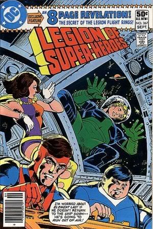
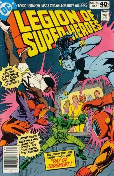
![[LOL]](graemlins/lol.gif)
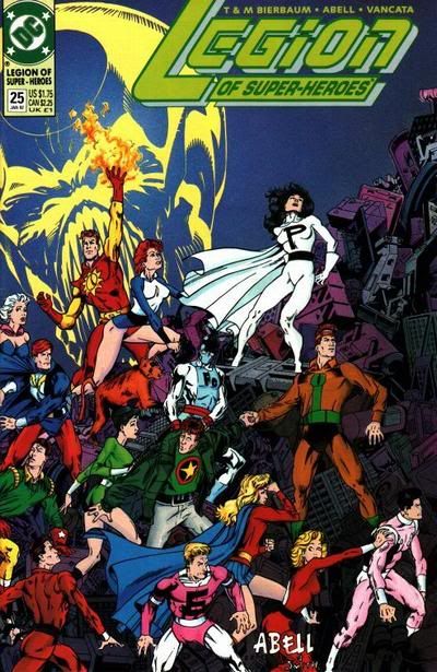
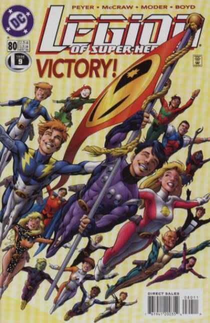
![[Band]](graemlins/band.gif)
![[Smile]](smile.gif)
![[Wink]](wink.gif)
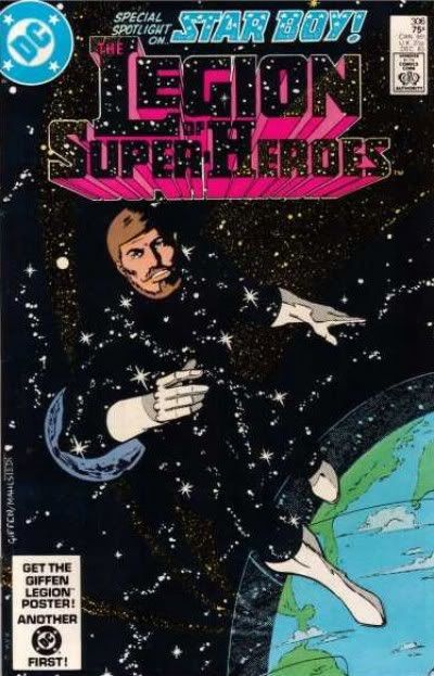

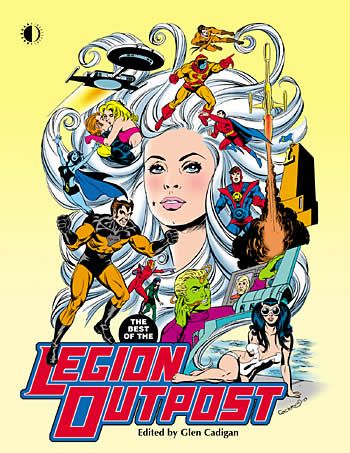
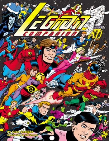
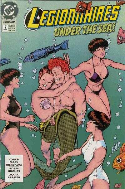
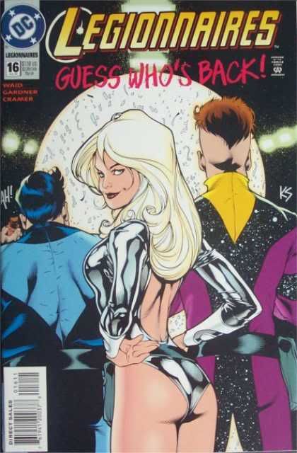
![[No]](graemlins/shake.gif)
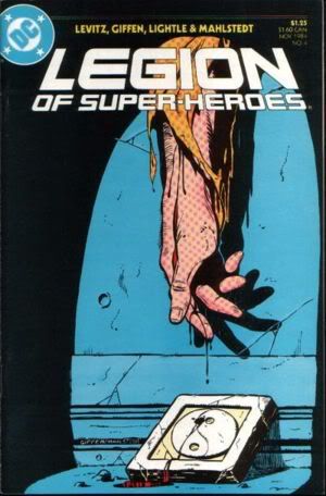
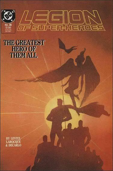
![[Karate Kid]](graemlins/KarateKid.gif)
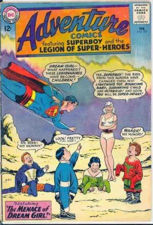
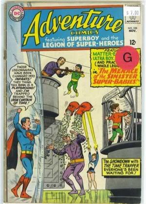
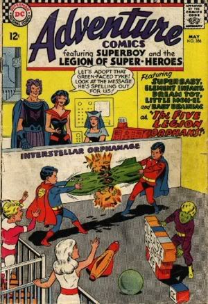
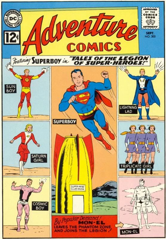
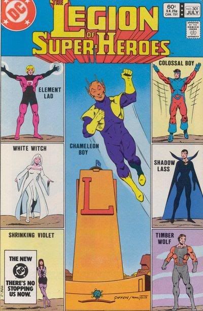
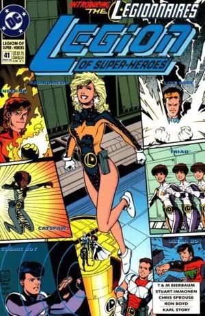
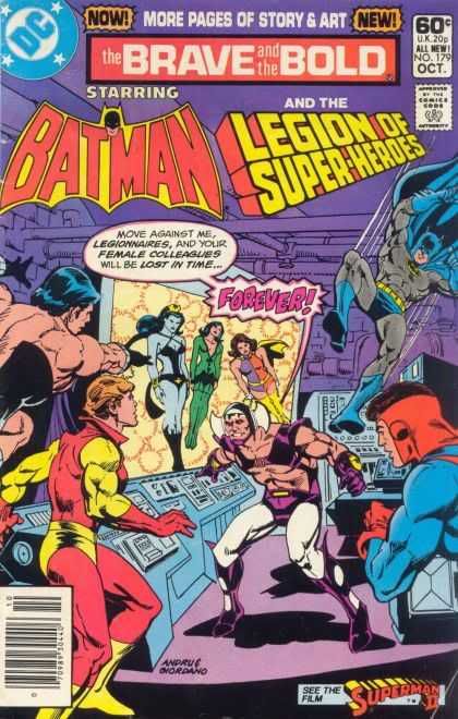
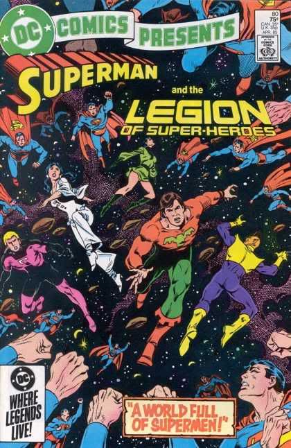
![[Ze Tongue]](graemlins/ZeTongue.gif)
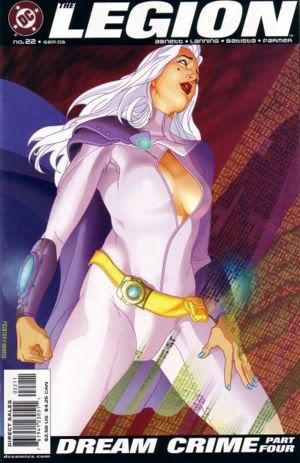
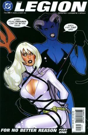
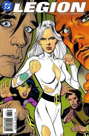
![[Devil]](graemlins/Devil1.gif)
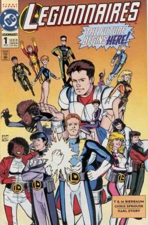
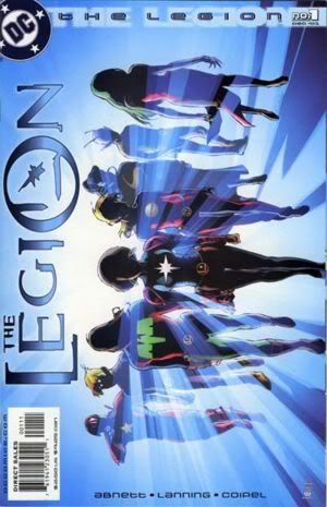
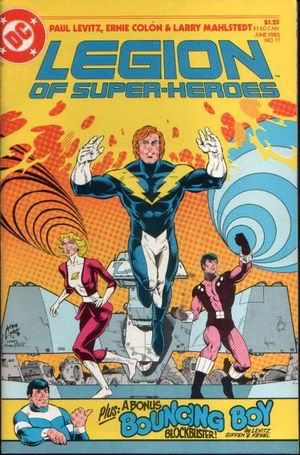
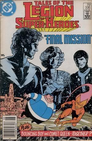
![[Yes]](graemlins/nod.gif)
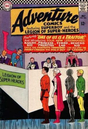
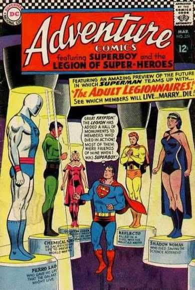
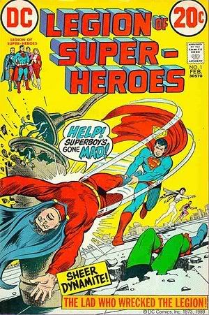
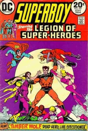
![[shrug]](graemlins/shrug.gif)
![[Frown]](frown.gif)
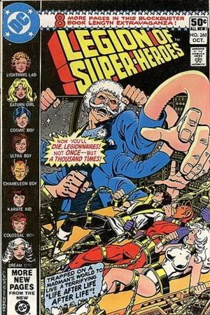
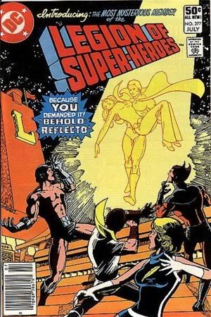
![[smack]](graemlins/smack.gif)
![[Hmmm?]](graemlins/hmmm.gif) Anyone else think Mayavale's about to cop a feel on Nura with the hand that's in the foreground? Kinky!
Anyone else think Mayavale's about to cop a feel on Nura with the hand that's in the foreground? Kinky! 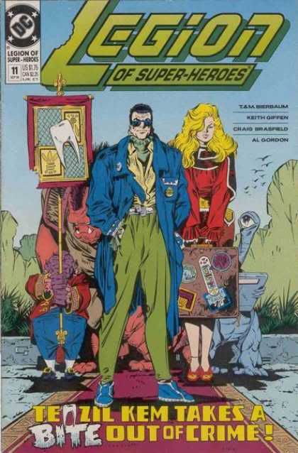
![[Venturan Walking Money]](graemlins/VenturanWalkingMoney.gif)
![[Eek!]](eek.gif)
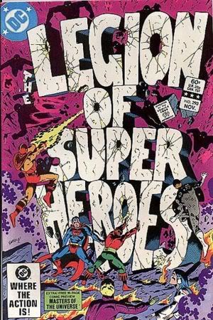
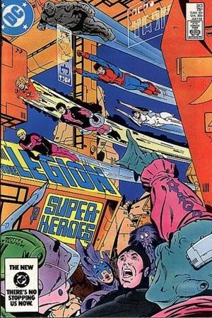
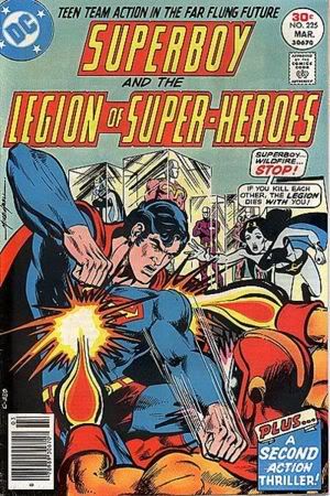
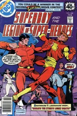
![[Confused]](confused.gif)
![[Love]](graemlins/love.gif)
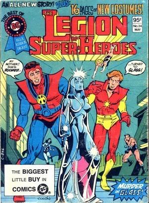
![[Holt]](graemlins/Holt.gif)
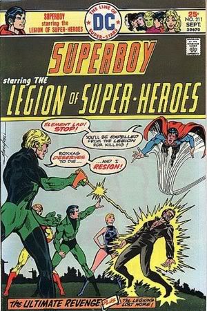
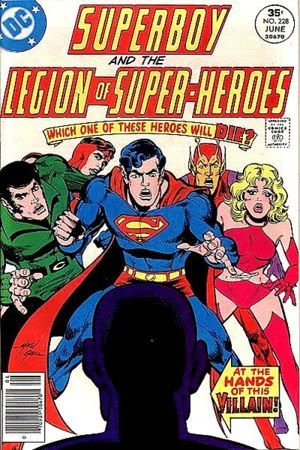

![[Chemical King]](graemlins/ChemicalKing.gif)
![[Darkseid]](graemlins/Darkseid.gif)
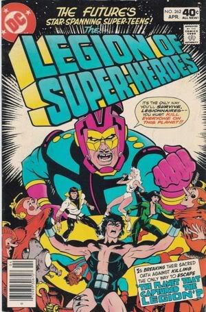
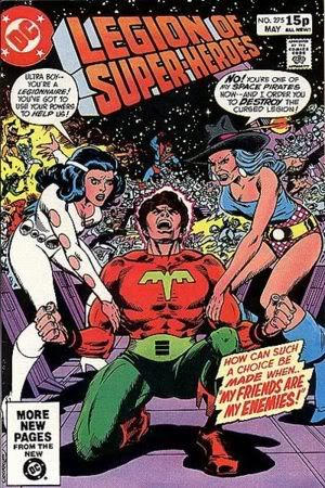
![[Embarrassed]](redface.gif) )
)
![[tease]](graemlins/tease.gif)

![[Drool]](graemlins/drool.gif)
![[Razz]](tongue.gif)
![[Dream Boy]](graemlins/DreamBoy.gif)
![[Girls wanting Legion autographs]](graemlins/AutographGirls.gif)
![[Legion Flag]](graemlins/flag.gif)
![[Validus - Animated]](graemlins/Validusa.gif)
![[Cheers]](graemlins/cheers.gif)

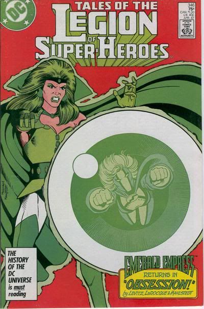
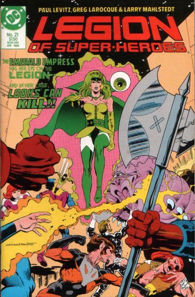
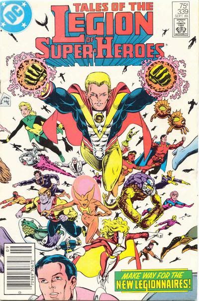
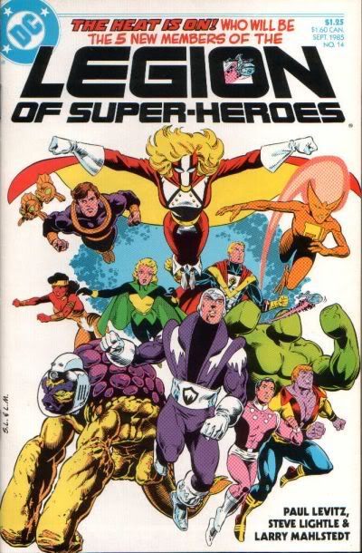
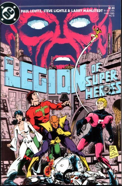
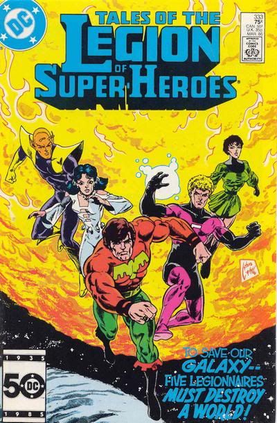
![[sigh]](graemlins/sigh.gif)
![[Dream Girl]](graemlins/DreamGirl.gif)
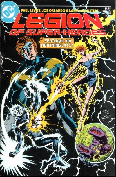
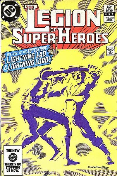
![[Estimate Boy]](graemlins/EstimateBoy.gif)

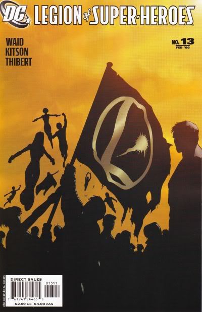
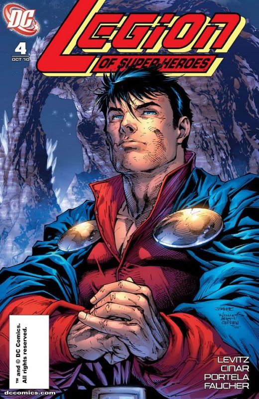
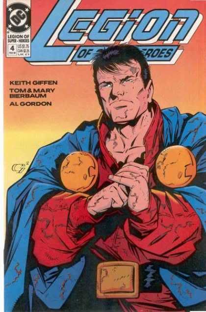
![[ROTFLMAO]](graemlins/rotflmao.gif)
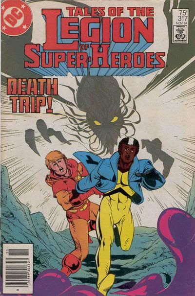
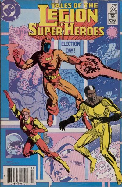
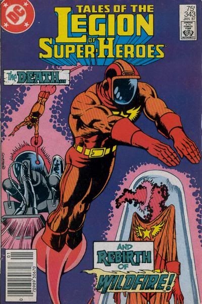


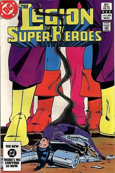
![[Cosmic Boy - Re-Imagined]](graemlins/CosmicBoy3.gif)