posted
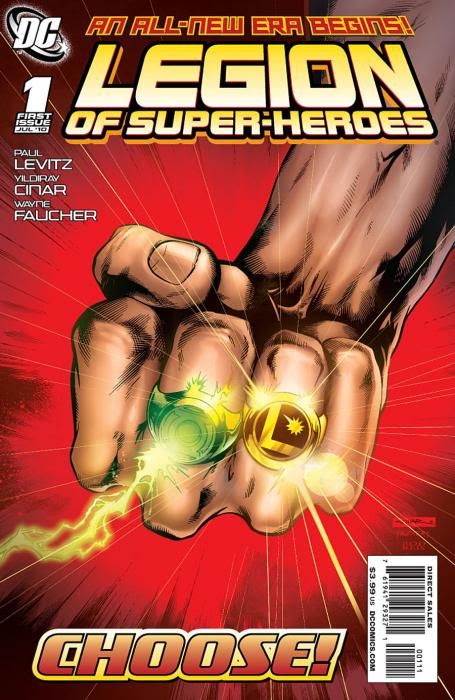
Though I love 5YL, that cover isn't exactly iconic. It represents the feel well but just ain't purty, ya know? The current number one is a striking image, though I'd rather have had a group shot or something. It definitely shows us the Legion is back while acknowledging something that has had little to do with Legion continuity previously in the form of the GL ring. (I'll bet the new cover image sold some books, too!)
The new #1 gets the nod.
-------------------- "Suck it, depressos!"--M. Lash
From: The Underbelly of Society | Registered: Jul 2003
| IP: Logged |
-------------------- I tried to rip their soul out.I tried to make them forget Superman. But they won't.
From: Kentucky | Registered: Oct 2005
| IP: Logged |
posted
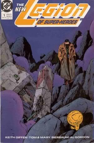
There are times when comic book creators transcend their medium, and manage to lift their work to the level of Art with a capital A. The cover of the first issue of the TMK run was one of those times. Comic book covers are traditionally loud affairs. The purpose is to get you to pay attention. Look at me! Buy me! They can be viewed as advertisements.
Giffen didn't play that game with the introduction of his version of the team. It was subtle, quiet and sad. It whispered, "everything is different." And, for once, it truly was. The colors created the mood and set the tone. This is the planet Braal. This is real science fiction. It is my all time favorite Legion cover.
-------------------- No regrets, Coyote.
From: Missouri | Registered: Oct 2003
| IP: Logged |
quote:Originally posted by Jerry: There are times when comic book creators transcend their medium, and manage to lift their work to the level of Art with a capital A. The cover of the first issue of the TMK run was one of those times. Comic book covers are traditionally loud affairs. The purpose is to get you to pay attention. Look at me! Buy me! They can be viewed as advertisements.
Giffen didn't play that game with the introduction of his version of the team. It was subtle, quiet and sad. It whispered, "everything is different." And, for once, it truly was. The colors created the mood and set the tone. This is the planet Braal. This is real science fiction. It is my all time favorite Legion cover.
Jerry, I've long admired your way with words. What a beautiful endorsement of TMK's LSH # 1 cover!
posted
I kinda like the concepts behind both covers but IMO both fall short on the execution too (which seems to be the case with a lot of Legion covers I'm noticing).
The colours don't work for me on the v.4 cover and that upside-down Legion ring on the Cinar cover is very grating.
I'll go for the v.4 cover because it's moody and ominous and tells a story unlike the new one which just says 'there's a Green Lantern in the Legion', which - yawn.
From: Australia | Registered: Dec 2003
| IP: Logged |
posted
The TMK issue. I hate the new cover, only because it's more of a Green Lantern cover than Legion, even with the ring. Loved the variant much better.
From: Tampa | Registered: Jul 2003
| IP: Logged |
posted
I'll vote for TMK, too. The Legion doesn't (or shouldn't) need the GL ring on the cover to sell it.
-------------------- The Semi-Great Gildersleeve - writing, super-heroes, and this 'n' that
From: The Stasis Zone | Registered: Jul 2003
| IP: Logged |
My only reservation is that Giffen over used the face black out. I mean, really over used it. Even when the bridge of the nose should have been seen. And maybe the tip of the chin. The parts that actually hit the light if you don't have your chin buried in your neck. sigh (pet peeve for me)
But I loved the costumes, coloring and feel of that era, probably my favorite Legion 'look'.
-------------------- 'In the twinkling of an eye' I'll be dancing in the sky!
Come, join me!
From: Salem, Oregon USA | Registered: Aug 2003
| IP: Logged |

 Topic Closed


 Hyperpath: Email this page to someone!
 Printer-friendly view of this topic | Subscribe To Topic


![[Smile]](smile.gif)