posted
I'm not a huge Grell fan since I thought and think, that many of his costumes are bordering on ridiculous but I DO think that he was a good follow-up for Cockrum. Their styles were similar enough to create a continuity of the new visual identity that Cockrum, and a few others (fan costumes) had begun.
One of my problems with Grell, too, is that his work is SO of that era, Disco stuff, that I don't think it carries over well. It's not 'ageless'.
Few artists and their work, are really.
I think that Swan, Adams, Cockrum, Lightle, Hughes and Coipel transend their 'eras'. (That list isn't exhaustive, by any means.)
-------------------- 'In the twinkling of an eye' I'll be dancing in the sky!
Come, join me!
From: Salem, Oregon USA | Registered: Aug 2003
| IP: Logged |
-------------------- Five billion years from now the Sun will go nova and obliterate the Earth. Don't sweat the small stuff!
From: Boston | Registered: Aug 2003
| IP: Logged |
posted
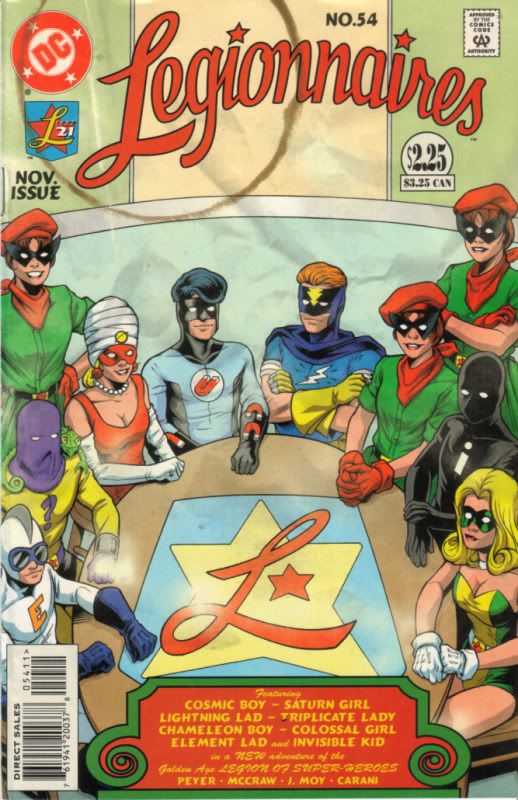
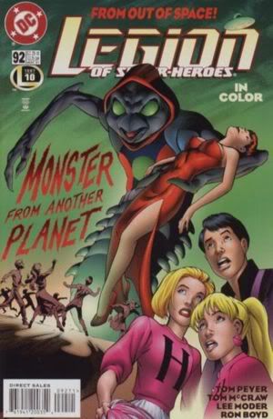
Hmm. If I had voted from memory, I would have gone the other way. 54 created some neat visual textures, but I don't care much for Moy. LSH #92 and the "B" movie poster get my vote.
posted
LSH 92 for me, too. Love seeing Gates featured in a cover, and the green background makes him seem more menacing, somehow. More...alien. They just did a good job on this one.
Leg. 54 looks too static for my taste.
From: Vancouver, BC, Canada | Registered: Jul 2003
| IP: Logged |
Eryk Davis Ester
Created from the Cosmic Legends of the Universe!
posted
Golden Age Legion for the win!
From: Liberty City | Registered: Jul 2003
| IP: Logged |
posted
I like both- but I'll go with LEGIONNAIRES 54 since it has interesting looks for some of my favorite characters (finhead Element Lad? Hooded Invisible Kid? That awful magnet insignia for Cosmic Boy...). How could I possibly vote against that turban on Saturn Girl's head?
I do love Gates starring on a cover... and the choice of a drive-in monster movie poster representing the 1950's is a good one.
This pair of covers reminds me of so much story-potential wasted in that idea of the Time Trapper testing the Legionnaires by placing them in different eras.
That could have been a recurring bit for *years*! Similar to the Time Trapper's recurring role in ADVENTURE comics. Instead, we had these two 'looks', followed by a muddled, confusing two-parter that seemingly wrapped everything up. I wasn't satisifed then, and I'm less so now.
What might have been...
From: Knoxville, TN | Registered: Jul 2003
| IP: Logged |
Eryk Davis Ester
Created from the Cosmic Legends of the Universe!
posted
One really cool thing about 54 that needs to be mentioned... the groovy artificial aging effects to make it look more authentically like a fifty-year old comic! Note the "fades" in various places!
From: Liberty City | Registered: Jul 2003
| IP: Logged |
posted
92. I also love the atmospheric, B-movie poster homage.
Another aspect that makes it stand out is the intentional catering to the prejudices of the era. "Monster from Another Planet" -- as if any other planet *had* to be populated by monsters (a prejudice the Legion was designed to counter). The clean-cut, all-American white kids (including two blonde girls). The exaggerated, gigantic form of Gates (who was actually small). The cover, perhaps in a nod to Gates' political leanings, effectively spoofs Red Scare paranoia.
-------------------- The Semi-Great Gildersleeve - writing, super-heroes, and this 'n' that
From: The Stasis Zone | Registered: Jul 2003
| IP: Logged |
posted
Legionnaires #54 for me. While this was the era that almost made me drop the Legion for the first time, I think that the overall look and faux aging of the cover make it a winner.
Artwise, Legion #92 is nicer, but 54 gets it for the gimmick cover.
From: PEI, Canada | Registered: Aug 2003
| IP: Logged |

 Topic Closed


 Hyperpath: Email this page to someone!
 Printer-friendly view of this topic | Subscribe To Topic