quote:Originally posted by jimgallagher: I'm not trying to single you out, Officer Taylor, because you're by no means the only one who does this, but I have a pet peeve about people stating their opinion as if it's a fact. So unless one can provide concrete data from an extensive survey of Legion fandom, that quantifiably states "75% of all Legion fans rate Grell in the top 3 artists of such and such an era" IMHO, one should preface such a statement with an "imho".
Well, the funny thing is it's NOT "imho"! The Superboy/LSH era is the big, gaping hole in my Legion collection! I have the beginnings of it in my Legion Archives (those particular volumes being ones I haven't read yet) and lots of scattered back issues, all unread because I'm such a completist that I don't want to read them until I have them all to read together.
So I'm about as unbiased about that era as I can be, I suppose. I like Cockrum and Grell based entirely off other seminal works they've done and not the Legion. Sherman, I've never read a story in which he did the art. But looking at Legion historically, it's hard to deny the influence Cockrum and Grell had on that era from the costumes and the character debuts alone. Sherman had less to do along those lines, but the regard for him from such a small body of work is hard to ignore.
I've been a part of Legion fandom online for as long as the internet came to be a phenomenon and those three emerge as having the most devoted fans among Legion artists from that era. And between Grell and Staton with those two covers, I recognize some hallmarks that distinguish Grell's style that I like and some from Staton that I dislike.
-------------------- "Suck it, depressos!"--M. Lash
From: The Underbelly of Society | Registered: Jul 2003
| IP: Logged |
posted
my faves are giffen, immonen, lightle, coipel, sprouse, .......... pretty much in that order ....... followed by that guy who started the threeboot, and does perez count .... and that recent action comic's guy who drew the subs .... yeah.
yeah!
From: Ninja Land | Registered: Nov 2004
| IP: Logged |
posted
# 225, though I agree that both covers seem forced. However, this one wins my vote because I dislike the other.
1. The red letters with white background make the logo of # 248 seem incomplete to me.
2. As far as Sun Boy deserving a walloping, not really. Shady gets injured while the team encounters a sewer monster (sent by Dr. Mantis Morlo), and Sun Boy feels unduly responsible. Mon goes a bit nuts and shirks his Legion duty to spend this issue and the next at Shady's bedside. Not one of Mon's finer moments.
3. I'm in the Grell-over-Staton camp. Whether this is due to nostalgia (Grell was the fourth Legion artist I was exposed to, after Forte, Swan, and Cockrum) or Grell's artistic merits I leave for others to decide. To me, the cover of # 225 flows better and is more visually interesting--in large part because of the mysterious mannequins in the background.
-------------------- The Semi-Great Gildersleeve - writing, super-heroes, and this 'n' that
From: The Stasis Zone | Registered: Jul 2003
| IP: Logged |
posted
I vote 225 just because Wildfire is my favorite. A Legion without Wildfire is not a Legion at all.
From: Bristol IN USA | Registered: Apr 2010
| IP: Logged |
posted
By way of trying to explain Grell's appeal, at the time, Grell's artwork seemed new and fresh and young, exciting, more detailed, more Neal Adamsy-pop art than old-style Kirby/Swan comic book art. Even his flaws in human anatomy seemed more like fresh new exciting poses rather than, umm, flaws in human anatomy.
Yet I like 248 better, though I think it is more Giordano than Staton. Its just a cleaner drawing.
-------------------- So what.
From: Harrisburg, PA | Registered: Apr 2006
| IP: Logged |
posted
248 is definitely more Giordano than Staton, in fact I'd call it a Giordano cover basically.
Staton has a cartoony aspect to his work that is pretty much non-existent in that cover. And those powerful lines are a Giordano trademark.
IMVHO, seldom has Staton's work looked better than it does on that particular cover.
One thing I notice though...Mon-El looks extremely powerful on that cover. Extremely powerful. Personally I it when Mon-El is drawn as being slight built better. Mon-El has never seemed like the type to worry much about his physique to me.
Registered: Mar 2006
| IP: Logged |
posted
#248 for me if only because it makes me think that any moment Dirks head will be leaving his body!
From: Dorset, England | Registered: Oct 2008
| IP: Logged |
posted
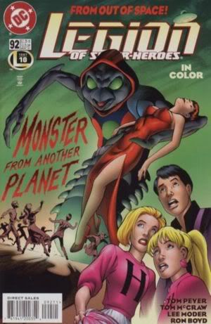
LSH #92. While I like the JSA riff in the L* cover, anything with Gates front and center in such an awesome way gets my vote.
From: Moncton, New Brunswick, Canada | Registered: Sep 2004
| IP: Logged |

 Topic Closed


 Hyperpath: Email this page to someone!
 Printer-friendly view of this topic | Subscribe To Topic