posted
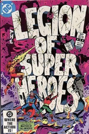
The first cover may have more action, but "the idea outmatches the execution" is right. The shattering text, rather than conveying a sense of danger to the organization it names, just looks cartoony.
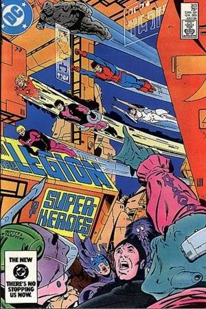
The second cover doesn't say much about what's inside; in that regard, it's a "poster" cover like many of the Modern Age. That said, it's an atypical poster cover. It doesn't focus on the Legion, but on the crowd and the technological background. And it succeeds in making that look interesting.
The flying cover does what it sets out to do better.
-------------------- Tom Strong, on nostalgia: "I suppose it's a ready substitute for genuine feeling." - Tom Strong #6, Alan Moore
From: Calgary, Alberta | Registered: May 2008
| IP: Logged |
posted
The second cover's prettier, but it's very generic and not indicative of the story within. 293 is also simply memorable and instantly identifiable by a Legion fan. I would have to get my 313 out and open it to even tell you what happens inside (was it part of Omen & Prophet?!?). Definitely taking 293!
-------------------- "Suck it, depressos!"--M. Lash
From: The Underbelly of Society | Registered: Jul 2003
| IP: Logged |
Wow, just when I think I have LSH fans figured out... I thought the GDS cover would utterly destroy 313, and so far that is not even close to the case! Which, IMO, makes things more fun!!
Anyhoo, I add my vote to the GDS (293) cover. At the time, this type/style cover was a first for the LSH, iirc.
SPECIAL INSIDERS SCOOP: the original face-off was going to be with 293 vs. the Lightle cover from MAGIC WARS that has the logo on the side of the HQ with dragons flying all around, but I switched at the last minute.
posted
# 293 does a superb job of portraying chaos and desperation; nevertheless, I vote for # 313 because I like the streamlined effect, the crowd scene, and Giffen's return to form after the chaotic abstractness of the Omen/Prophet issues (which ended with # 310, by the way).
I don't remember what happened in # 313, either, but that doesn't detract from the cover's artistic merits.
-------------------- The Semi-Great Gildersleeve - writing, super-heroes, and this 'n' that
From: The Stasis Zone | Registered: Jul 2003
| IP: Logged |
posted
For most of these contests I've separated the cover, as a work of art, from the story in the issue. I can't do that here. "The Great Darkness Saga" was a creative pinnacle for the Legion. There was a chemistry bubbling with the creative team, production staff, editors, and DC as a whole. Everything came together to make an exciting and historical Legion story. The cover to #293 is part of that. Wildfire, Superboy and Ultra Boy in action against the battered logo is a product of the creativity of the period. It gets my vote.
-------------------- No regrets, Coyote.
From: Missouri | Registered: Oct 2003
| IP: Logged |
posted
I agree with Jerry and Officer Taylor. They took the words right out of my mind. I cannot divorce the Great Darkness Saga from the first cover and I too, can't even remember what happened in the 2nd story, but I remember being very disappointed in it. I think it might have been some good cop/bad cop drivel. I think I may have even gotten a letter published complaining about it.
-------------------- Buy my new graphic novel! http://www.dodeka12.com
From: Champaign, IL | Registered: Jul 2003
| IP: Logged |
quote:Originally posted by Dev Em: Is that when Jan went black? With his for dyed black and a funky mustache as well?
Yep. I just re-read the issue. Jan and Gim go undercover as Science Police officers as part of the Legion's plot to expose a blackmailer who threatens President Allon. Too many Legionnaires are employed--including the cover-absent Superboy--for such a minor case, and the story does not justify being spread over two issues (312 contained the first part). Though not a bad story, it's hardly memorable. It does, however, showcase some lovely Giffen/Mahlstedt art, particularly on the post-Darkseid Daxam.
-------------------- The Semi-Great Gildersleeve - writing, super-heroes, and this 'n' that
From: The Stasis Zone | Registered: Jul 2003
| IP: Logged |
posted
I think that technically the flying cover is better rendered. But the cover to #293 actually makes me interested in the contents of the book, which is what a cover should do. So I'll vote for #293.
quote:Originally posted by He Who Wanders: # I don't remember what happened in # 313, either, but that doesn't detract from the cover's artistic merits.
Hey, Huey, I understand your reasoning, but in my case it's hard to divorce my gut feelings when there's a major story involved versus a comparatively inconsequential one. As nice as 313's cover is, it's not memorable among Legion covers for me. 293's is.
Hell, it's possible that if Lash decided to pit 313 against that Lightle cover from Magic Wars, I probably would choose 313 because of my negative feelings toward Magic Wars!
-------------------- "Suck it, depressos!"--M. Lash
From: The Underbelly of Society | Registered: Jul 2003
| IP: Logged |
quote:Originally posted by He Who Wanders: # I don't remember what happened in # 313, either, but that doesn't detract from the cover's artistic merits.
Hey, Huey, I understand your reasoning, but in my case it's hard to divorce my gut feelings when there's a major story involved versus a comparatively inconsequential one. As nice as 313's cover is, it's not memorable among Legion covers for me. 293's is.
Hell, it's possible that if Lash decided to pit 313 against that Lightle cover from Magic Wars, I probably would choose 313 because of my negative feelings toward Magic Wars!
Sure, everyone has his or her own criteria. To some, the cover represents their overall experience of the issue. To others, it's a work of art that should be judged separately from the contents. I fall into the latter category (usually).
-------------------- The Semi-Great Gildersleeve - writing, super-heroes, and this 'n' that
From: The Stasis Zone | Registered: Jul 2003
| IP: Logged |

 Topic Closed


 Hyperpath: Email this page to someone!
 Printer-friendly view of this topic | Subscribe To Topic