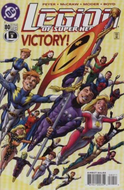
I love #25 because it represents a bright moment in an otherwise VERY dark era but I also love #80 because hey - it's Alan Davis drawing the Legion flying through the sky waving their flag! What's not to love?
That issue was also the excellent culmination to a year's worth of intriguing and exciting stories and holds a dear spot in my Legion-loving heart so I'm going with it.
#80 for the win.
From: Australia | Registered: Dec 2003
| IP: Logged |
posted
Dang, Lash. You're making this hard. Both are great.
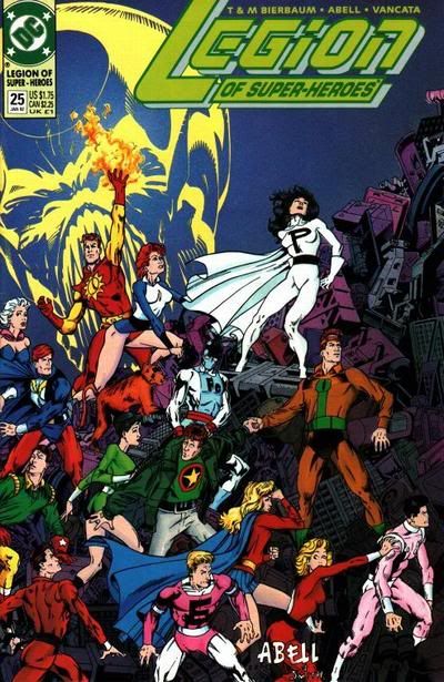
I'm going to have to go with the Dusty Abell cover for #25. It's a substance over style thing. #80 is sleek and beautiful to look at. It has a better layout. However, the Abell cover tells more of a story. The image of the Dominator looking down gives a sense of danger. Gim, Imra and Devlin looking over their shoulders conveys a sense of urgency and movement. Dirk turning to flash his powers gives us a sense of his personality and defiance to whatever the threat is. The detail in the metallic mountain of debris gives it an eery dark feel.
-------------------- No regrets, Coyote.
From: Missouri | Registered: Oct 2003
| IP: Logged |
posted
The cover of #80 with the Victory! sign and all those smiling faces makes me want to stand up, wave the flag and yell yay Legion! I don't want to do that with the other one. Beautiful as it is.
I vote for #80.
From: Vancouver, BC, Canada | Registered: Jul 2003
| IP: Logged |
posted
Again for me, the difference is in the details. LOOK at that debris the LSH is standing in on # 25. How long did that take Dusty to draw???
Also, # 25 marks the point where I went from 'LSH fan' to 'complete LSH nerd learning about and obsessing over EVERYTHING LSH related' (it helped that the Archives were coming out regularly during this time-span).
posted
# 25 because of its ominous mood and the contrast in colors.
By comparison, #80 almost hits you over the head with it's "gosh-wow-aren't-we-cool" vibe. I also think the composition is (literally) in your face.
-------------------- The Semi-Great Gildersleeve - writing, super-heroes, and this 'n' that
From: The Stasis Zone | Registered: Jul 2003
| IP: Logged |
posted
80. 25 looks like its a detail of a larger picture, as if another cover connects to the left. 80 is a fun group picture but not much of a selling point for a cover. Hmm. 80 final answer.
-------------------- So what.
From: Harrisburg, PA | Registered: Apr 2006
| IP: Logged |
I also like the story telling aspect of the picture over the group shot, which a group shot of the Legion flying has been done and redone.
-------------------- Five billion years from now the Sun will go nova and obliterate the Earth. Don't sweat the small stuff!
From: Boston | Registered: Aug 2003
| IP: Logged |
Set
There's not a word yet, for old friends who've just met.
posted
80. It captures the Legion I love to read about, set in a future filled with hope, not darkness.
25 has too many flaws. Lightning Lad's legs are attached wrong (or there's a coloring error, or something that makes him look like he's wearing a saggy diaper). Ayla is in a Liefield pose. Rokk looks like a caveman. Sun Boy's got an interesting dynamic pose, but his skull is square, like he's Herman Munster, pretending to be Sun Boy. Too many of the figures look deformed, or are posed awkwardly. Imra appears to be surprised by the sight of her own shoulder. What, did it sneak up on her? Tinya is doing her best Betty Boop pose, which apparently is the thing to do while your teammates appear to be running away from a giant floating Dominator head...
And the dark red haired dude in the center, wearing Star Boy's shirt and activating his Wonder Twin powers by bumping fists with Invisible Lyle, while grabbing Violet's ass with his other hand? I don't even know what's up with that. Let's put the dude who some Legion fans wouldn't even recognize in the center of the cover...
Registered: Aug 2006
| IP: Logged |
quote:Originally posted by Set: 25 has too many flaws. Lightning Lad's legs are attached wrong. Ayla is in a Liefield pose. Rokk looks like a caveman. Sun Boy's got an interesting dynamic pose, but his skull is square, like he's Herman Munster, pretending to be Sun Boy. Too many of the figures look deformed, or are posed awkwardly. Imra appears to be surprised by the sight of her own shoulder. What, did it sneak up on her? Tinya is doing her best Betty Boop pose, which apparently is the thing to do while your teammates appear to be running away from a giant floating Dominator head...
When you put it that way, I almost want to change my vote. Almost.
-------------------- The Semi-Great Gildersleeve - writing, super-heroes, and this 'n' that
From: The Stasis Zone | Registered: Jul 2003
| IP: Logged |

 Topic Closed


 Hyperpath: Email this page to someone!
 Printer-friendly view of this topic | Subscribe To Topic


![[Band]](graemlins/band.gif)
![[LOL]](graemlins/lol.gif)


