posted
Legion # 1, for the mystery, uniqueness, and resolution of the Lost story.
-------------------- The Semi-Great Gildersleeve - writing, super-heroes, and this 'n' that
From: The Stasis Zone | Registered: Jul 2003
| IP: Logged |
It was tough though, I love the energy popping off the page by Copiel.
From: If you don't want my peaches, honey... | Registered: Sep 2003
| IP: Logged |
posted
Taking any sentimental attachment to characters aside, I think The Legion #1 is one of the best first issue covers I have seen for ANY comic book team really....it has loads of atmosphere, so it gets my vote!
-------------------- Read the alternate adventures of the Legion after Legion of Three Worlds! postlo3w
Registered: Nov 2009
| IP: Logged |
posted
ALL-SPECIAL FACE-OFF FAN SUGGESTED BATTLE ROYALE DELUXE SUPREME EXCELLENTE
Here at Face-Off Central, we listen to YOU!! One of our regular voters wondered about having a face-off 'twixt an original BAXTER COVER and the later NEWSTAND COVER.... and I thought that sounded fun!
posted
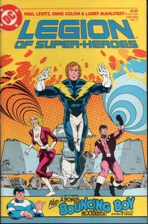
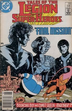
Wow. Lightle vs. Colon. Each has its strengths, but I need to go with Legion #11. Rokk looks great on that cover.
-------------------- No regrets, Coyote.
From: Missouri | Registered: Oct 2003
| IP: Logged |
Set
There's not a word yet, for old friends who've just met.
posted
Good art on both, I have no idea what the story is about in either, two out of three of my favorite costumes (Garth and Imra, Rokk, not so much) and one of Imra's more interesting face-framing hairstyles.
Both also have Chuck.
The LSH cover has some dynamic poses and gratuitious displays of power and a shot of the HQ.
The Tales cover has Nose-Grabber Lad, some alien world and cityscape, and a third-tier character (Comet Queen). I love to see Academy students (although she's at the bottom of the list I'd want to see...).
Wow. This one isn't easy!
I'll go with Tales, since the cover may not be as beautiful as Lightle's work on the LSH cover, but it is more representative of what's behind the cover, and it's suggestive that the Big Three founders are going to take a break, to deal with non-superheroing life concerns, like Graym-raising or whatever it is that has Rokk with such a frowny face.
A Legion with less focus on the Big Three, and more on less-developed characters, appeals to me, and while I have no idea if this is what the Tales cover actually means, that's what it *feels* like it represents...
Registered: Aug 2006
| IP: Logged |
posted
I love that 60s style strip across the bottom of the LSH #11 cover with Bouncing Boy pointing to the announcement of his own appearance in the issue, and generally prefer Lightle's art to Colon's...
But I'm gonna go with Tales #336 for the win. Just seems like a cleverer and more interesting design.
From: Australia | Registered: Dec 2003
| IP: Logged |

 Topic Closed


 Hyperpath: Email this page to someone!
 Printer-friendly view of this topic | Subscribe To Topic


![[Smile]](smile.gif)