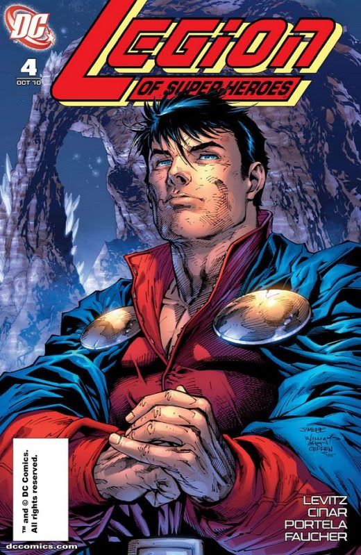
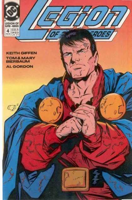
To me that looks more like Mon than the Giffen one. To me Mon has this incredible quiet strength that is best portrayed when he isn't looking like a "grumpy old man" (sorry, that description made me laugh). Mon doesn't need to look angry to convey you are about to get a beat down, the simple fact that you are doing evil in his presence means you're getting a beat down.
And yeah, coloring on the Giffen one is pretty bad.
-------------------- Long Live the Legion!
Registered: Mar 2007
| IP: Logged |
posted
Though Lee's cover is stunningly beautiful (one of the best pieces Lee's ever drawn IMO) and I'm SO glad I won it, I have to agree about the determination Giffen gives Mon in the original.Lee's version brings out his nobility; Giffen's shows he's ready for a scrap. If Lee's homage had brought that quality out more, I may have given it to Lee for the sheer beauty.
But as it is, I'll give Giffen the edge because of what the image represents to the contents of the original issue. (For he record, Giffen's is beautiful, too!)
-------------------- "Suck it, depressos!"--M. Lash
From: The Underbelly of Society | Registered: Jul 2003
| IP: Logged |
posted
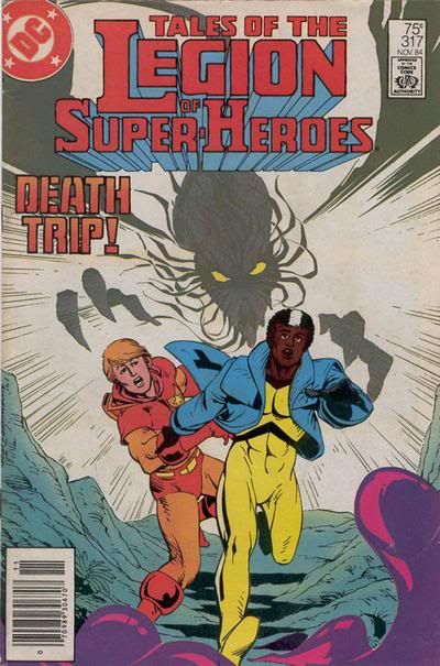
#317 - It's less crowded, tells more of a story, and gives us the mystery of why is there a person in Wildfire's containment suit? Worth picking up to find out. Drake as a person is kind of handsome. Jacques' blue jacket is a nice touch.
[ September 08, 2010, 08:36 PM: Message edited by: Jerry ]
-------------------- No regrets, Coyote.
From: Missouri | Registered: Oct 2003
| IP: Logged |

 Topic Closed


 Hyperpath: Email this page to someone!
 Printer-friendly view of this topic | Subscribe To Topic


![[LOL]](graemlins/lol.gif)